Wonderlab’s Doozy Pots

Wonderlab’s Doozy Pots

The Challenge

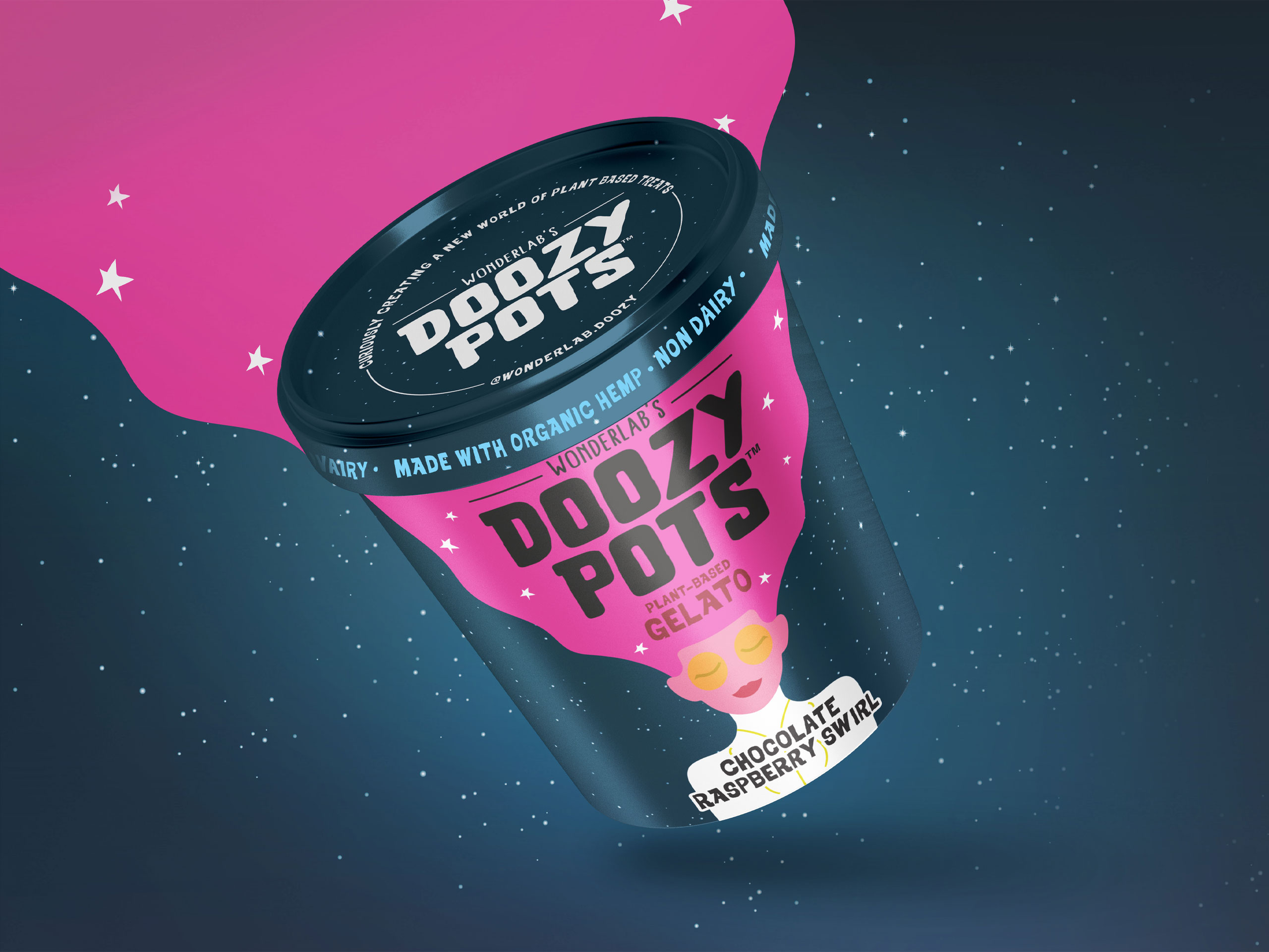
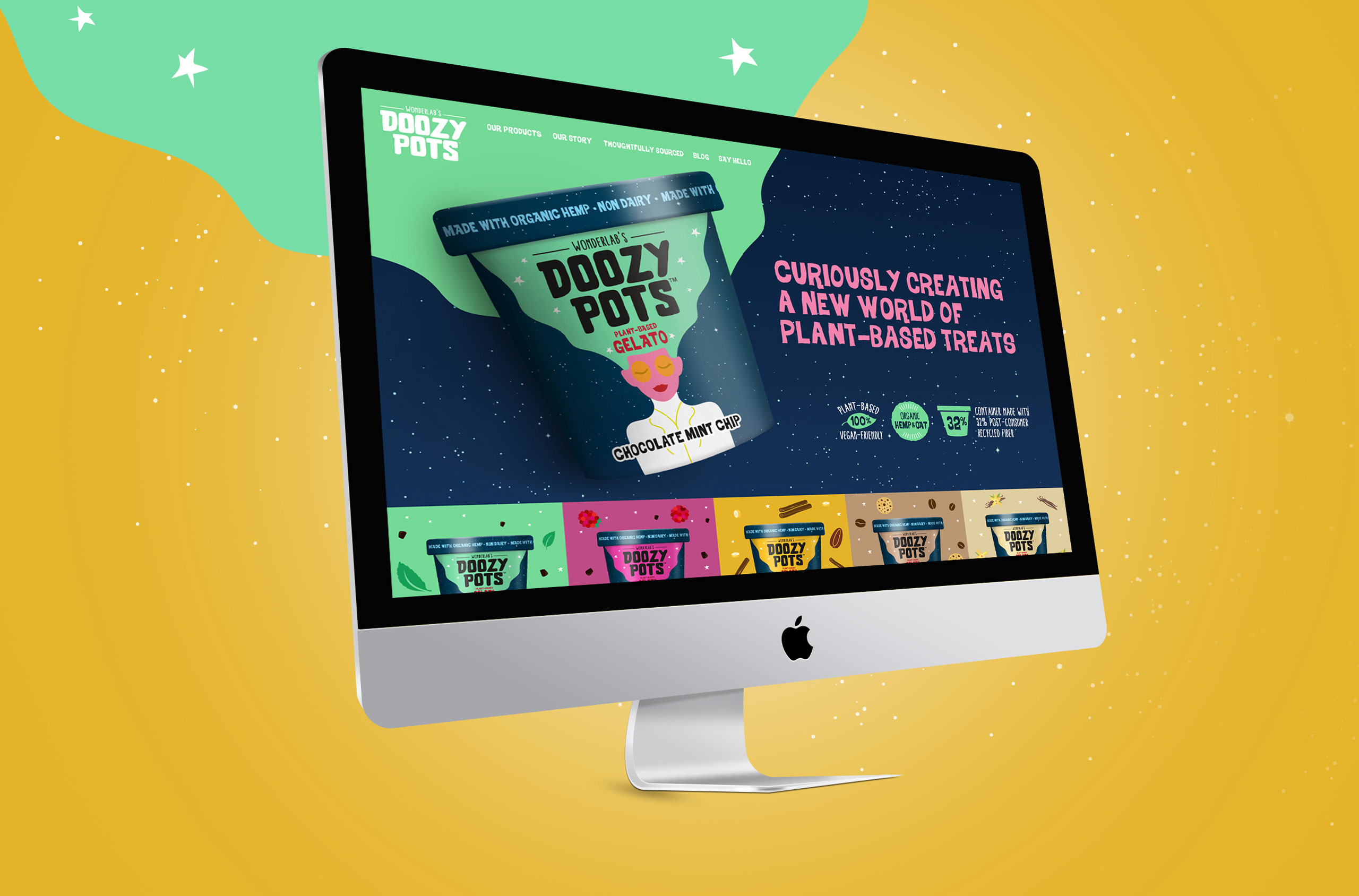
Plant-based ice cream brand Doozy Pots aspired to satisfy your sweet tooth while reshaping food systems as a whole. While food scientist Kirsten Sutaria had a dream for her brand, she still needed to create a brand identity, visual identity, and messaging strategy for her plant based gelato brand.

With the opportunity to introduce a new challenger into the vegan gelato space, Doozy Pots tapped The GRO Agency to develop an inspiring brand identity and product packaging.

Our challenge with the Doozy Pots branding and product packaging was to effectively capture and communicate all the magical alchemy of food science, while appealing to the right consumers who would resonate with the brand message.

The Solution

For an upstart brand in a highly competitive space, carving out a well-defined niche is of the utmost importance. For this female-owned, plant-based ice cream company that brought low-allergen indulgence, regenerative farming, and the magical alchemy of food science, we found the right amount of inspiration within the founder’s story herself.

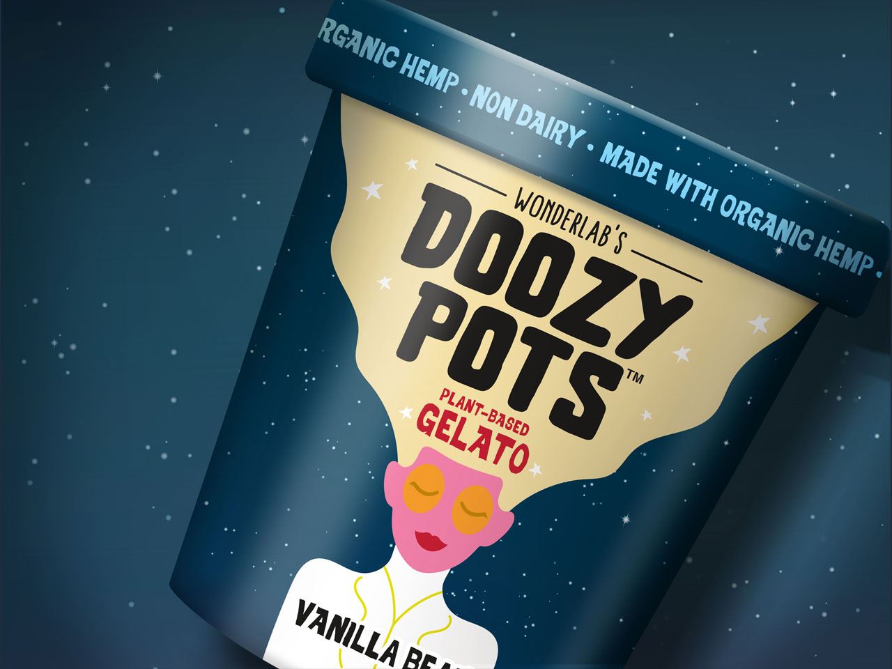
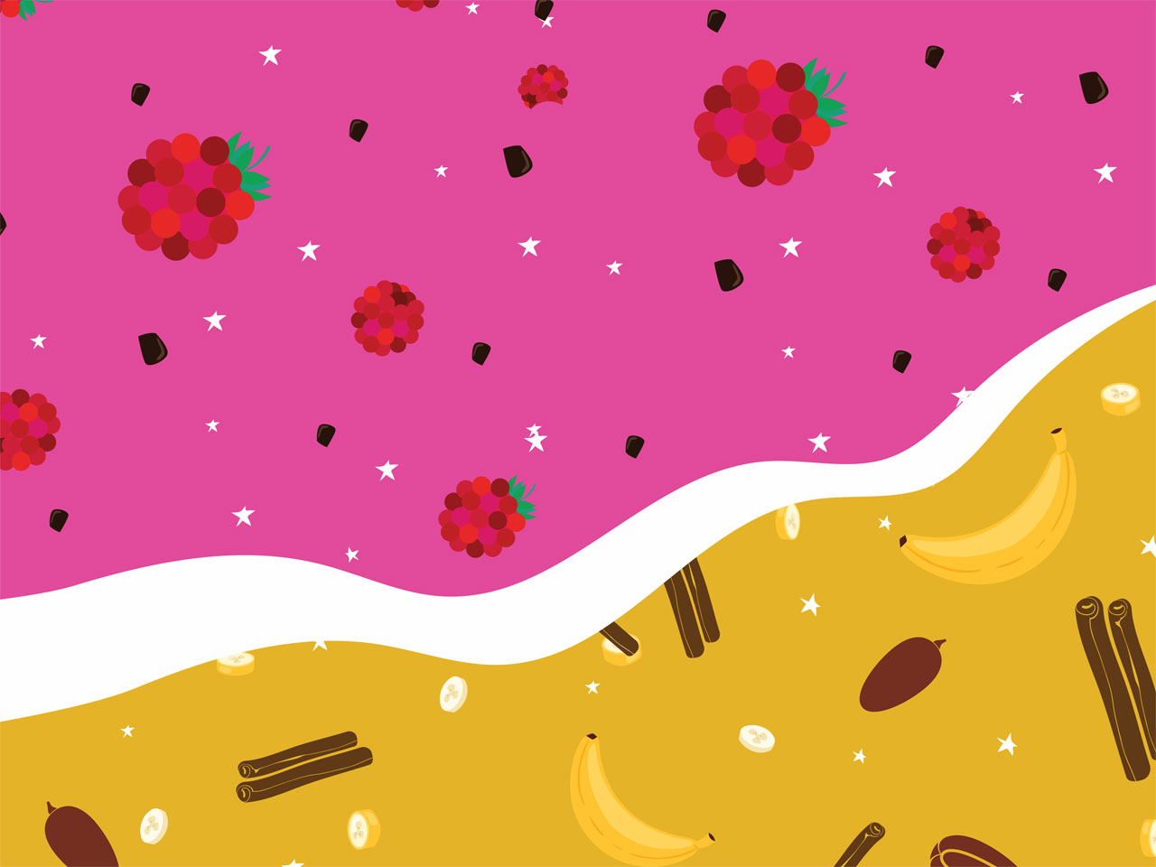
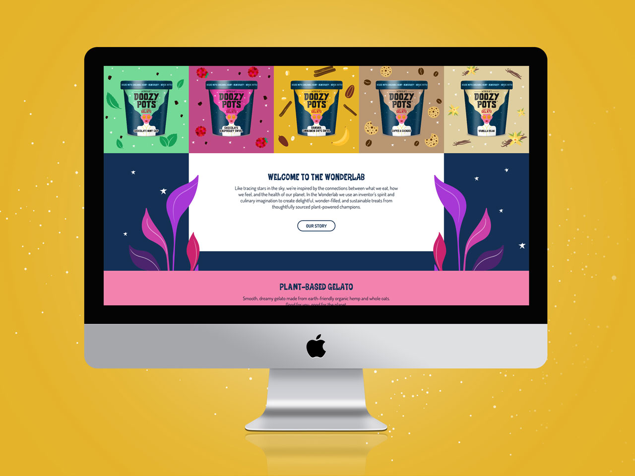
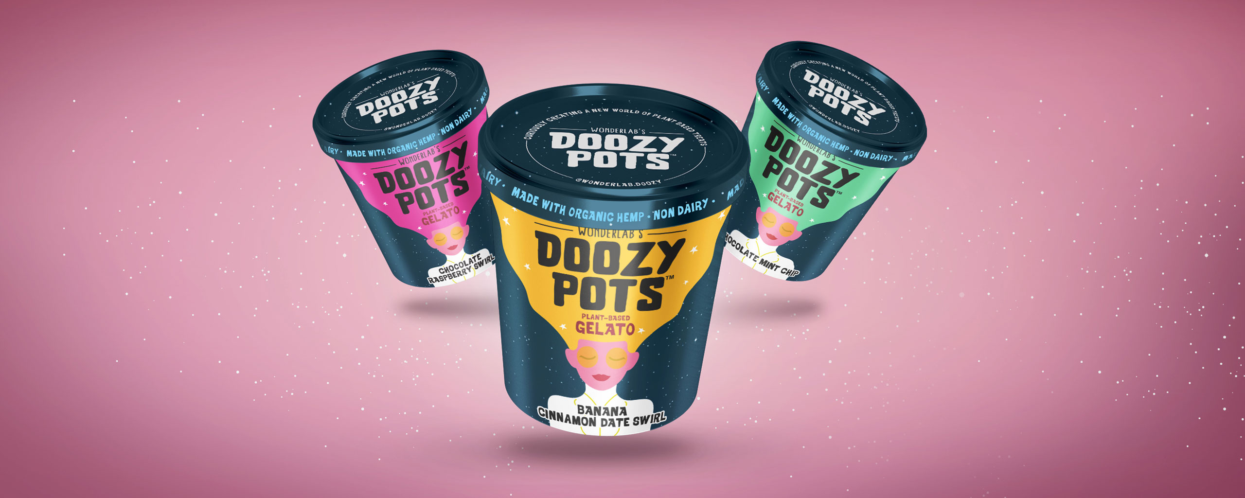
First, we created a visual identity that illuminated the story behind Doozy Pots, a creative female founder with the goal of reshaping food systems with low allergen, socially responsible, plant-based ice cream. The goal with the illustrations was to catch attention and tell the whole story of the Doozy Pots company right at first glance in the frozen aisle.

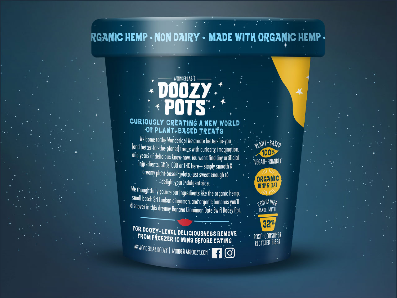
Then, the messaging strategy promised an indulgent experience of taste and nourishing ingredients, unlike others in the frozen dessert sector. Not only could Doozy Pots customers satisfy their cravings, but they could do so completely guilt-free with regards to their own health and their support of sustainability through regenerative farming.

Services

  • Brand Strategy
  • Naming
  • Logo Design
  • Packaging Design
  • Flavor/Size Adaptations
  • Packaging Production
  • Illustration
  • Website
In the past 2 years of working with the team at the GRO Agency they have become an extension of our team, transforming our vision into a brand. GRO brought Doozy Pots to life, creating a category disrupting on-shelf presence for our plant-based gelatos and developing a much loved brand identity. They’re responsive, creative, and seriously talented. Everyone at the GRO agency is a pleasure to work with and we’re proud to have them as part of the extended Doozy Pots family.

Kirsten Sutaria
Founder Wonderlab’s Doozy Pots

Wonderlab’s Doozy Pots
Country Natural Beef

Country Natural Beef

The Challenge

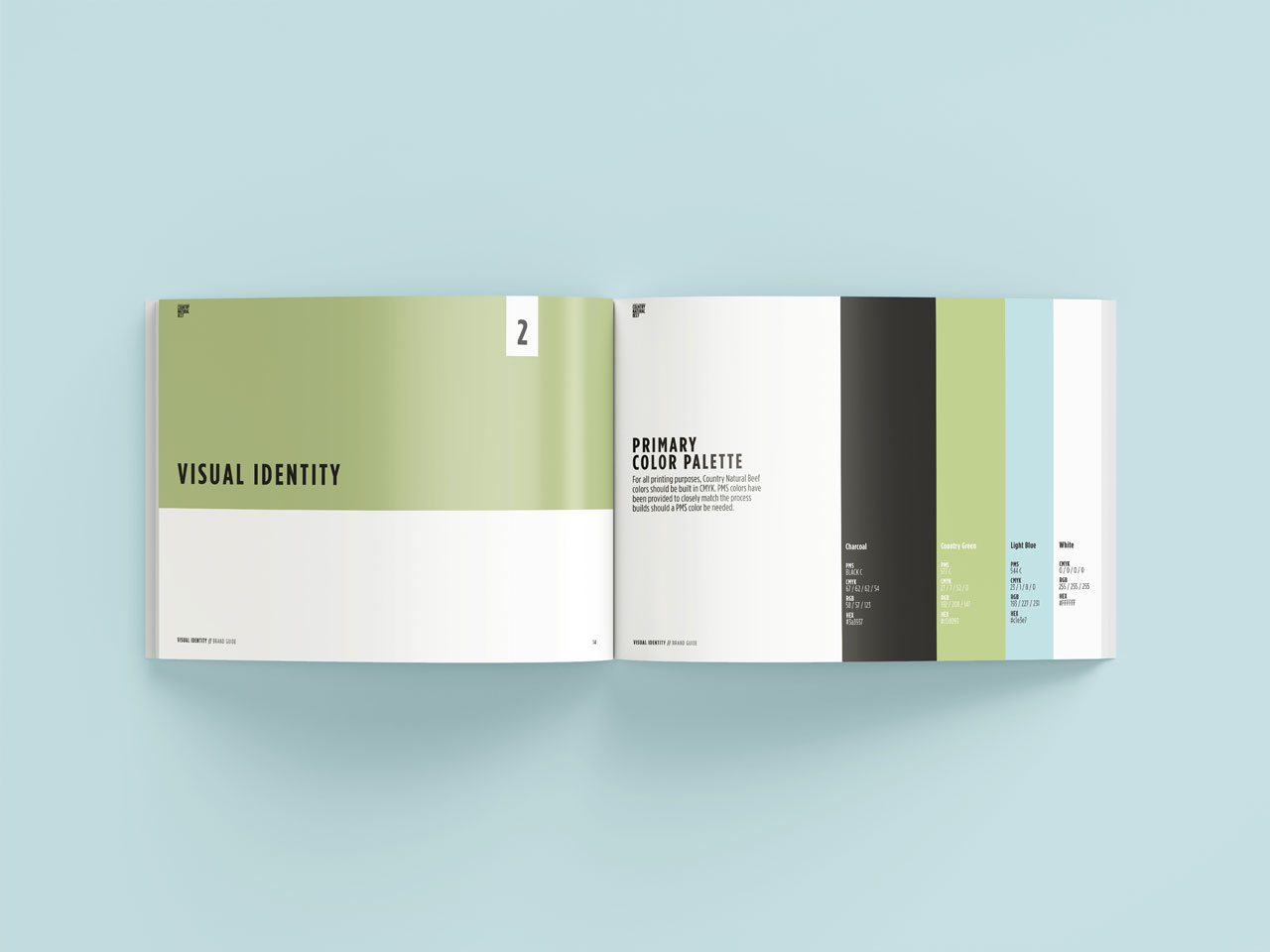
Ranching co-operative and meat provider Country Natural Beef (CNB) had a robust history as a forward-thinking cooperative of family ranchers who have been raising healthy beef in harmony with the land since 1986, but their identity was failing to tell the full story. To better communicate their pride-ridden work and shared philosophies, CNB needed to create a more telling visual identity.

With an opportunity to carve out an elevated brand identity, CNB tapped The GRO Agency to deliver unique packaging design and mouth-watering product photography.

Our challenge with the CNB product packaging redesign was to 1) tell the authentic story of CNB’s progressive and sustainable approach to ranching, deeply ingrained in the communities and families of the Co-op, and 2) make a premium and more ownable visual identity centered around their community engagement and sustainable practices.

The Solution

In the meat industry, brands must avoid appearing like a big corporate supplier at risk of subconsciously being thrown in the overarching category of ‘over-processed’. WIth the rebrand, CNB wisely made it clear to consumers that whenever they buy CNB products, they are buying quality beef directly from a ranch family, not a big corporate supplier.

First, amongst many of CNB’s philosophies is the strong belief that they would not market products that their own families would not eat. To serve as an anchor for the rebrand, the GRO Agency rallied the brand behind a new credo, families feeding families, to emphasize their community-driven roots and co-operative practices.
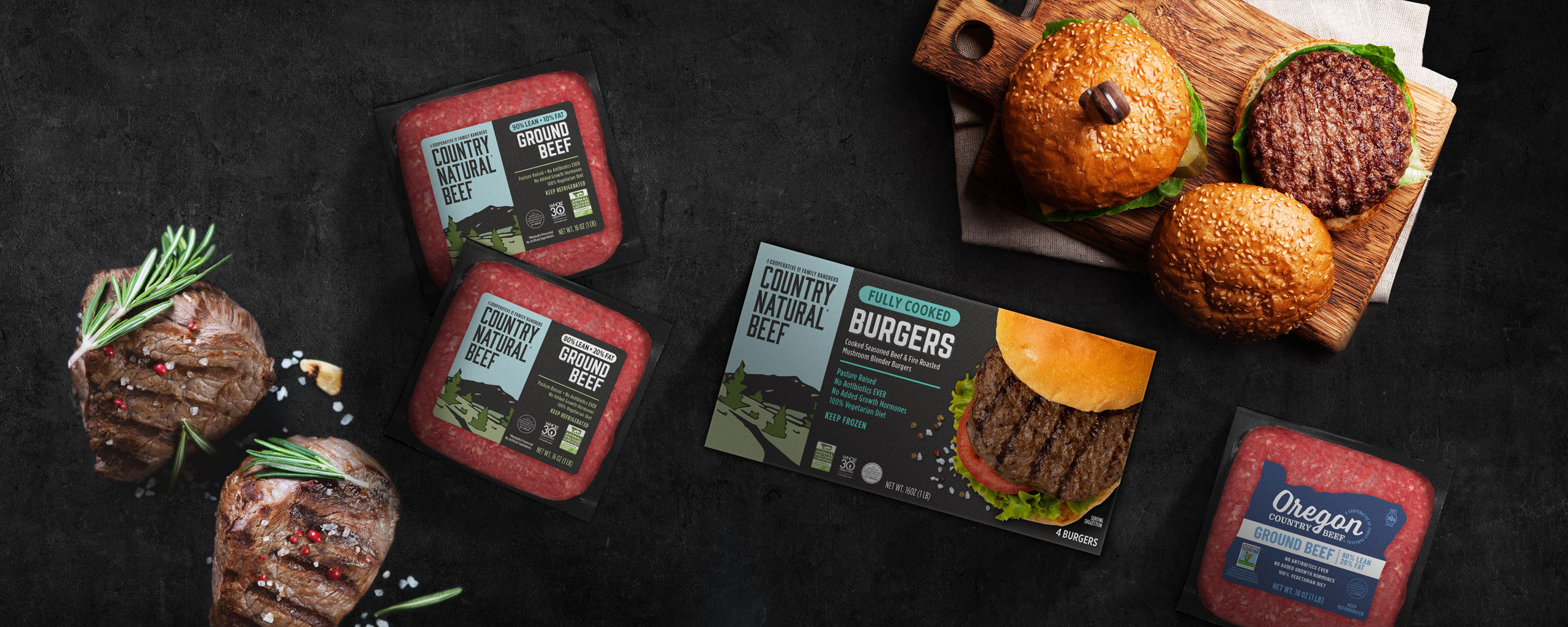
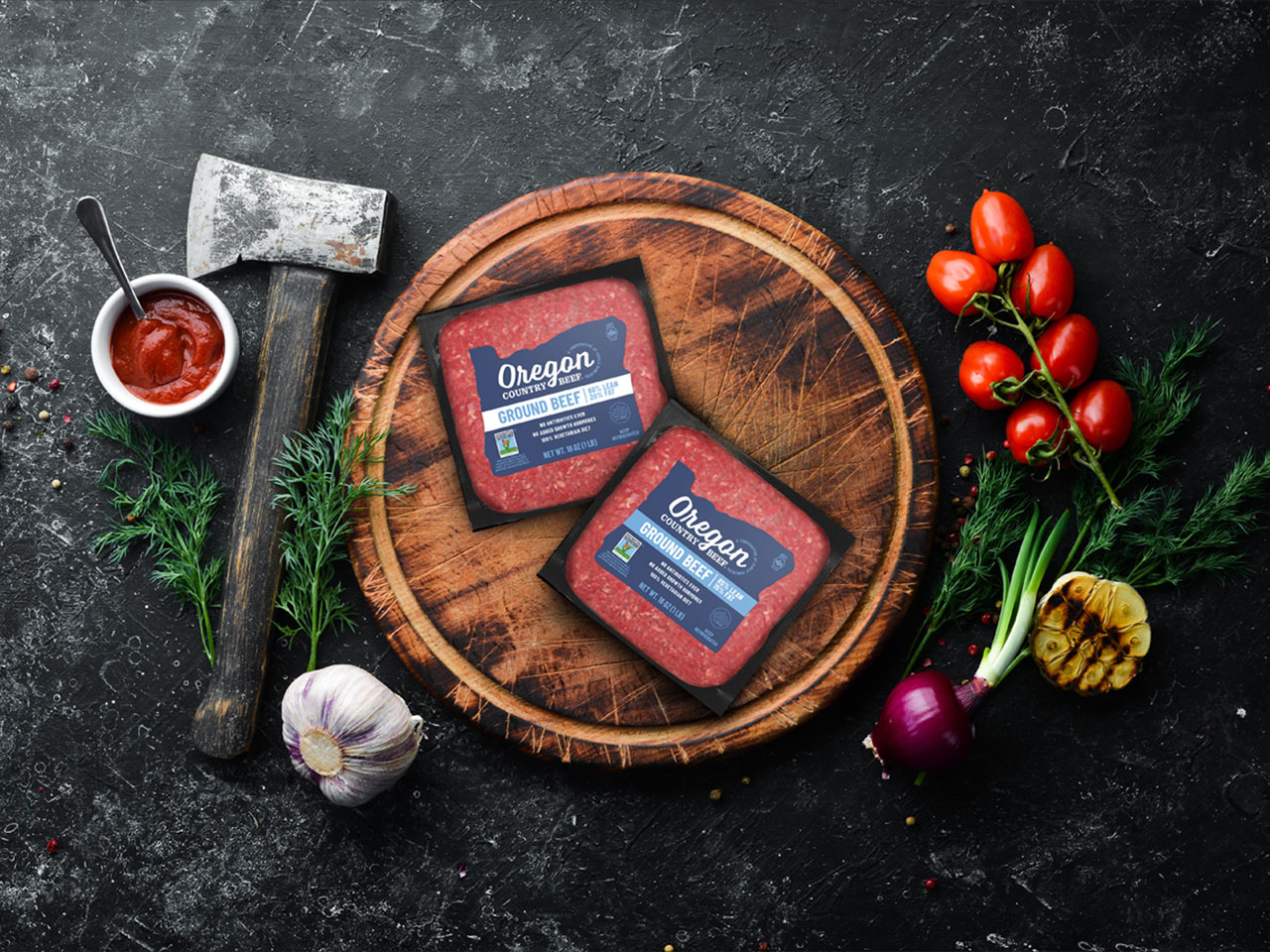
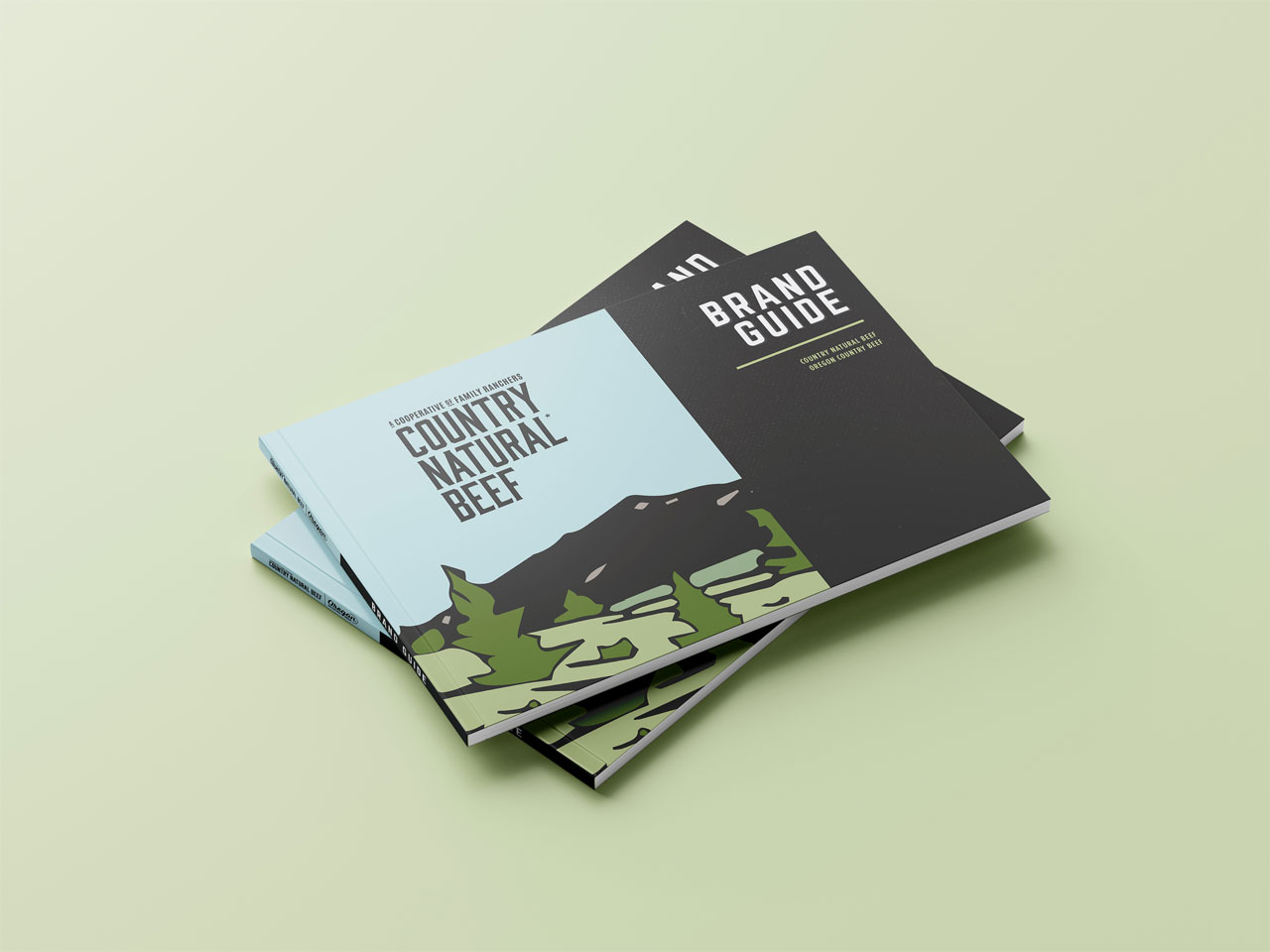
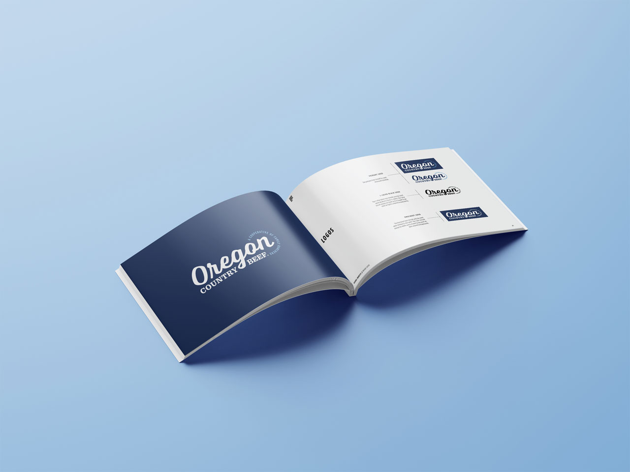
In addition to the human component, the packaging design introduced a modern style to some of the existing design elements that the Co-op had owned for many years, like strong typography reminiscent of a hearty meal. To make the brand name treatments for both CNB and their sub-brand Oregon Country Beef more distinctive and therefore more ownable, the communication hierarchy was rearranged to focus more on the logomark, and appear less of a white-label brand.
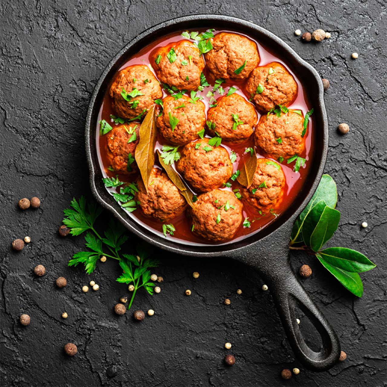
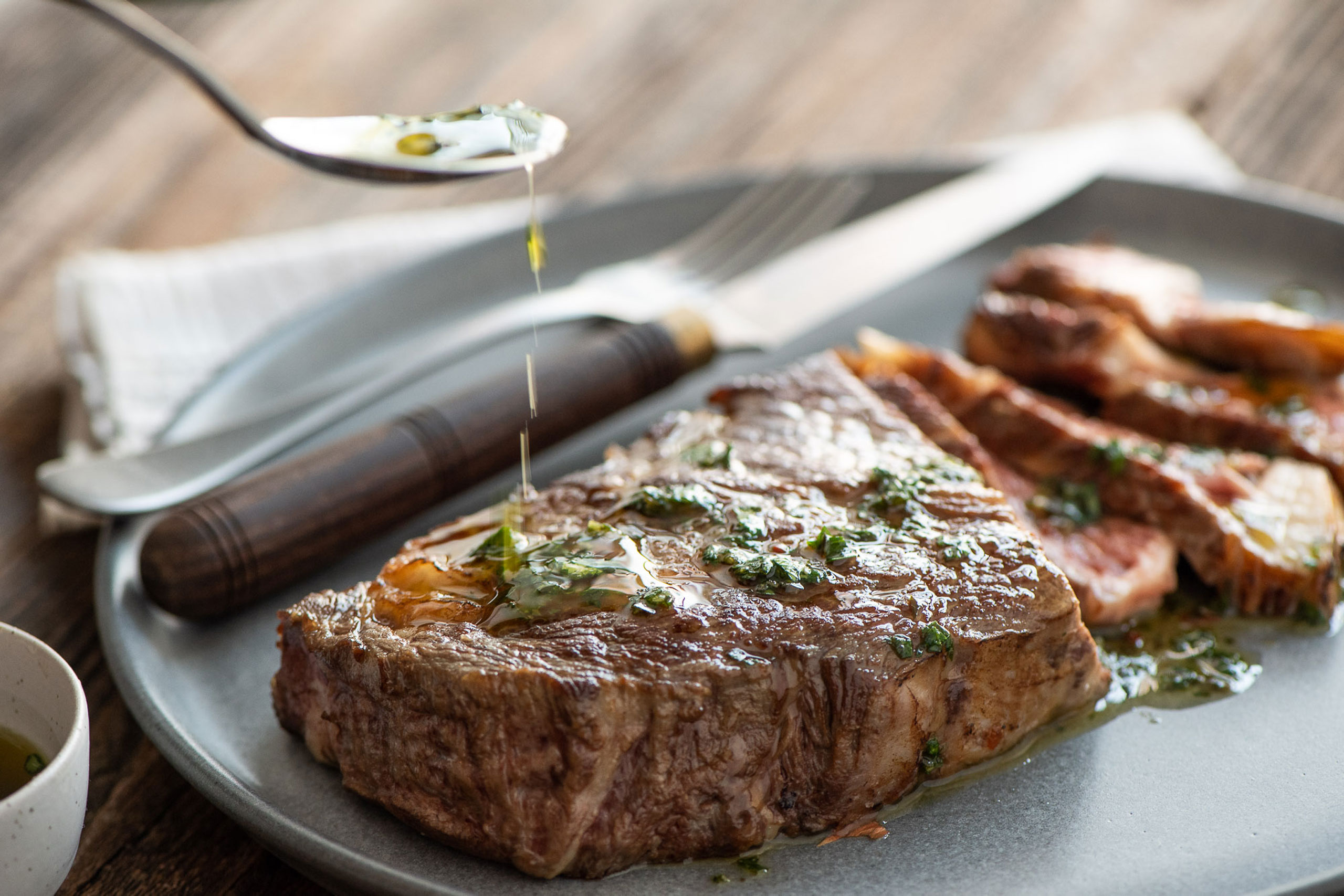
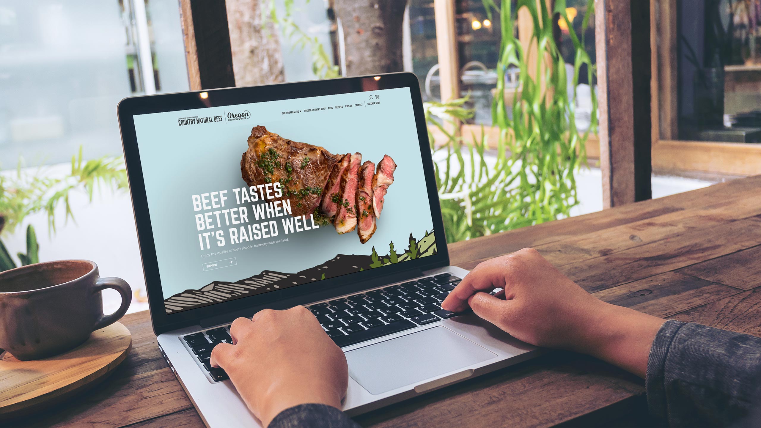
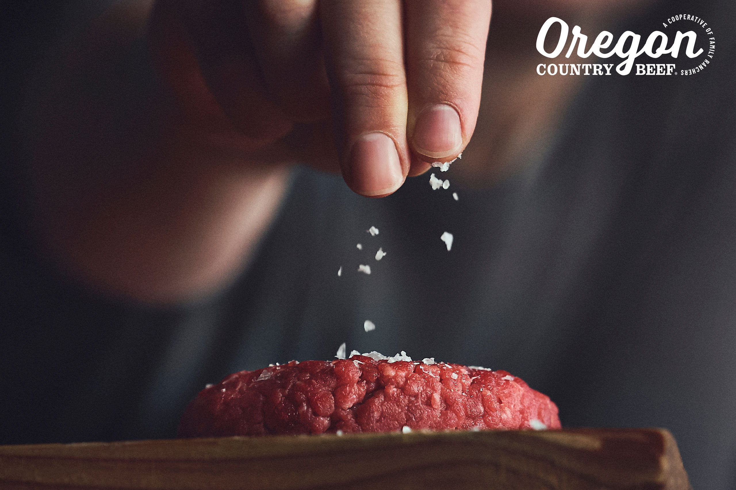
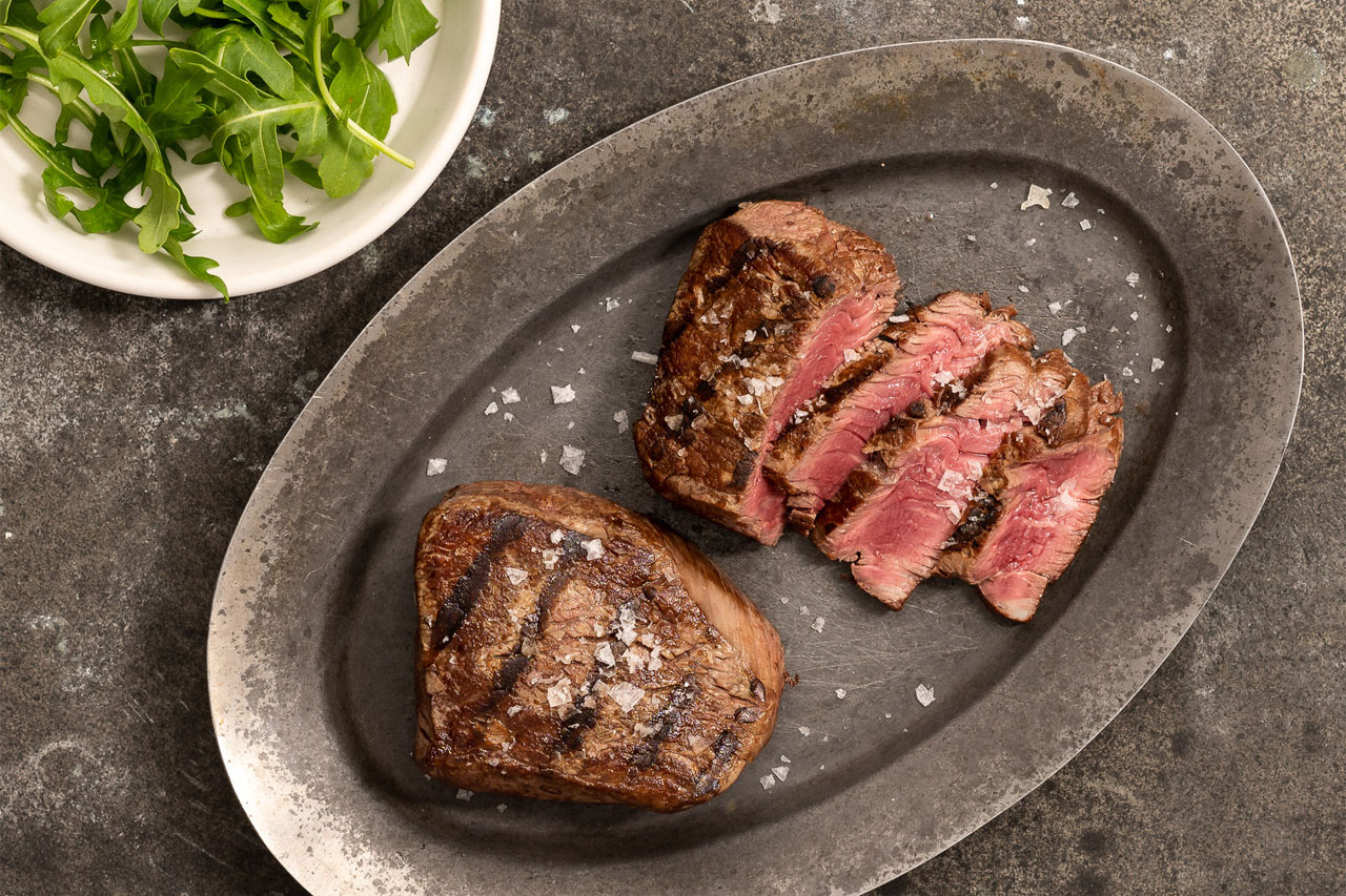
Finally, to seal the deal, the website design showcased mouth-watering product photography that captured the sizzling, juicy goodness of a perfectly-prepared meat dish.

Services

  • Brand Strategy
  • Logo Design
  • Packaging Design
  • Packaging Adaptations
  • Packaging Production
  • Website
Country Natural Beef
Clear Theory

Clear Theory

The Challenge

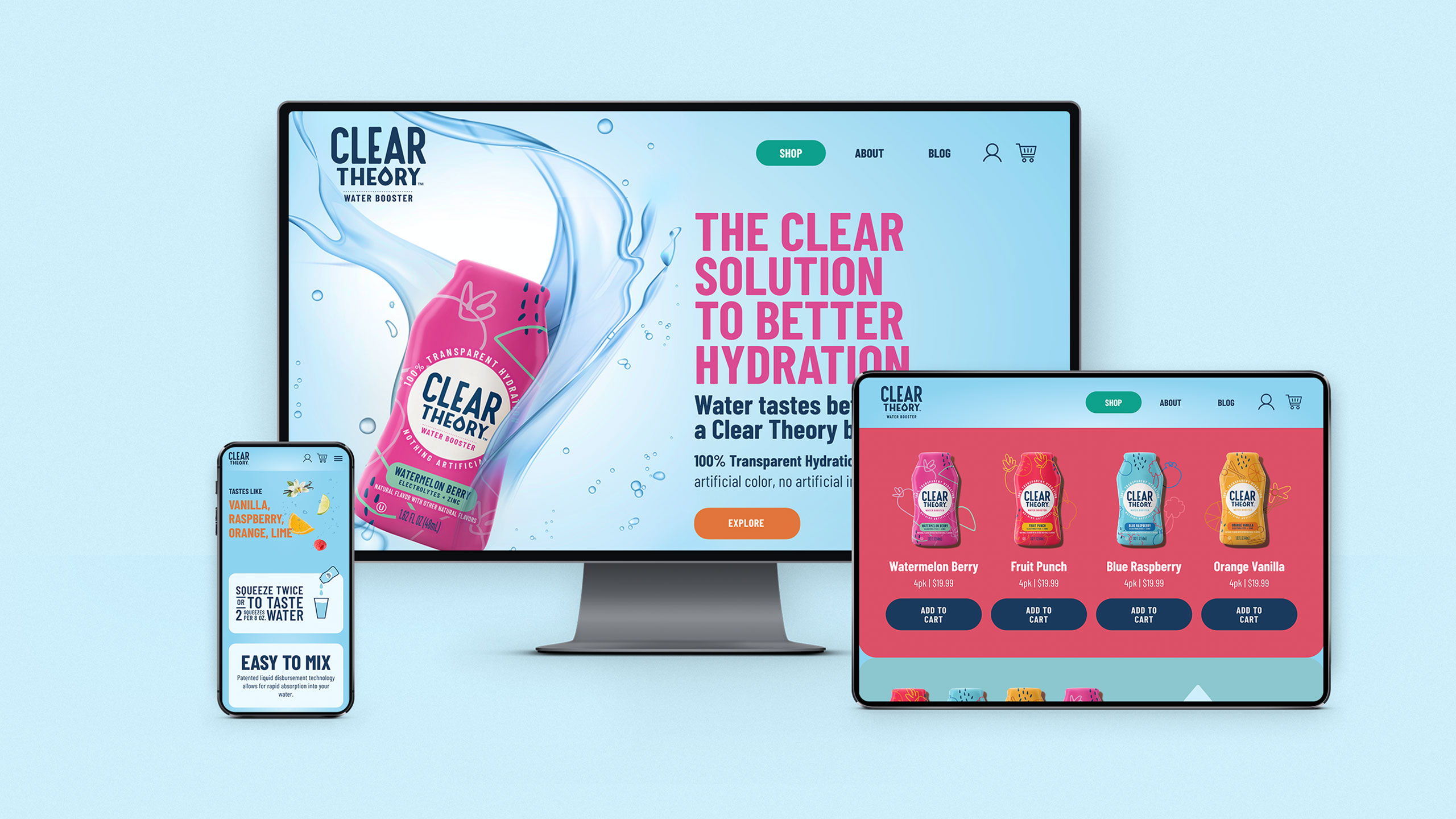
Water booster brand Clear Theory needed to position their products in a way that could compete with existing market leaders in the water-enhancing category. With the market dominated by big brands that promised enhancing athletic performance, Clear Theory wanted to forge its own path.

With an opportunity to target a gap in the market, Clear Theory trusted The GRO Agency to deliver a cohesive brand identity and eye-catching product packaging.

Our challenge with the Clear Theory rebrand was to speak to a brand new customer segment with an authentically refreshing voice, while differentiating themselves from their big-business competitors.

The Solution

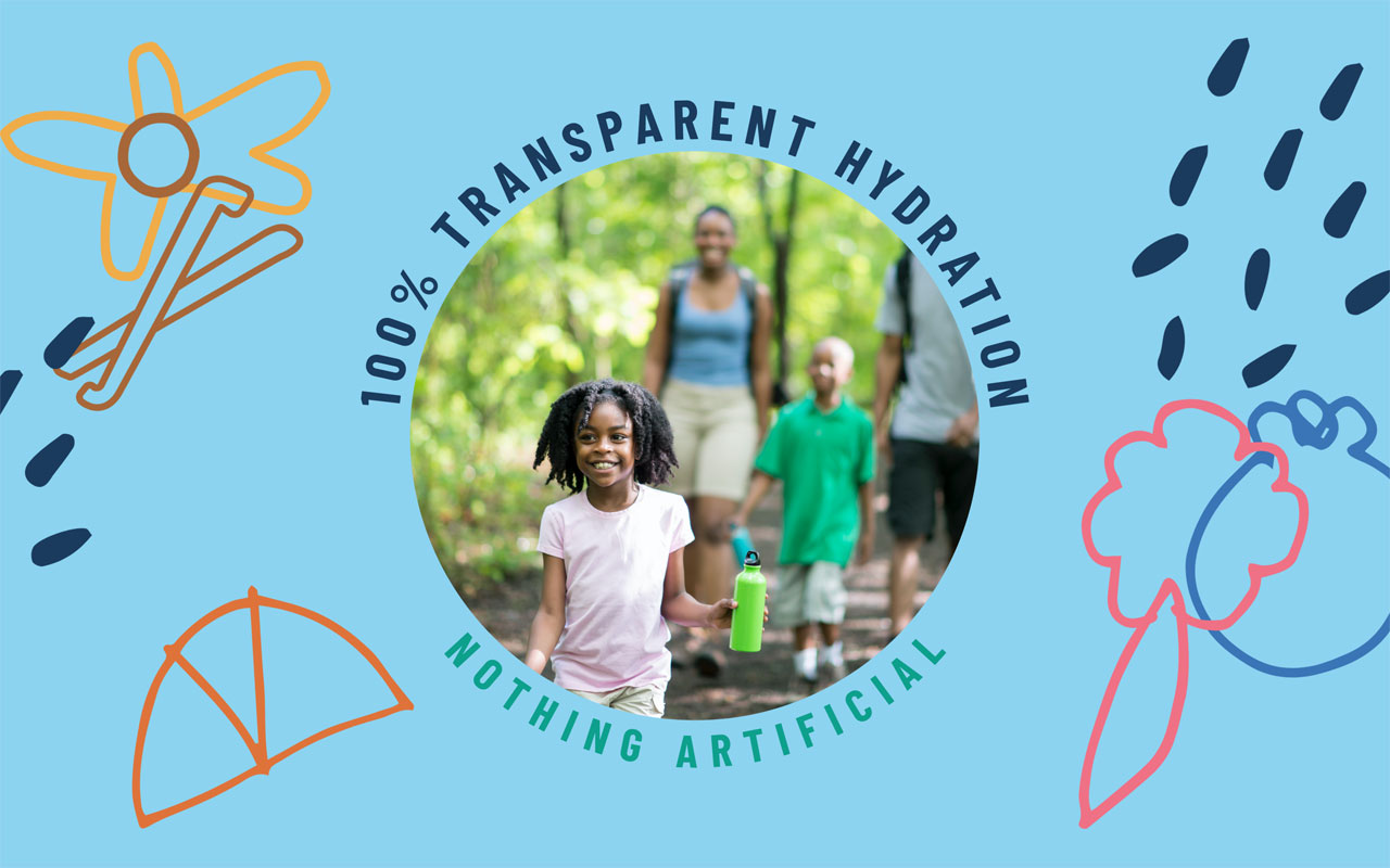
While hydration is an important factor for athletic performance, drinking more water is, in fact, good for everyone. Staying true to the authenticity of their founders, Clear Theory was positioned as a premium, family-owned alternative that targeted modern, on-the-go families.

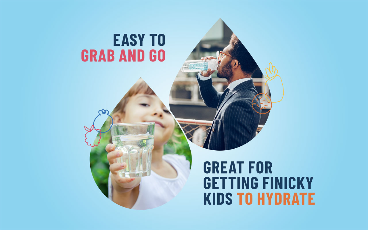
First, the brand identity promoted functional hydration with daily, delicious, hassle-free water consumption for children and adults. What’s more, Clear Theory became a preferred choice to get children in the habit of hydrating – something that would resonate with parents who were struggling with picky eaters and drinkers.

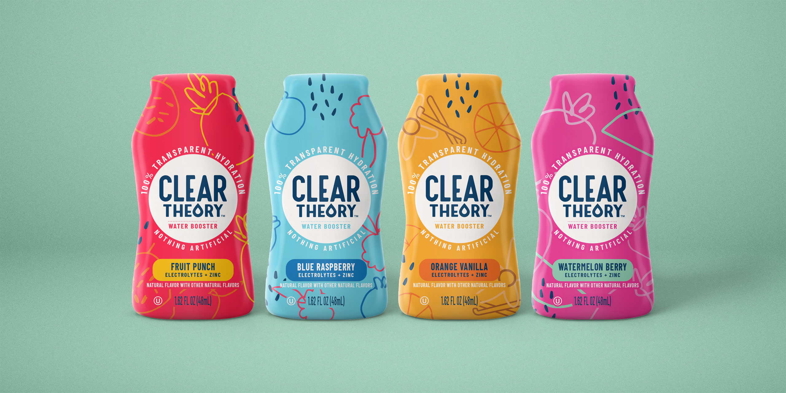
Next, the product messaging made extra effort to distinguish itself from competitors. The packaging is sure to mention that not only does Clear Theory’s flavor combinations rank highly, but also the all-natural water drops are, as the name suggests, CLEAR – devoid of the artificial coloring and flavors included in other options.

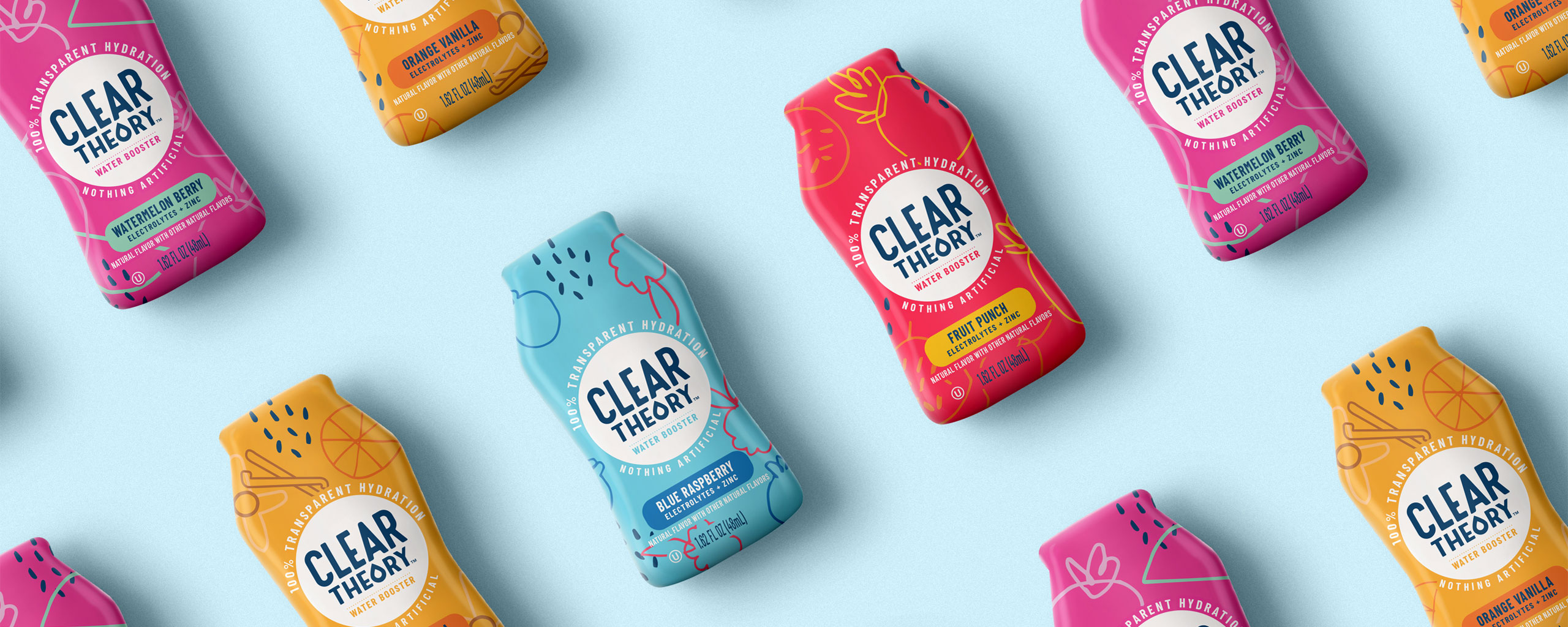
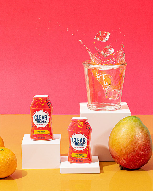
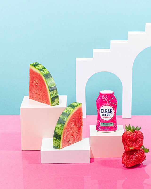
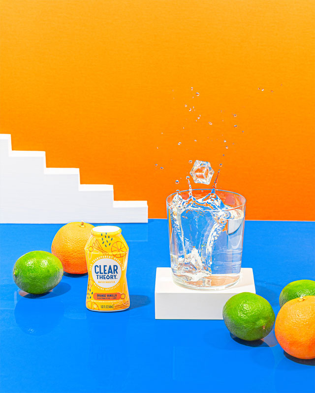
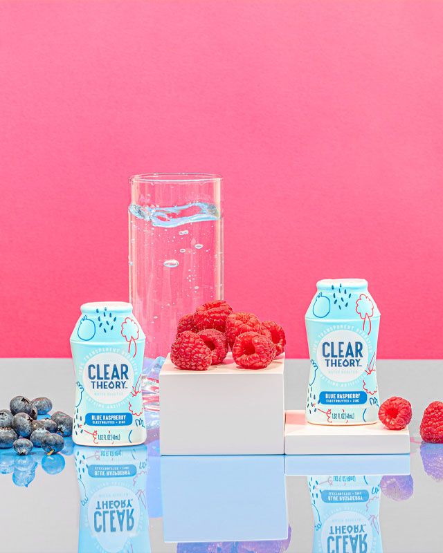
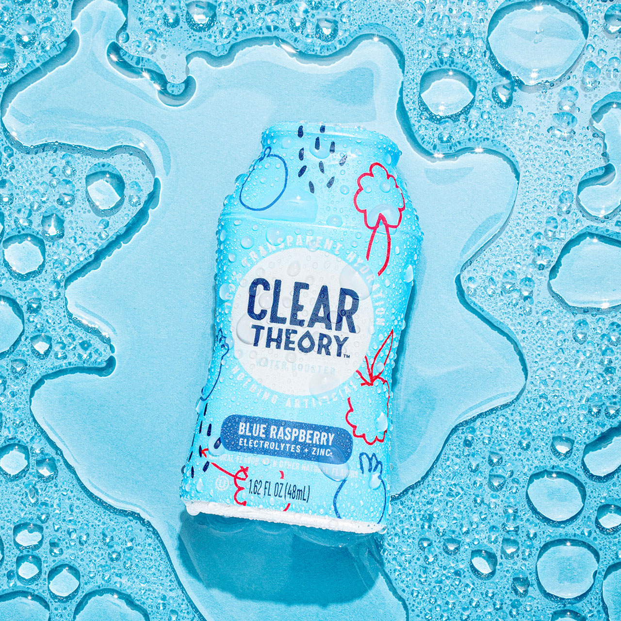
Finally, the product packaging design leverages refreshing primary colors that contrast fruit silhouettes, serving as a reassuring nod to the flavors bursting within each drop.

Services

  • Brand Strategy
  • Naming
  • Logo Design
  • Packaging Design
  • Adaptation: Full Portfolio
  • Packaging Production
  • Website
  • Sales Collateral
Clear Theory
Clear Theory
Clear Theory
Clear Theory
Clear Theory
Clear Theory
Clear Theory
Clear Theory
Clear Theory
Clear Theory
Simply Fuel

Simply Fuel

The Challenge

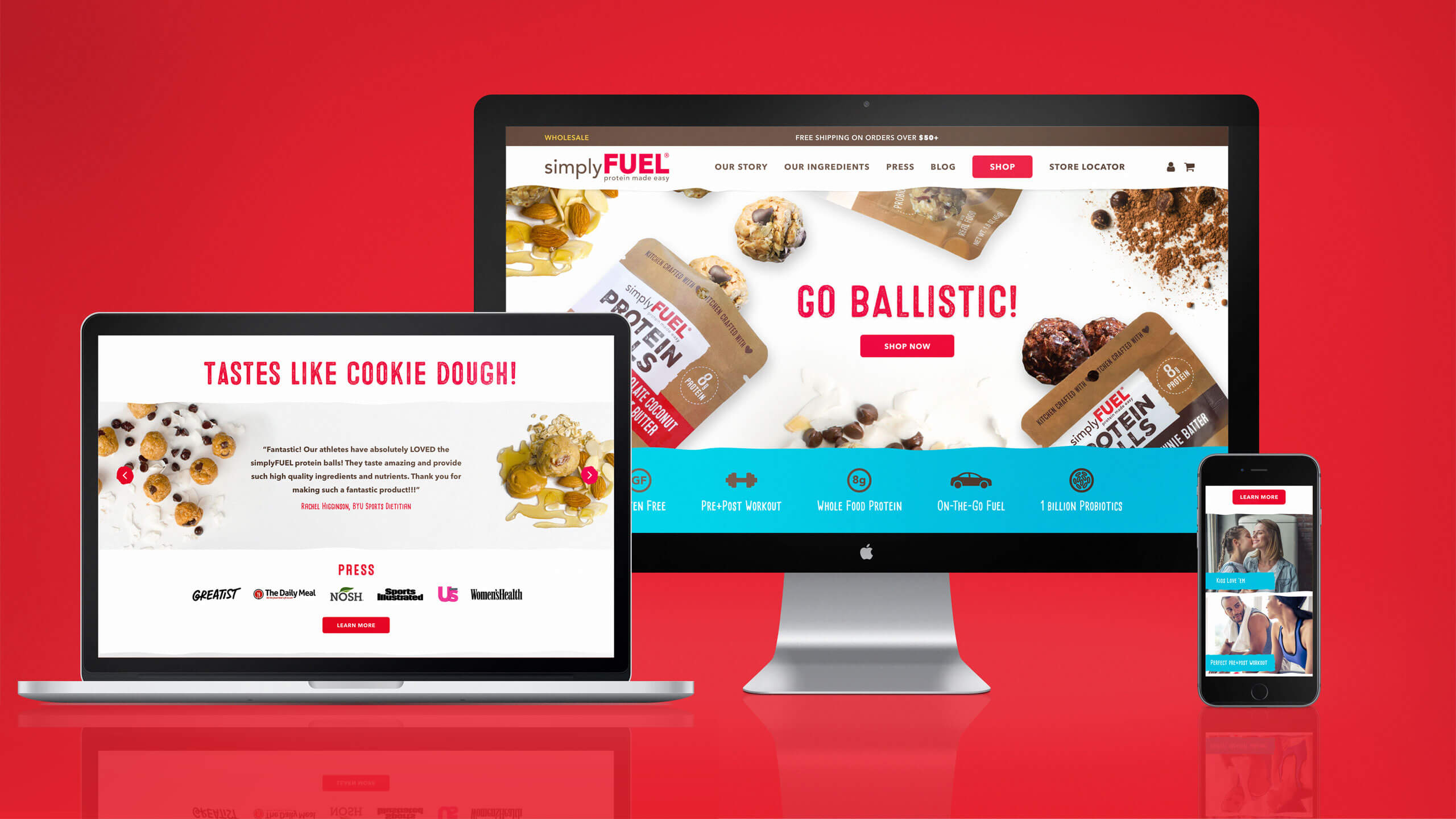
Health & energy snack brand Simply Fuel had outgrown its humble beginnings as a viral homemade sensation and go-to snack of the Kansas City Royals. Founder Mitzi Dulan knew that if she wanted to expand and deliver her scrumptious, protein-packed energy balls to the masses, she would need to level up the look and feel of her packaging, but in a way that still reflected the brand’s homemade element that customers really loved.

With an opportunity to delight both new and existing customers, Simply Fuel engaged The GRO Agency to invigorate their product packaging and design.

Our challenge with the Simply Fuel packaging rebrand was to bring its appearance up to speed with modern expectations of a trustworthy snack company, all without compromising the recognizable home-made element at the core of their brand.

The Solution

Fueled by creative analysis, the concept of “home-made” foods were distilled into a list of clear visuals and experiences. Incorporating all of these elements into brand visuals, Simply Fuel’s new packaging concept successfully evoked a nostalgic and appetizing mindset.

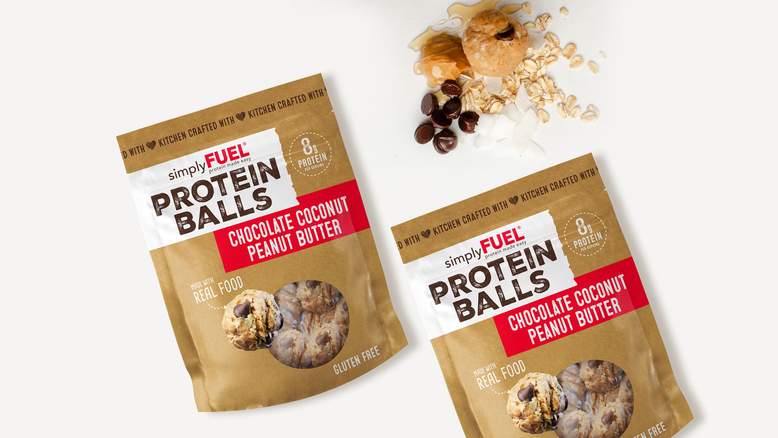
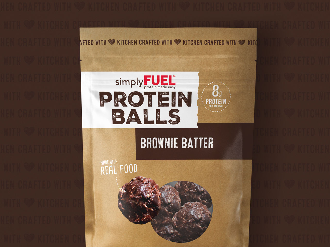
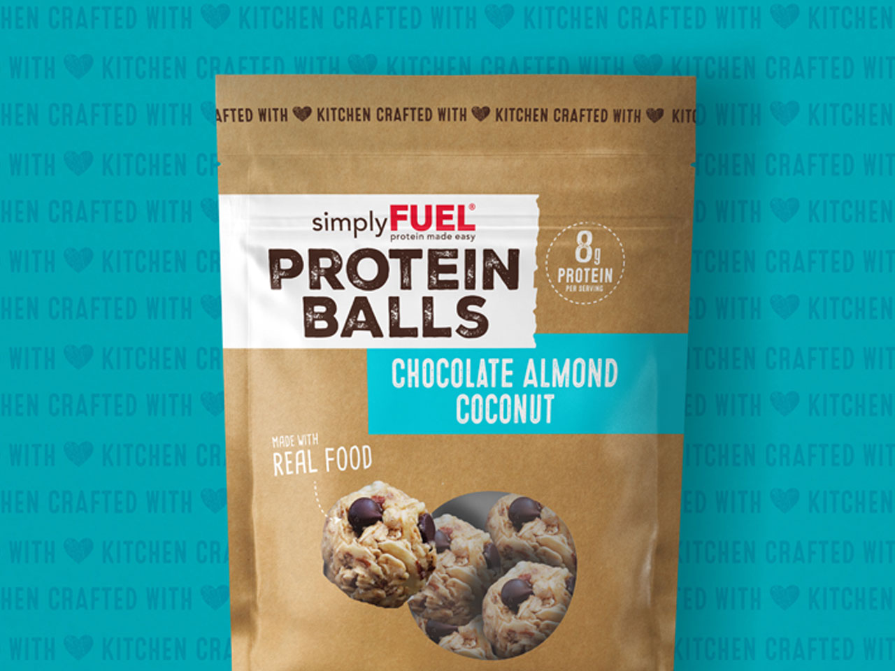
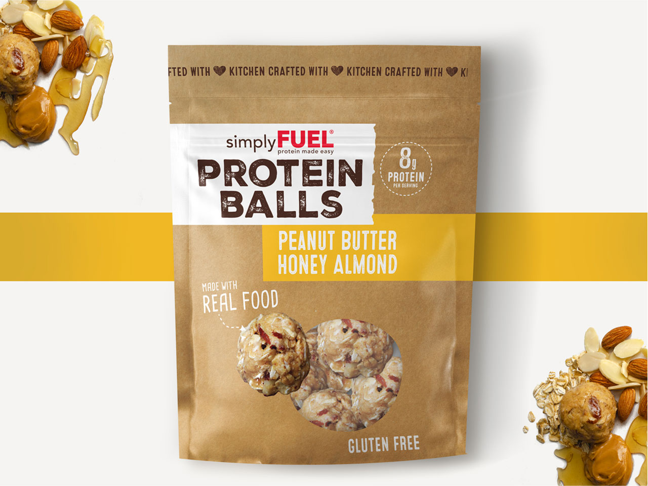
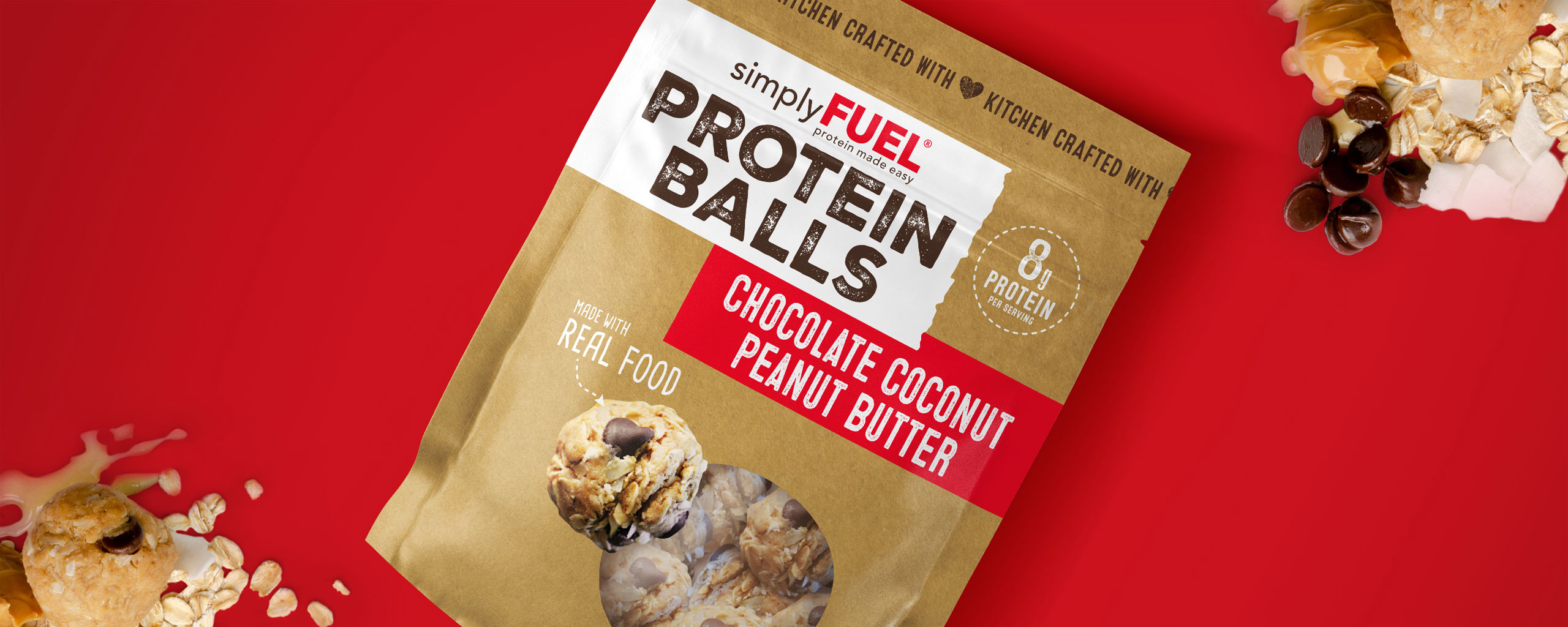
First, to convey a visual language of warmth, care, and the handcrafted quality of the products, the packaging design employs homespun, craft paper texture with torn paper edges, as well as a rustic “stamped” typography, as a nod to fresh baked goods packaged right at the counter.

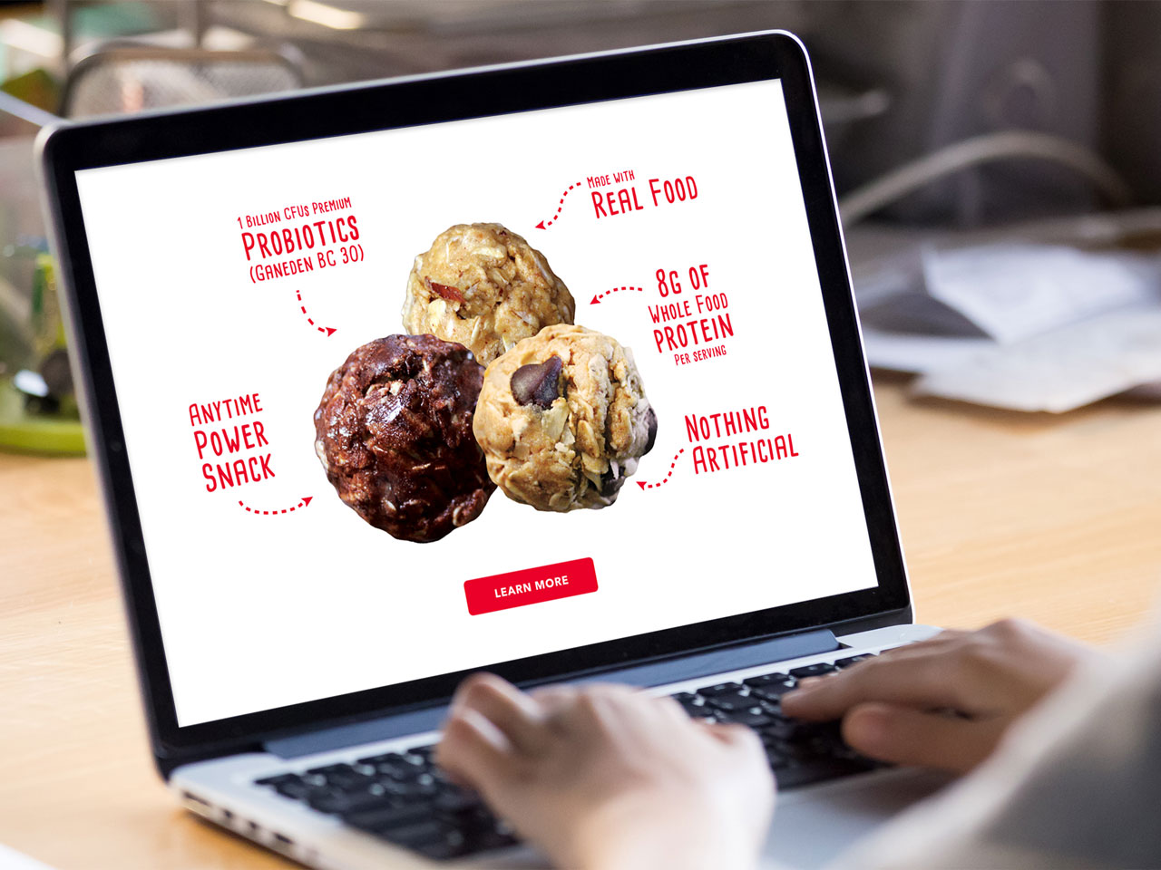
Next, because Simply Fuel was created for a health-conscious audience, the product messaging lends itself to a guilt-free indulgence as it lays a heavy focus on the health benefits, including the all-natural ingredients, protein density of a single serving, and allergen-friendly properties.

Finally, to seal in the undeniable fact that these delectable morsels taste too good to be healthy, high-quality product photography, true-to-size for enhanced effect, effectively captures the texture and density that await your first bite.

Services

  • Packaging Design
  • Flavor/Size Adaptations
  • Packaging Production
  • Website
GRO did an expert job at refreshing the brand, without alienating our existing, very loyal consumer base. Since redesigning our packaging we have seen an increase in national distribution and club store opportunities.

Mitzi Dulan
Founder Simply Fuel

Simply Fuel
Simply Fuel
Simply Fuel
Simply Fuel
Simply Fuel
Simply Fuel
Nope Beverages

Nope Beverages

The Challenge

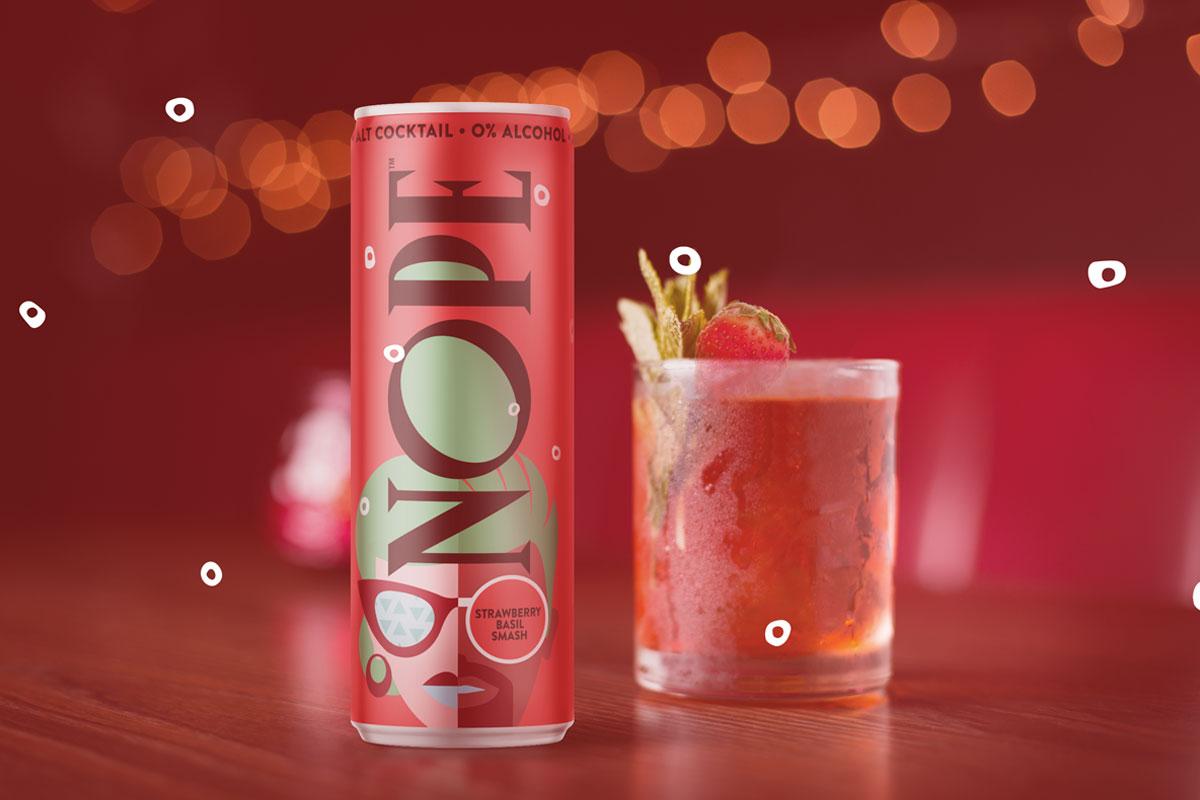
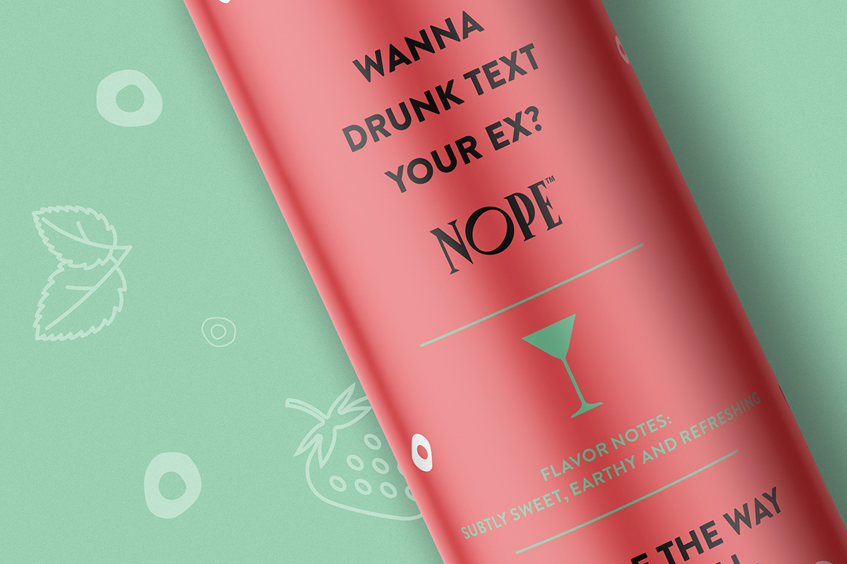
Alt-cocktail beverage brand Nope was already changing cocktail culture, but decided it was time to further carve their niche in the skyrocketing non-alcoholic beverage industry. With a sober/sober-curious audience who still very much wanted to be part of the scene, Nope needed to design their product packaging in a way that could help Nope drinkers fit in, and at the same time, stand out from their alcohol-drinking peers.

With an opportunity to appeal to sober socialites in the booming, no- and low-alcohol beverage sector (+506% since 2015, with projections of a $280 million market size in 2021 and 7.1% growth by 2025, according to Nielsen), Nope brought on The GRO Agency to deliver bold packaging concepts for their various flavored beverages.

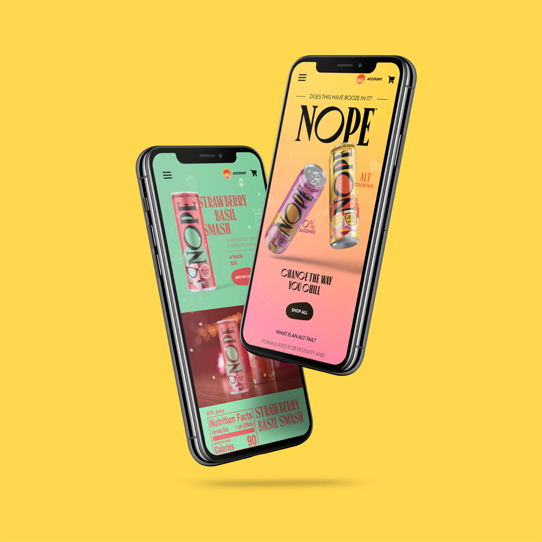
Our challenge with the Nope packaging design was to confidently engage young consumers on the shelf, across digital platforms, and even at the bar, while punctuating the occasion with a social statement that didn’t alienate drinkers.

The Solution

Through current-trend analysis on market data and social media, the Nope brand was re-engineered to address the issues that Nope’s target consumers face when it comes to drinking alcohol and social events,while positioning their “crafted” cocktails as the first-choice for taste and quality.

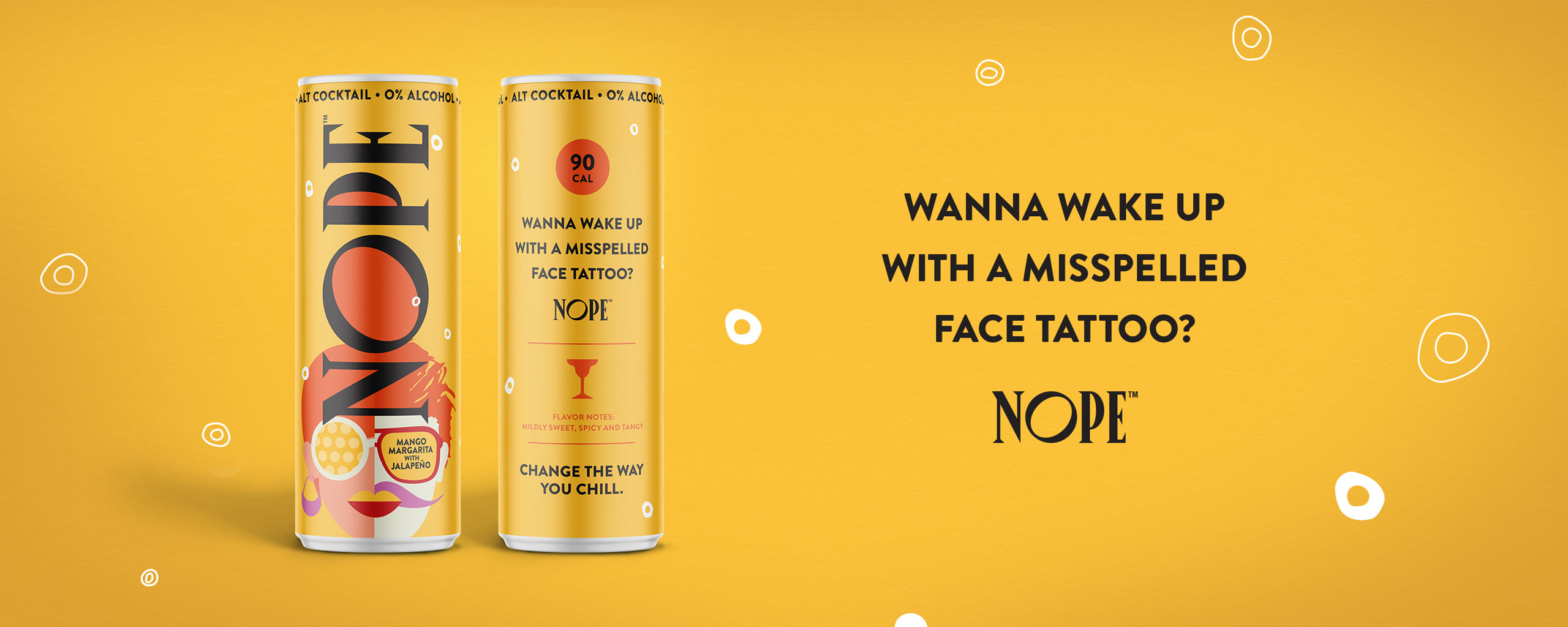
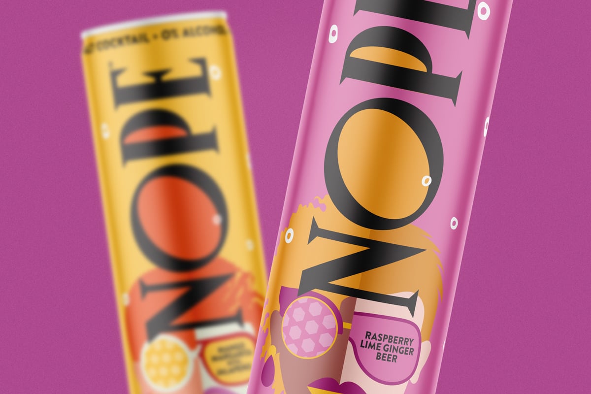
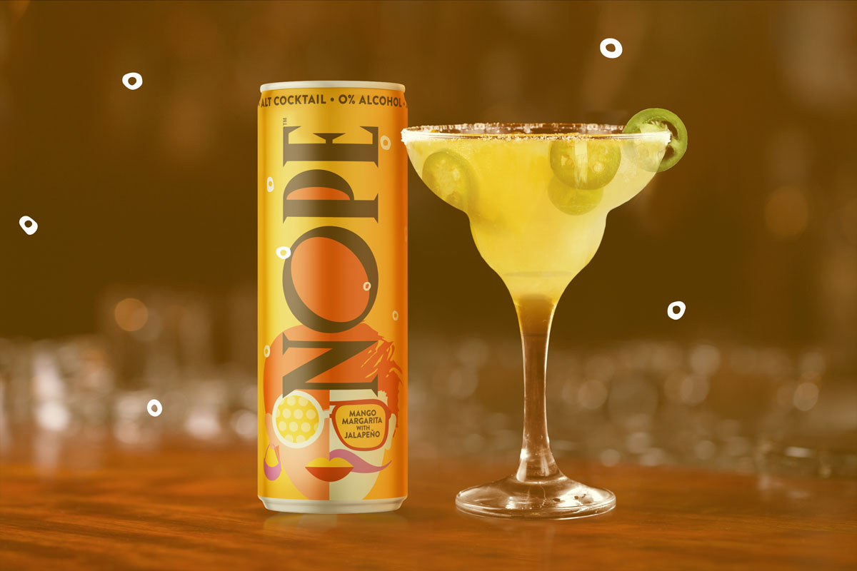
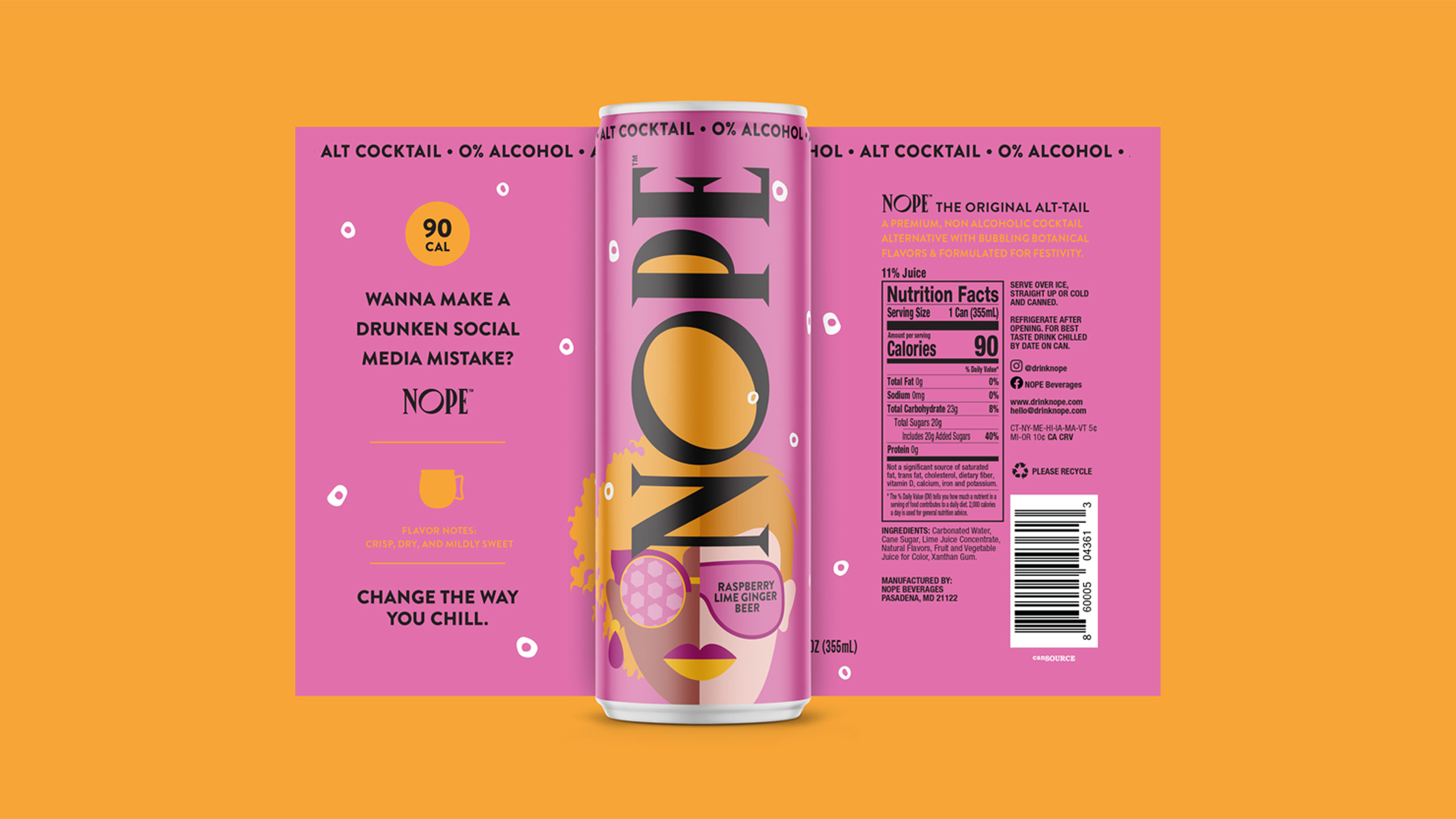
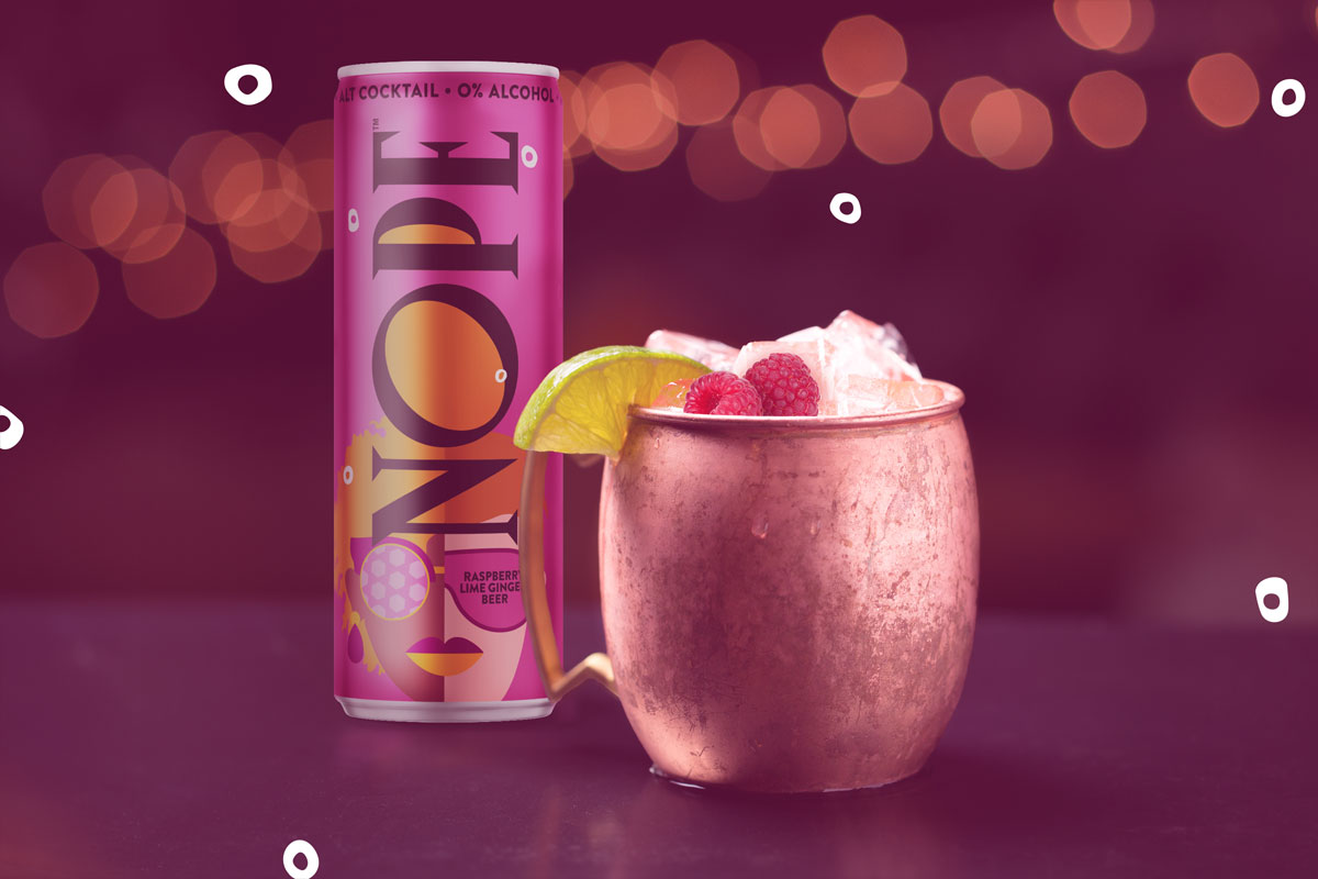
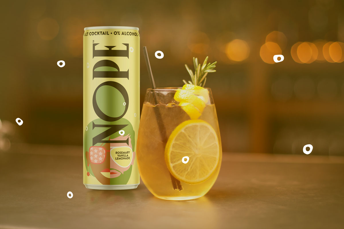
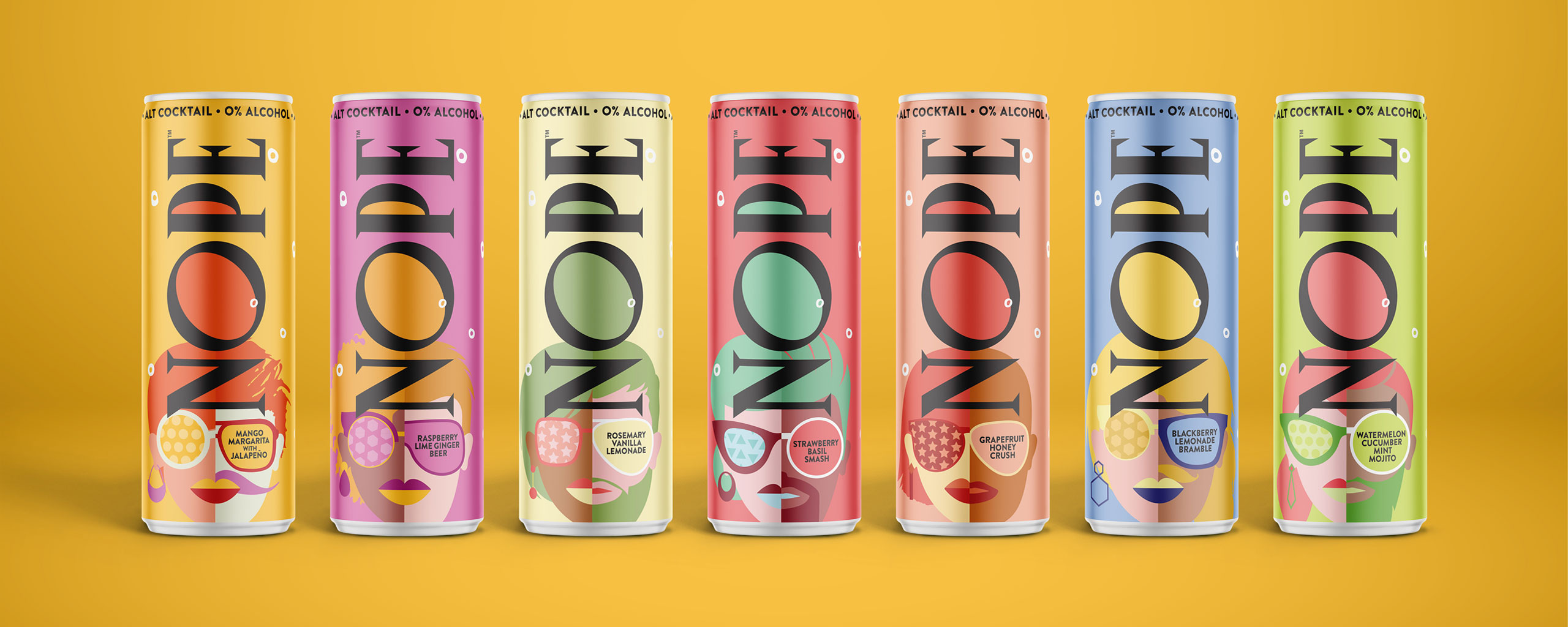
First, cocktail-themed color palettes and textures reminiscent of a vintage 90’s cocktail bar, the Nope packaging alludes to a smooth, crisp sipping experience that visually promises to satisfy the consumer’s thirst.

What’s more, at a first glance or in a dimly lit space, the Nope packaging design and colors are intentionally indistinguishable from a traditional alcoholic beverage, thus empowering the consumer to share their life choices at their own discretion.

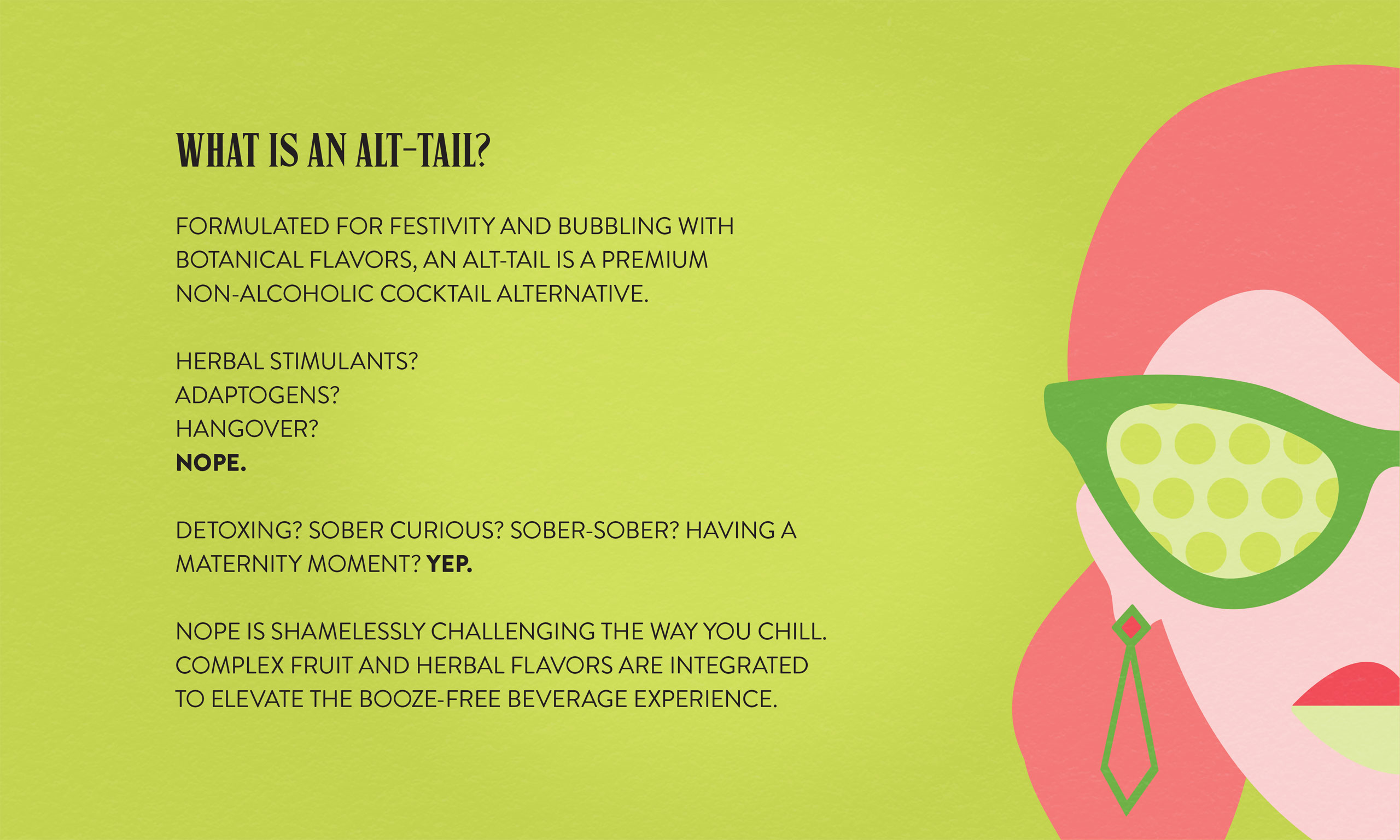
Finally, the brand messaging generates eye-catching sass and a feisty spirit that gives the consumer a low-calorie, celebratory beverage without the hangover. In other words, Nope became the brand that let you party hard, responsibly.

Services

  • Brand Strategy
  • Logo Design
  • Packaging Design
  • Flavor/Size Adaptations
  • Packaging Production
  • Illustration
  • Website
Thank you to The Gro Agency for turning my words and ideas into a vibrant and bold package that captures the fun and articulates the mission of our brand. You are truly a multi-talented team that brought a level of passion to this project that matched my own to create something that not only we love but our customers can’t put down. They’re hooked and we are grateful!

Beth Ann Shaeffer
Founder NOPE Beverages

Nope Beverages
Nope Beverages
Nope Beverages
Nope Beverages
Nope Beverages
Nope Beverages
Nope Beverages
Nope Beverages
Nope Beverages
Nope Beverages
Nope Beverages
Nope Beverages