Have A Ball
The Challenge
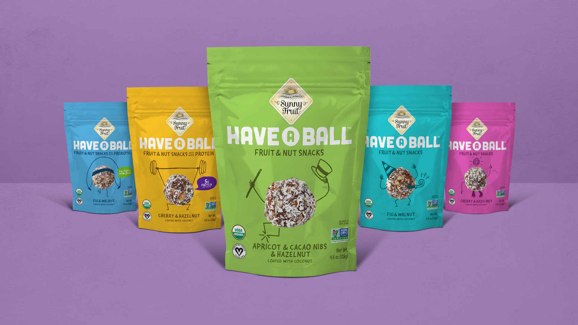
Snack ball brand Have a Ball promised their customers a high-energy, feel-good experience from their organic fruit and nut snack, but their brand identity wasn’t bringing the message home. Have a Ball needed to create a brand identity that would differentiate and compete in the saturated fruit & nut ball market.
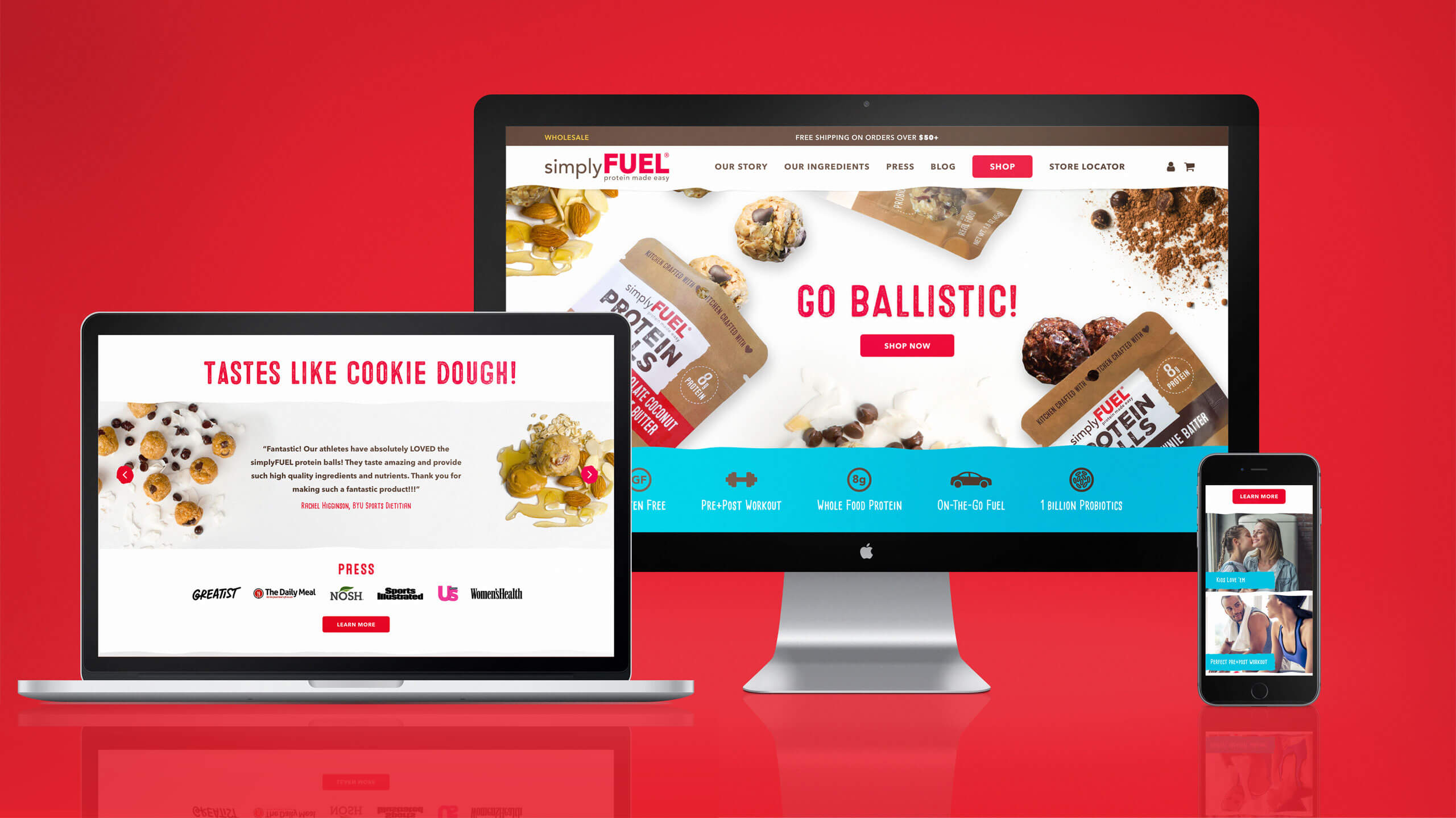
WIth an opportunity to create a memorable brand and improve their shelf impact, Have a Ball partnered with The GRO Agency to develop a visual identity and product packaging.
Our challenge with the Have a Ball branding was to find a perspective that uniquely illustrated the health and flavor characteristics of the Have a Ball products, while carving out an eye-catching visual identity that could be easily recognizable on the shelf.
The Solution
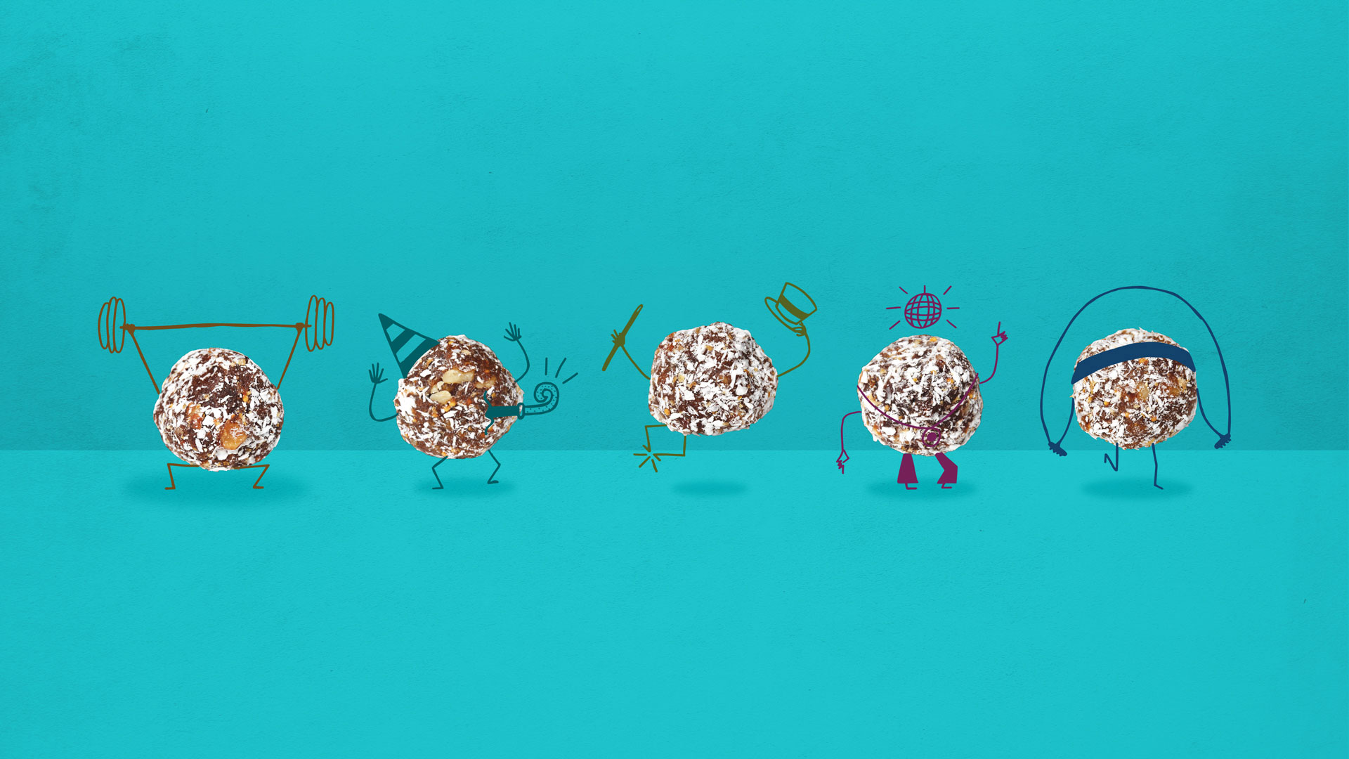
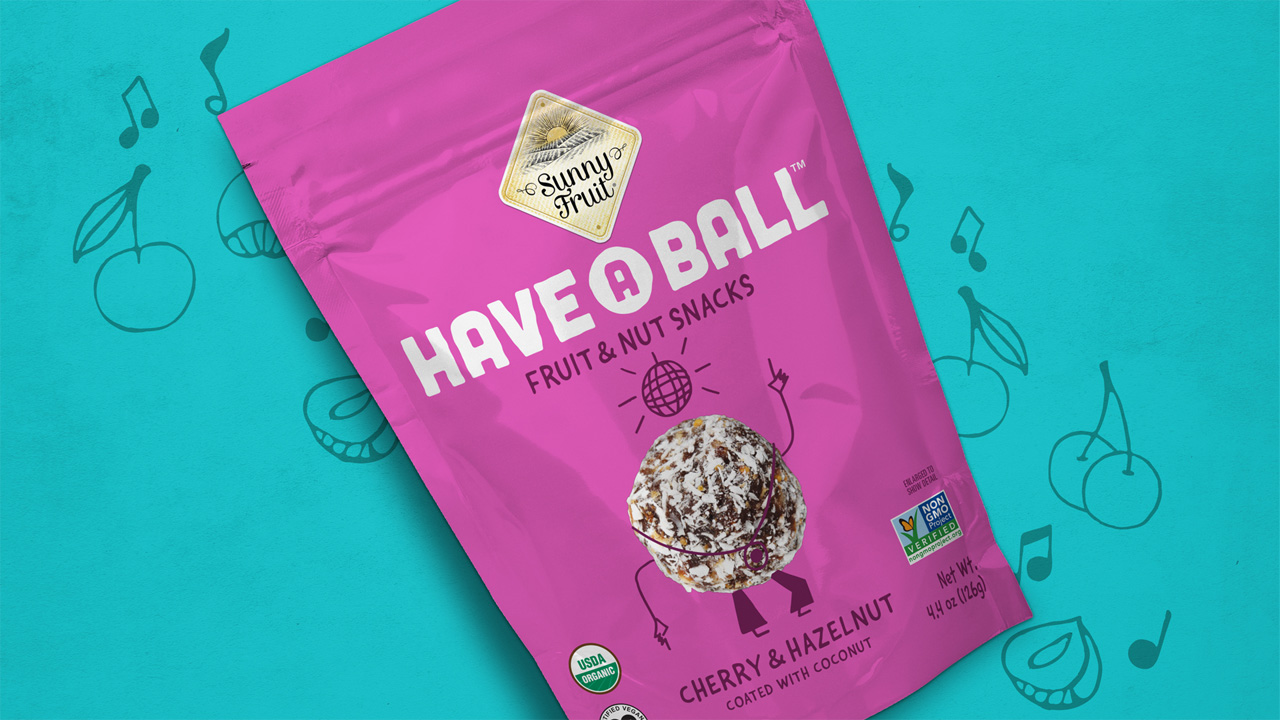
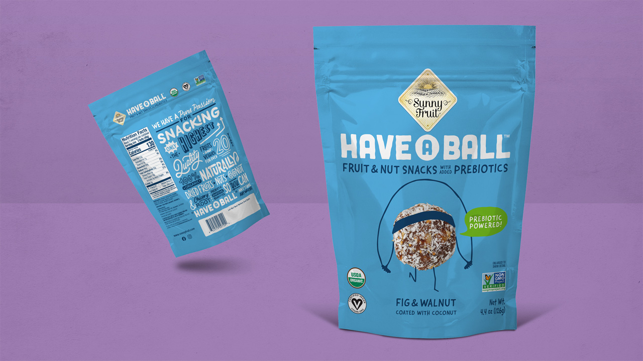
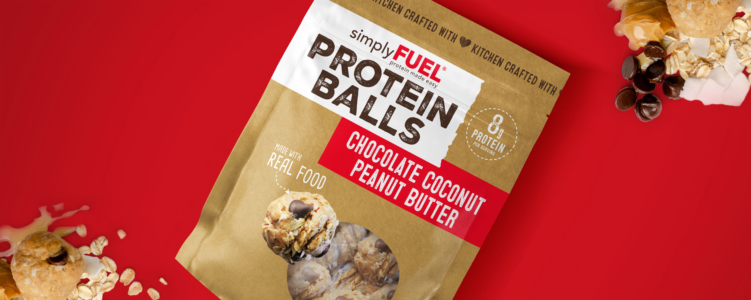
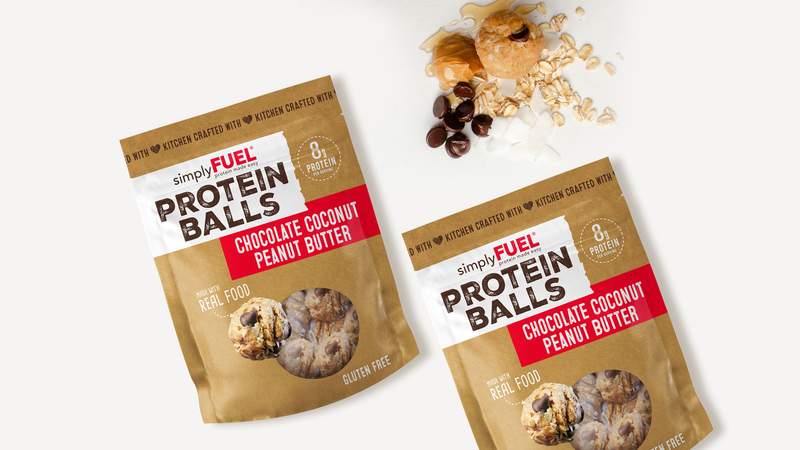
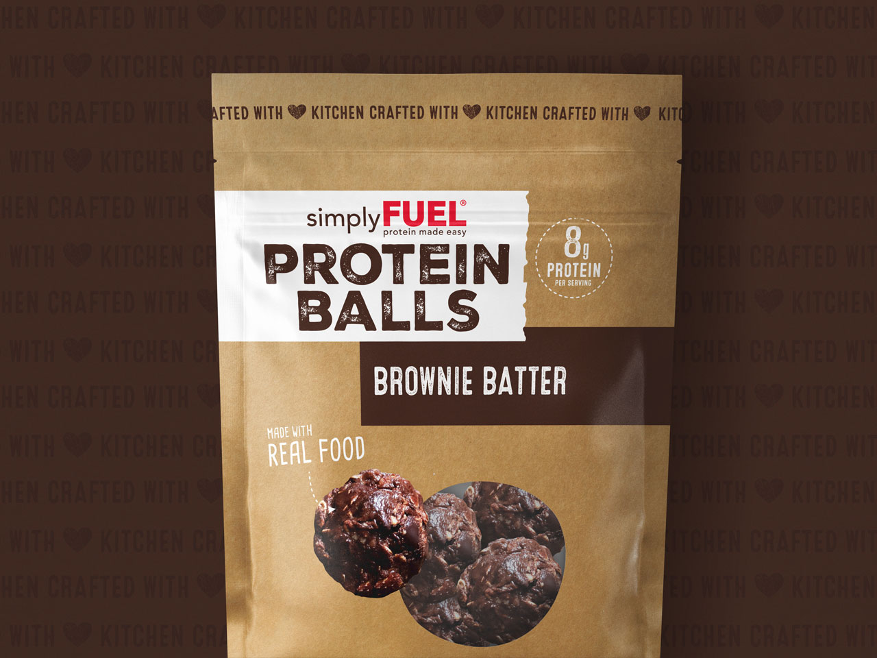
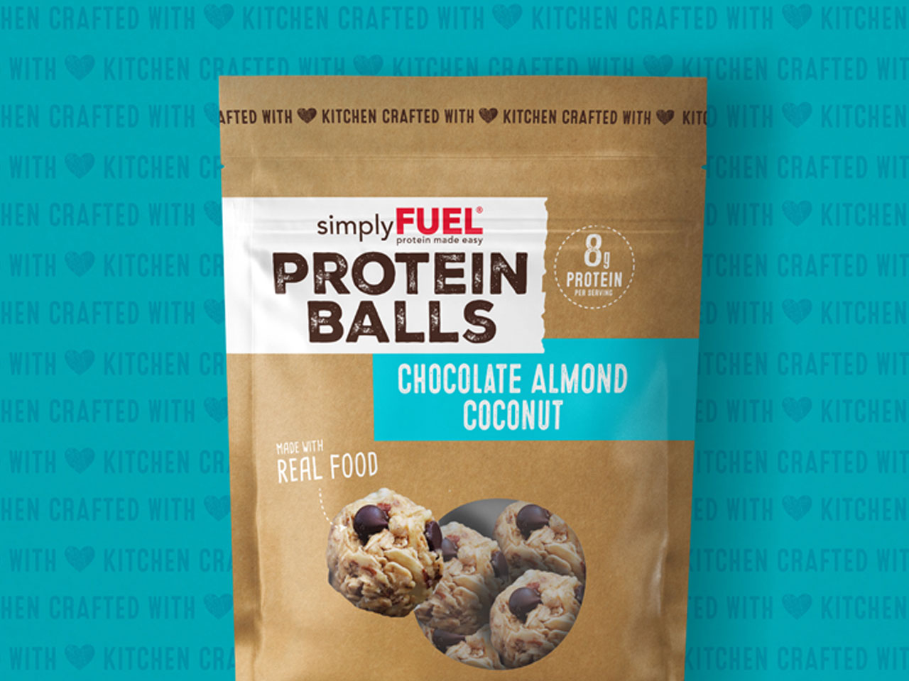
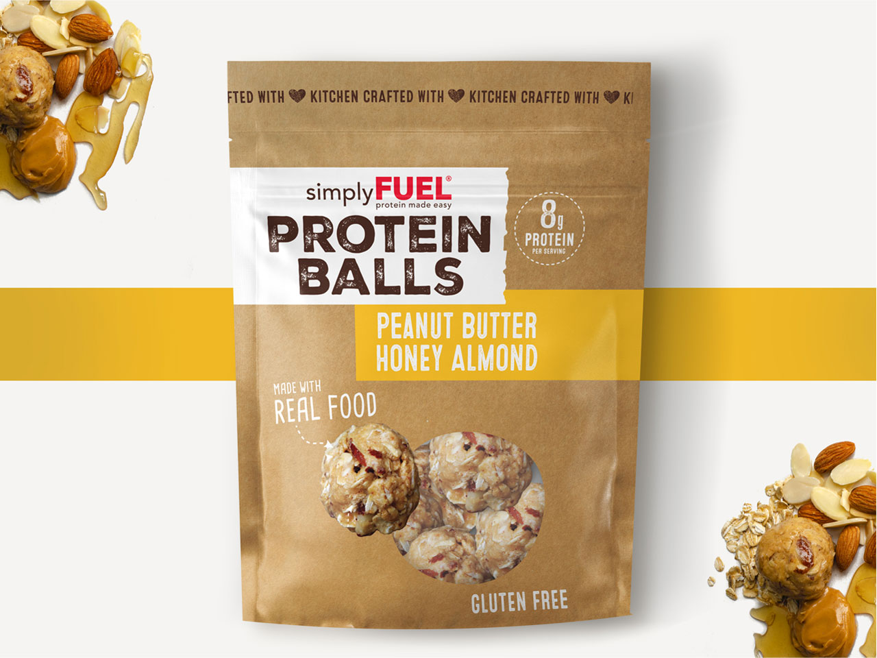
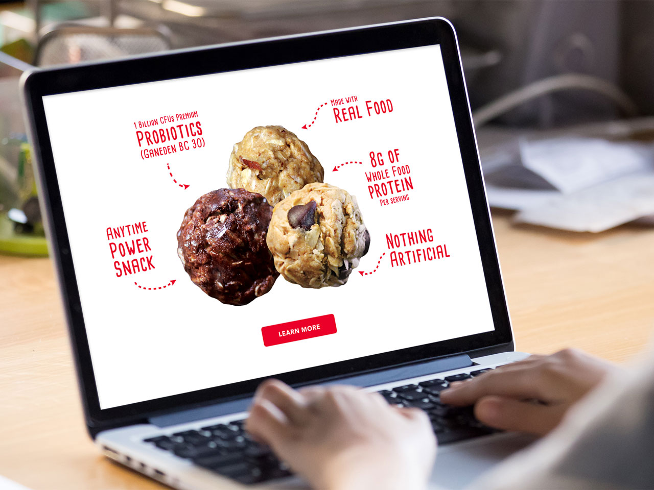
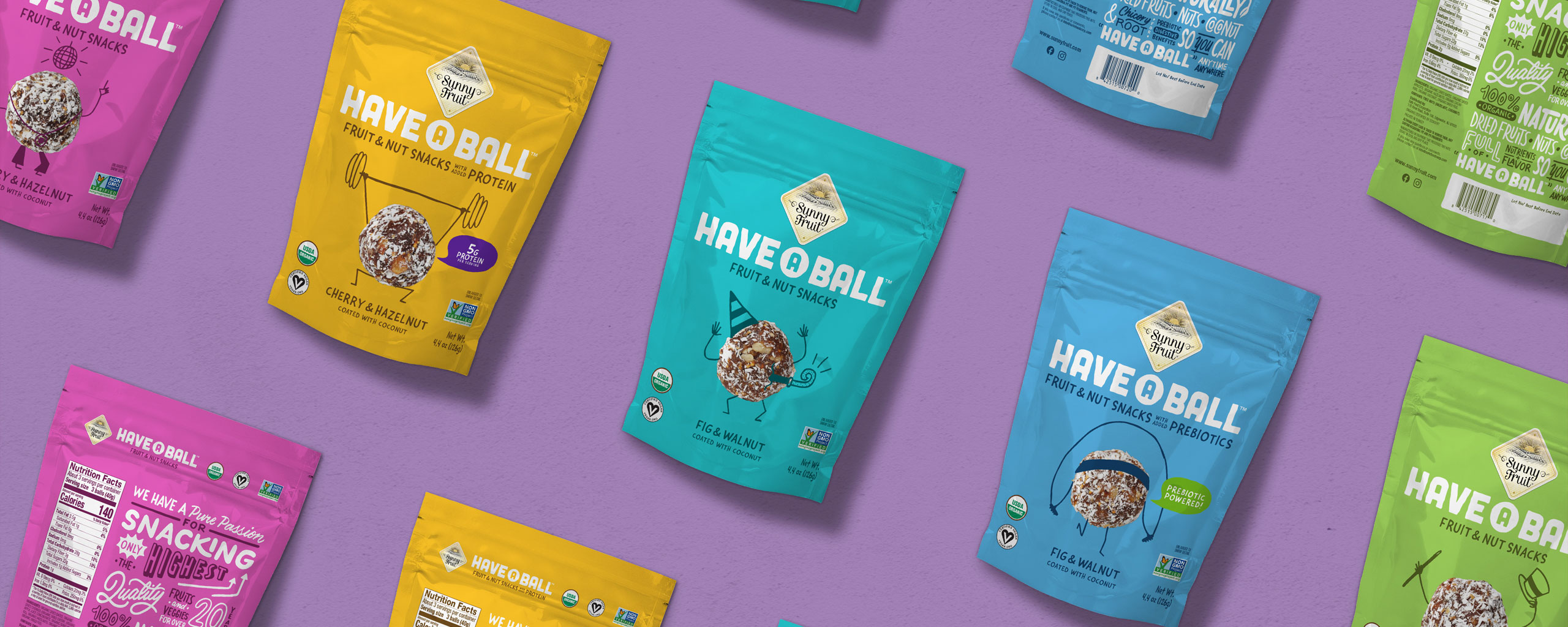
Through the art of personification, we helped each Have a Ball product tell the age-old adage of ‘you are what you eat’. Bestowed with lively personalities, each package showcased the Have a Ball product illustrated to perform energetic activities like jumping rope, lifting weights, tap dancing, and more.
This visual strategy immediately informed the customer what to expect after consuming the tasty, functional treat. Live product photography that highlighted the wholesome ingredients paired beautifully with bright, eye-catching colors to help consumers easily find Have a Ball on the shelf.
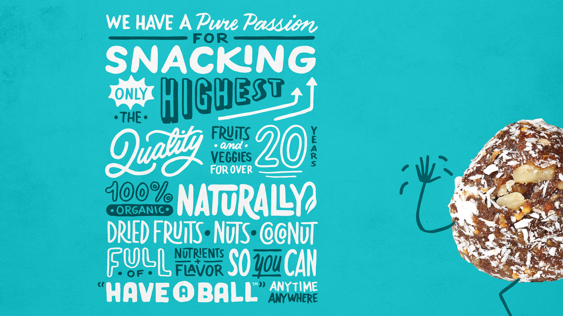
From there, the brand messaging propagated through a high-energy voice brimming with passion for health and wellness. The brand became a beacon for a well-balanced and nutritious diet, and allowed consumers to ‘have a ball’ while chasing a more active lifestyle.
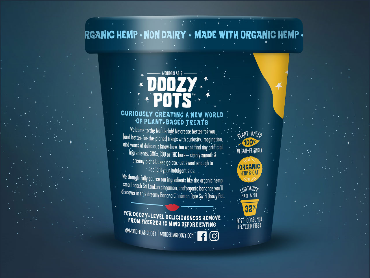
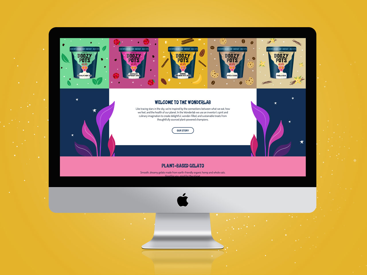
Services
- Naming
- Logo Design
- Packaging Design
- Flavor/Size Adaptations
- Packaging Production
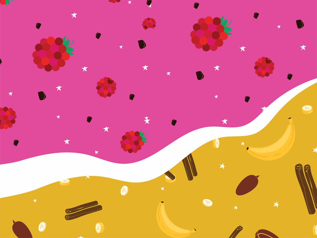
- Illustration
- Sales Collateral
GRO helped us create a fun, memorable name and package design for our fruit & nut ball innovation. GRO is adept at building different brand strategies and visual languages for several brands in a portfolio.
Yigit Isiker
President Safe Food Corporation