General Mills License Work
The Challenge
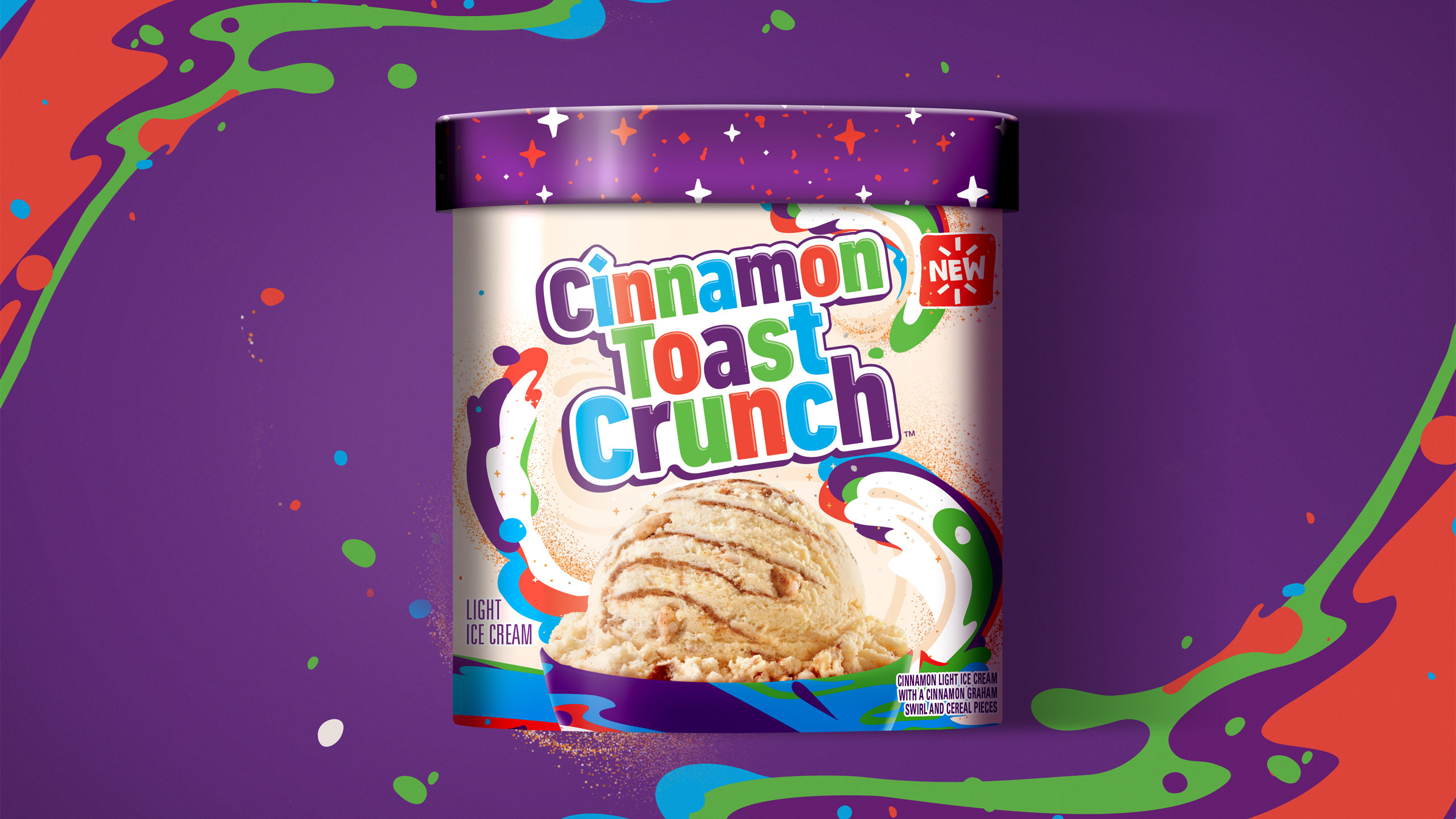
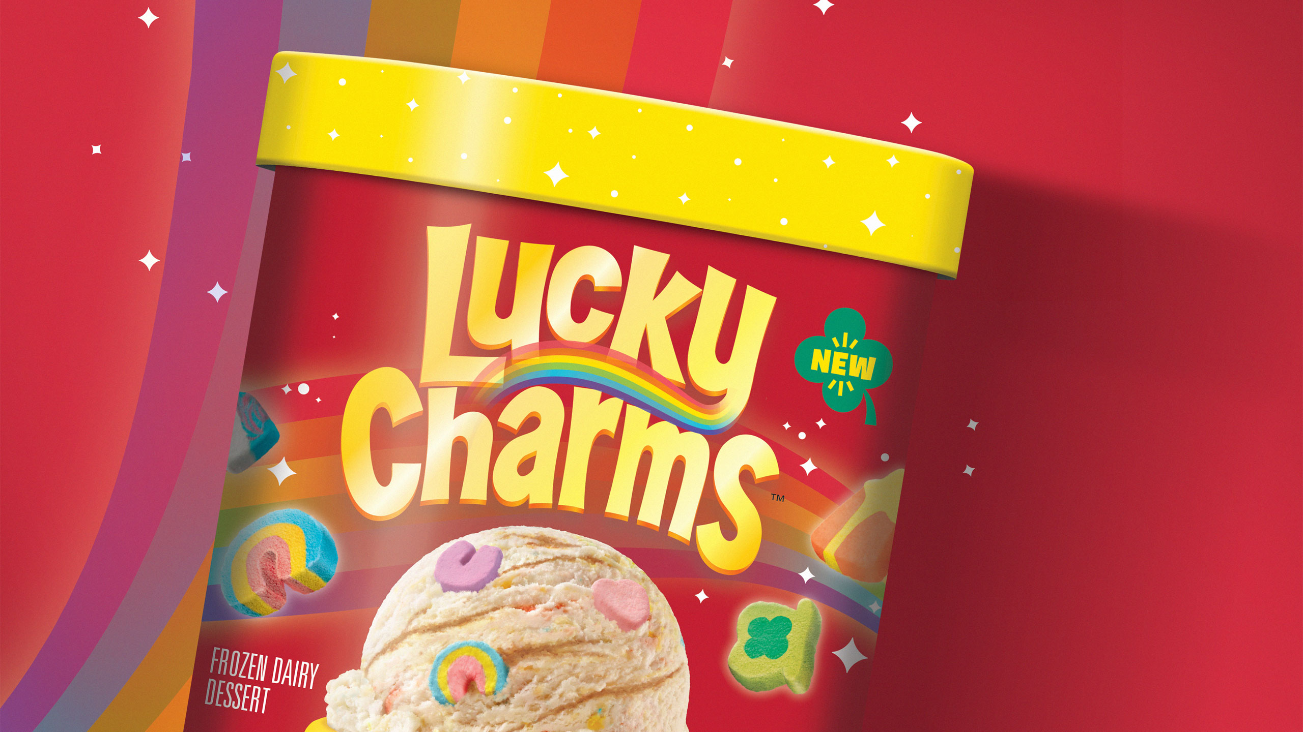
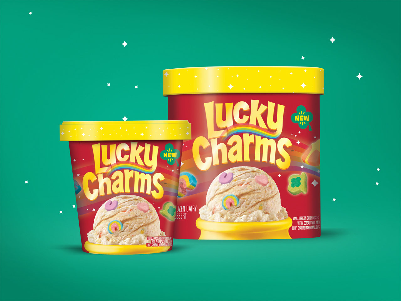
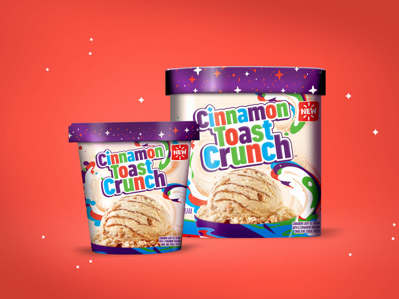
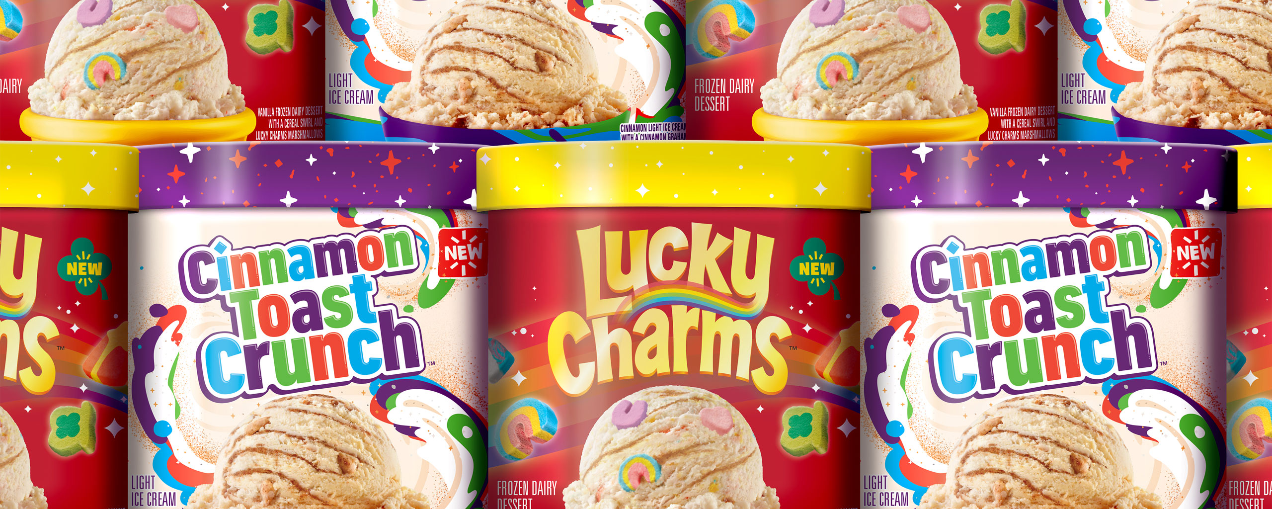
Ice cream brand Dreyer’s Grand Ice Cream was developing the highly-anticipated crossover of the decade in their new line of ice cream flavors, directly inspired by General Mills cereals like Cinnamon Toast Crunch and Lucky Charms. With this much brand firepower behind one line of products, it was crucial to properly capture and communicate the brand elements of both companies into a powerful product design strategy.
With an opportunity to introduce an innovative product line to a wider consumer base, Dreyer’s Grand Ice Cream brought on The GRO Agency to design the packaging for their new line of General Mills cereal-flavored ice cream products.
Our challenge with the General Mills product packaging was to translate the essence of the brands so that they were instantly recognizable to the shoppers, while also appealing to a slightly older consumer base.
The Solution
In the cereal aisle, brands rely heavily on mascots and kid-friendly illustrations, whereas ice cream products typically aim toward an older crowd and require a heavier focus on appetite appeal. For the Dreyer’s-General Mills packaging, the brand elements were distilled down to its key components in order to strike a balance between the competing consumer expectations.
First, to maintain the brands’ recognizability among consumers, the product packaging showcased the playful attitude and nostalgia of each respective brands, with an intentional focus to eliminate any seemingly juvenile aspects. By focusing on the brand design elements and omitting the cartoonish mascots, the package was instantly recognizable and easily targeted the whole family.
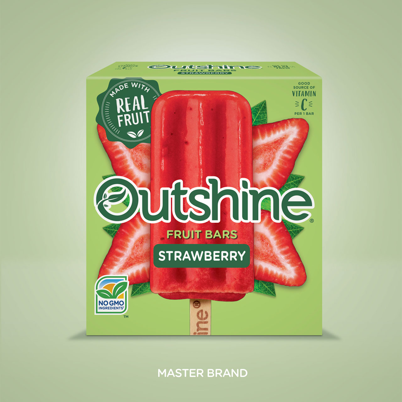
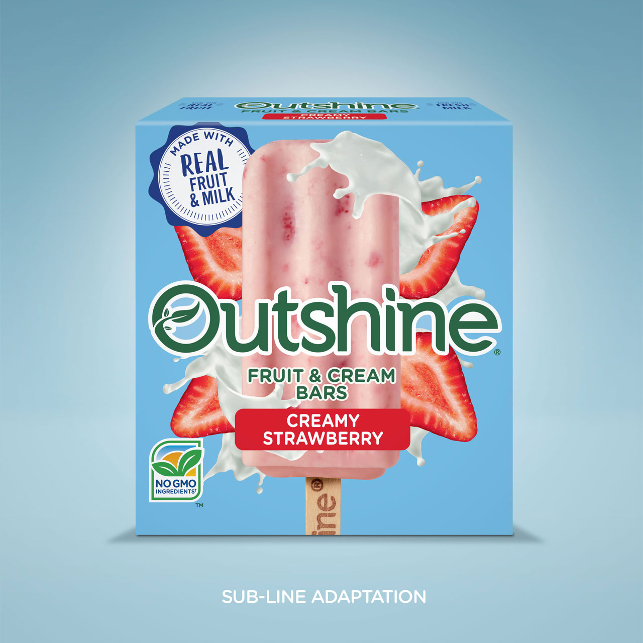
Then, by incorporating the bold use of color and a design system built for flexibility with plenty of room for the brandmark to play, the packaging truly brought life to these classic brands within this new space. Stylized bowls in the language of the respective brands helped bring the design together as a unified whole.
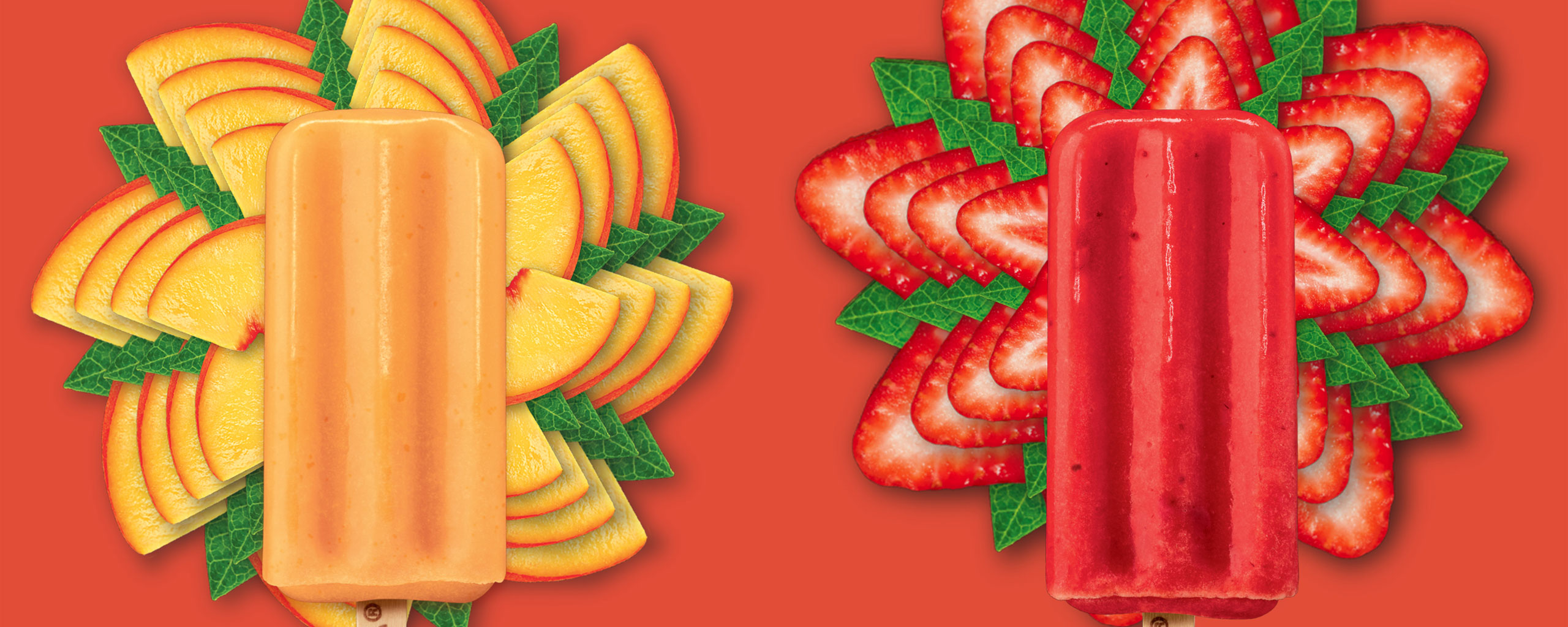
Finally, the appetite appeal was a key part of the overall success of this packaging. To get that right, live product photography with high-quality photo-illustration created delicious scoops that genuinely encapsulated the richness, texture, and flavor profile of the ice cream product.
Services
- Packaging Design
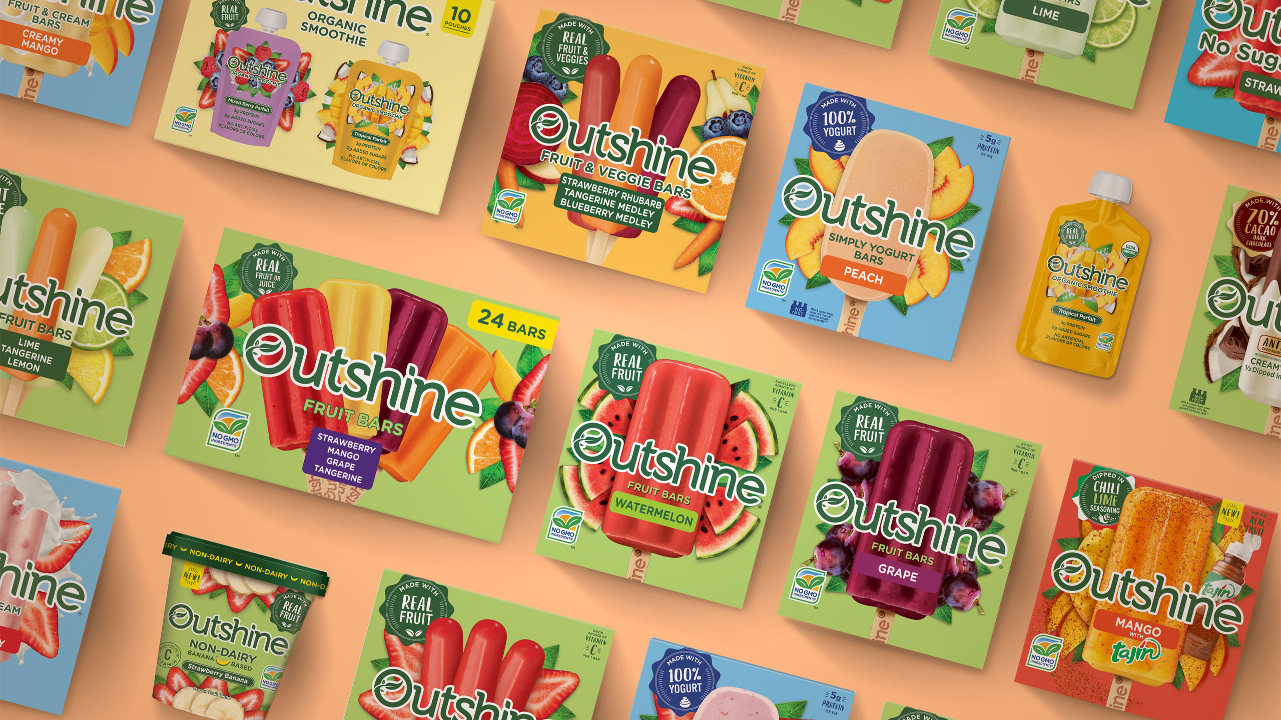
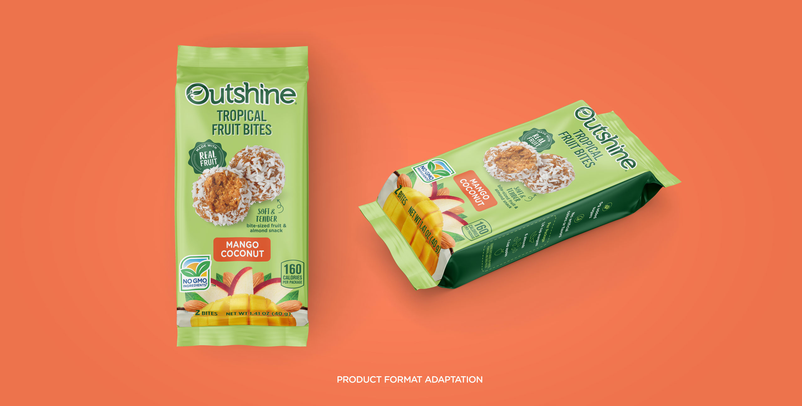
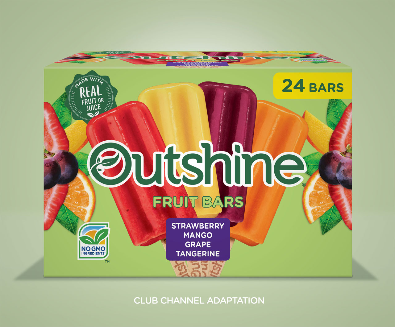
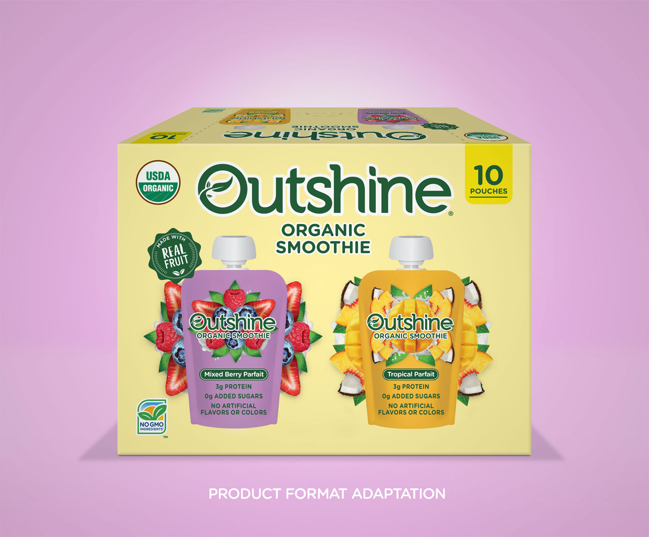
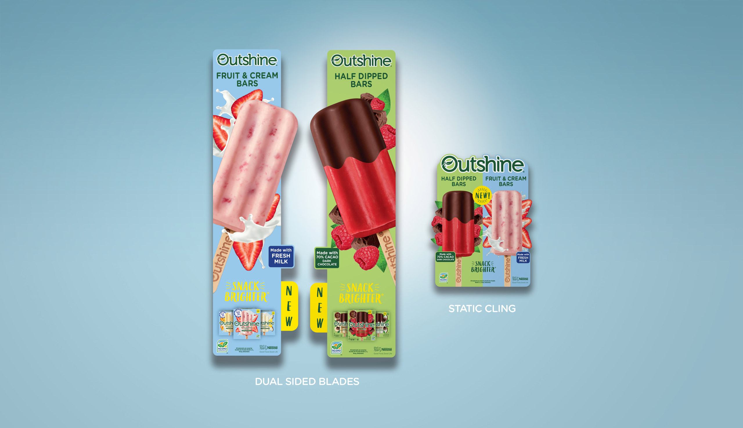
- Adaptation: Full Portfolio
- Packaging Production
- Photography
- Point of Sale