Hershey Kit Kat

Hershey Kit Kat

The Challenge

When we started working with Hershey, they already had a strong portfolio of cause marketing programs and wanted to build a new program around Black Music Month. They had an idea to extend their platform to the communities in Tennessee, where their manufacturing plant employed hundreds of community members.

With projects like this, we encourage our clients who want to launch DEI campaigns to rethink an approach for momentary impact on sales by considering embodying DEI values as a permanent fixture in their marketing approaches—caring about affected communities and the faces that come from there and still reside there. Hershey was already practicing this philosophy making our job a little easier! 

Our challenge was to develop a campaign that was authentic and supported black communities without Hershey being seen as taking advantage of the cause simply for monetary purposes. We did some light consumer research and found that Hershey was seen as neutral or not seen as a firm supporter of BIPOC communities. Even with DEI programs in place at the corporate level and programs that help youth. Knowing this we needed to ensure that whatever the program was it connected to communities AND supported black people throughout the process.

The Solution

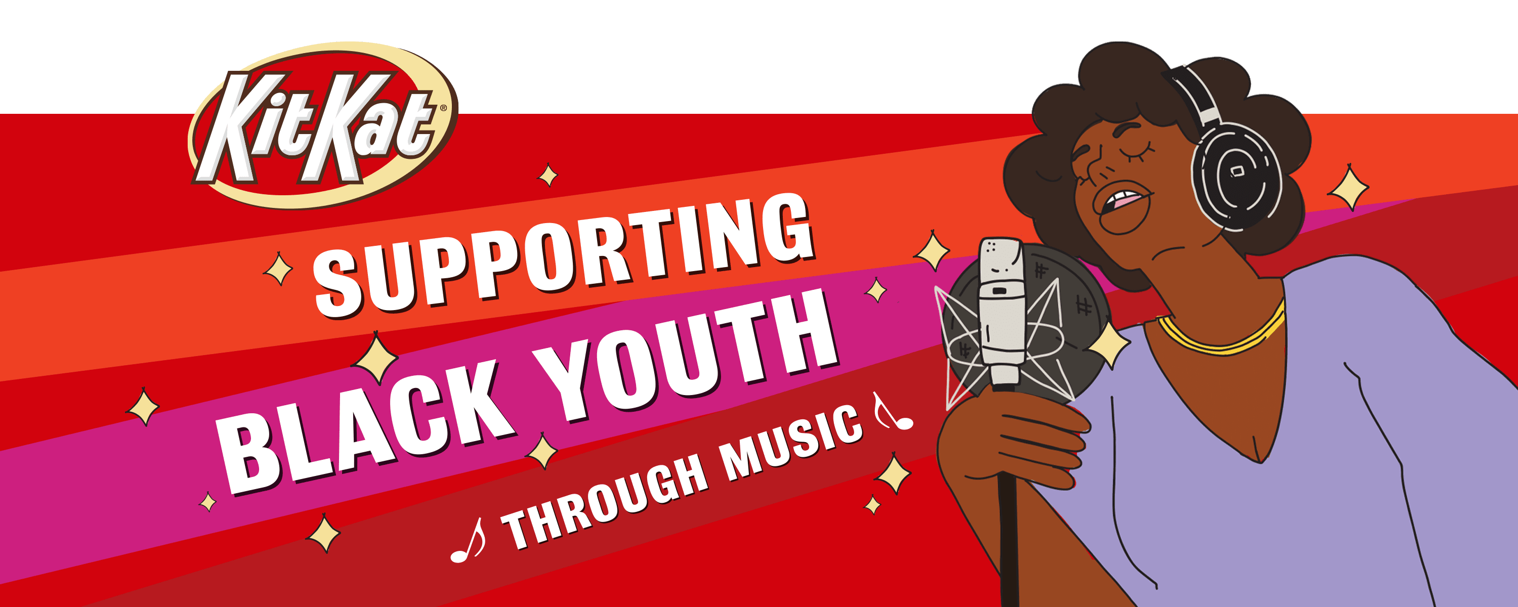
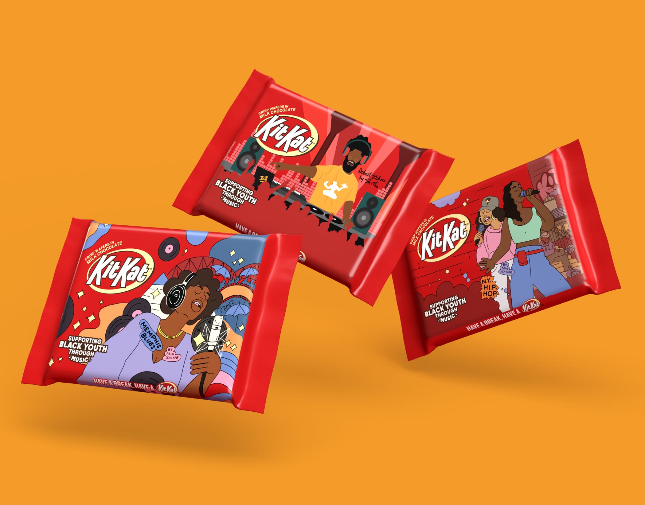
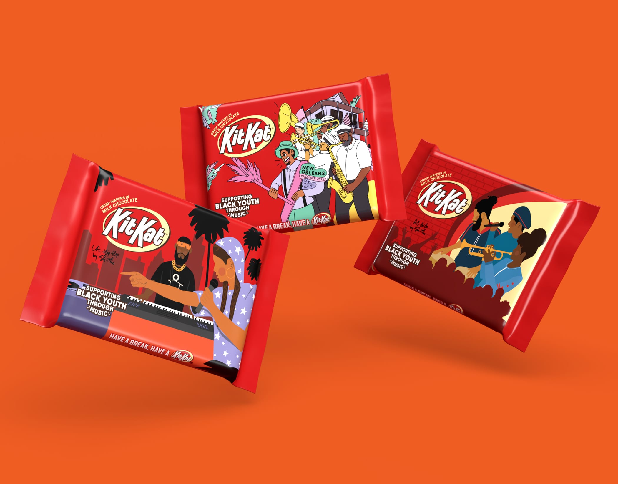
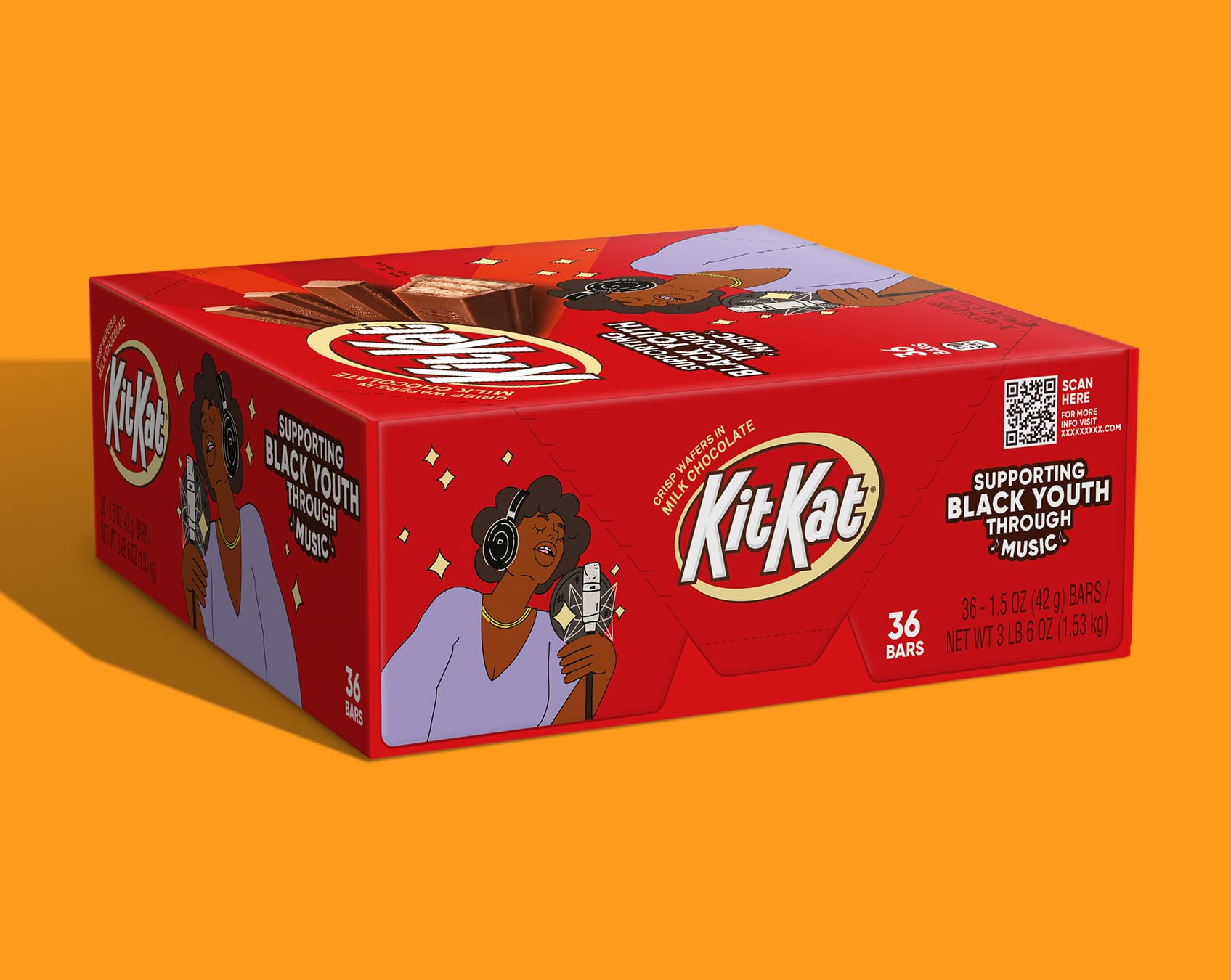
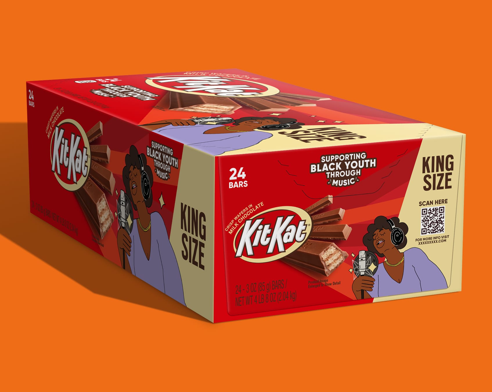
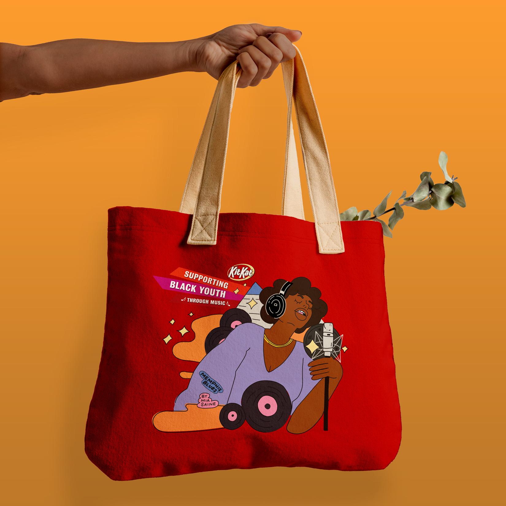
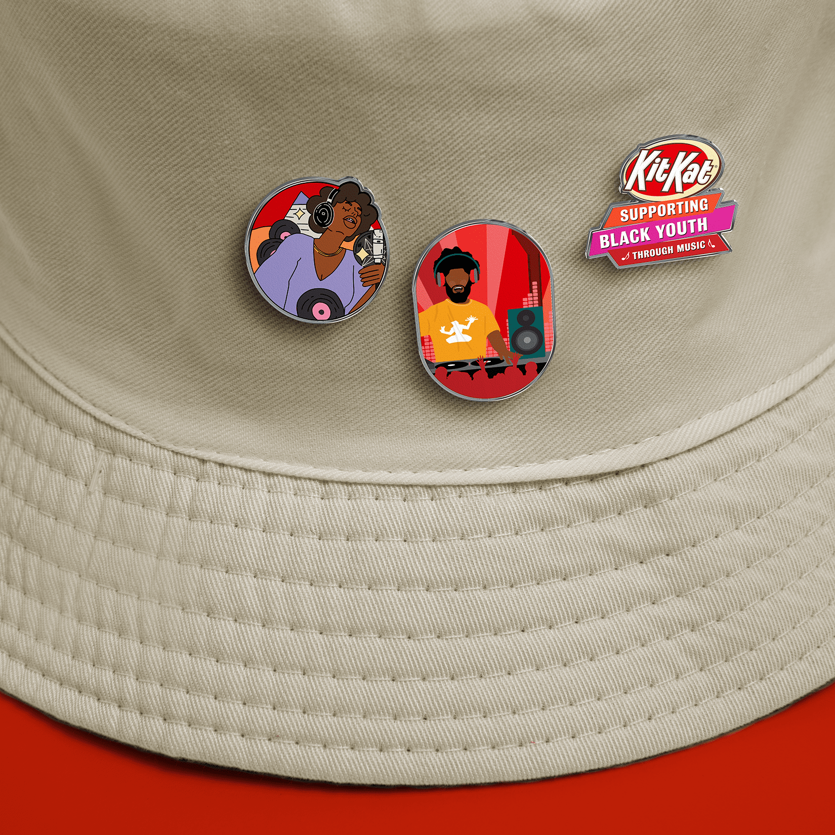
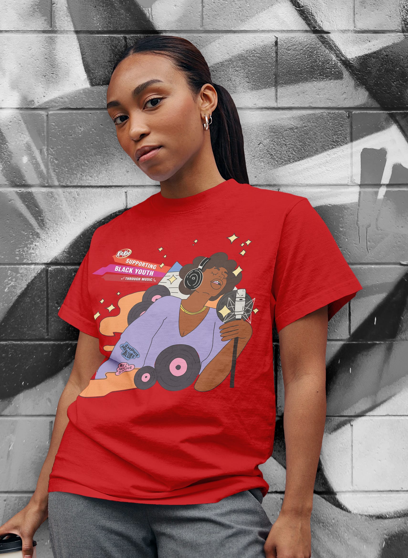
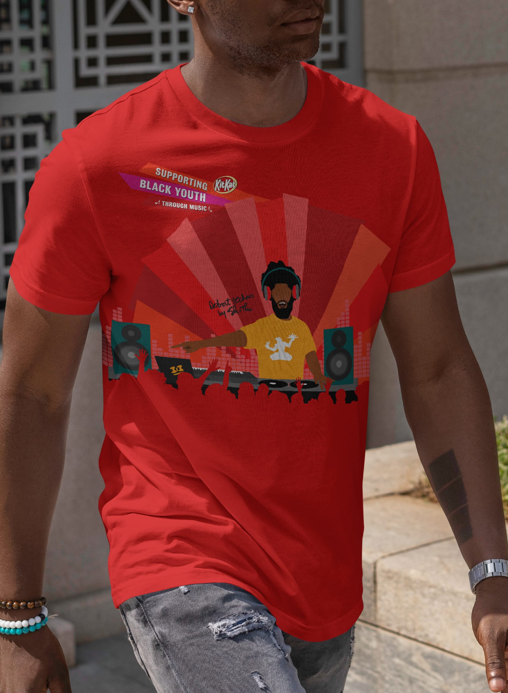
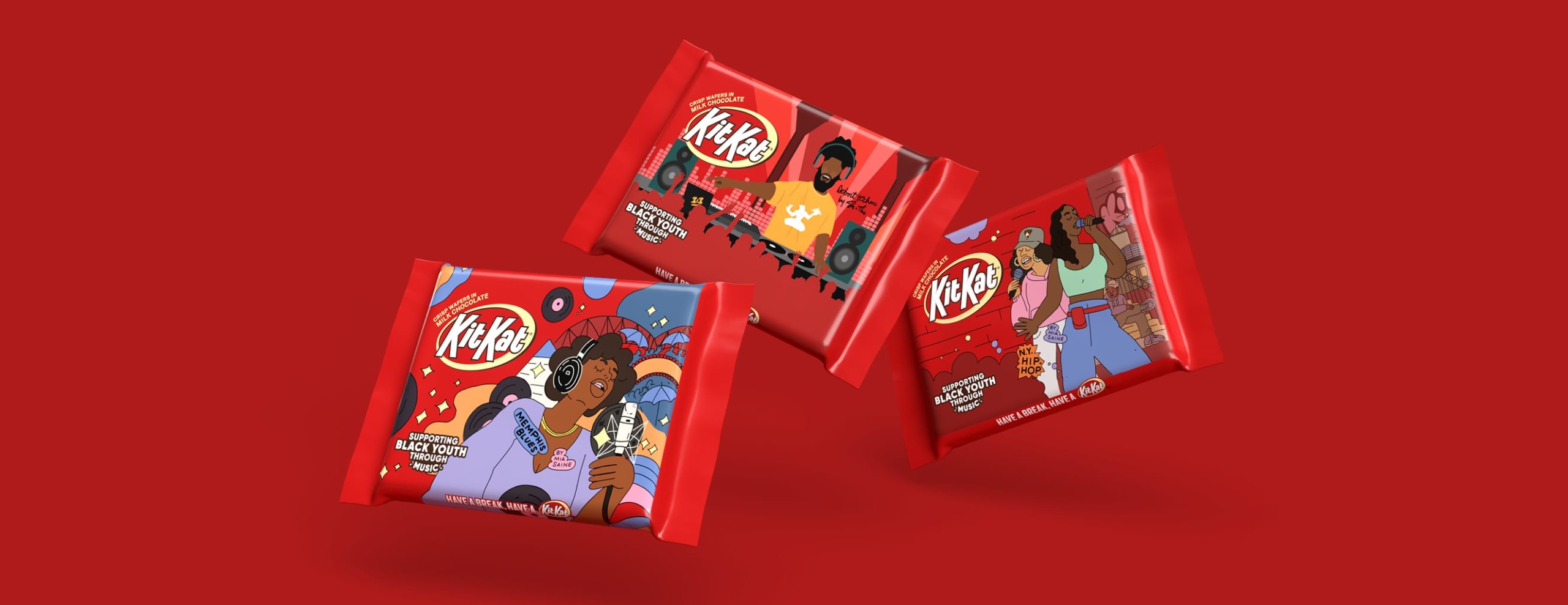
The concept we landed on provided a unique opportunity for Hershey to contribute to local organizations AND support black illustrators. We proposed limited edition packaging using black illustrators and a charitable donation to an organization that supports youth through music. 

The initial test program honed in on working with one organization, Memphis Music Initiative, a Memphis Tennessee non-profit that provides music programming and support for local youth. The program was a great success during its limited trial in Target stores in 2022 and was further expanded for 2023.

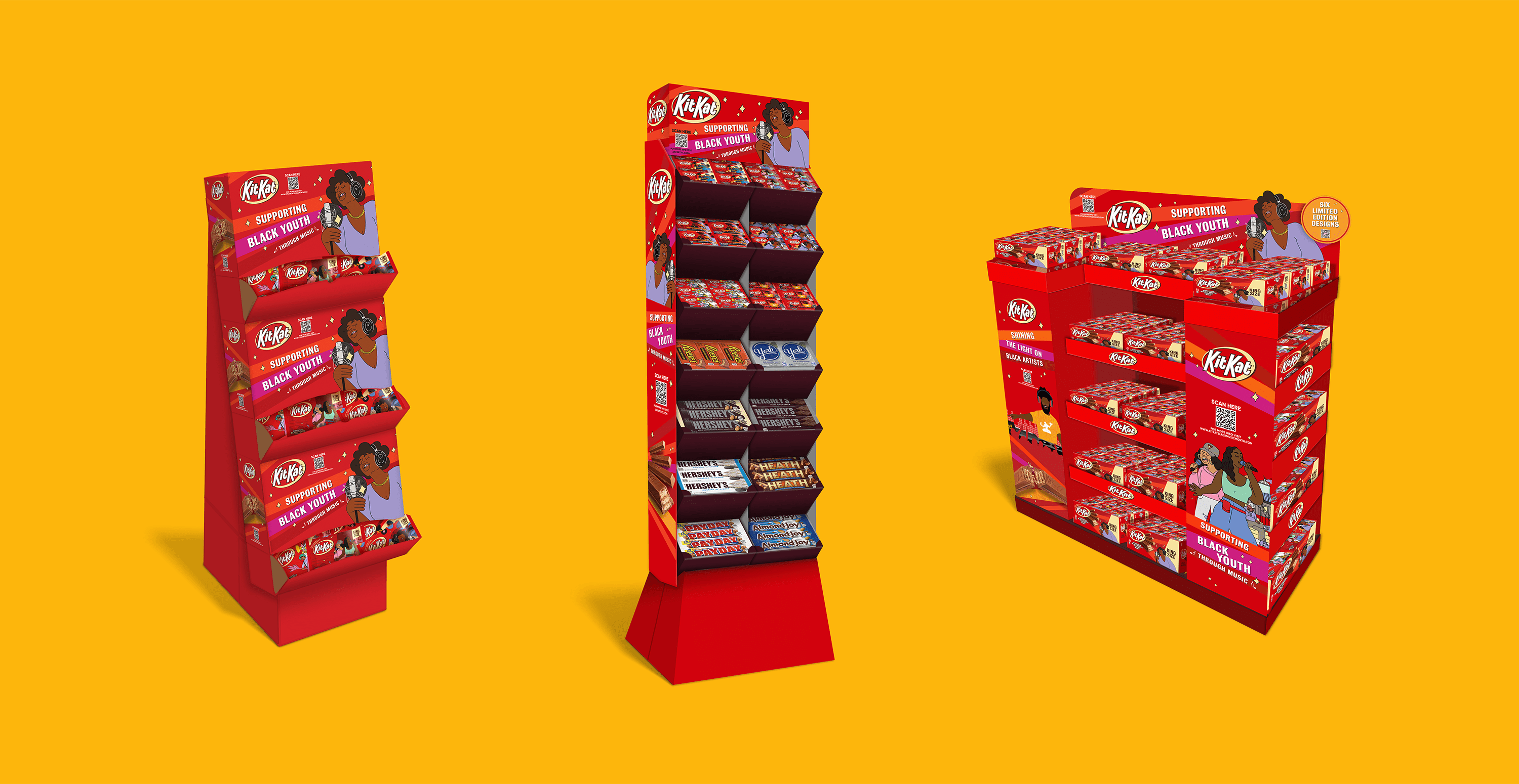
What began as a six illustration, one organization program launched in select Target stores is now a national program with six cities, six organizations, and a growing number of retailers with a total $13M buy-in. Some participating retailers include CVS, Kroger, Meijer, Rite Aid, Target, Walmart, Stop N Shop, Walmart, and 7-Eleven.

Finally, discovering and working with the illustrators and seeing the growth in their careers has been a fulfilling experience. We’re proud to support these strong artists and look forward to future programs that elevate and focus on the foundational roots of music in this country.

Services

  • Campaign Marketing Concept
  • Packaging Design
  • Illustration
  • Point of Sale

6 cities

across the US with 6 non-profit organizations supported. There were 171 earned placements and 36K unique visitors to the landing page, in one month.

Hershey Kit Kat
Hershey Kit Kat
Hershey Kit Kat
Hershey Kit Kat
Hershey Kit Kat
Hershey Kit Kat
Hershey Kit Kat
Hershey Kit Kat
Hershey Kit Kat
Hershey Kit Kat
General Mills License Work

General Mills License Work

The Challenge

Ice cream brand Dreyer’s Grand Ice Cream was developing the highly-anticipated crossover of the decade in their new line of ice cream flavors, directly inspired by General Mills cereals like Cinnamon Toast Crunch and Lucky Charms. With this much brand firepower behind one line of products, it was crucial to properly capture and communicate the brand elements of both companies into a powerful product design strategy.

With an opportunity to introduce an innovative product line to a wider consumer base, Dreyer’s Grand Ice Cream brought on The GRO Agency to design the packaging for their new line of General Mills cereal-flavored ice cream products.

Our challenge with the General Mills product packaging was to translate the essence of the brands so that they were instantly recognizable to the shoppers, while also appealing to a slightly older consumer base.

The Solution

In the cereal aisle, brands rely heavily on mascots and kid-friendly illustrations, whereas ice cream products typically aim toward an older crowd and require a heavier focus on appetite appeal. For the Dreyer’s-General Mills packaging, the brand elements were distilled down to its key components in order to strike a balance between the competing consumer expectations.

First, to maintain the brands’ recognizability among consumers, the product packaging showcased the playful attitude and nostalgia of each respective brands, with an intentional focus to eliminate any seemingly juvenile aspects. By focusing on the brand design elements and omitting the cartoonish mascots, the package was instantly recognizable and easily targeted the whole family.

Then, by incorporating the bold use of color and a design system built for flexibility with plenty of room for the brandmark to play, the packaging truly brought life to these classic brands within this new space. Stylized bowls in the language of the respective brands helped bring the design together as a unified whole.

Finally, the appetite appeal was a key part of the overall success of this packaging. To get that right, live product photography with high-quality photo-illustration created delicious scoops that genuinely encapsulated the richness, texture, and flavor profile of the ice cream product.

Services

  • Packaging Design
  • Adaptation: Full Portfolio
  • Packaging Production
  • Photography
  • Point of Sale
General Mills License Work
Outshine Innovations

Outshine Innovations

The Challenge

Frozen fruit bar brand Outshine was branching their product portfolio in all different directions – not just new flavors and sizes, but also forging their way into new aisles and categories altogether. Along with their widespread variety of sub-brands and SKUs, Outshine needed to resolve shopability issues that began to result from flavor confusion and hierarchy issues within their established brand.

With an opportunity to improve their in-store shelf impact and expand their brand presence, Outshine tapped their long-time partner The GRO Agency to update their brand messaging and refine their product packaging across a growing number of lines and sublines.

Our challenge with the Outshine product portfolio enhancement was 1) to maintain consistency across the full portfolio, while still differentiating within it across sub brands and forms, and 2) to create strong brand recognition outside the frozen aisle where the brand is not typically encountered.

The Solution

Consumer tastes and preferences led the decision to boldly update, organize, and prioritize Outshine’s messaging and product expansion. Inspired by the brand’s core message, GRO helped Outshine develop and introduce new flavors, sub brands, product innovations, forms, and formats of their beloved frozen fruit bar – even outside the frozen aisle.

First, new flavors and formats of Outshine led the way, with their Organic line appealing to the health-conscious shopper and the Half-Dipped bars for the chocolate lover. Fruit & Cream bars brought a new texture to the table, while the Tajin line added some spice to the line-up. Outshine and GRO are still partnering on more flavors to this day.

Next, as a bold leap from the frozen food aisle, Outshine borrowed from their existing design and messaging hierarchy to introduce their shelf-stable smoothie category and snack categories. Remaining recognizable to a loyal shopper, these new products clearly articulated what made Outshine special in the frozen aisle, just geared towards a fresh audience.

Finally, to satisfy all the different ways that consumers interact with the Outshine brand, whether a personal snack or a party treat, GRO helped Outshine introduce new size variations and pack sizes, such as the ‘club’ size. With an organized brand messaging around the core brand identity, Outshine was free to expand their product lines as they pleased, without the confusion.

Services

  • Packaging Design
  • Adaptation: Full Portfolio
  • Packaging Production
  • Photography
  • Point of Sale
When we needed to expand our brand outside of our traditional aisle, we turned to GRO. The team at GRO brought expertise and creativity to the project, and were the quintessential partner throughout.

Sarah Holley Manager
Product Innovation Nestlé USA

Outshine Innovations
Nestlé Drumstick

Nestlé Drumstick

The Challenge

Ice cream brand Nestle Drumstick had recently undergone an evolutionary refresh of their master brand. If that wasn’t enough, they also planned to widely release ‘Crushed It’, their break-through product line of cookie-crumb-coated ice cream cones and bars. From the first bite, these innovative frozen treats proved themselves a truly unique, multi-textural eating experience, unlike anything Nestle Drumstick had released before and unlike anything in the all-family snacking category.

With the opportunity to revitalize and modernize their entire brand portfolio, Nestle Drumstick tapped The GRO Agency to produce creative packaging for their fresh brand identity across all new and existing SKUs.

Our challenge with ‘Crushed It’ was to 1) visually communicate what a delight that first bite of ‘Crushed It’ feels like for the consumer, 2) distinguish packaging concepts and graphics from their existing offerings, and 3) build on their existing brand to remain recognizable within the Drumstick brand universe.

The Solution

Driven by consumer insights, we created a new visual and verbal strategy that would adapt and refine the new design across the whole Drumstick portfolio, including the ‘Crushed It’ product line.

First, to vividly communicate the unique feeling and texture of that first, delectable, melt-in-your-mouth bite, our team fabricated a product-specific logo leveraging the same recognizable color palettes and layout of the core brand. As it doesn’t resemble any existing Drumstick logo, this sub-logo both differentiates the packaging to catch the eye, while also reinforcing the product experience.

Next, the product messaging invites consumers to indulge and experience, not merely sample, the finely-coated ice cream snack. When it comes to dessert, we find that taste and indulgence are primary decision-drivers. Finally, in show-don’t-tell fashion, we broadcasted the enticing product photography front-and-center to illuminate a sweeter life after that first bite.

Services

  • Sub-Line Logo Design
  • Packaging Design
  • Adaptation: Full Portfolio
  • Packaging Production
  • Product Photography
  • Point of Sale
The GRO team jumped into a rush redesign project for Drumstick and executed with precision and speed. Their attention to detail and deep packaging production experience allowed us to meet our deadline with a bolder, new look for this iconic brand.

Brian Lemco
Packaging Project Manager
Dreyer’s Grand Ice Cream

Nestlé Drumstick
Nestlé Drumstick
Nestlé Drumstick
Nestlé Drumstick