Bashas’ A to Z Pantry

Bashas’ A to Z Pantry

The Challenge

The mid-sized, Arizona-based grocery chain, Bashas’, was looking to develop their own brands throughout the center store and beyond. The chain has a long, memorable history in Arizona and wanted to build a brand that connected with their hometown grocery roots.

While seeking to satisfy their current customers with their continued value offerings they wanted to set themselves up to capture new customers who were looking for higher-quality value products.

Our challenge was to ensure that the new brand connected to the roots of Arizona and elevated their own brand to compete with national brands while still connecting with value shoppers.

The Solution

Developing a brand name for a private-label line of groceries can be a challenge since the products span a large group of categories. It was imperative that the brand name tie back to Bashas’ and/or their Arizona roots. “Bashas’ A to Z Pantry” rose to the top of our exhaustive naming exercise and immediately provided the breadth for a large set of products while connecting to their state pride. It also allowed the brand to flex into broader categories e.g. A to Z Home, A to Z Essentials, etc.

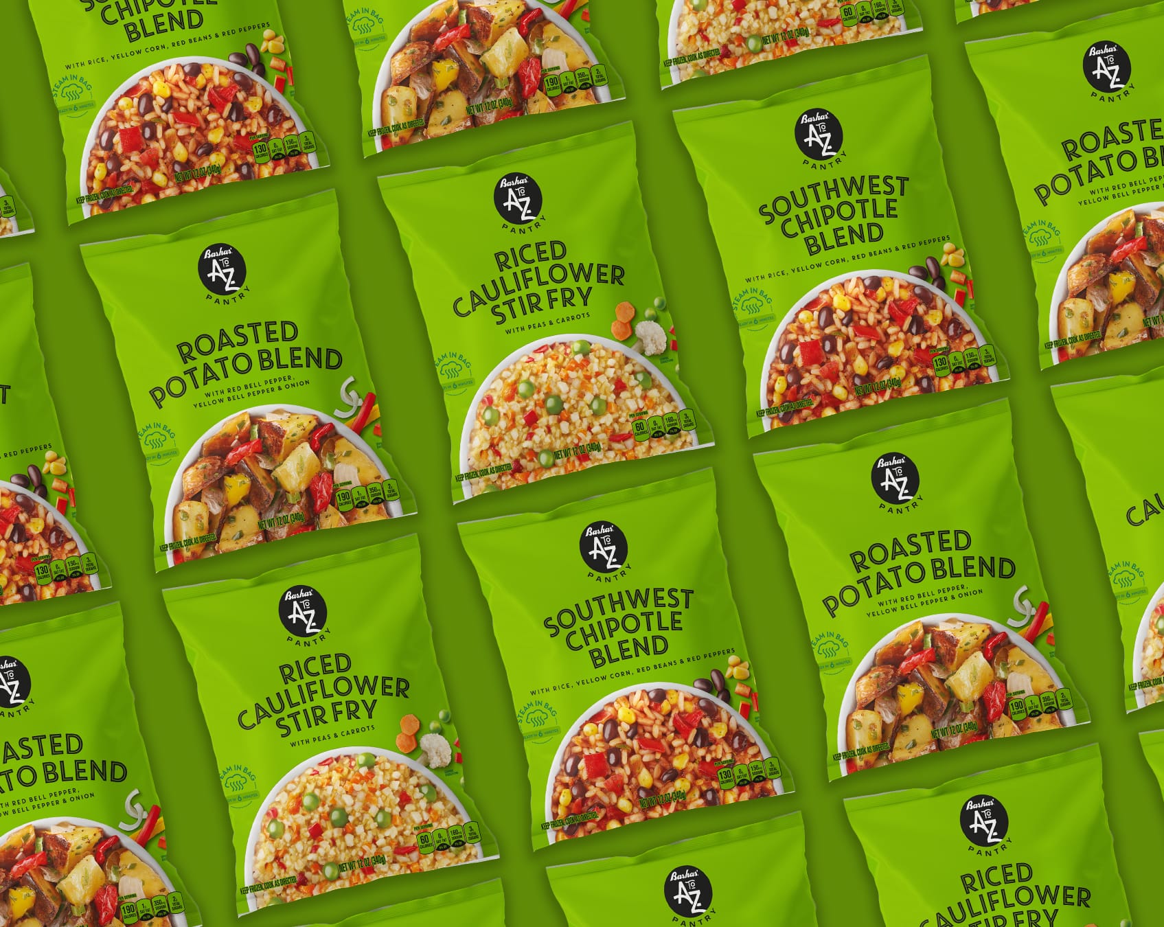
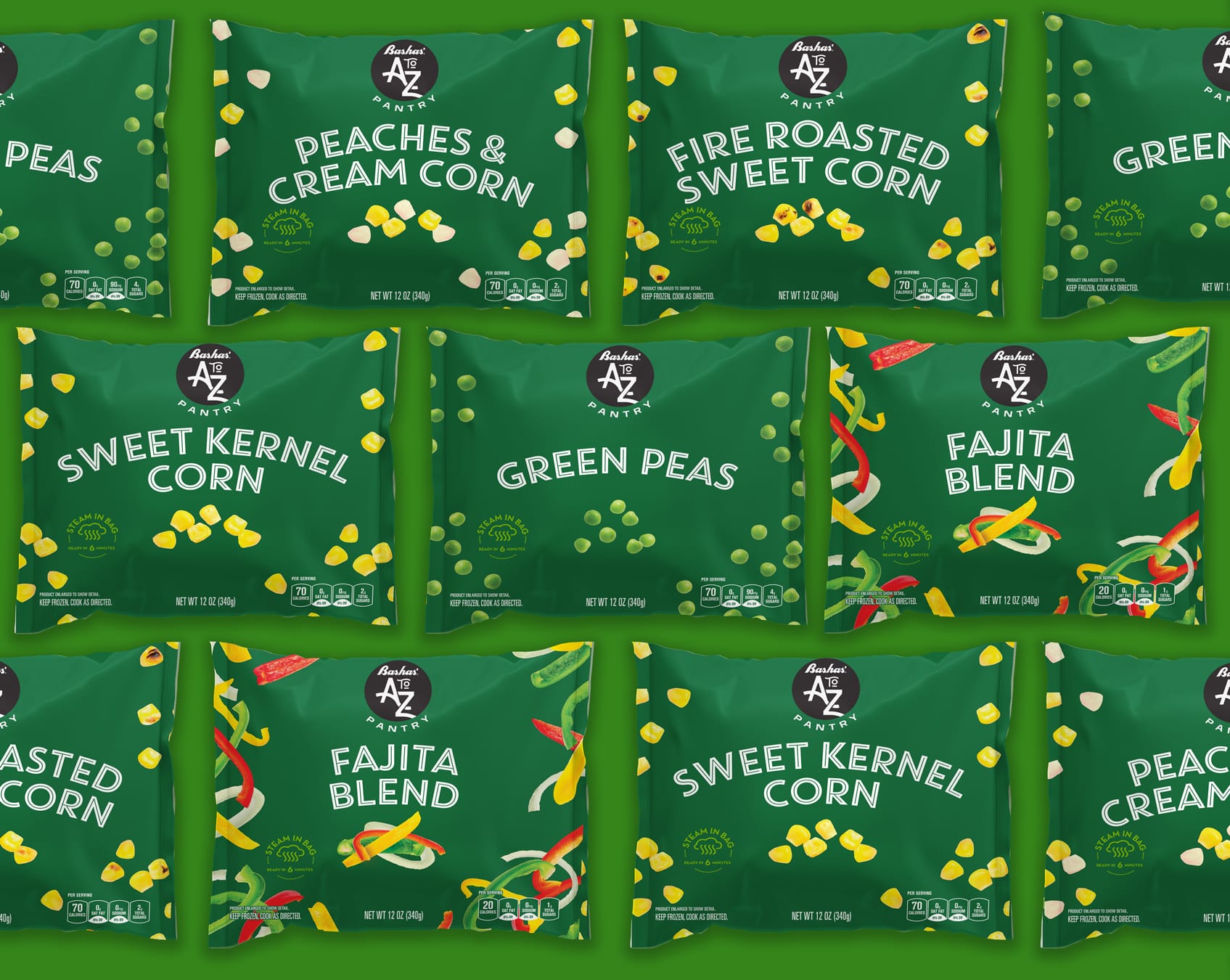
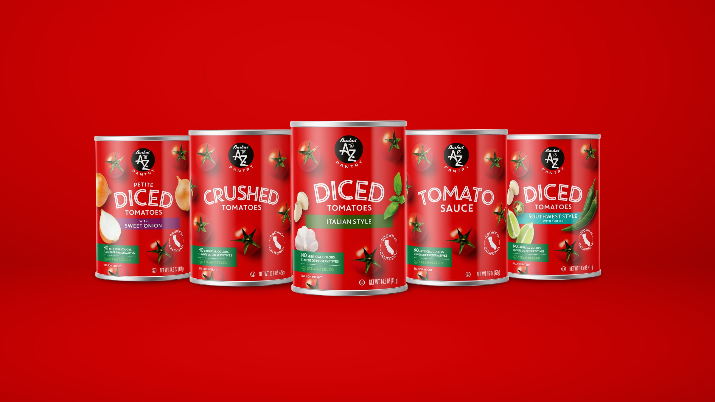
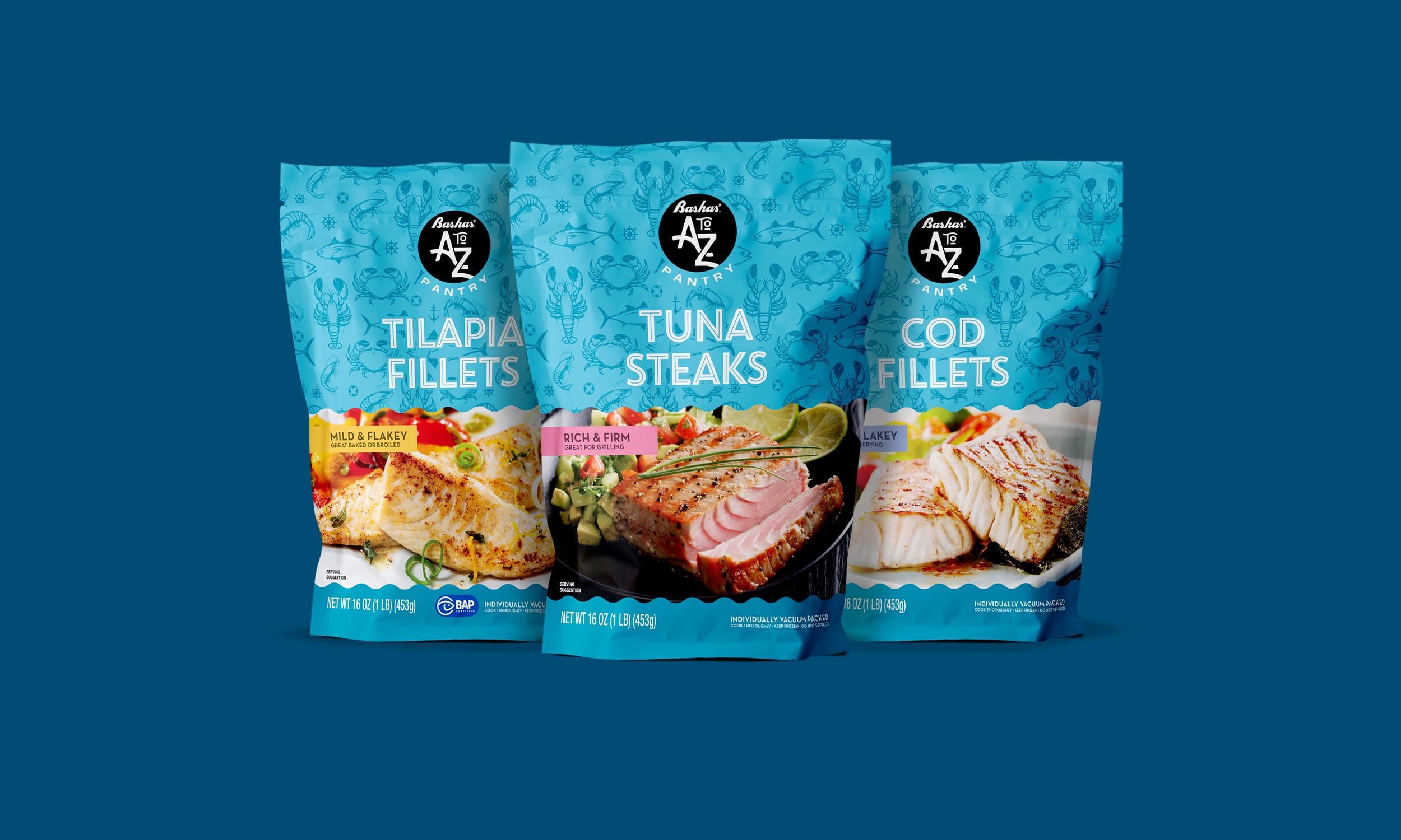
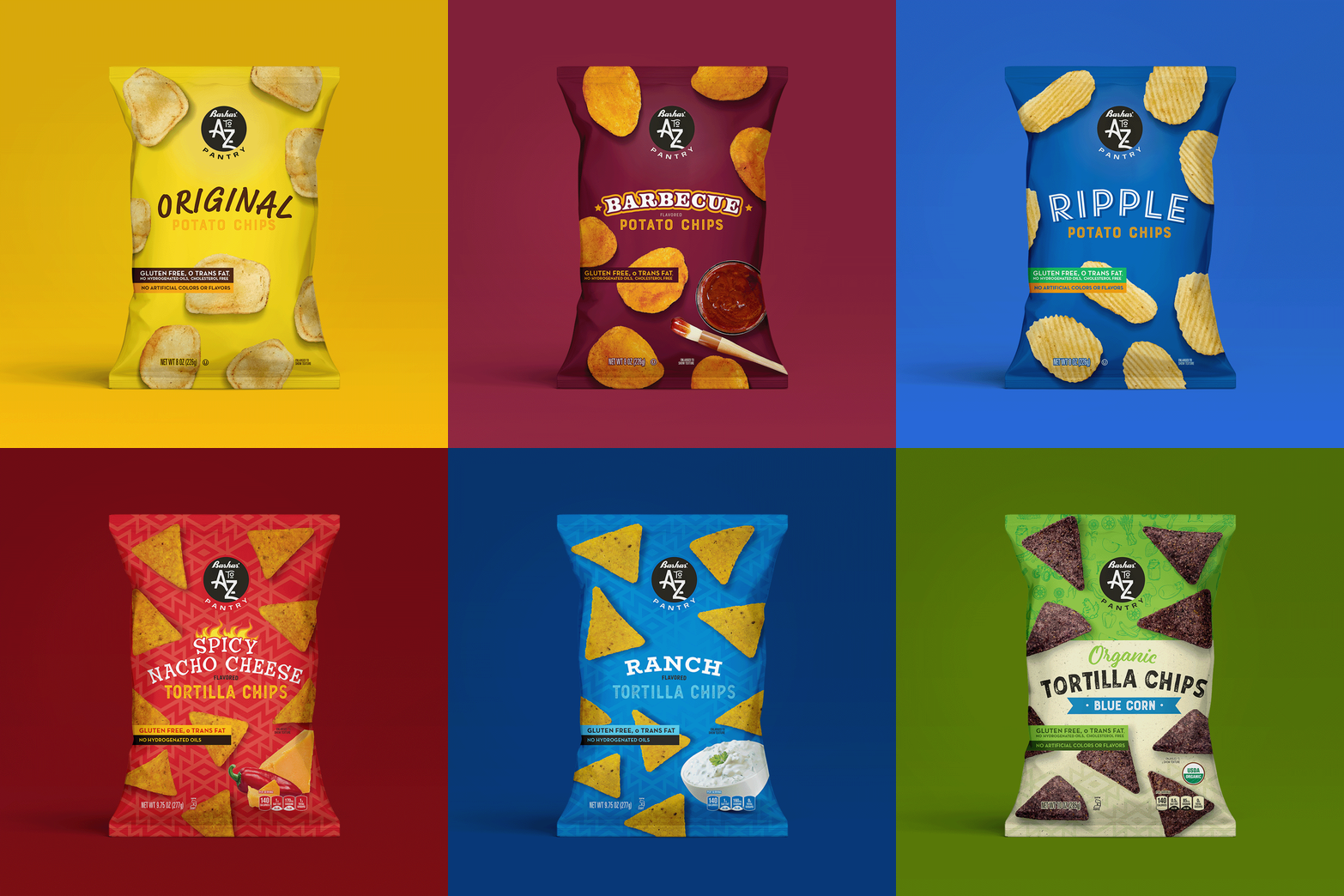
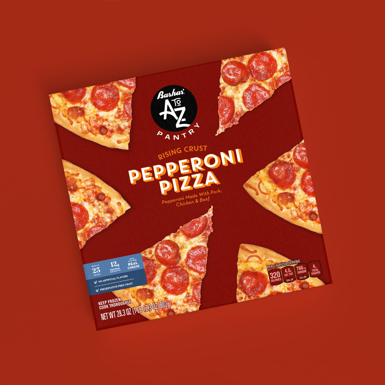
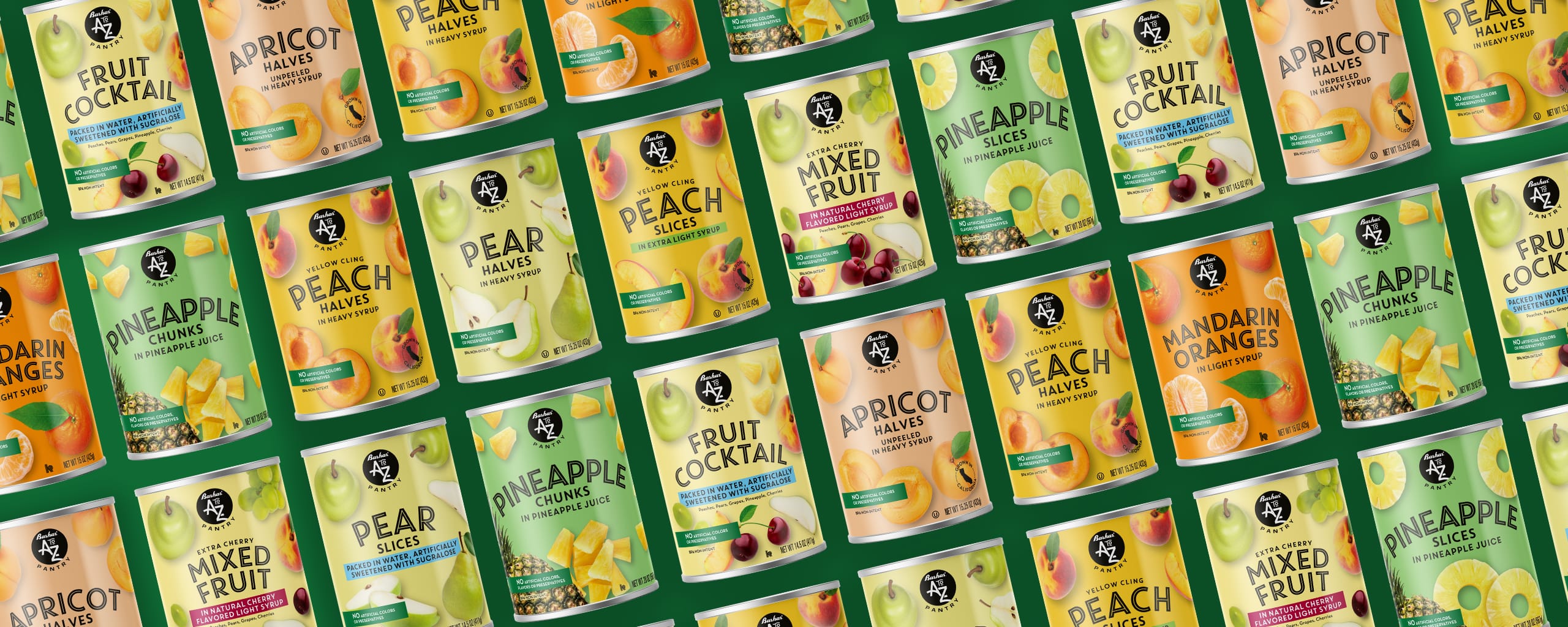
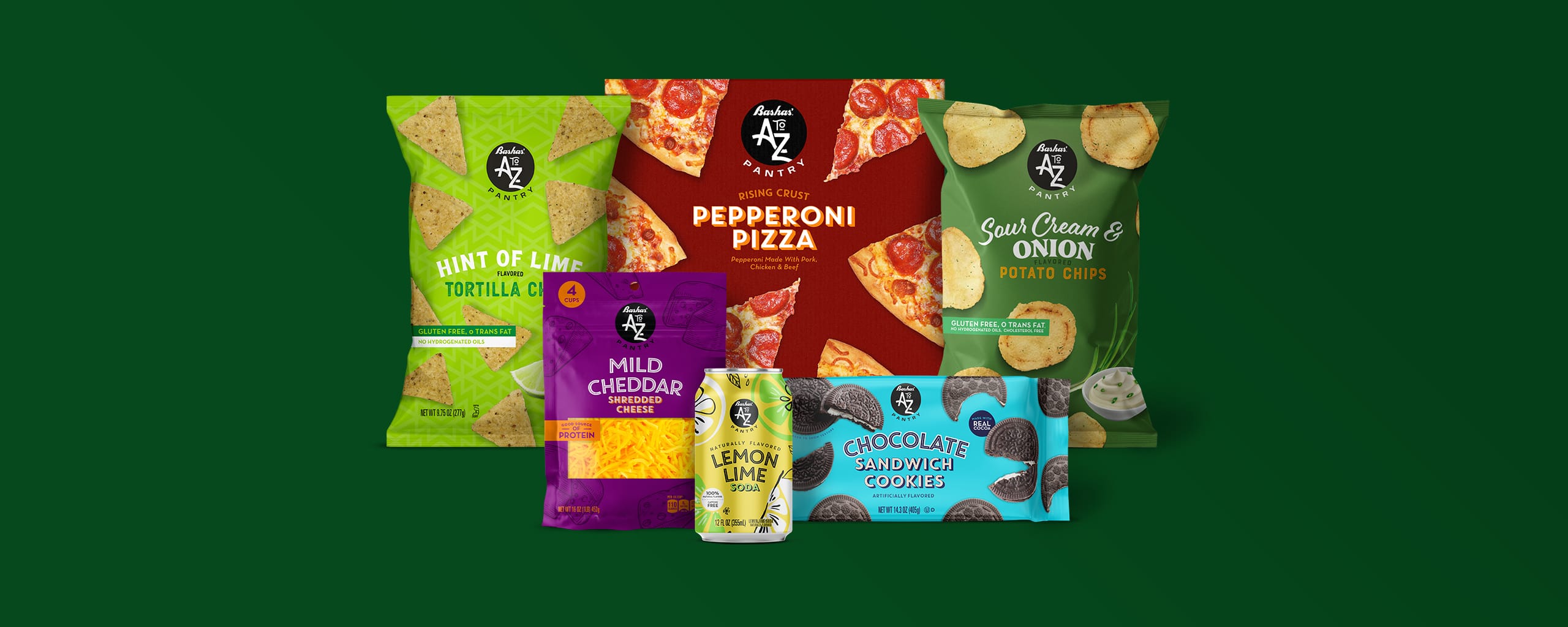
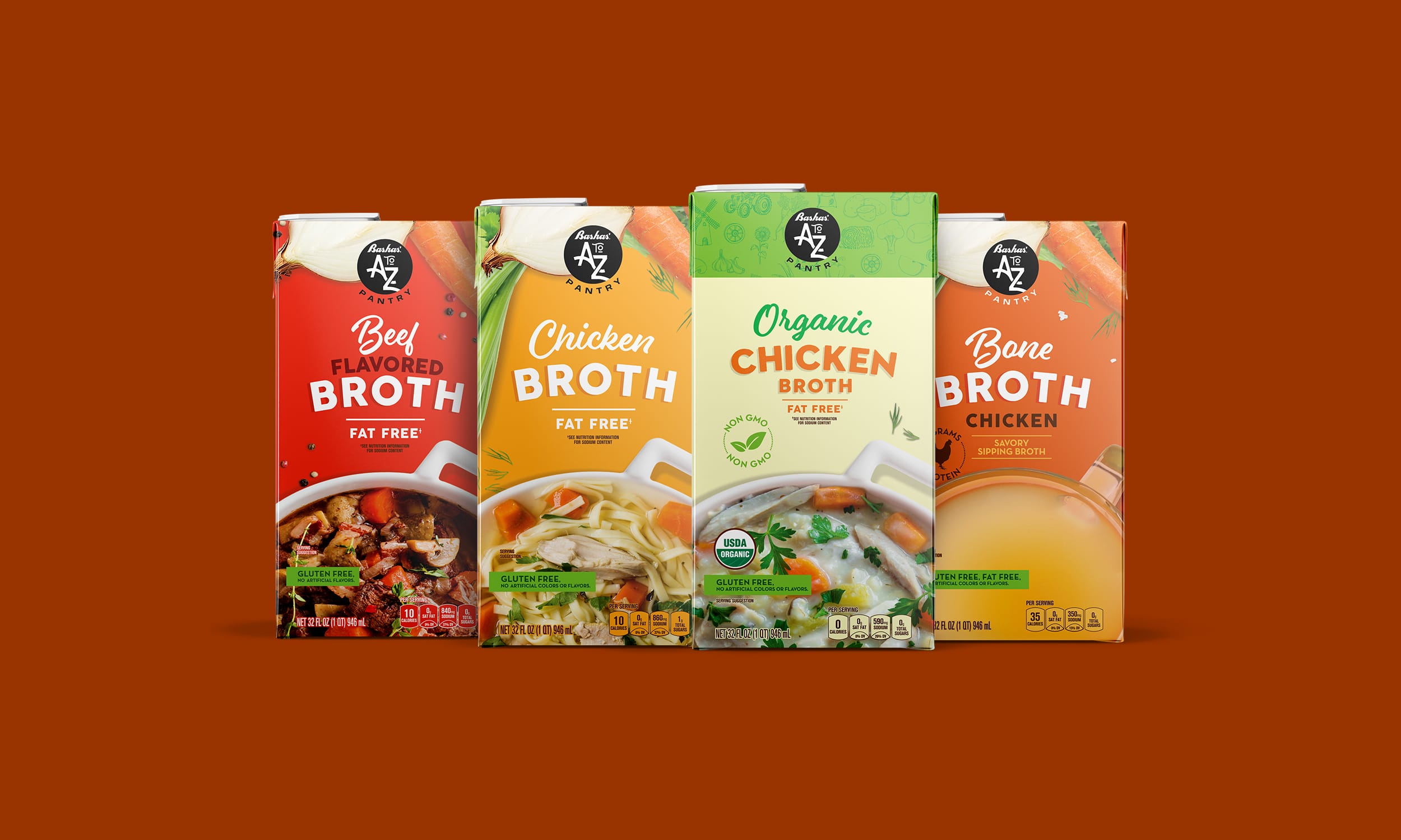
The next step, create a brand design system where the visual architecture could quickly communicate the brand to consumers and help it stand out on shelf. The bold, iconic A to Z Pantry symbol and the simple yet playful use of photography helped to achieve a unique product set across the store.

What’s more, the flexibility of the system and typography allowed for special situations where creativity is needed to compete with national brands in categories like salty snacks, cereal, and soda. While the claims statements were designed to provide consistency across product lines, helping consumers quickly identify the product’s benefits.

Then, the packaging system needed to stretch to work across a large variety of shapes and sizes, different printing processes, and different substrates. Working to ensure that it had an impact at any point in the customer shopping journey, from frozen to canned foods. The design work proved that the system could communicate on any shelf in the store.

Services

  • Naming
  • Logo Design
  • Packaging Design
  • Packaging Adaptations
  • Packaging Production
  • Product Photography

9%

Sales increased nine percent in categories where only the packaging was updated
Bashas’ A to Z Pantry
AtoZ Canned Fruit Image
A to Z Pizza image
A to Z Canned Fruit variety image
Disney License Work

Disney License Work

The Challenge

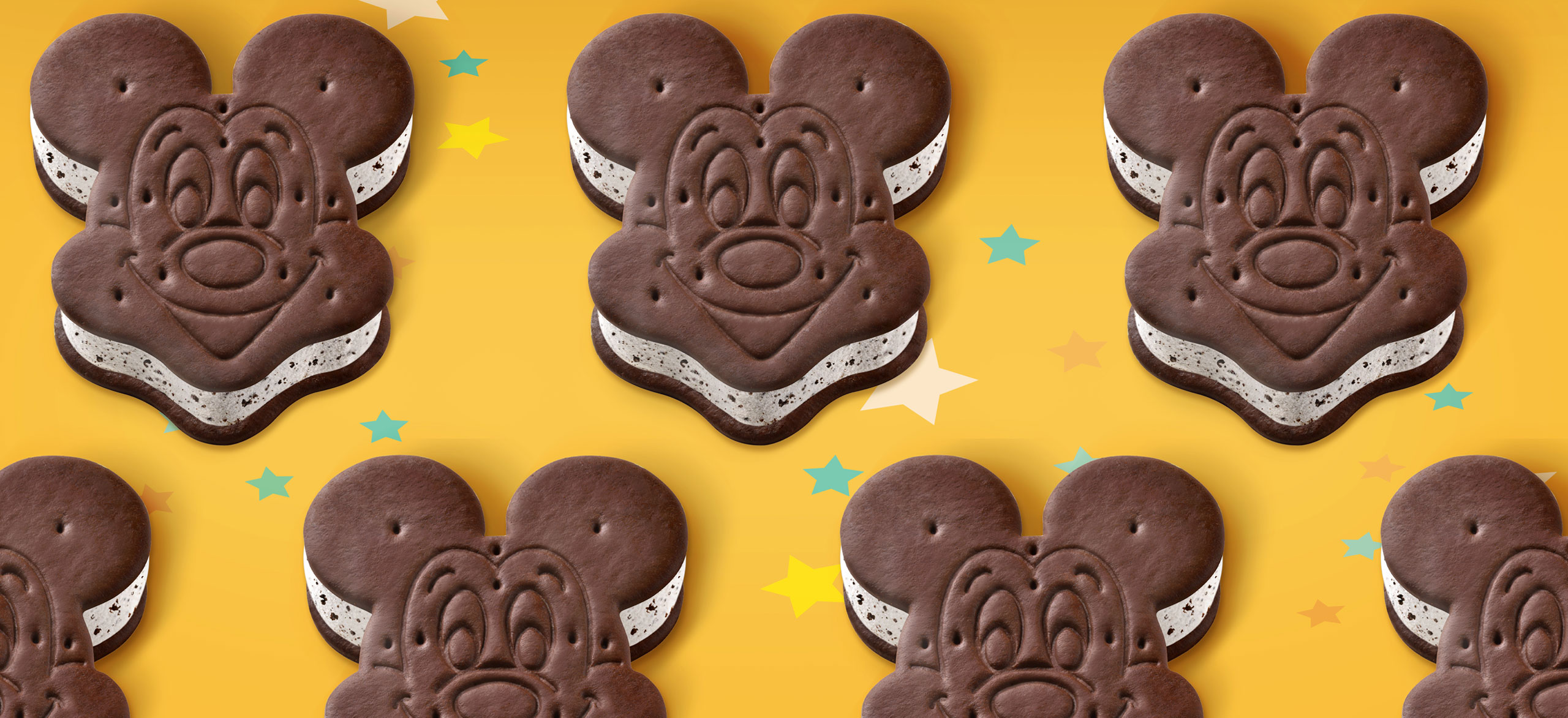
Ice cream brand Dreyer’s Grand Ice Cream hoped to conjure up the magic of Disney in the frozen aisle with a new line of Mickey Mouse ice cream products. Previously a Disney Park exclusive, Dreyer’s Grand Ice Cream needed to design packaging that would represent the Disney brand, leverage the nostalgia of America’s favorite mouse, and create a unified line of products that would attract attention on shelf.

With the opportunity to first bring a Disney Park exclusive to the masses, Dreyer’s Grand Ice Cream tapped The GRO Agency to design packaging for their assortment of Mickey Mouse Ice Cream Products.

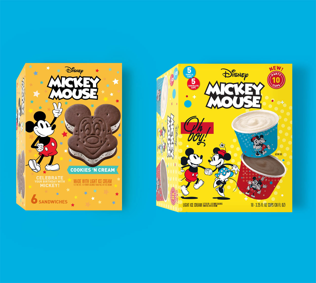
Our challenge with the Mickey Mouse packaging design was to 1) work within the strict licensing parameters, 2) creatively utilize brand elements and colors to design a system that fit for the Disney brand, and 3) all while standing out from the competition in the freezer aisle.

The Solution

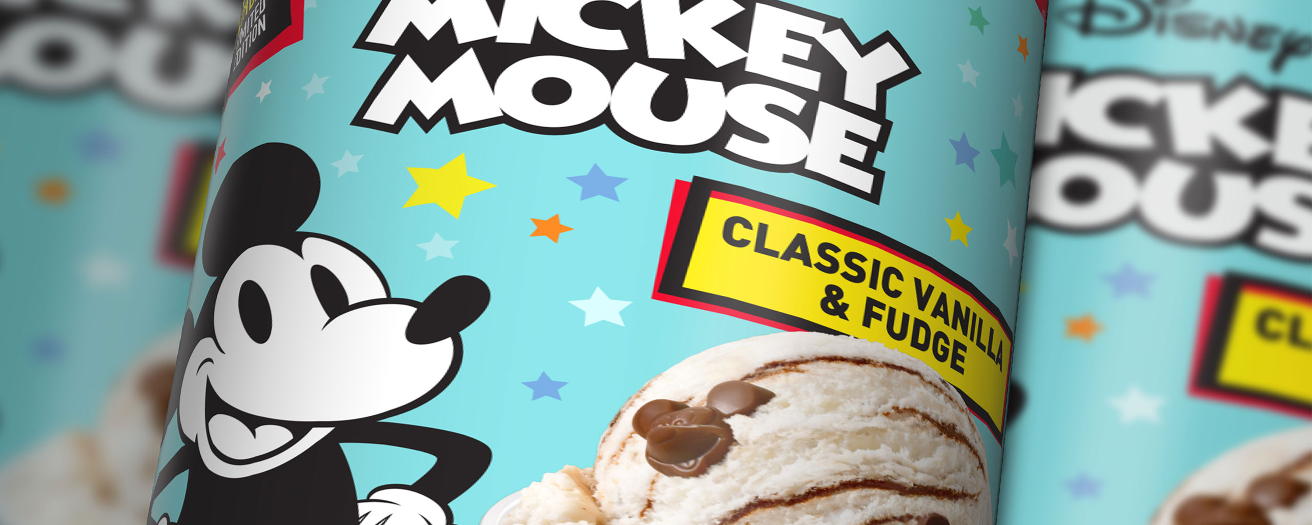
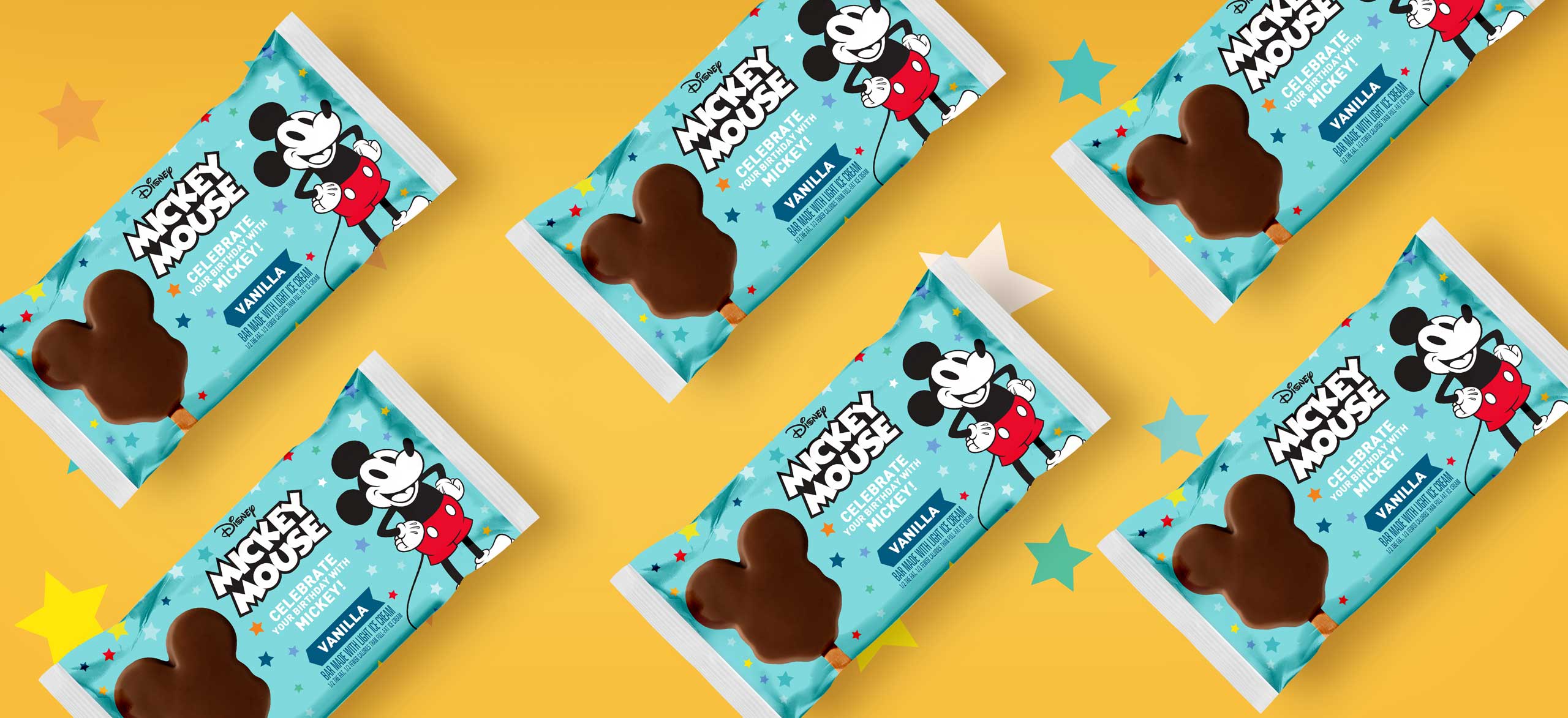
To create impactful packaging that would thrill the devoted Disney enthusiast yet appeal to the general ice cream lover, Mickey brand assets were employed thoughtfully and strategically throughout the design. The result: In the year following the launch, Mickey Bars were the top performing Nestle ice scream snack in 2019.

First, leveraging similar Disney-branded layouts and color palettes throughout the design system, the product line shares a unified look to help them stand out and remain recognizable as a cohesive offering. The packaging is simple, straight to the point, but also communicates that essence of Disney magic, as well as the deep and poignant nostalgia inherent to the brand.

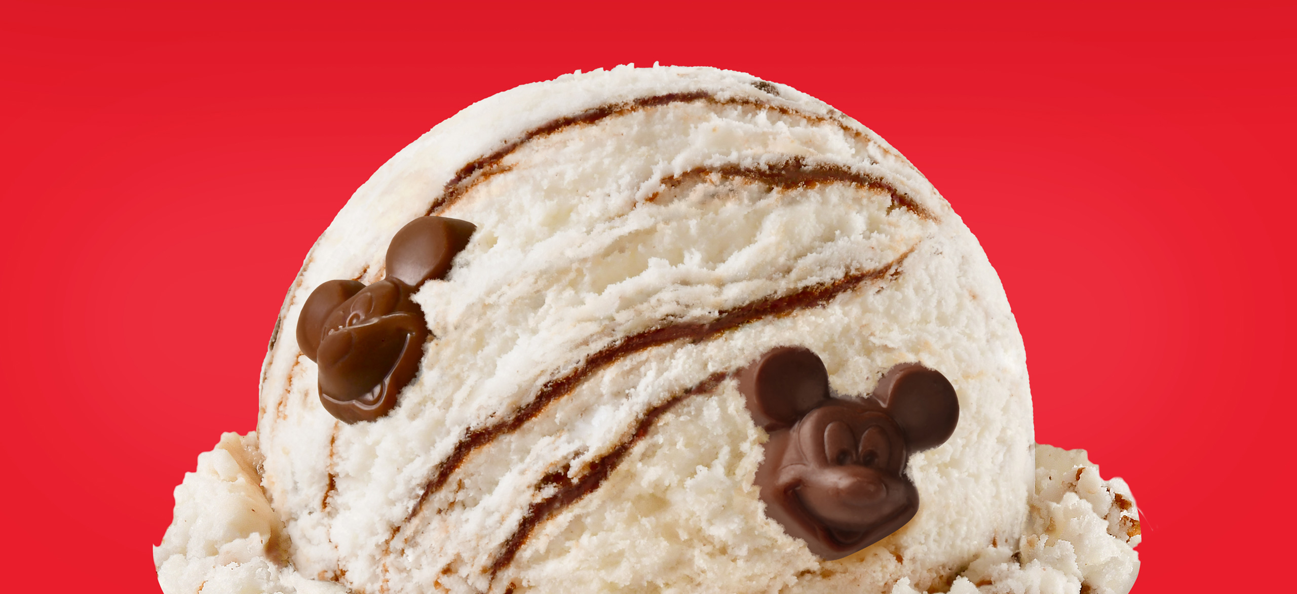
From there, appetizing product photography broadcasted the creamy textures and flavors of the ice cream product, while the appealing color palette captured the hearts of kids, adults, and even the Disney agnostic alike.

Services

  • Packaging Design
  • Packaging Adaptations
  • Packaging Production
  • Product Photography
The top performing Nestlé ice cream snack SKU the year after release

Nestlé Licensing Team

Disney License Work
Disney License Work
Disney License Work
Disney License Work
Disney License Work
Disney License Work
Ian’s Foods

Ian’s Foods

The Challenge

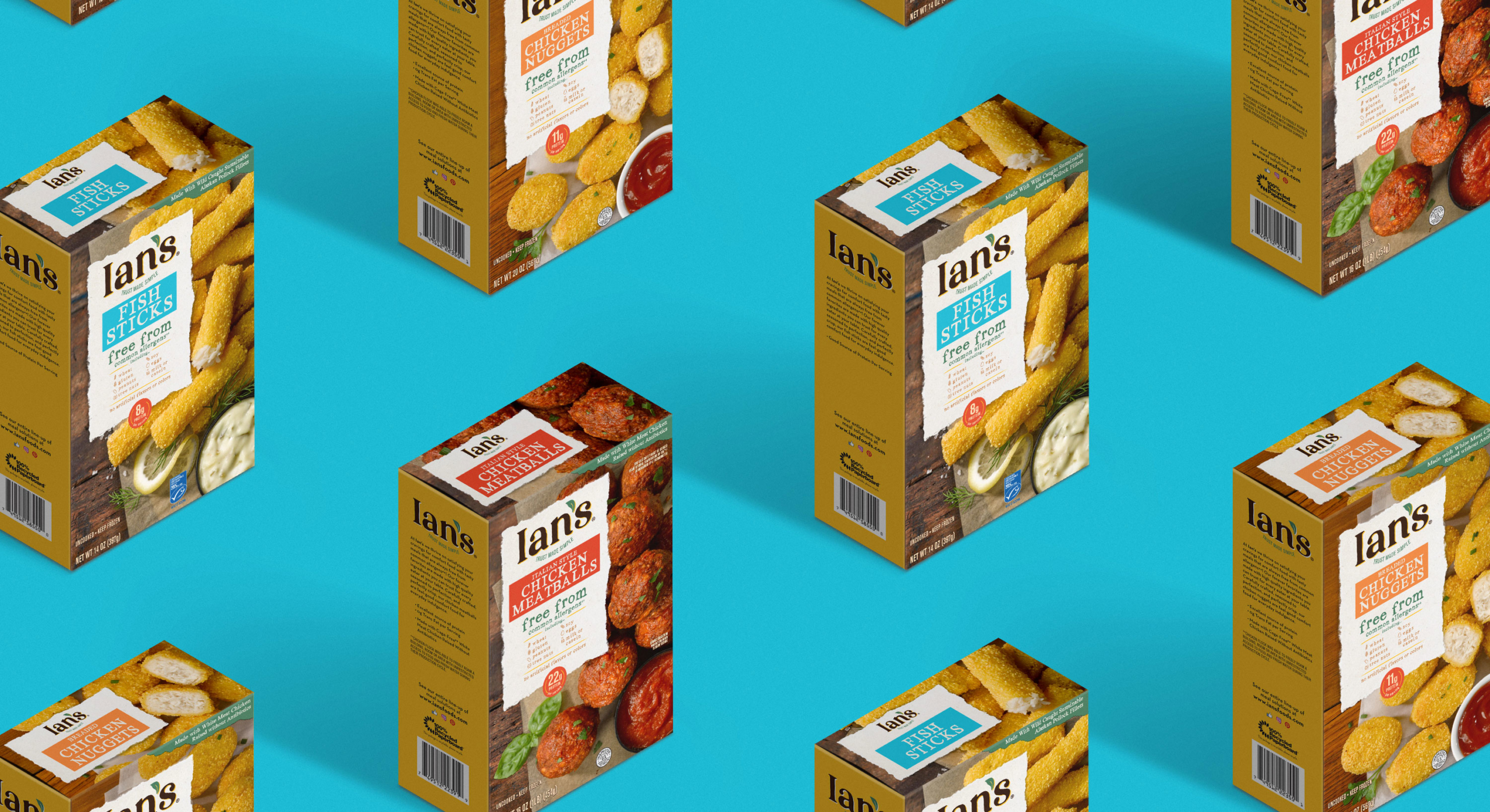
Gluten-free food brand Ian’s found themselves in a similar predicament to others in the allergen-friendly food market: better-for-you products carry the misnomer that they cannot be as delicious as their allergen-having competitors. Although their high-quality selection of nourishing foods, along with a commitment to sustainability, had awarded them a sizable and loyal consumer base, Ian’s realized that they were not telling (nor selling) the full story of what actually made their products unique.

With an opportunity to think outside their gluten-free box and appeal to a wider audience, Ian’s brought on The GRO Agency to refresh their brand packaging and design.

Our challenge with the Ian’s packaging rebrand was to shift the narrative around all of Ian’s genuine value propositions, without ostracizing their current clientele who relied on a trustworthy product for their day-to-day health and lifestyle.

The Solution

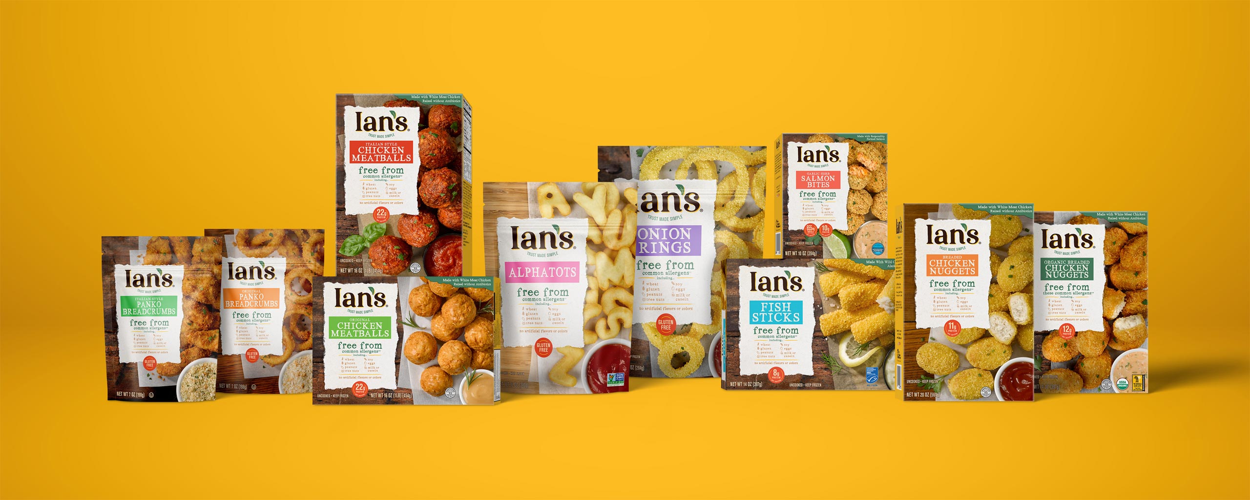
When it comes to an informed brand strategy, we let consumer research do the talking. In this case, our overarching analysis led us to develop a brand strategy with the central premise of comfort – comfort foods and flavors that you love without the allergens and artificial ingredients that you don’t.

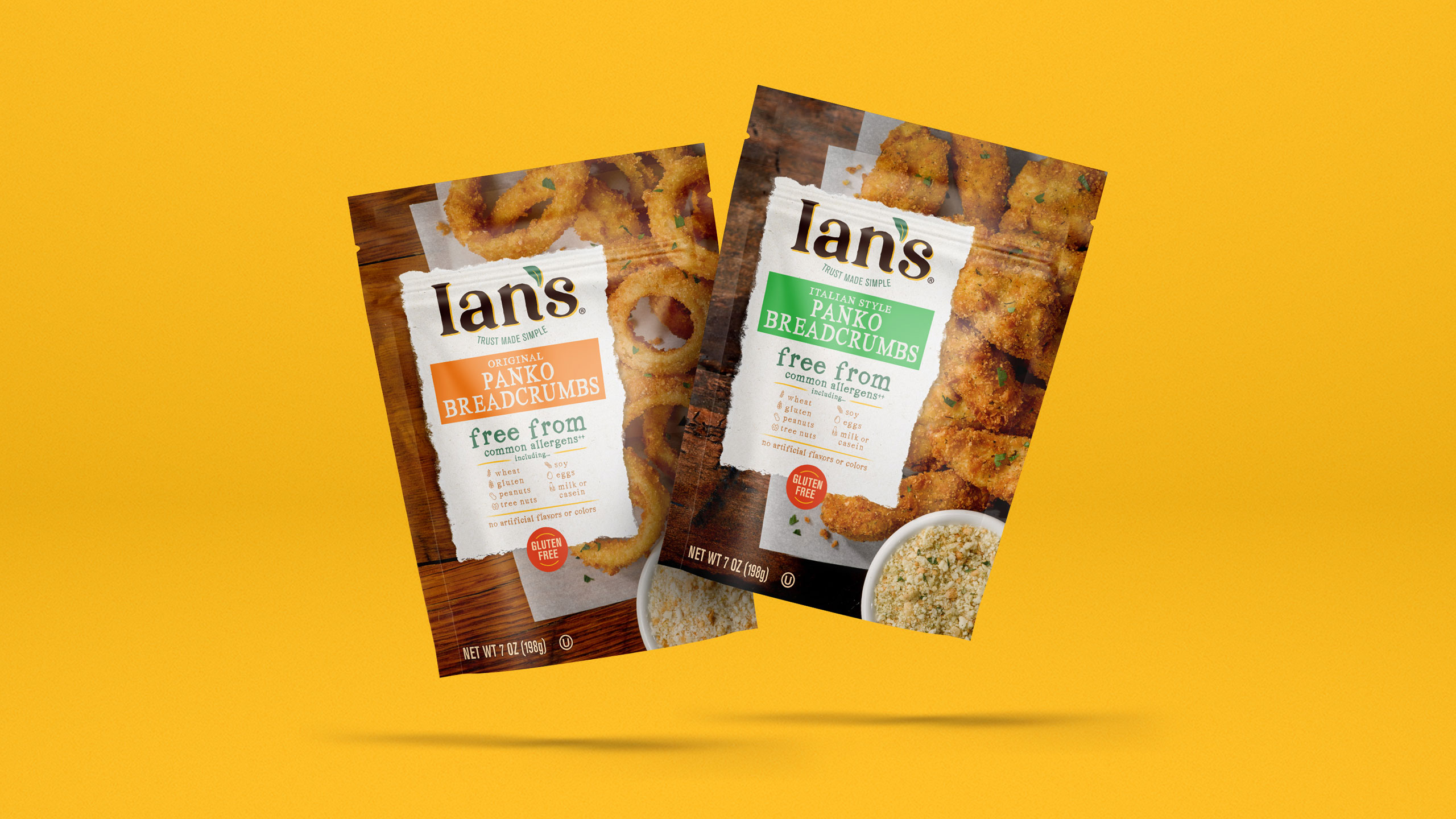
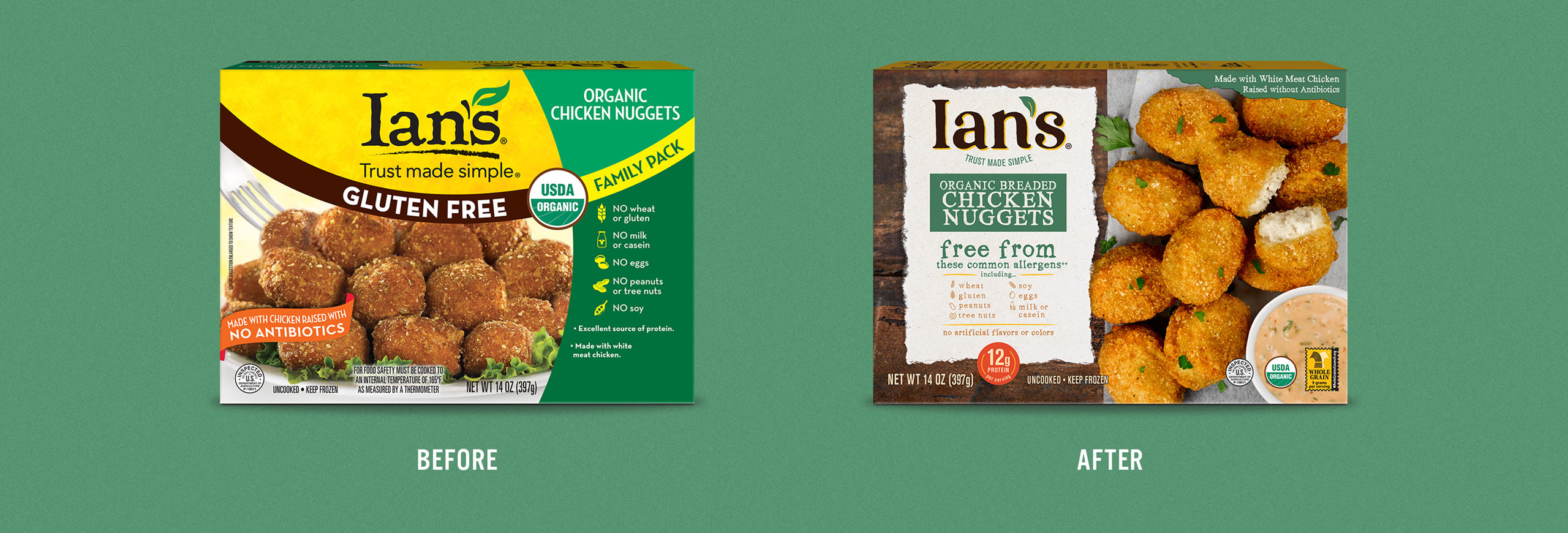
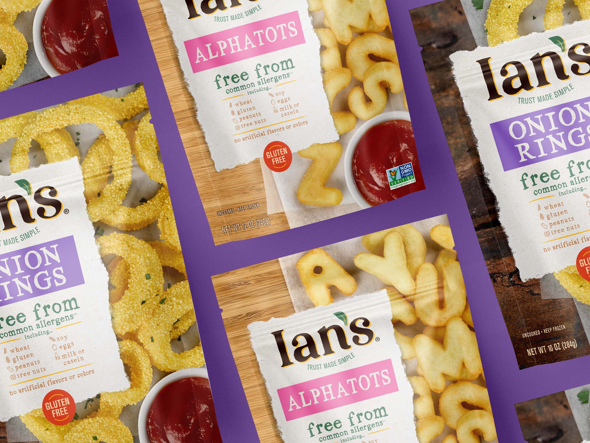
Based on this guiding principle, Ian’s logo was invigorated with on-trend design elements that remain recognizable and anchor their existing customer base, all while more accurately reflecting Ian’s core purpose. The sleek icon and typography is more easily distinguishable to the Ian’s brand, while nodding to the former brand that customers have grown to know and love.

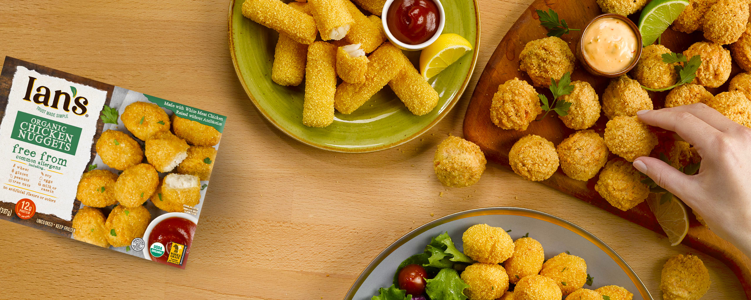
Then, the packaging layout was updated to cultivate a rustic, natural aesthetic reminiscent of home-made, comfort cooking. The product messaging also encompasses all that Ian’s brings to the table, including a more complete list of allergen-friendly categories, while retaining a primary focus on gluten-free.
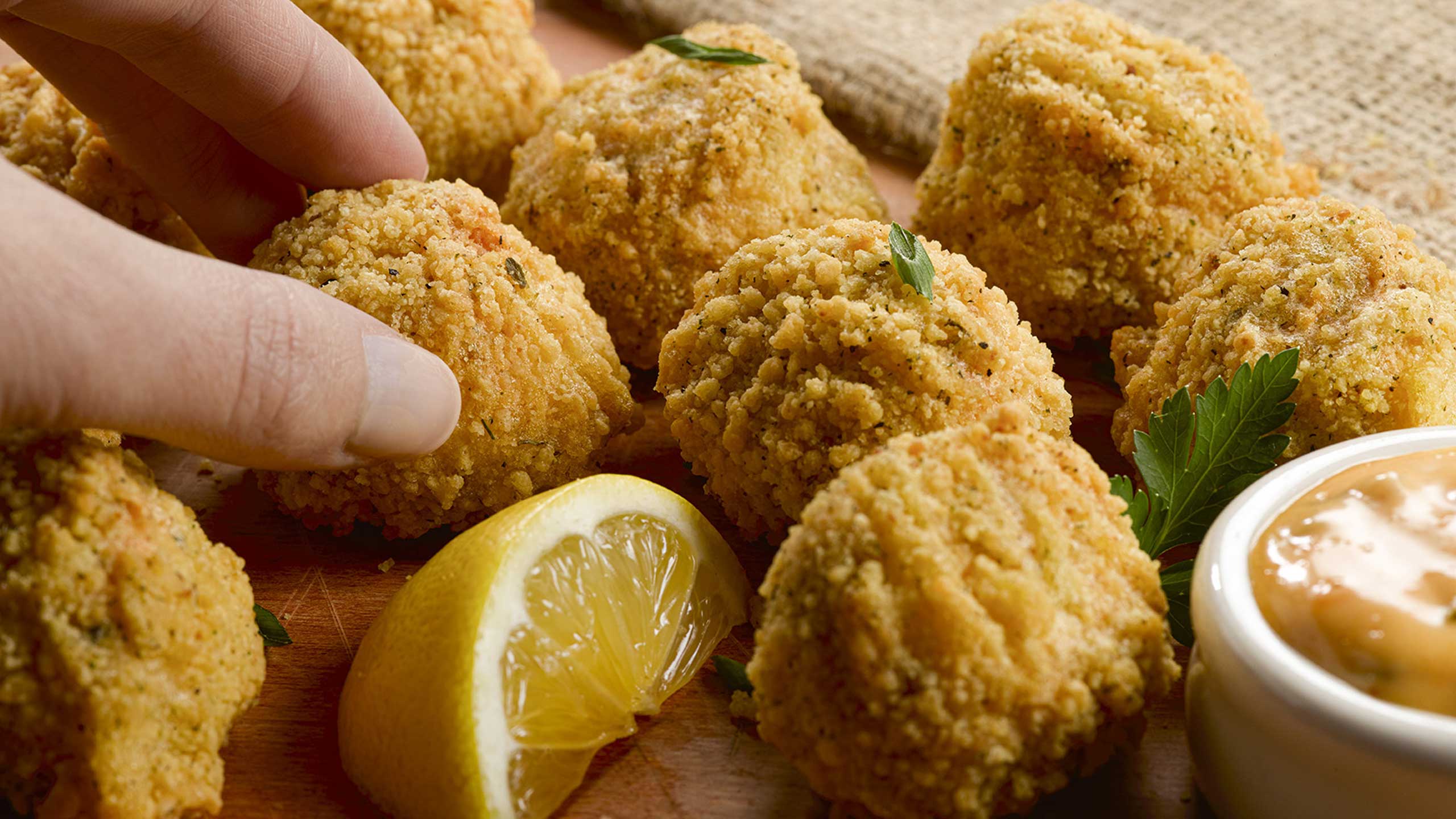
Finally, through high-quality product photography that effectively highlights each flavorful quality of the product, the focus slightly shifts from the better-for-you aspects towards a more taste-driven experience.

Services

  • Packaging Design
  • Adaptation: Full Portfolio
  • Product Photography
Ian’s Foods
Ian’s Foods
Ian’s Foods
Ian’s Foods
Ian’s Foods
Ian’s Foods
Ian’s Foods
Ian’s Foods
Nestlé Drumstick

Nestlé Drumstick

The Challenge

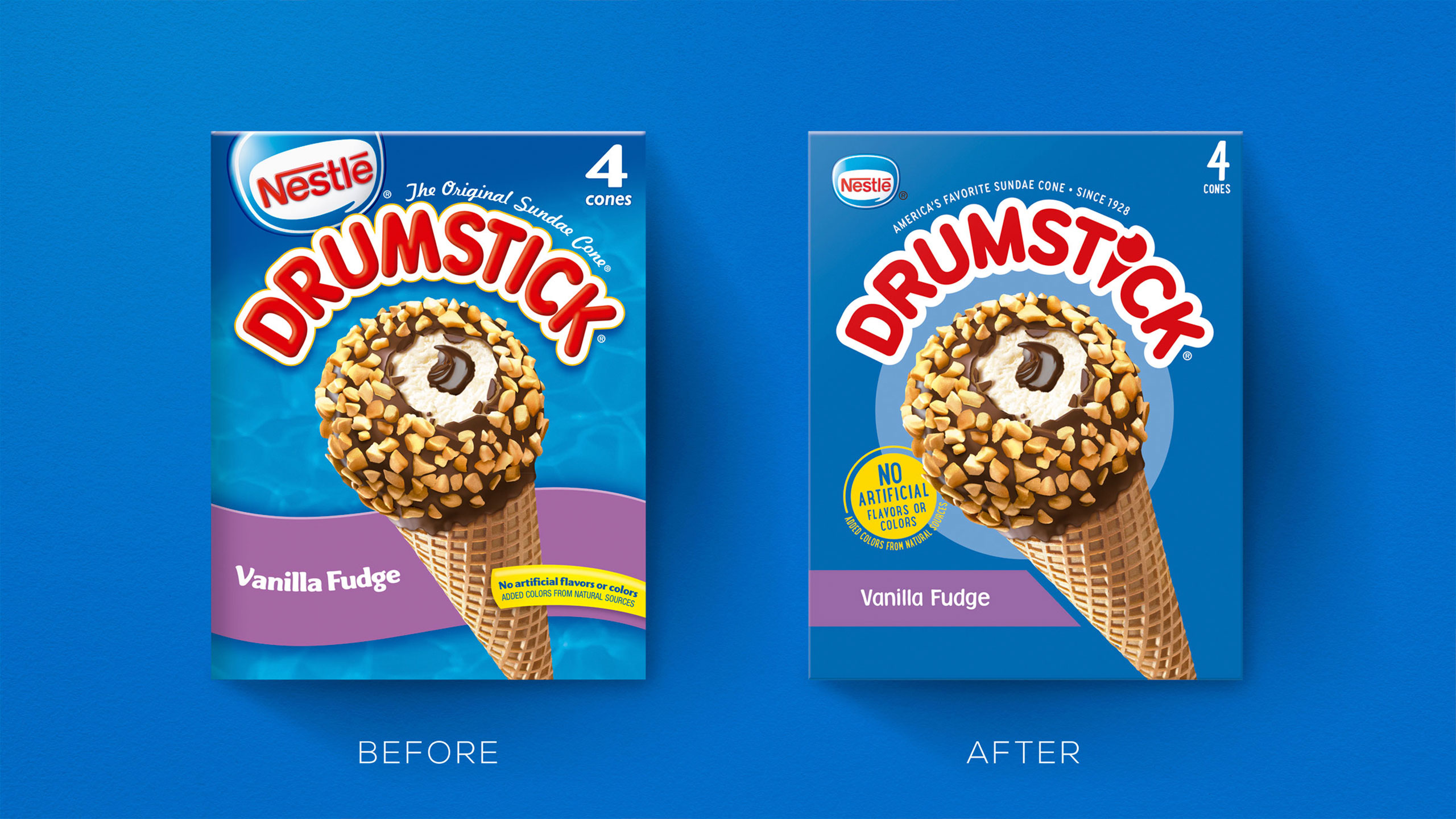
Ice cream brand Nestle Drumstick had recently undergone an evolutionary refresh of their master brand. If that wasn’t enough, they also planned to widely release ‘Crushed It’, their break-through product line of cookie-crumb-coated ice cream cones and bars. From the first bite, these innovative frozen treats proved themselves a truly unique, multi-textural eating experience, unlike anything Nestle Drumstick had released before and unlike anything in the all-family snacking category.

With the opportunity to revitalize and modernize their entire brand portfolio, Nestle Drumstick tapped The GRO Agency to produce creative packaging for their fresh brand identity across all new and existing SKUs.

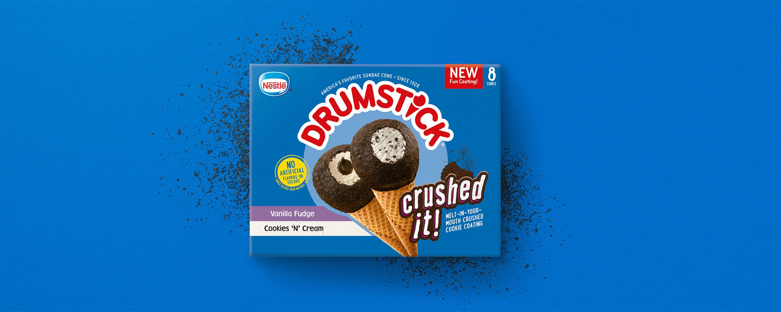
Our challenge with ‘Crushed It’ was to 1) visually communicate what a delight that first bite of ‘Crushed It’ feels like for the consumer, 2) distinguish packaging concepts and graphics from their existing offerings, and 3) build on their existing brand to remain recognizable within the Drumstick brand universe.

The Solution

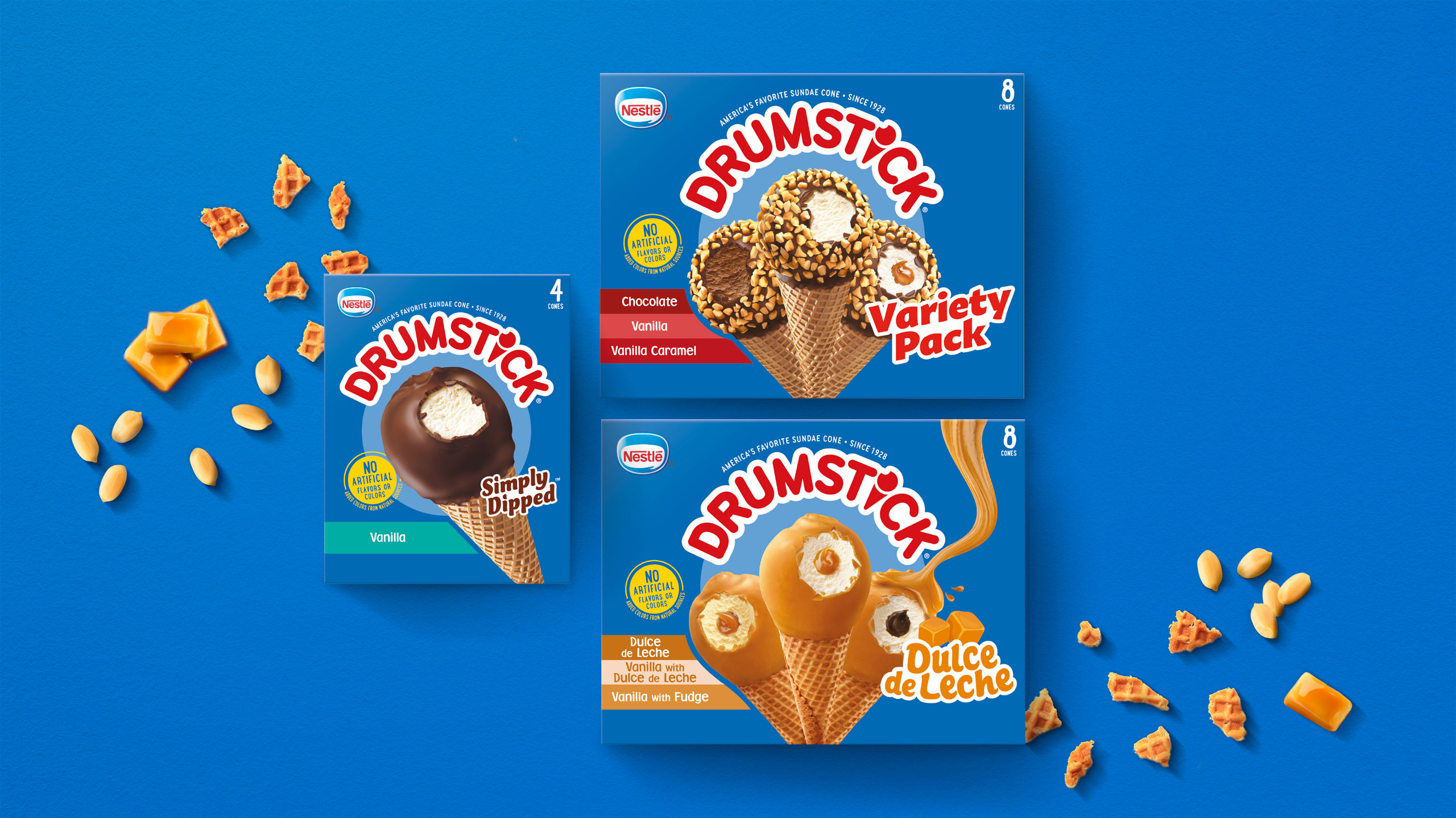
Driven by consumer insights, we created a new visual and verbal strategy that would adapt and refine the new design across the whole Drumstick portfolio, including the ‘Crushed It’ product line.

First, to vividly communicate the unique feeling and texture of that first, delectable, melt-in-your-mouth bite, our team fabricated a product-specific logo leveraging the same recognizable color palettes and layout of the core brand. As it doesn’t resemble any existing Drumstick logo, this sub-logo both differentiates the packaging to catch the eye, while also reinforcing the product experience.

Next, the product messaging invites consumers to indulge and experience, not merely sample, the finely-coated ice cream snack. When it comes to dessert, we find that taste and indulgence are primary decision-drivers. Finally, in show-don’t-tell fashion, we broadcasted the enticing product photography front-and-center to illuminate a sweeter life after that first bite.

Services

  • Sub-Line Logo Design
  • Packaging Design
  • Adaptation: Full Portfolio
  • Packaging Production
  • Product Photography
  • Point of Sale
The GRO team jumped into a rush redesign project for Drumstick and executed with precision and speed. Their attention to detail and deep packaging production experience allowed us to meet our deadline with a bolder, new look for this iconic brand.

Brian Lemco
Packaging Project Manager
Dreyer’s Grand Ice Cream

Nestlé Drumstick
Nestlé Drumstick
Nestlé Drumstick
Nestlé Drumstick