Happy Moose
The Challenge
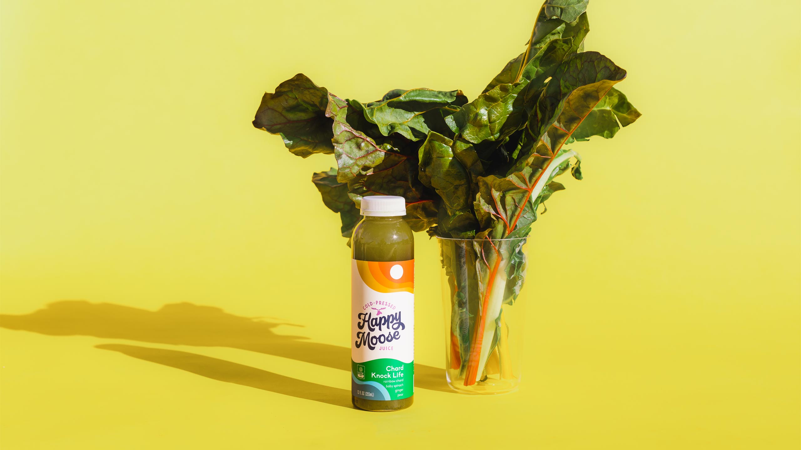
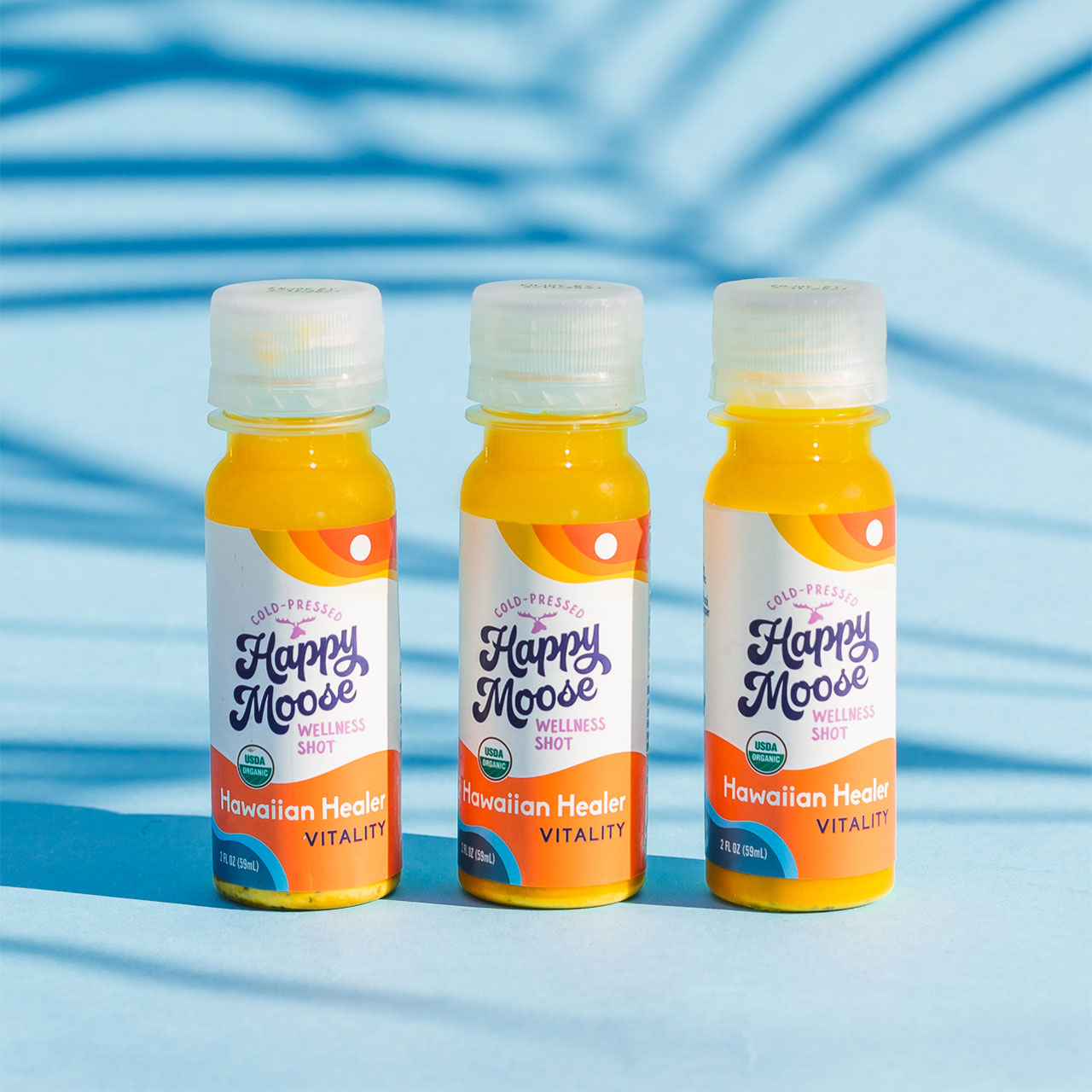
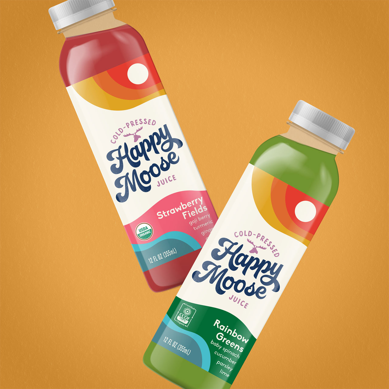
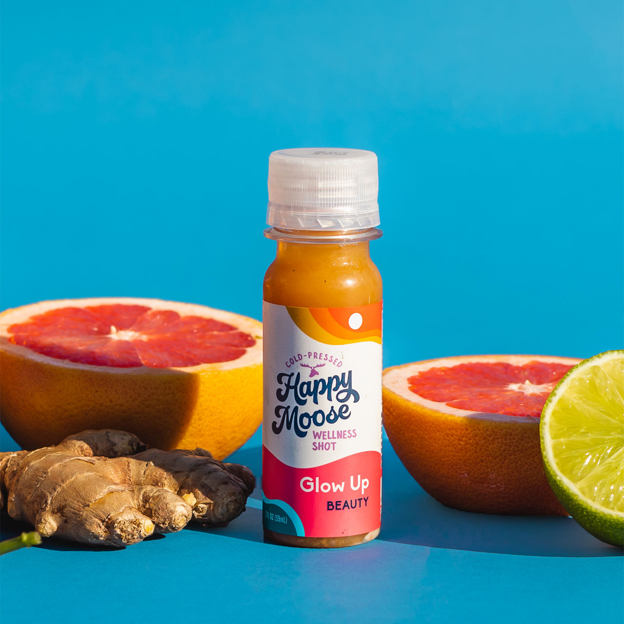
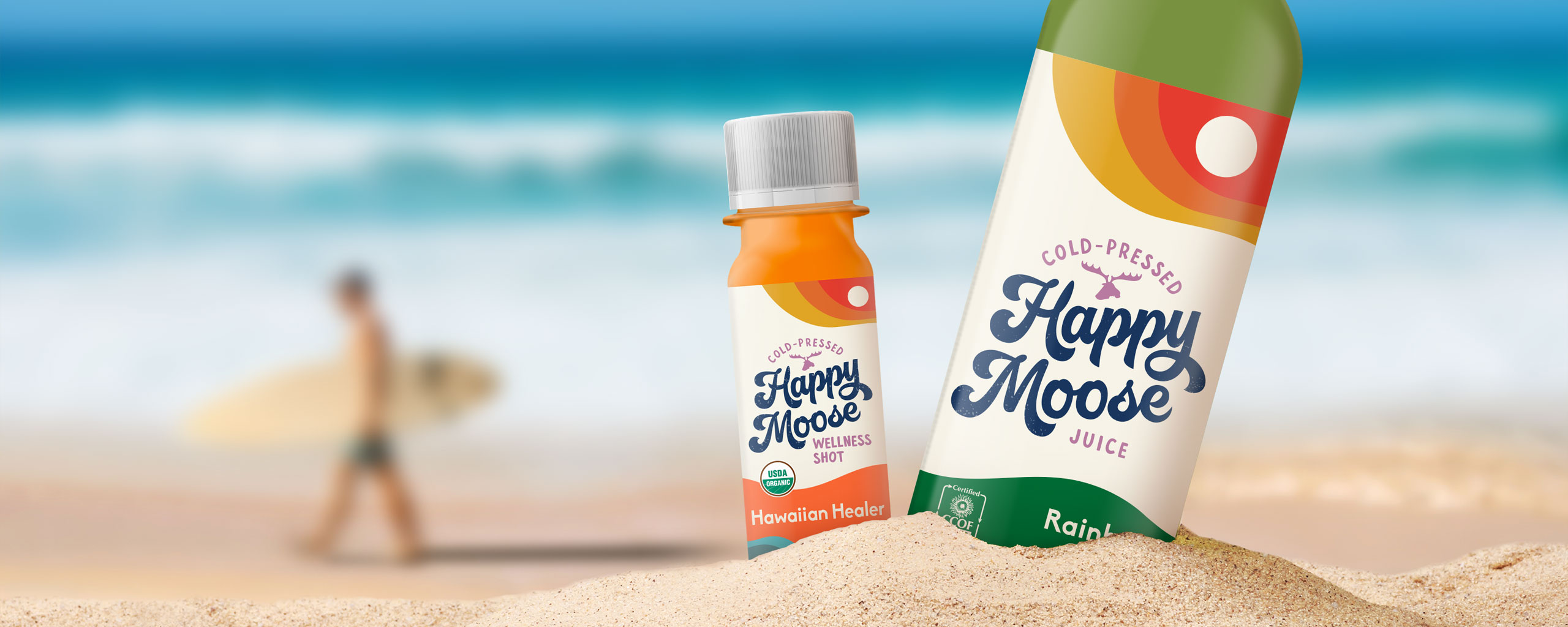
Cold-pressed juice brand Happy Moose squeezed a better juice, but without a clear visual identity, the audience found themselves hard-pressed to choose Happy Moose over their competitors. With rows and rows of juice options on the shelves, the juice brand wanted to update their packaging design to tell a more engaging brand story.
With an opportunity to stand out as a premium contender in the juice market, Happy Moose tapped The GRO Agency to align the brand essence and update the product packaging.
Our challenge with the Happy Moose packaging rebrand was to develop unique brand visuals and messaging that authentically told the Happy Moose story, as well as clearly communicate all the health benefits of drinking Happy Moose cold-pressed juice, in a way that audiences would care about.
The Solution
When defining and distilling a brand identity, oftentimes the best inspiration comes from within. In this case, the Happy Moose brand identity borrowed directly from the creative background of the music-loving founder himself.
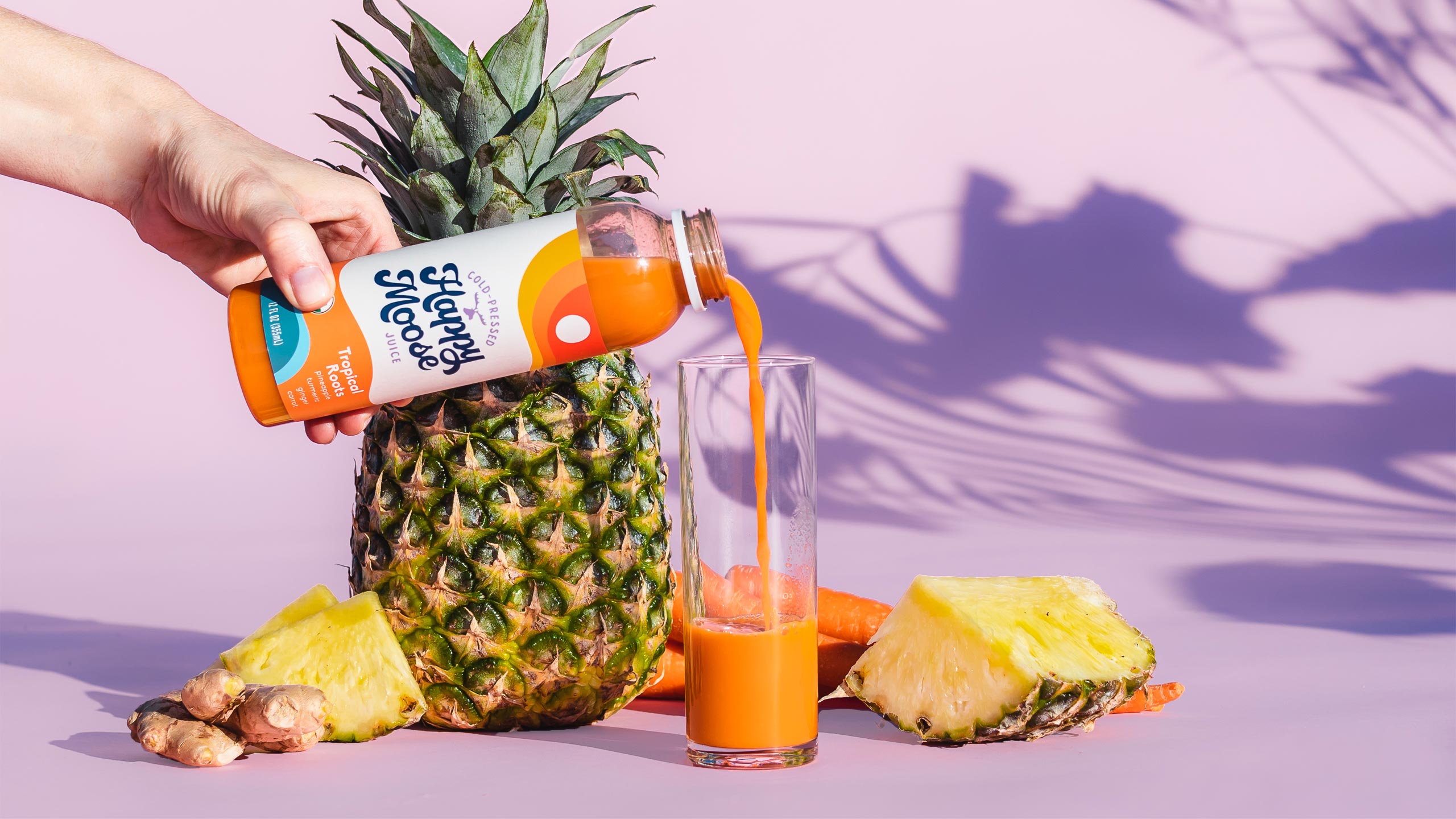
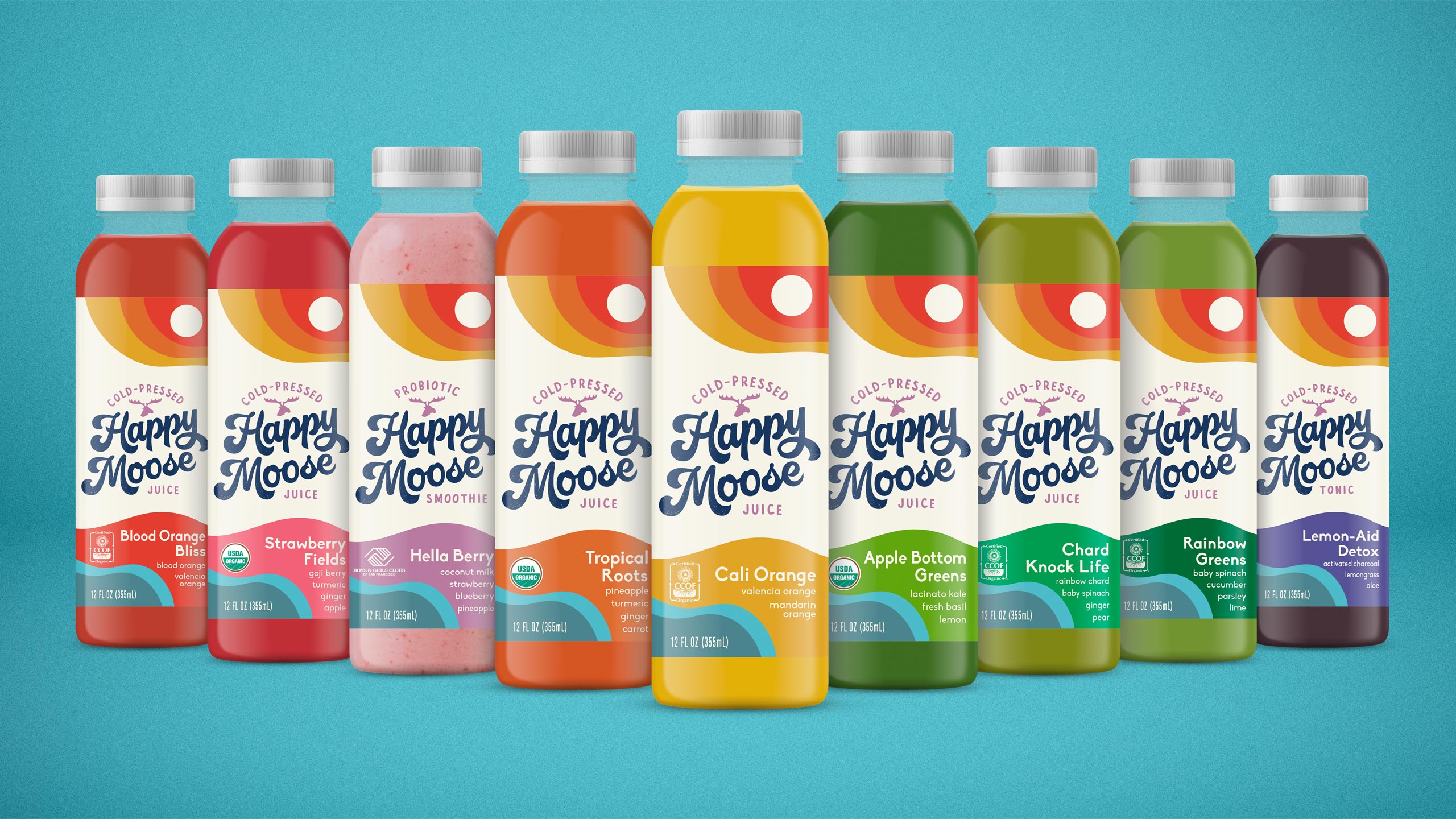
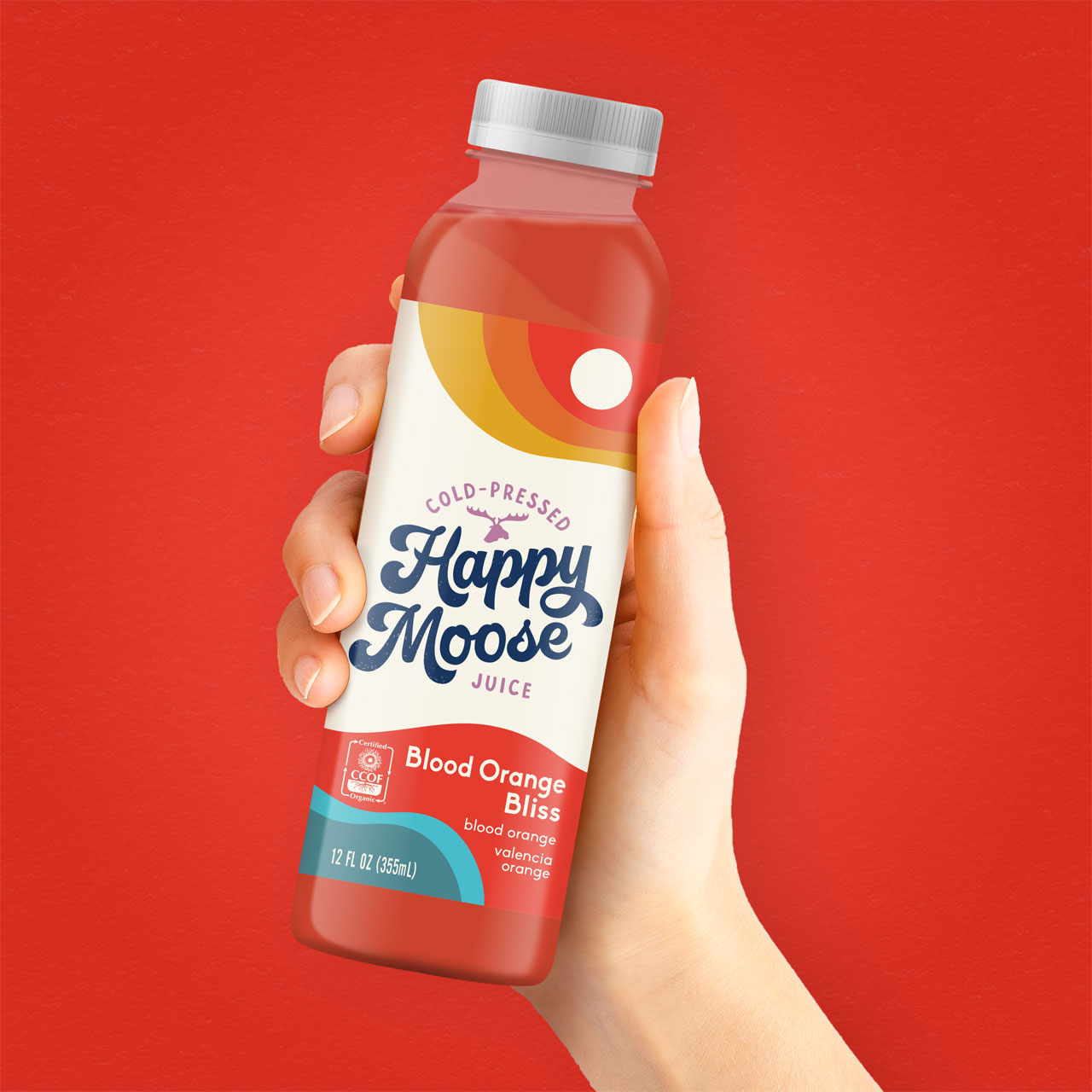
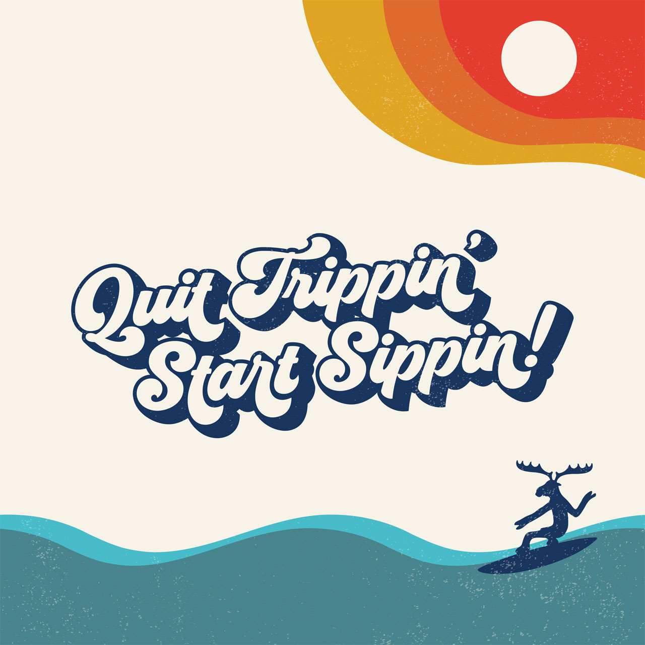
First, borrowing from the vintage aesthetics of Dogtown, the Z Boys, skate culture, and the artistic expressions of the Californian 70’s, the Happy Moose visual language and color scheme reflected all the unique aspects of a romanticized era. With ocean waves and surfing moose, the product packaging became a promise to quench your thirst and have fun doing it.
Next, pinning the musician-turned-entrepreneur at the center of the brand strategy, the Happy Moose verbal strategy took on an organic voice of its own – Not only to describe its unique flavor combinations and heirloom ingredients, but also to communicate the nutritional benefits of cold-pressed juice in a way that customers could digest.
Finally, engaging a wide audience of eco-conscious juice drinkers, the product messaging made mention of the community partnerships that made Happy Juice special, including support from organic farmers and national organizations.
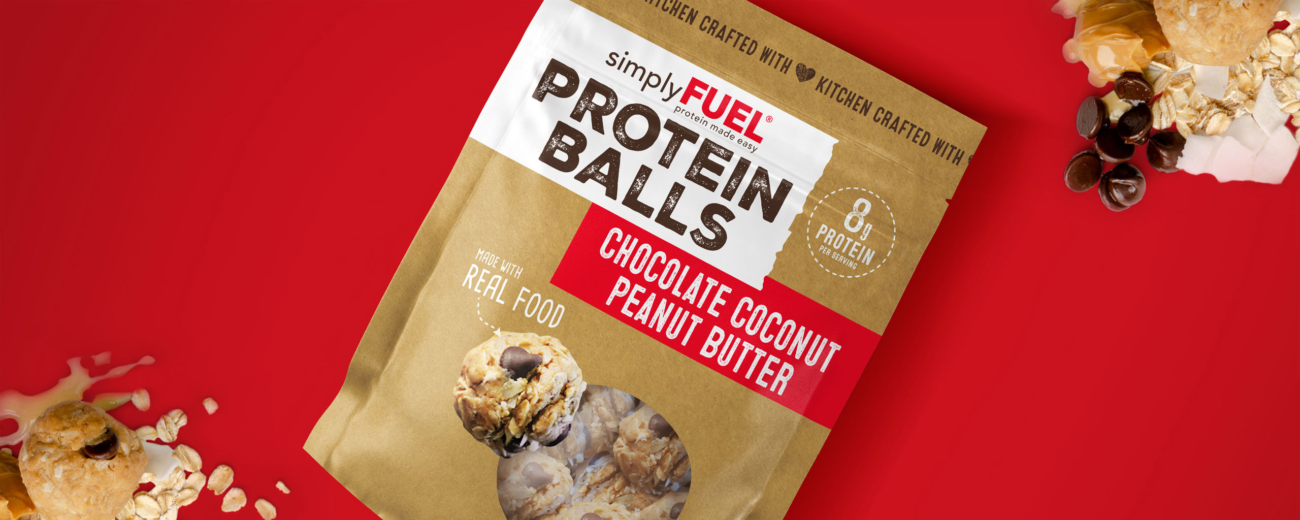
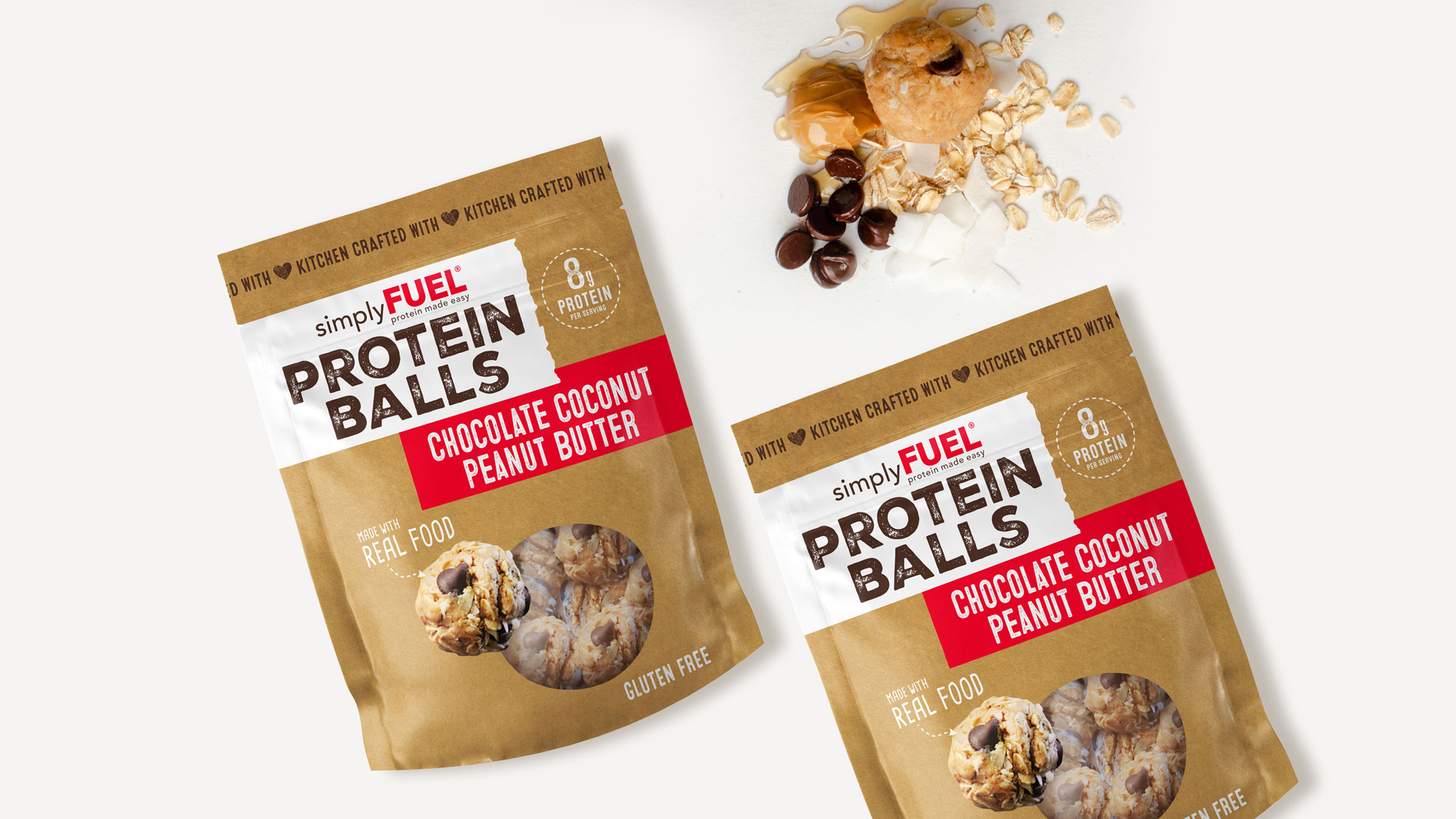
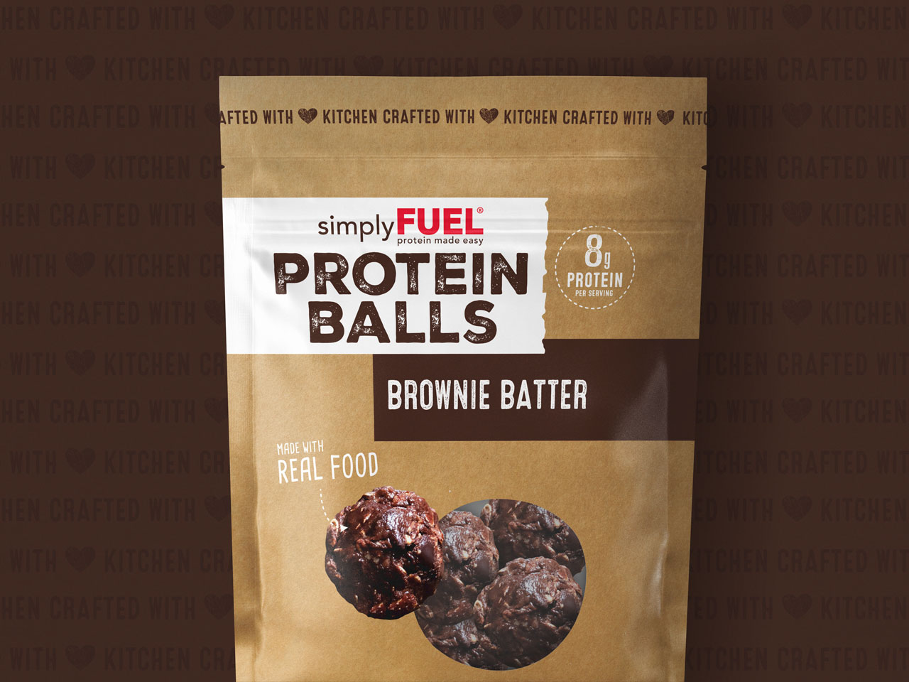
Services
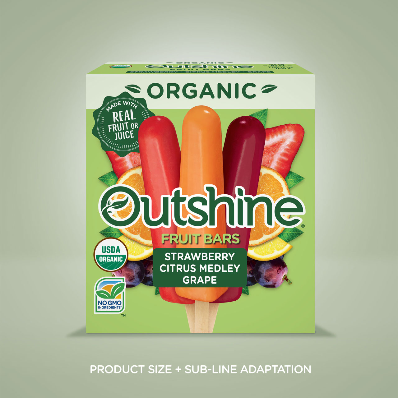
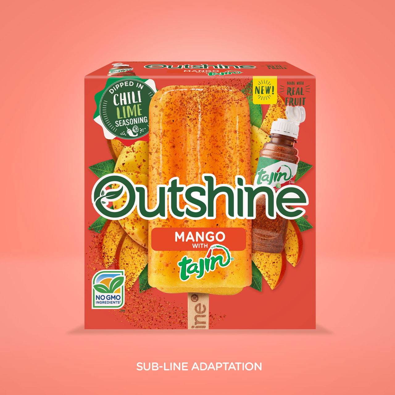
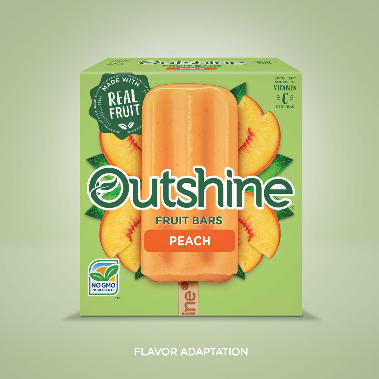
- Packaging Design
- Flavor/Size Adaptations
- Packaging Production
As an emerging CPG brand, I am so happy that we decided to work with GRO on our recent brand refresh and packaging design project. Along with having many talented designers in their arsenal, Kelly and Danielle are simply amazing humans to work with. They approach the project with loads of empathy for the founder/brand and when we needed to have tough conversations, they never failed to foster a client-first mentality.
Ryan Armistead
Founder Happy Moose