Hershey Kit Kat

Hershey Kit Kat

The Challenge

When we started working with Hershey, they already had a strong portfolio of cause marketing programs and wanted to build a new program around Black Music Month. They had an idea to extend their platform to the communities in Tennessee, where their manufacturing plant employed hundreds of community members.

With projects like this, we encourage our clients who want to launch DEI campaigns to rethink an approach for momentary impact on sales by considering embodying DEI values as a permanent fixture in their marketing approaches—caring about affected communities and the faces that come from there and still reside there. Hershey was already practicing this philosophy making our job a little easier! 

Our challenge was to develop a campaign that was authentic and supported black communities without Hershey being seen as taking advantage of the cause simply for monetary purposes. We did some light consumer research and found that Hershey was seen as neutral or not seen as a firm supporter of BIPOC communities. Even with DEI programs in place at the corporate level and programs that help youth. Knowing this we needed to ensure that whatever the program was it connected to communities AND supported black people throughout the process.

The Solution

The concept we landed on provided a unique opportunity for Hershey to contribute to local organizations AND support black illustrators. We proposed limited edition packaging using black illustrators and a charitable donation to an organization that supports youth through music. 

The initial test program honed in on working with one organization, Memphis Music Initiative, a Memphis Tennessee non-profit that provides music programming and support for local youth. The program was a great success during its limited trial in Target stores in 2022 and was further expanded for 2023.

What began as a six illustration, one organization program launched in select Target stores is now a national program with six cities, six organizations, and a growing number of retailers with a total $13M buy-in. Some participating retailers include CVS, Kroger, Meijer, Rite Aid, Target, Walmart, Stop N Shop, Walmart, and 7-Eleven.

Finally, discovering and working with the illustrators and seeing the growth in their careers has been a fulfilling experience. We’re proud to support these strong artists and look forward to future programs that elevate and focus on the foundational roots of music in this country.

Services

  • Campaign Marketing Concept
  • Packaging Design
  • Illustration
  • Point of Sale

6 cities

across the US with 6 non-profit organizations supported. There were 171 earned placements and 36K unique visitors to the landing page, in one month.

Hershey Kit Kat
Hershey Kit Kat
Hershey Kit Kat
Hershey Kit Kat
Hershey Kit Kat
Hershey Kit Kat
Hershey Kit Kat
Hershey Kit Kat
Hershey Kit Kat
Hershey Kit Kat

Why It’s Time to Uplevel Your Store Brand Packaging

All Insights

Why It’s Time to Uplevel Your Store Brand Packaging

April 6, 2023

If you’re not buying Kirkland pants, laundry detergent and peanut butter pretzels all in one shopping trip, are you even doing it right? 

From the last few months of 2022 to now Numerator tells us that, “total CPG private label dollar is up compared to [2021] across all income groups.” Specifically, baby, grocery and household categories are up; hence, successes at larger box stores like Costco and Sam’s Club. The pandemic and, now, inflation are pushing consumers to look for ways to save. And, again, this includes ALL income groups.

Considering all income groups (low, middle and high), Numerator also tells us that it’s the middle and high-income households who are purchasing private labels because they have seen its quality improve over time, and they’re looking for ways to save money. According to Nielsen IQ, “When inflation peaked in October [2022], value-based retailers’ sales jumped by 10%, capturing 42% of CPG sales. This coincided with private label CPG sales now accounting for 19% of total CPG sales worldwide and nearly 15% in the US.”

If CPG private label demand is up, this also means competition is rising. So what should you be doing to uplevel your brand’s packaging and overall identity and reputation?

Create a Private Label Brand Strategy

Without the reassurance that this hot private label trend will stick, you need a strategy around making your own brand’s goods stand the test of time and to compel shoppers into becoming loyal brand advocates.

The pandemic forced some consumers into becoming first-time buyers of store brand goods. They were, sometimes, the only options left on the shelf. Since then, many have seen the value of sticking with those brands for multiple reasons: 

  • They realize the quality is just as good as big brand names, because, often, the ingredients are just the same, if not better.
  • The obvious money saver became a no brainer once they realized they weren’t skimping on quality.
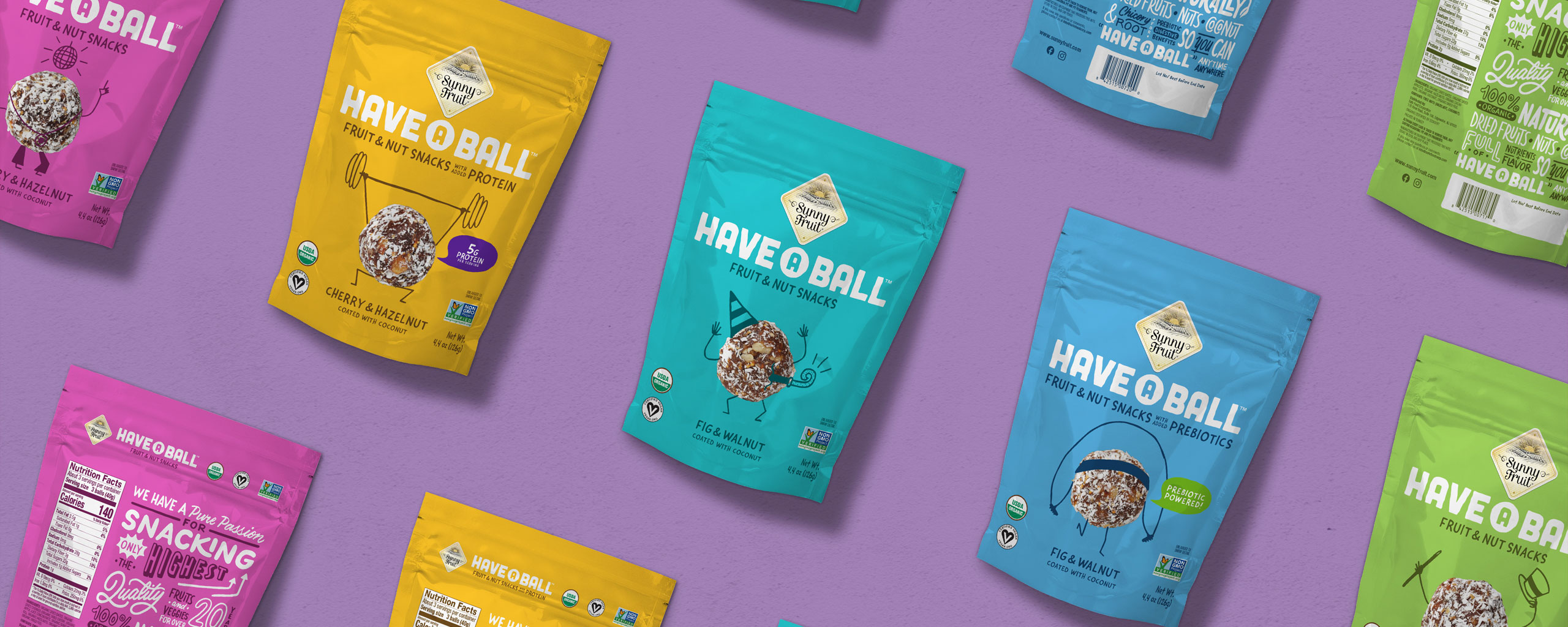
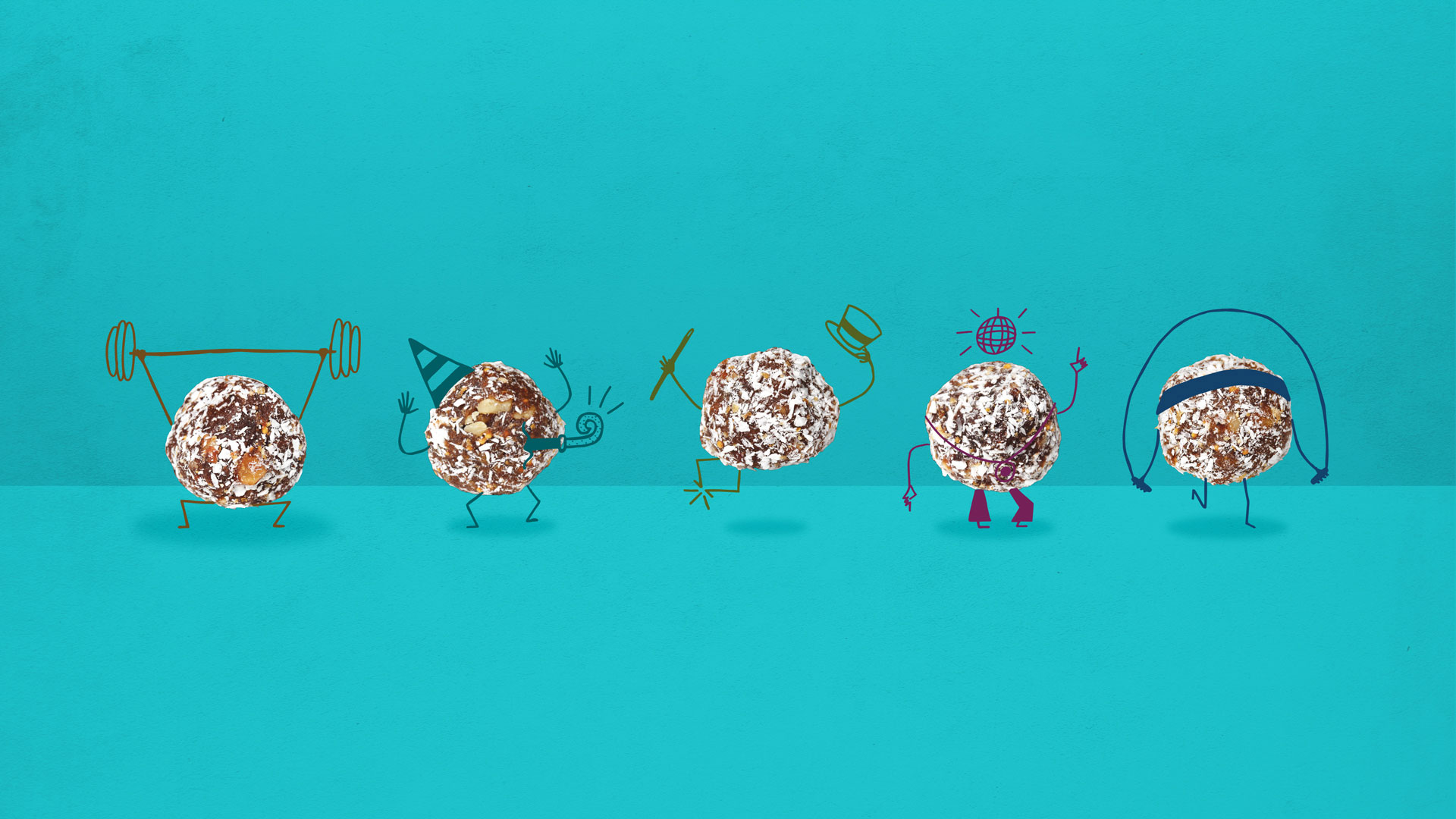
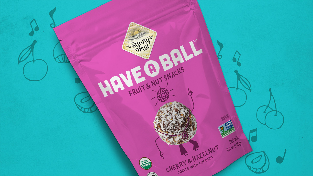
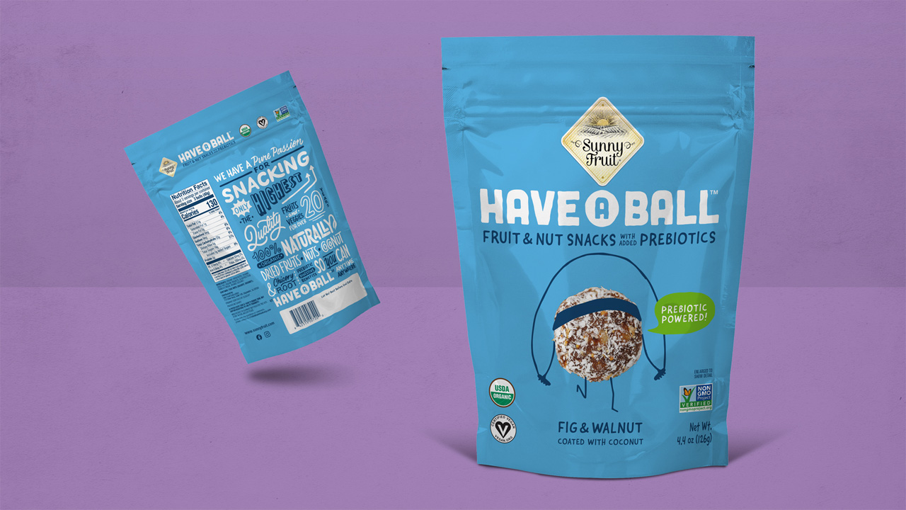
  • Some private label packaging has matched their creative design and visual messaging to the product quality, and consumers don’t feel embarrassment when dropping products in their cart.

But not every brand has elevated their packaging design to their product quality. Therefore, potential first-time buyers are hesitant to reach for that can.

So, a strategy is needed for compelling first-time buyers of a private label product along with a strategy to turn those buyers into loyal purchasers, and, finally, brand advocates (whom we can now call, modern-day influencers).

“Retailers that seize this moment to reset their private-label strategies can translate short-term switching behavior into long-term customer loyalty.”

McKinsey & Co.

Now is the time to create aspirations for what your own brand could be.

  • Conduct market research and observe consumer behavior to truly discover who your target market is. 
  • Definite your brand’s value proposition and differentiation from national brands.
  • Set goals for margin and penetration rates.
  • Adjust organizational structures to shift a higher focus on private labels.
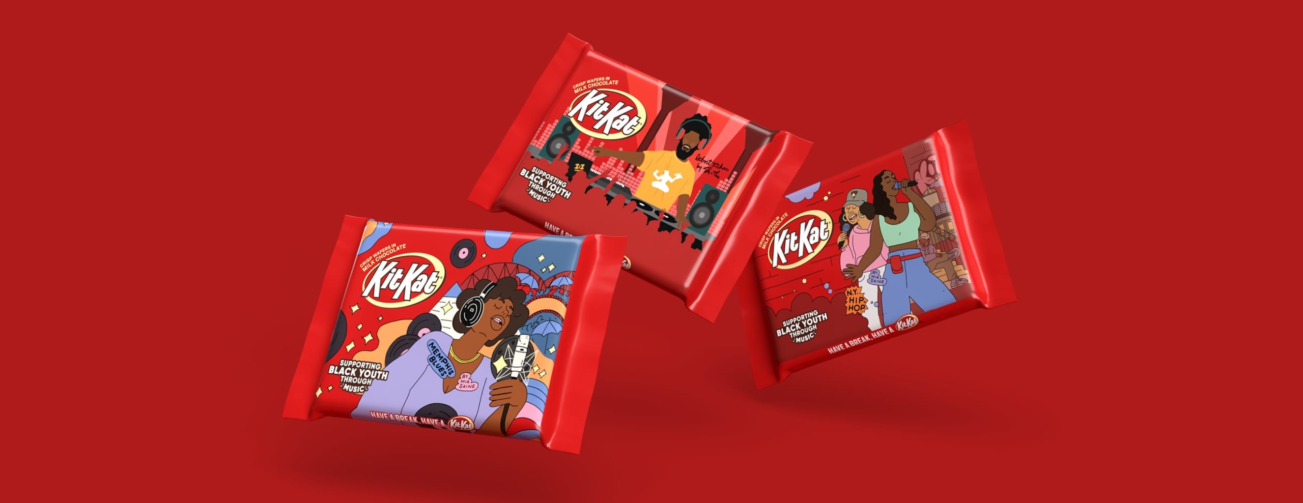
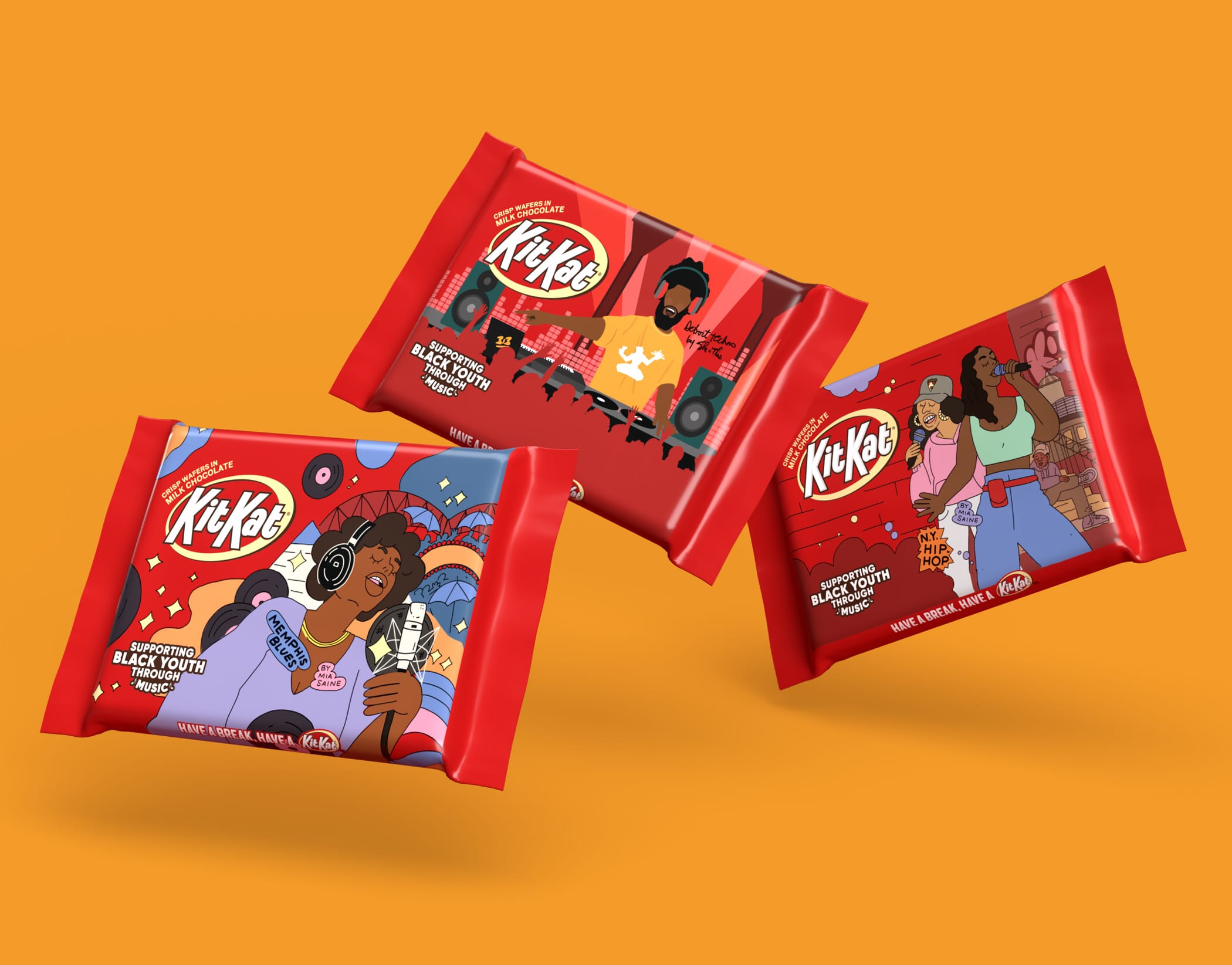
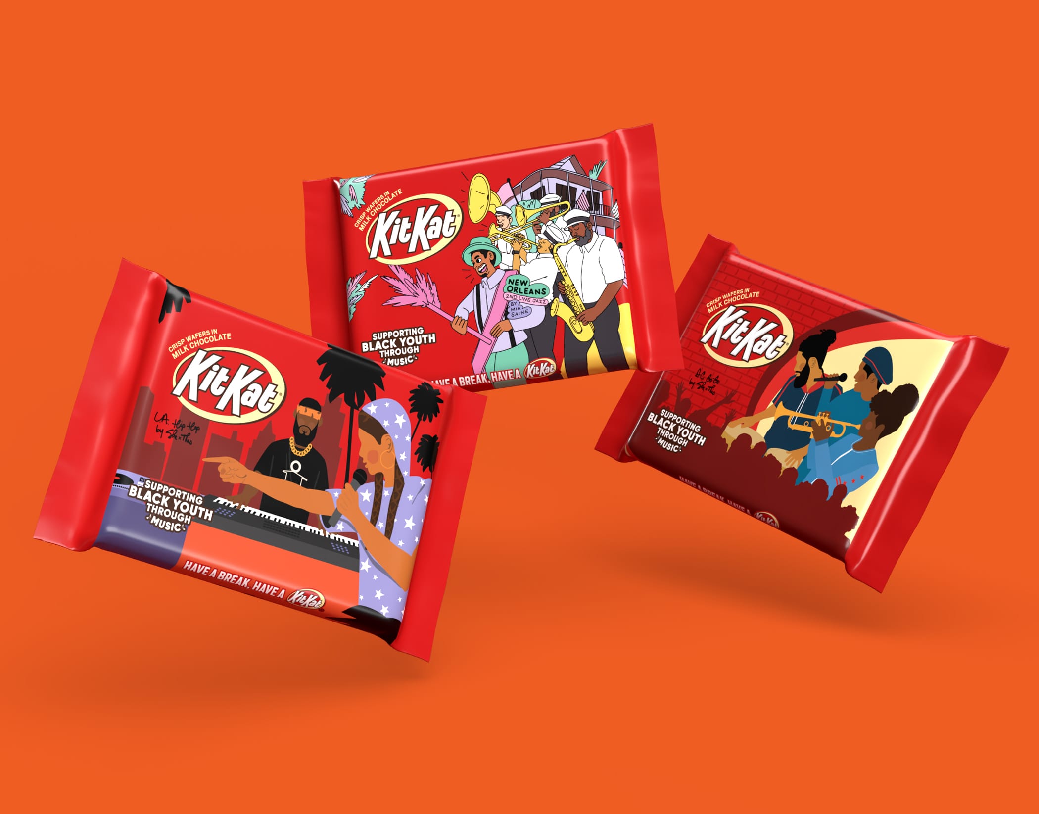
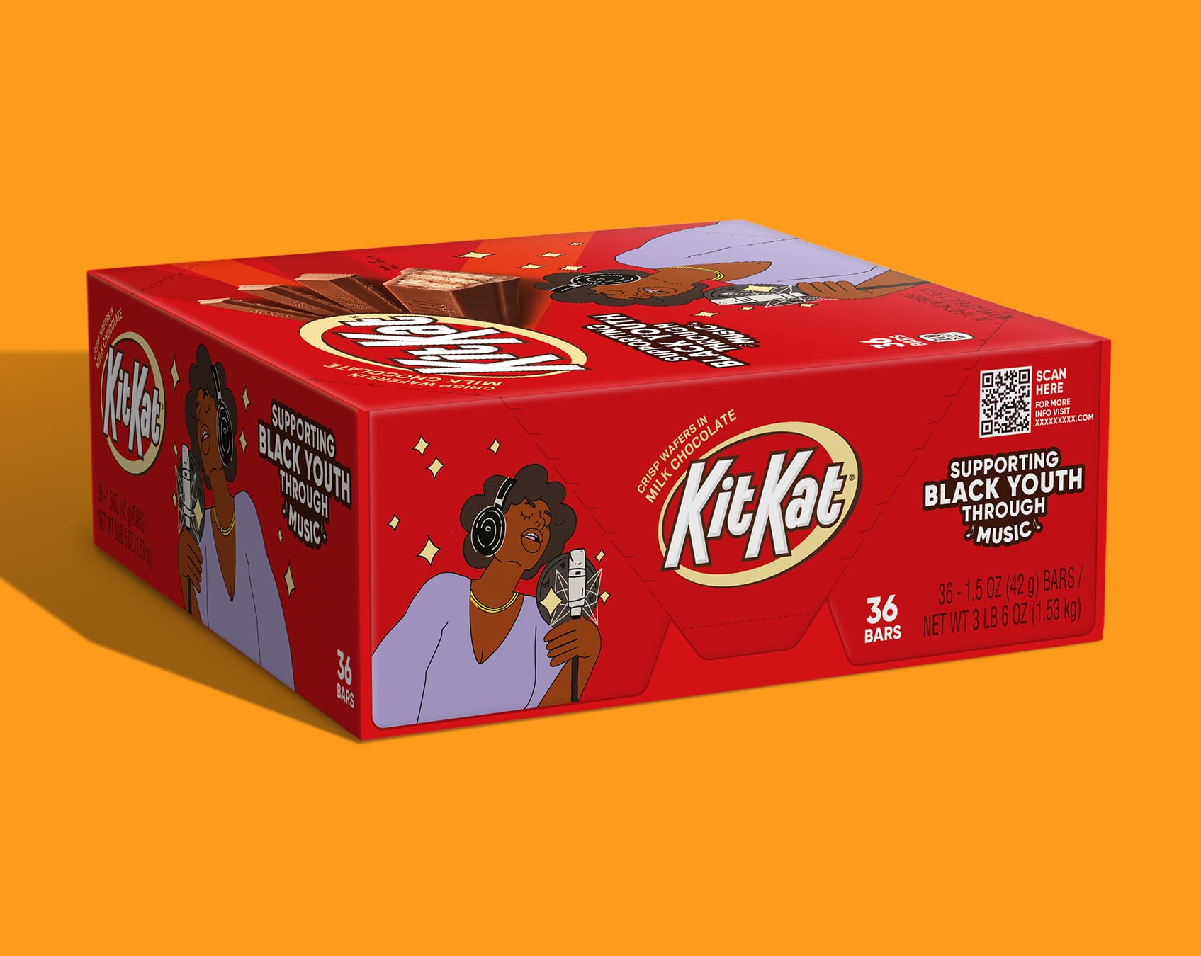
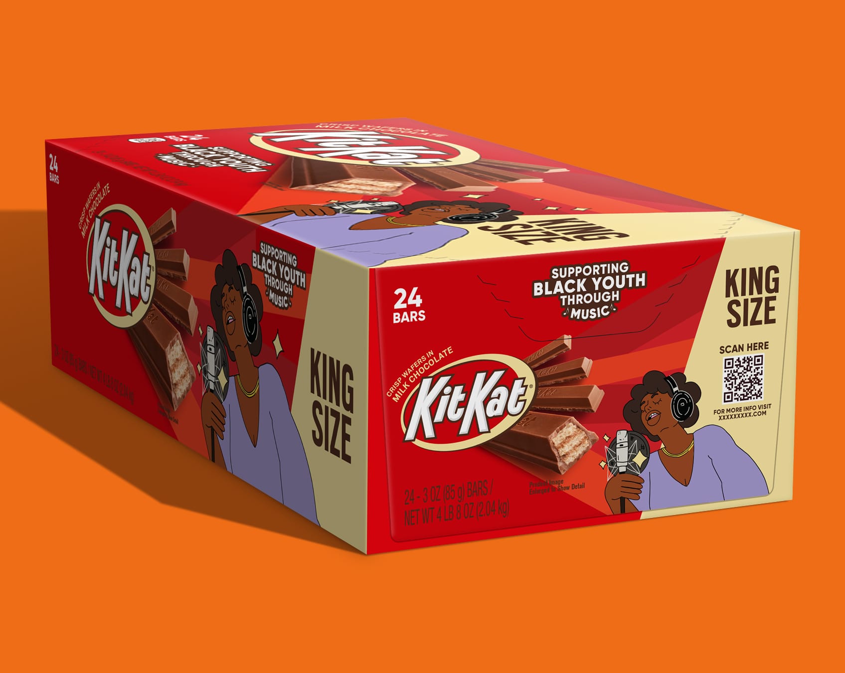
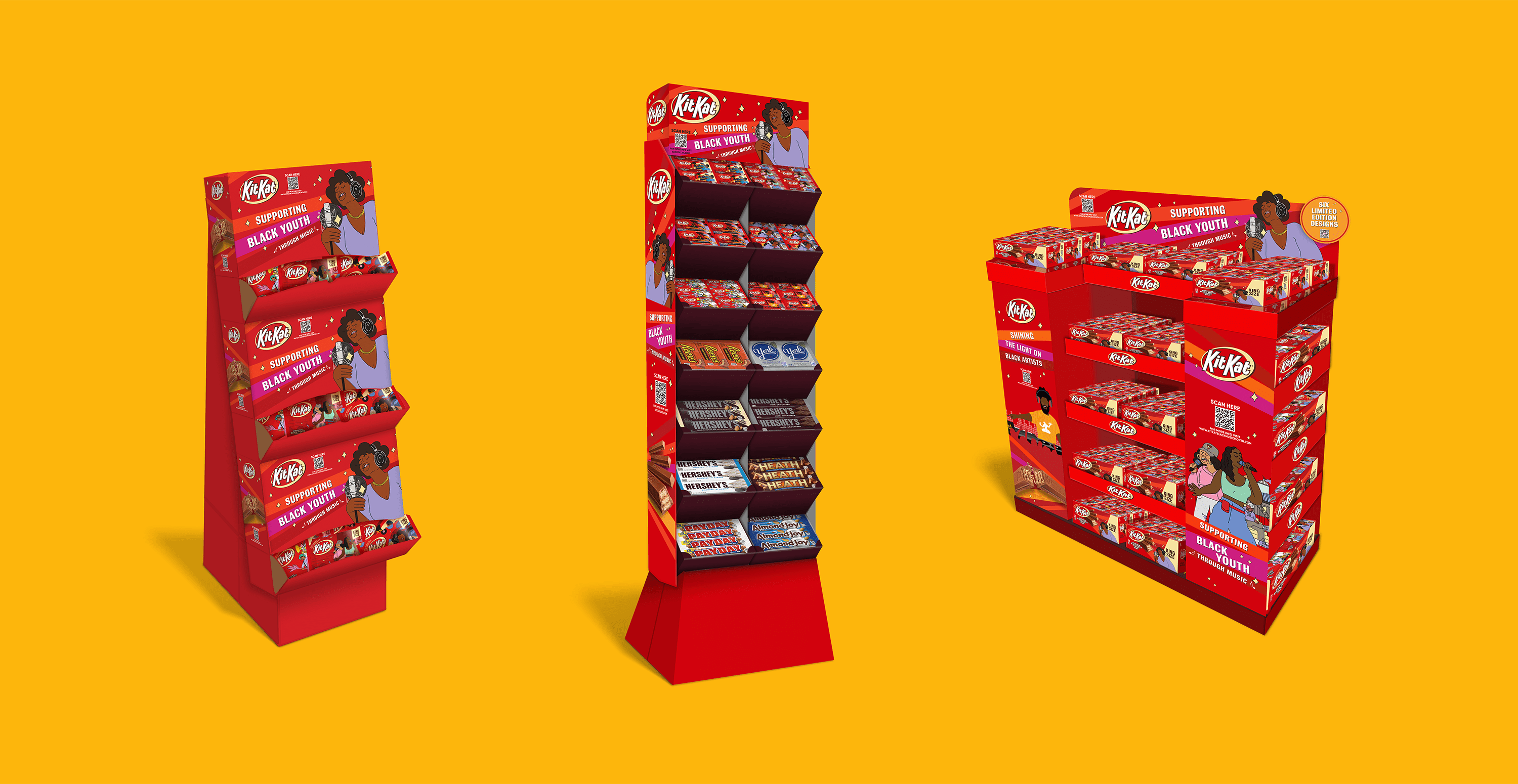
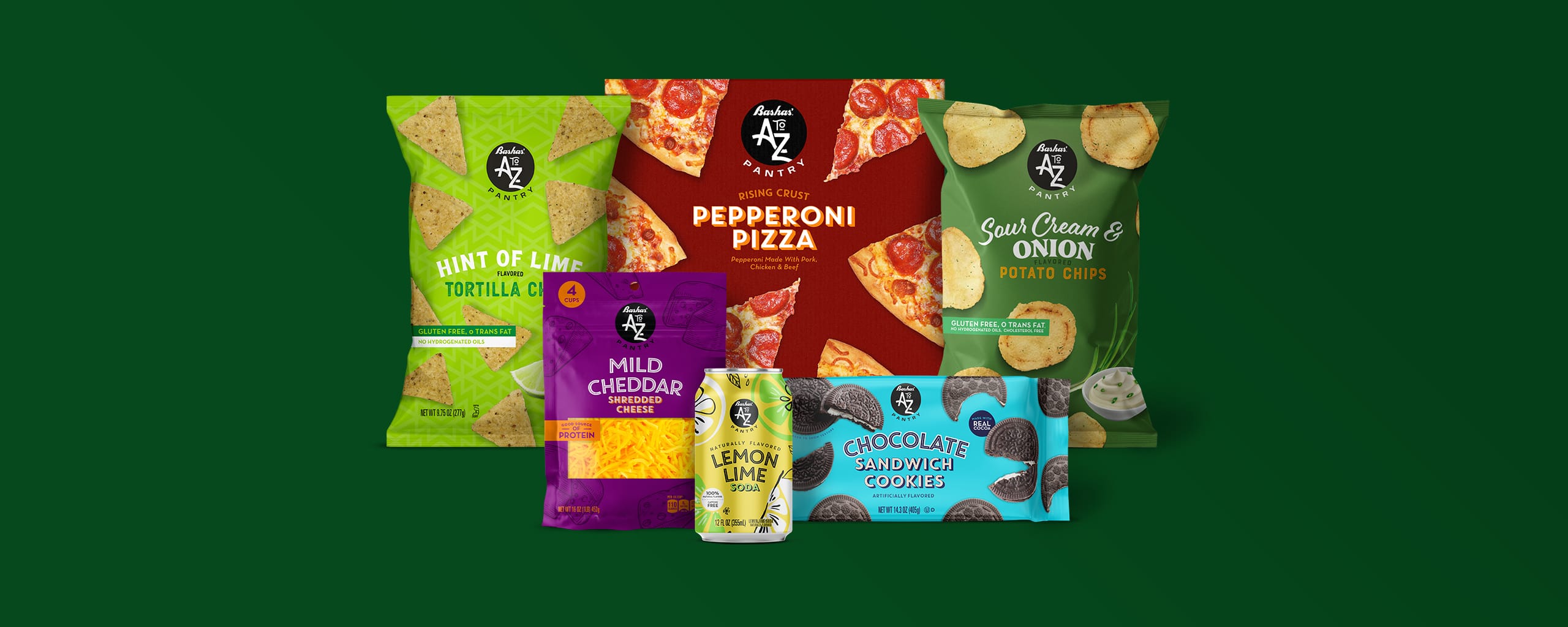
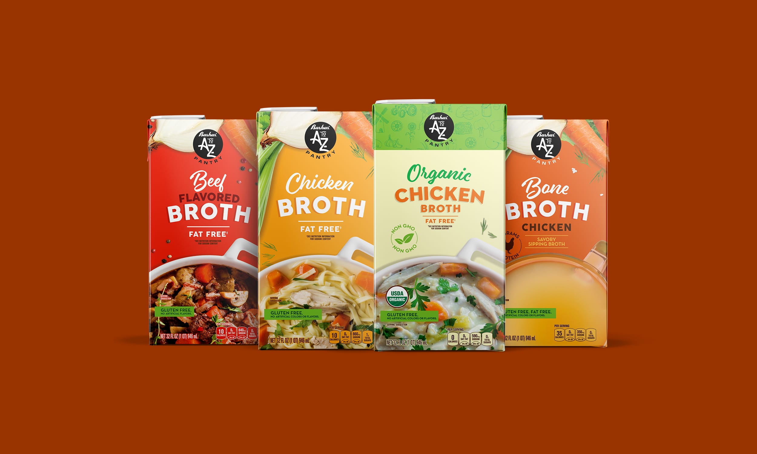
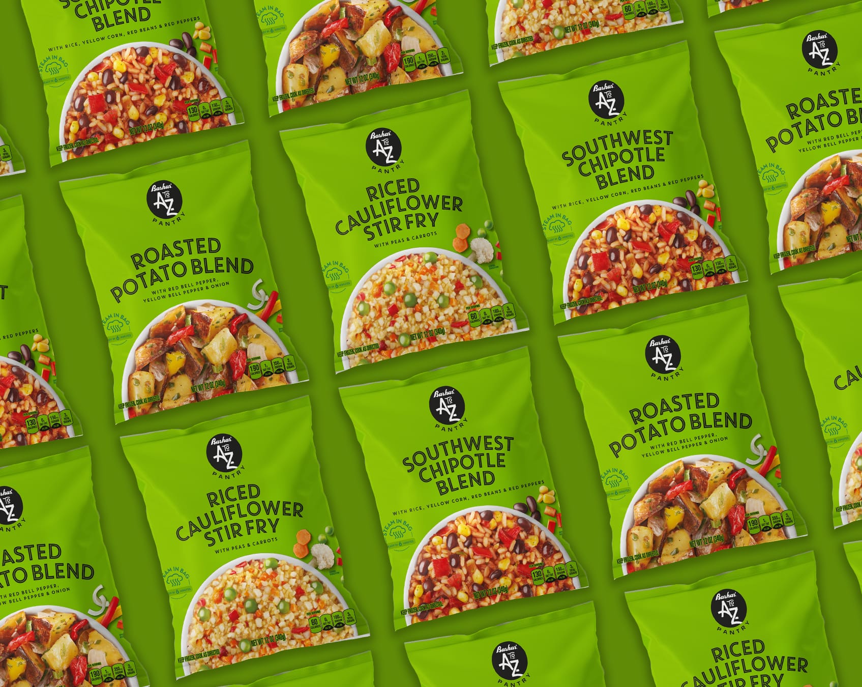
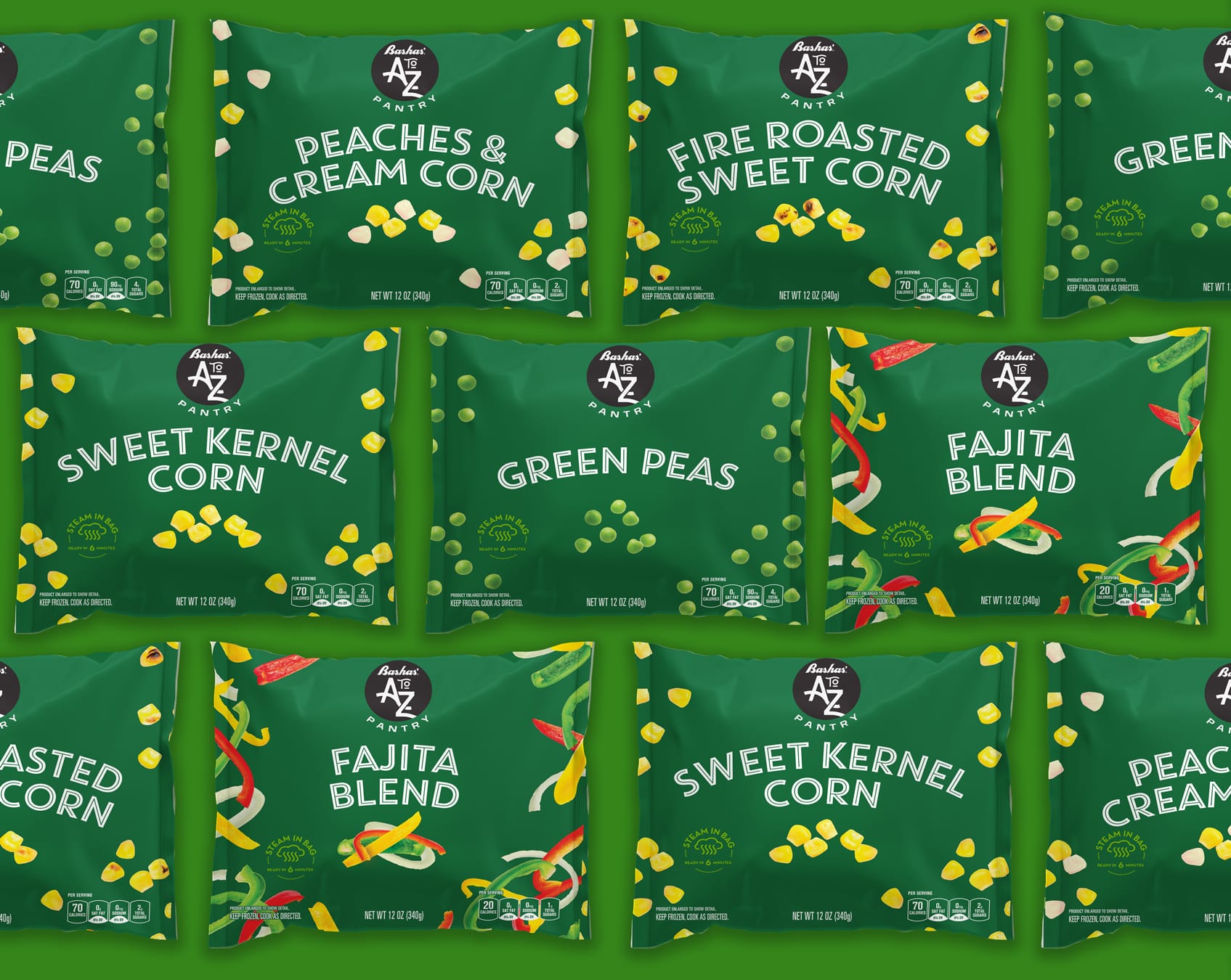
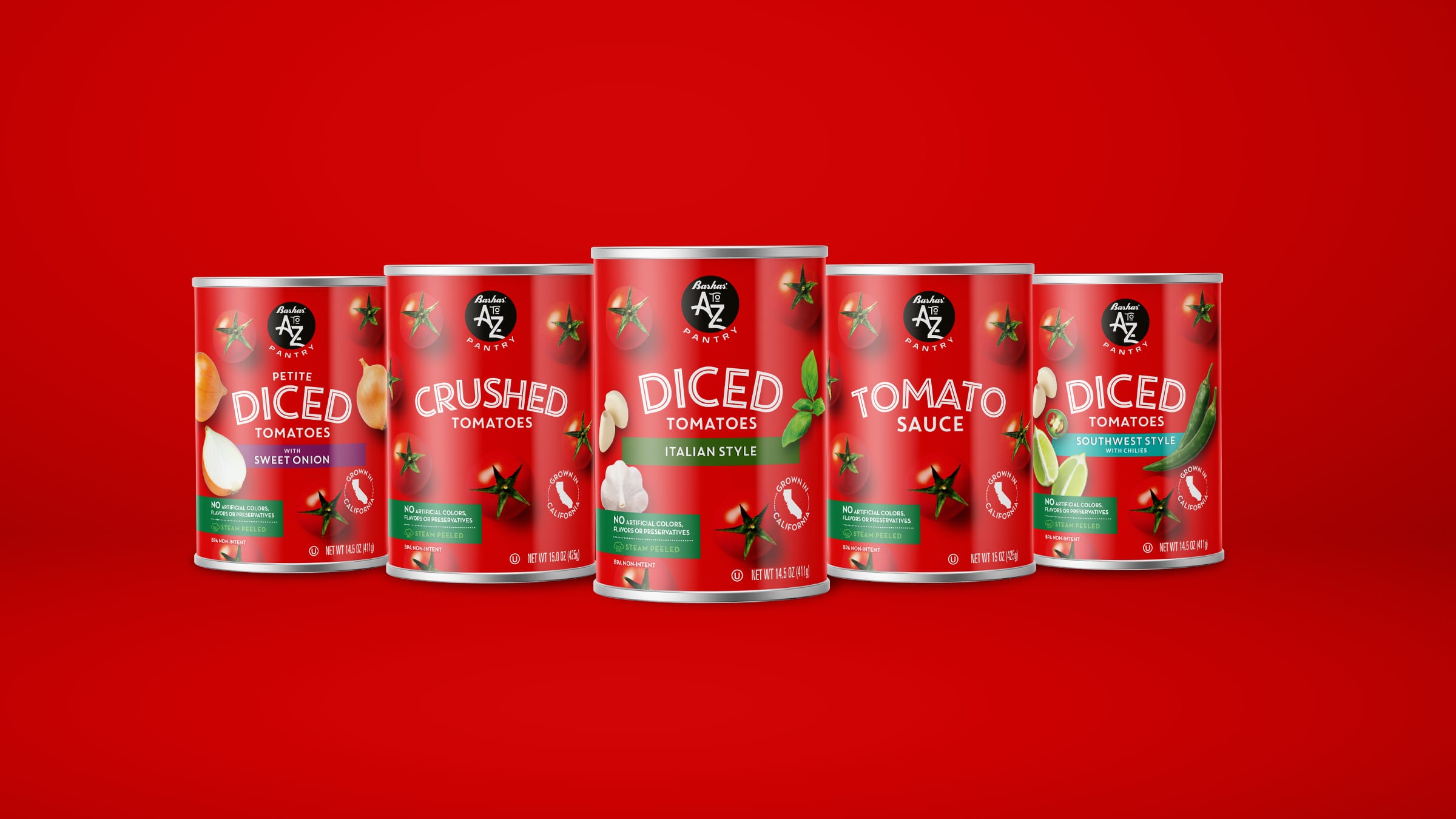
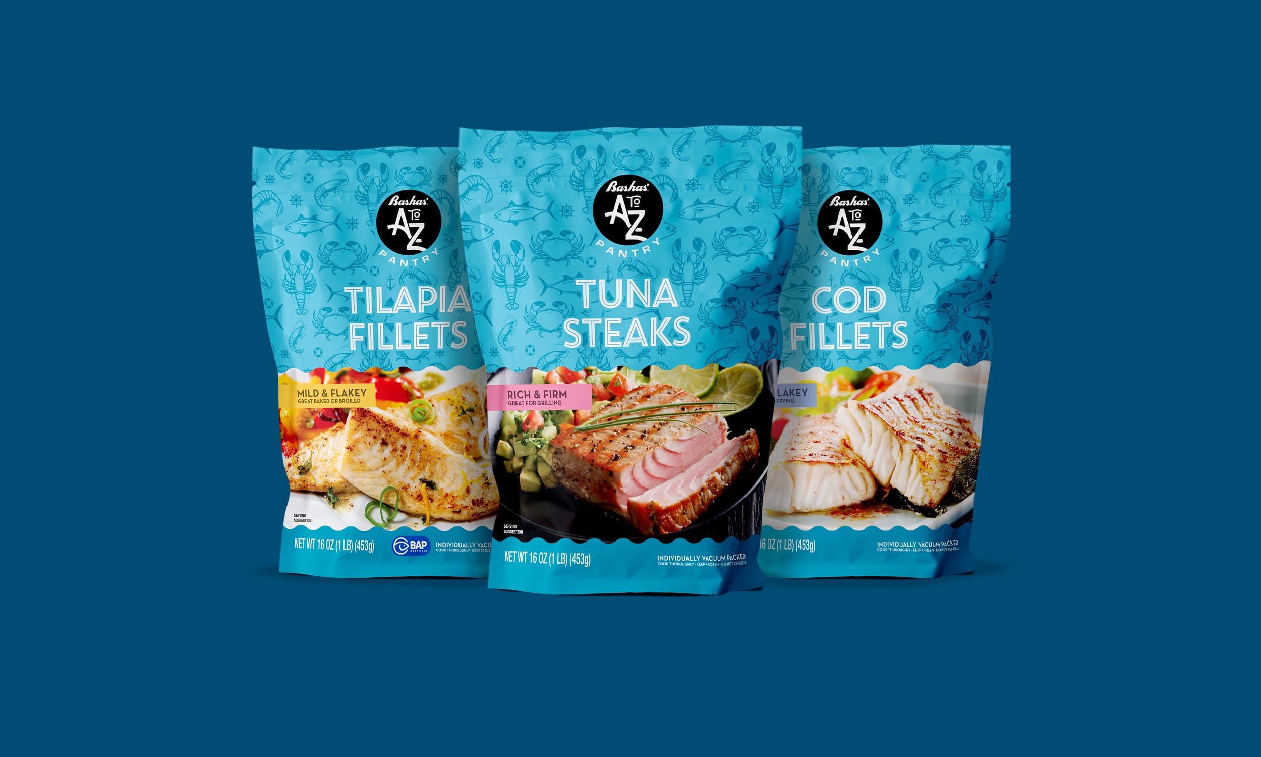
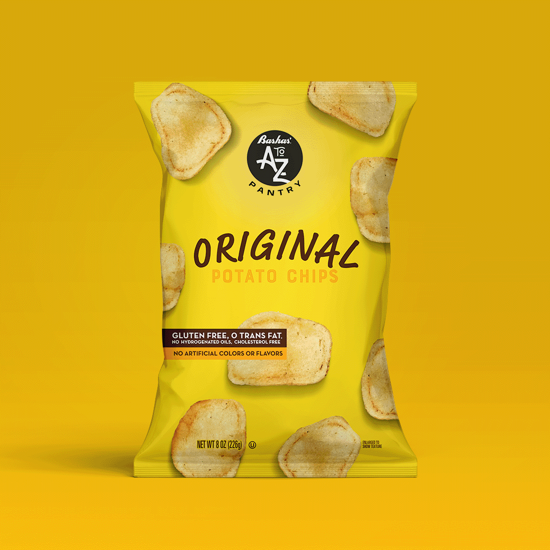
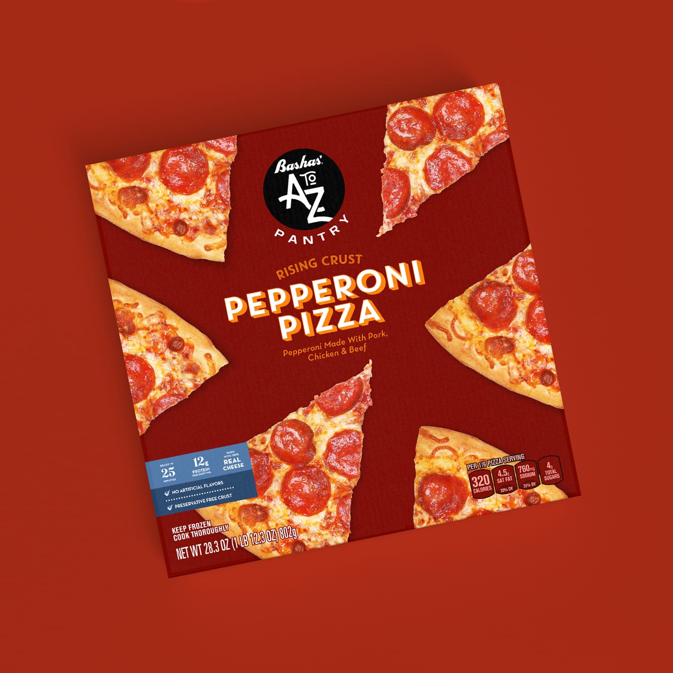
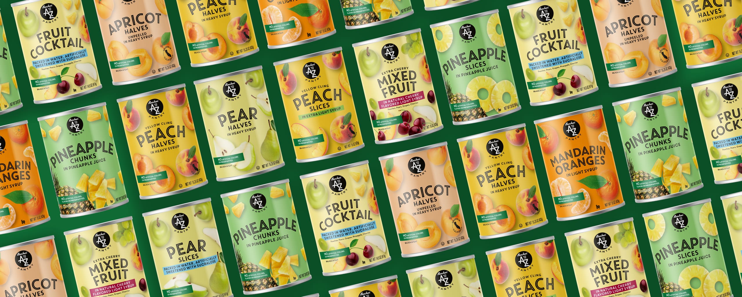
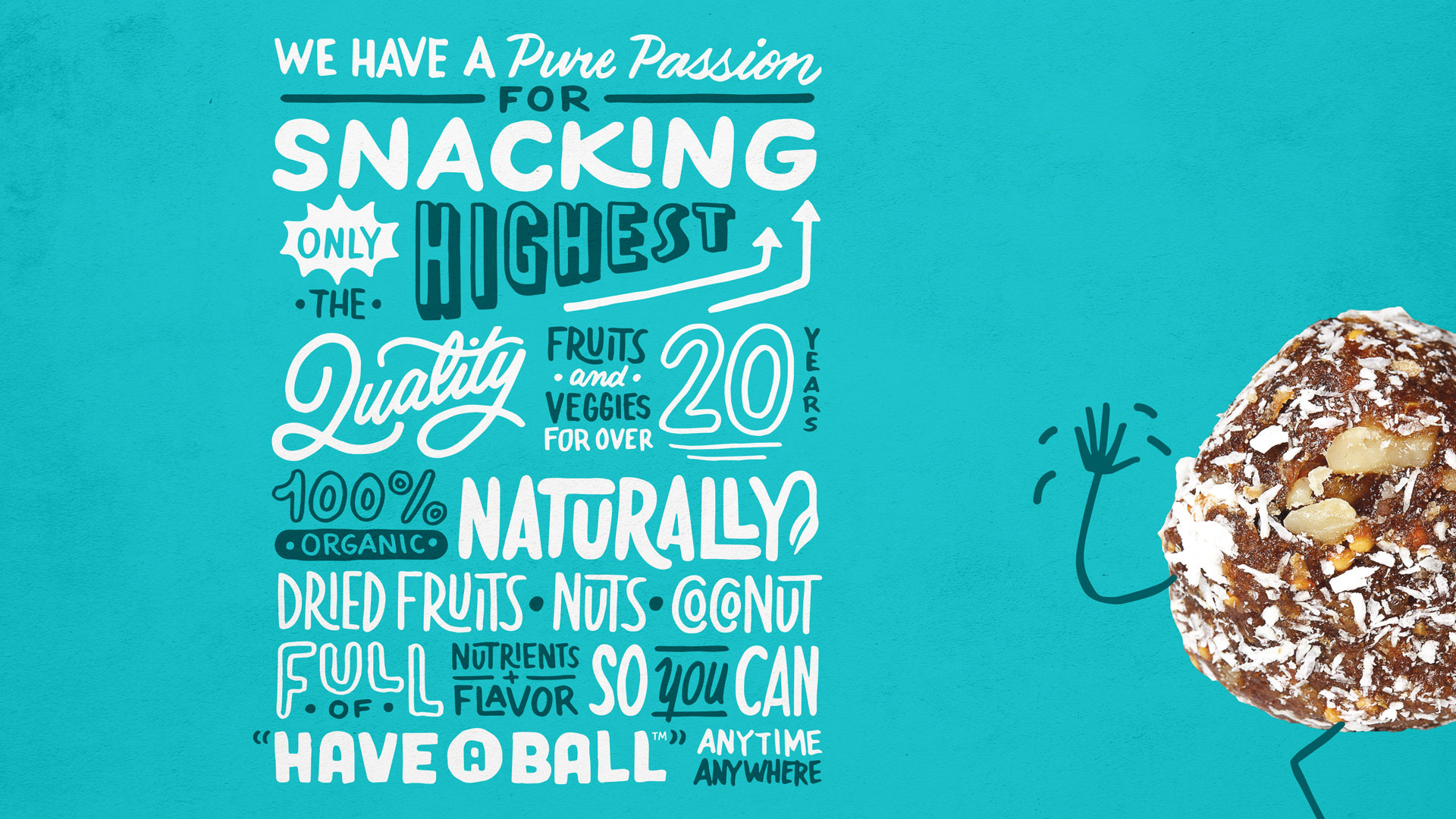
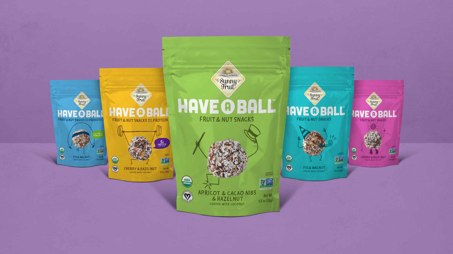
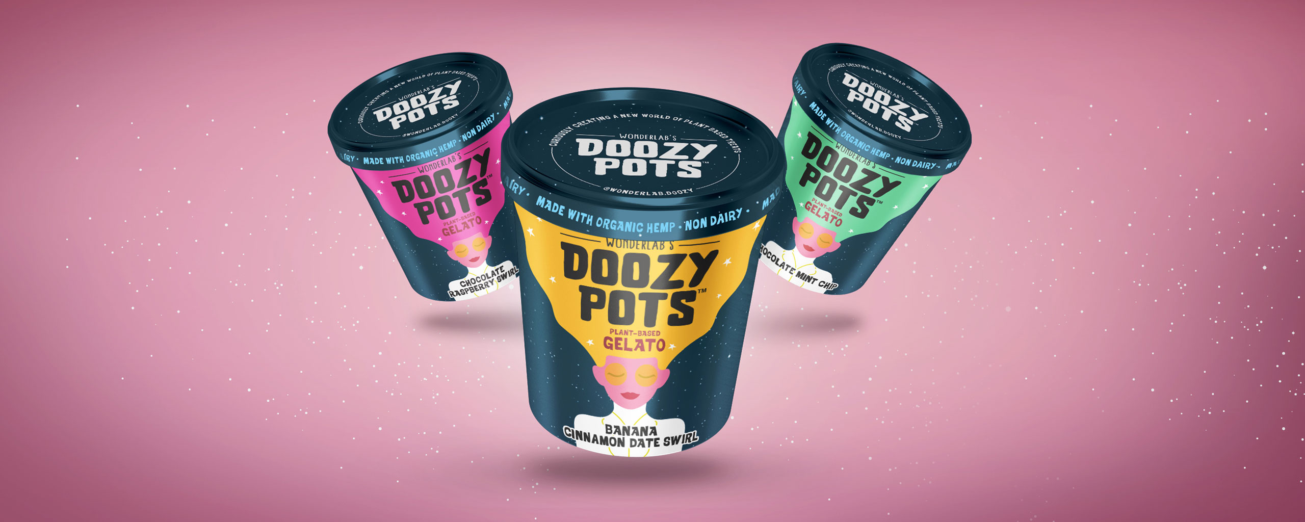
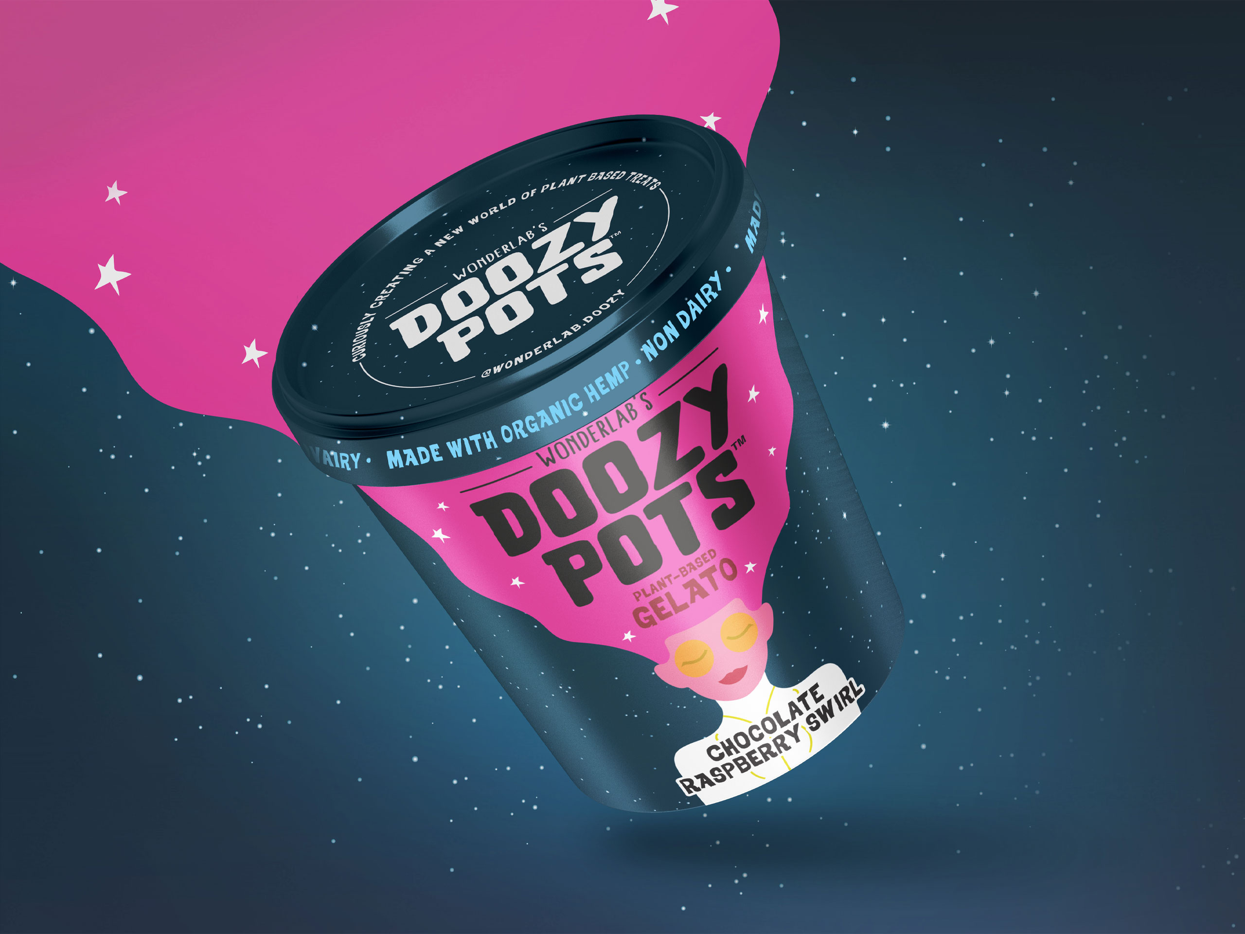
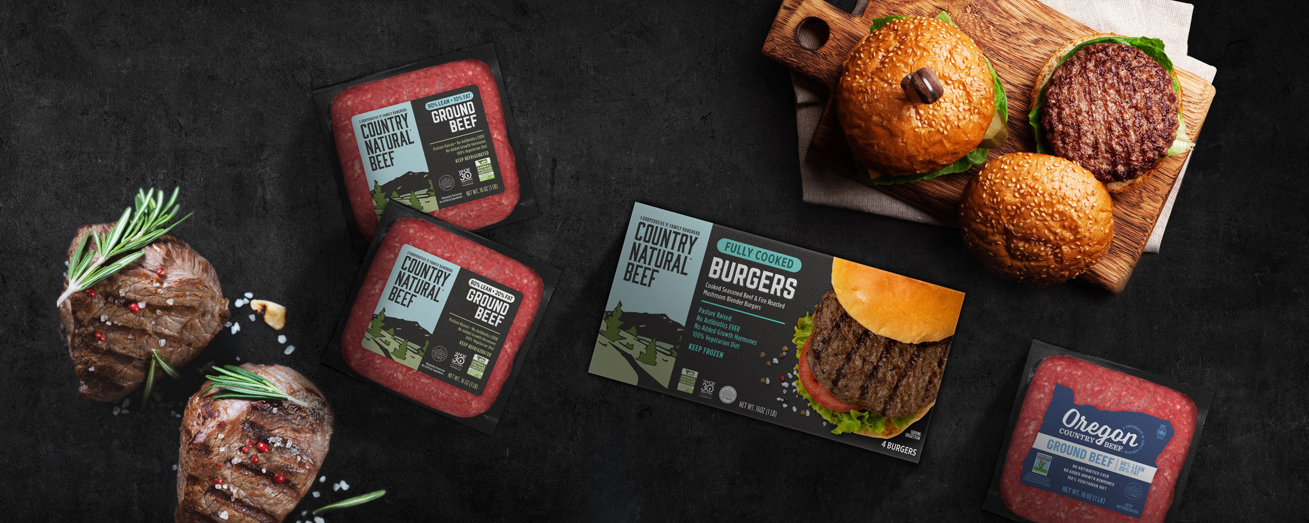
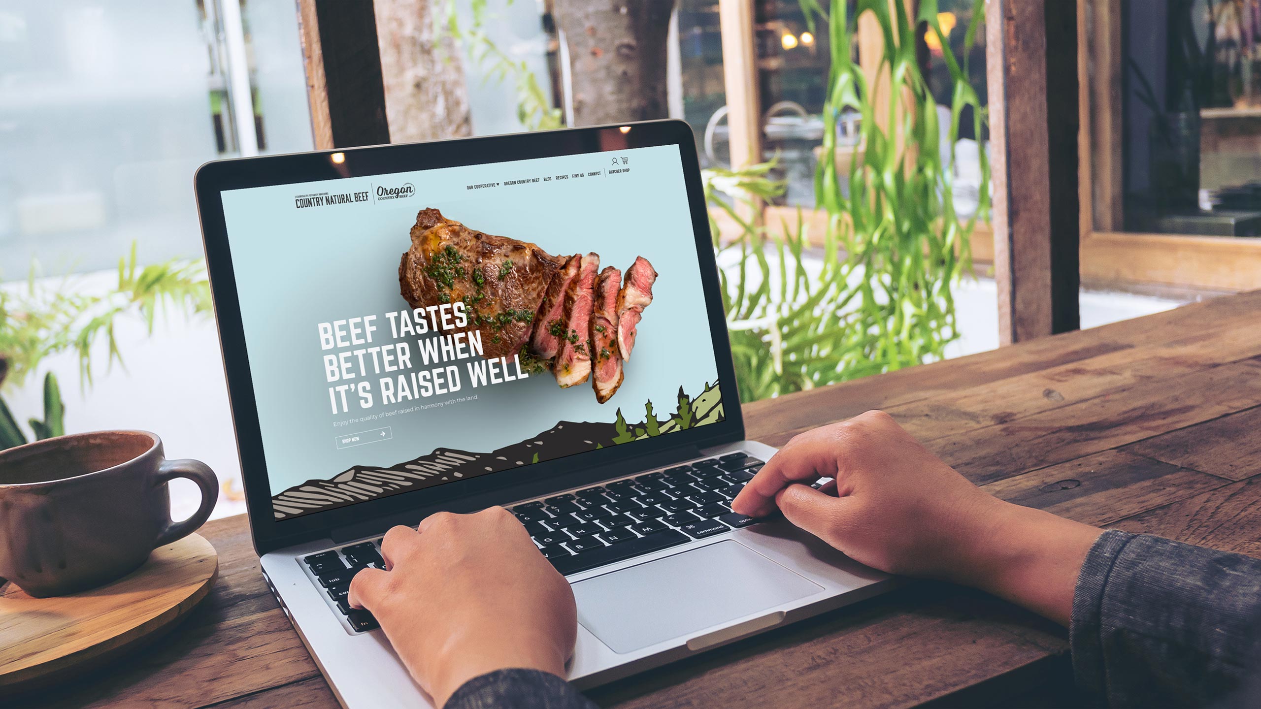
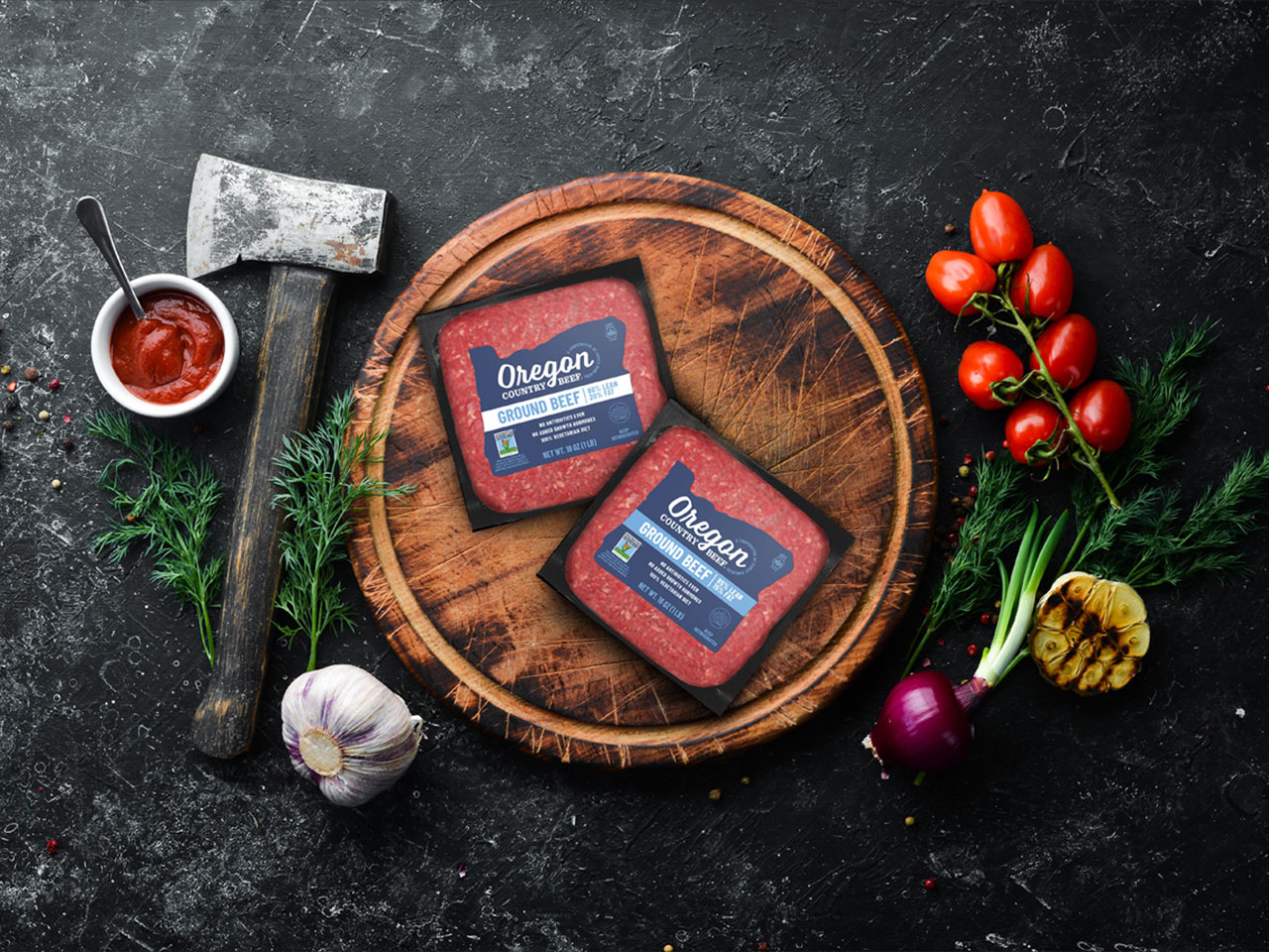
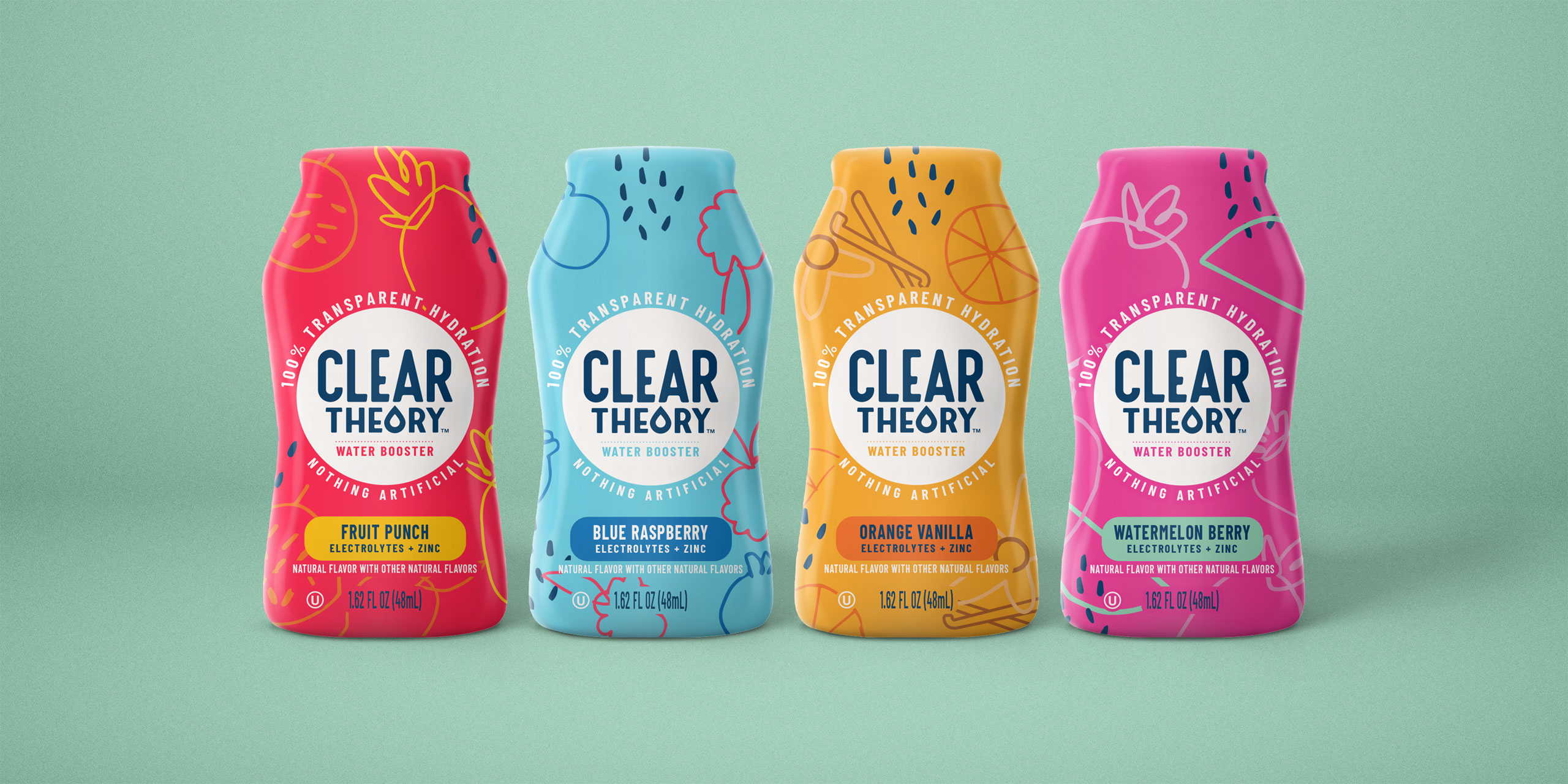
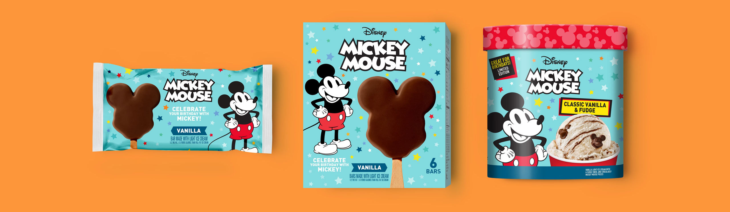
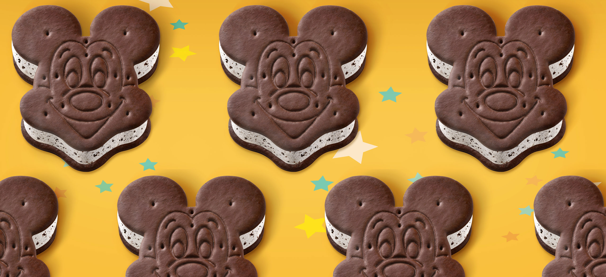
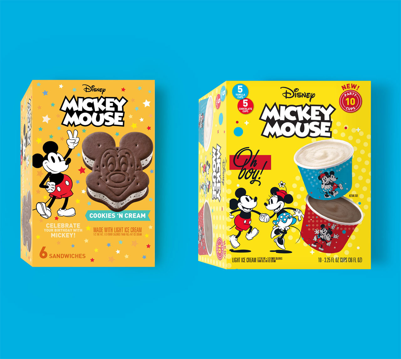
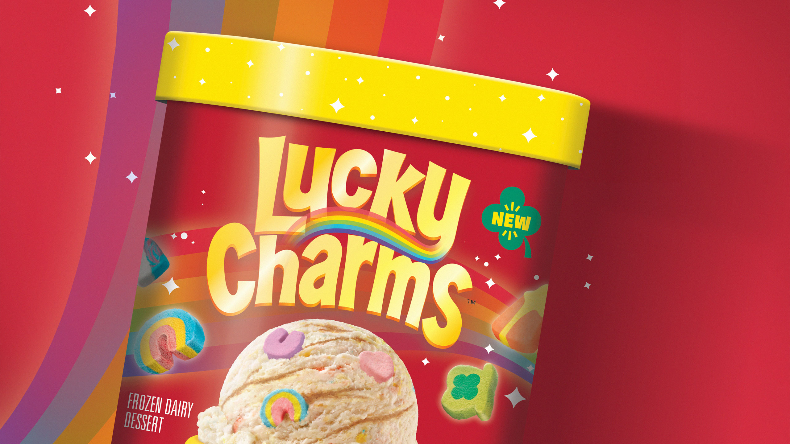
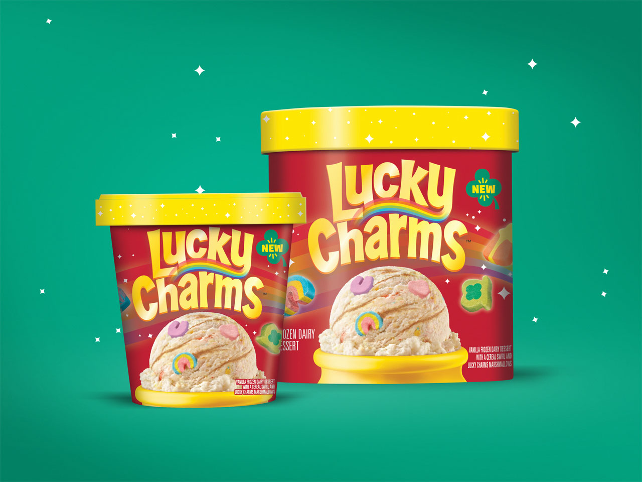
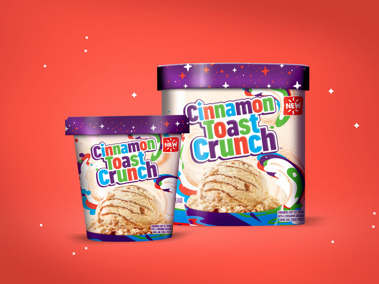
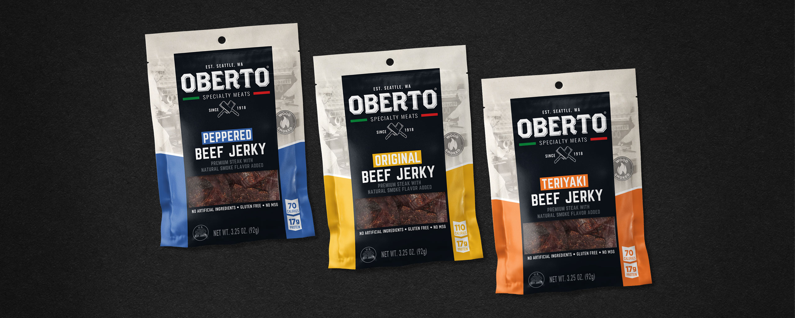
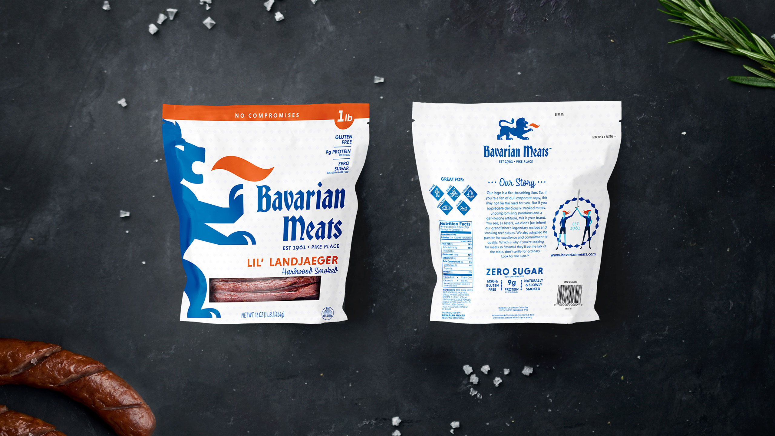
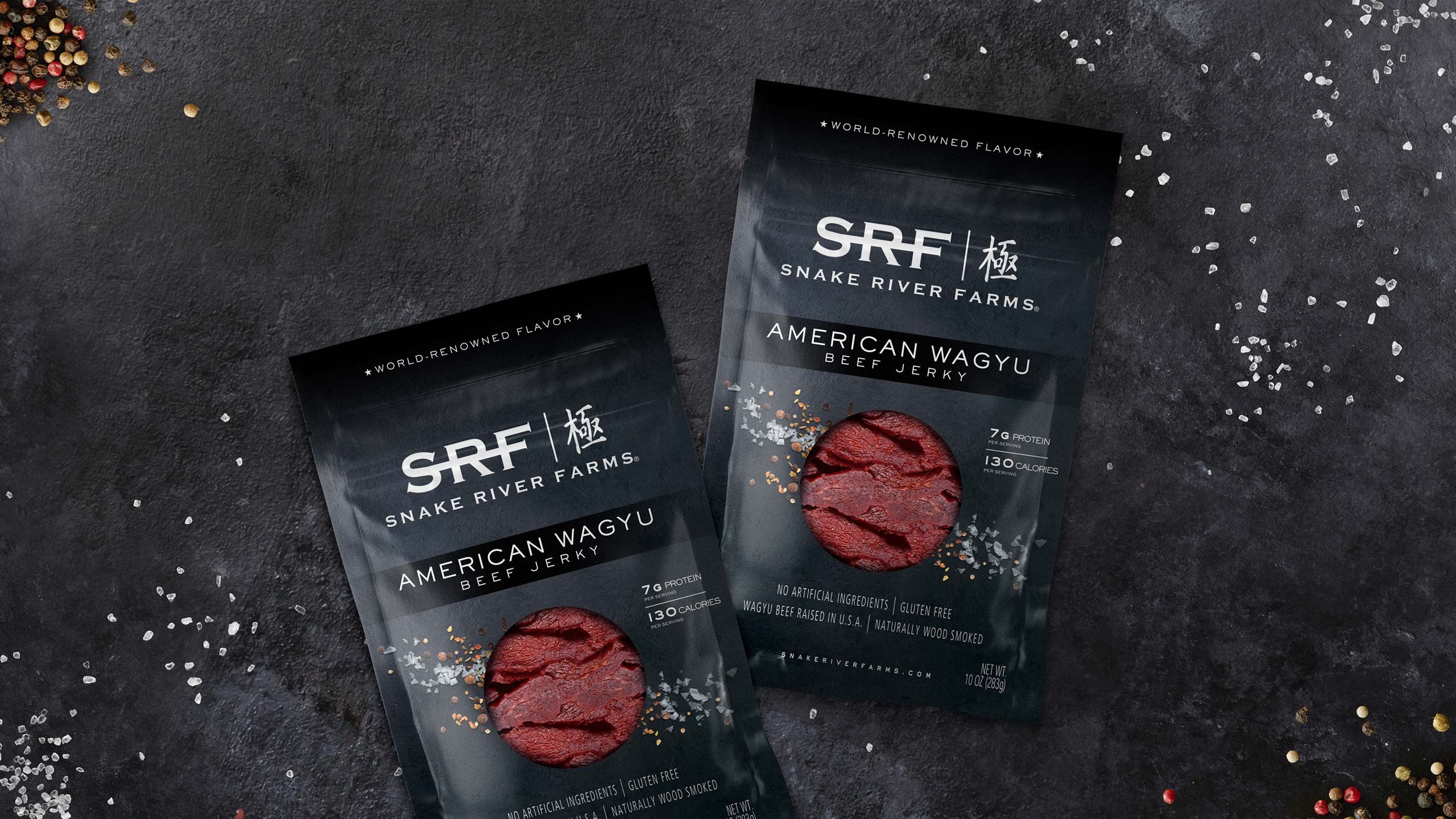
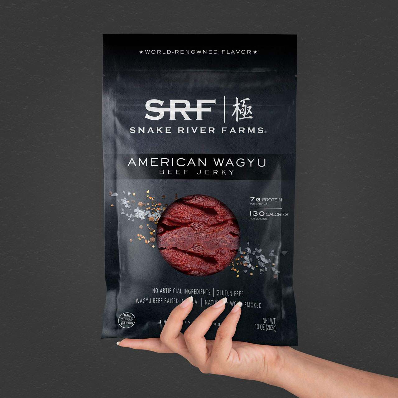
  • Focus on the packaging design, content and marketing messages, and be willing to invest some serious dollars into making them stand strong on the shelf next to national brands.

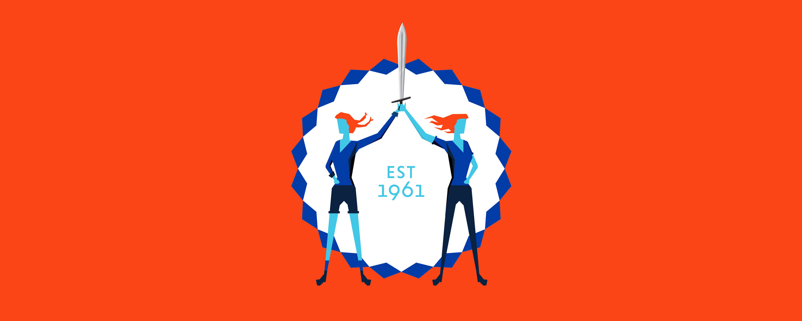
Quality Ingredients Should Meet Quality Design

As the hope for the economy to better itself rises and inflation decreases, this is the space where the private label category will be tested. So how do you create a private label design and messaging that pulls in customers and keeps them for the long-run?

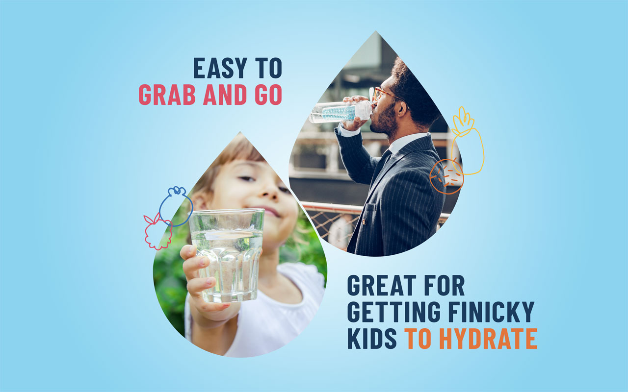
If they “take a chance” on your store brand and find that the quality is satisfactory (or even exceeds expectations), we want them to reach for that product over and over. Even more, we want them expanding their horizons beyond a single line of that private label into more and more categories of the same brand.

Let’s say you’ve coerced a buyer into becoming a loyal canned and boxed goods customer, but they have used the same national brand refrigerated goods for decades. How can we get them to change their behavior from a packaging standpoint? 

We realize design is one piece of the total marketing strategy. There are other messages that will be speaking to the buyer to lead them to our private label goods. How can we make them proud to purchase those goods from a visually appealing point of view?

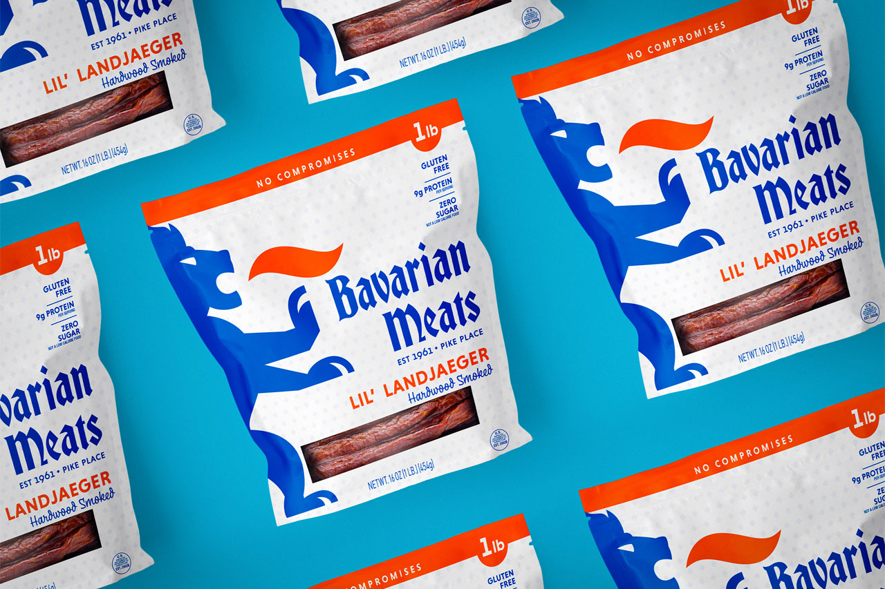
Your brand design needs to stand out among the noise and familiar visuals of national brands.

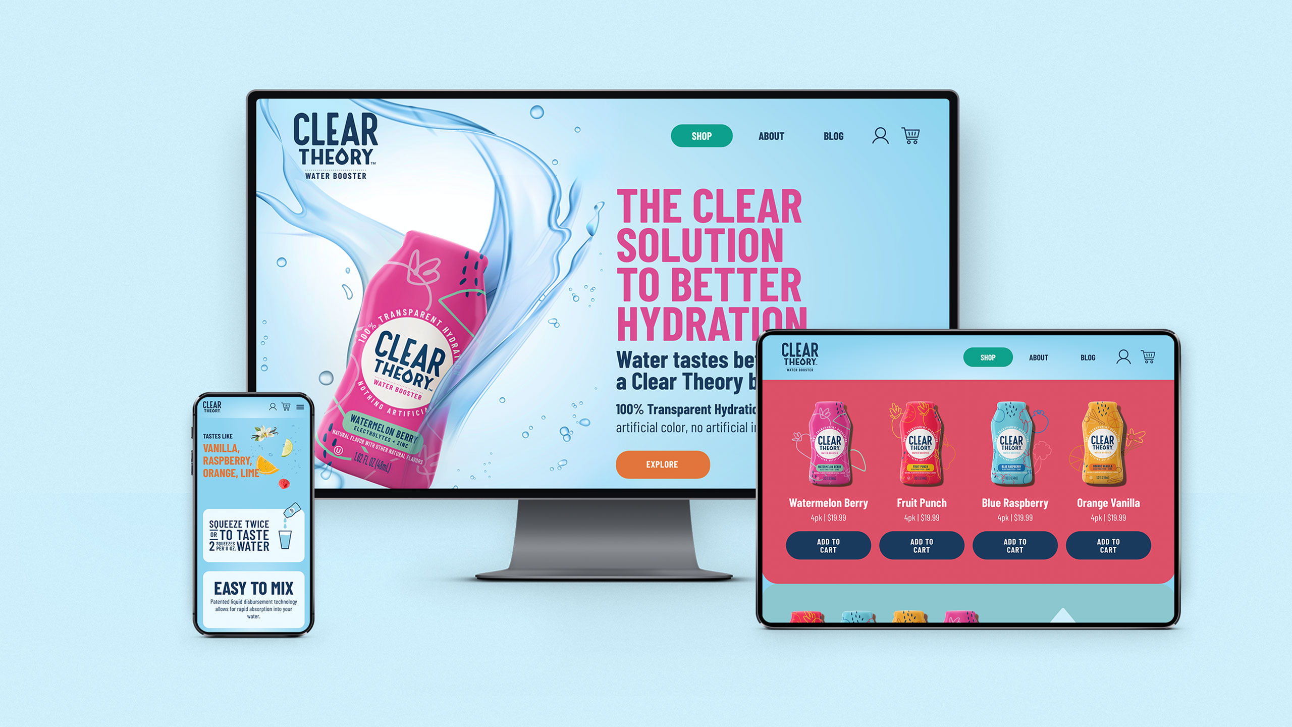
Your brand isn’t just competing on the store shelf – it’s now a potential victim of scrolling. Nielsen IQ tells us that “In the last two years, private-label food products have increased their share of sales from 6% to more than 11% thanks to shipped and delivery purchases. They also increased their share of click-and-collect sales in the same period, from 25% to 27%.”

A few years before the pandemic, Target rolled out their curbside “drive-up,” and even a few years before that, Instacart started to become a household name. When the global pandemic hit in 2020, these shopping conveniences became lifesavers for families and stores. 

These shopping amenities gave store brands the opportunity to push their own brands to the top of in-app shopping search results. It also allowed shoppers who hadn’t reached for store brand names yet, an opportunity to try them out without feeling like they were filling their cart with low-value products. 

The stigma has certainly changed over the past decade or two on the purchase of store brands, but some designs don’t seem to have gotten the memo that it’s okay, no, necessary, to elevate your own brand design and packaging.

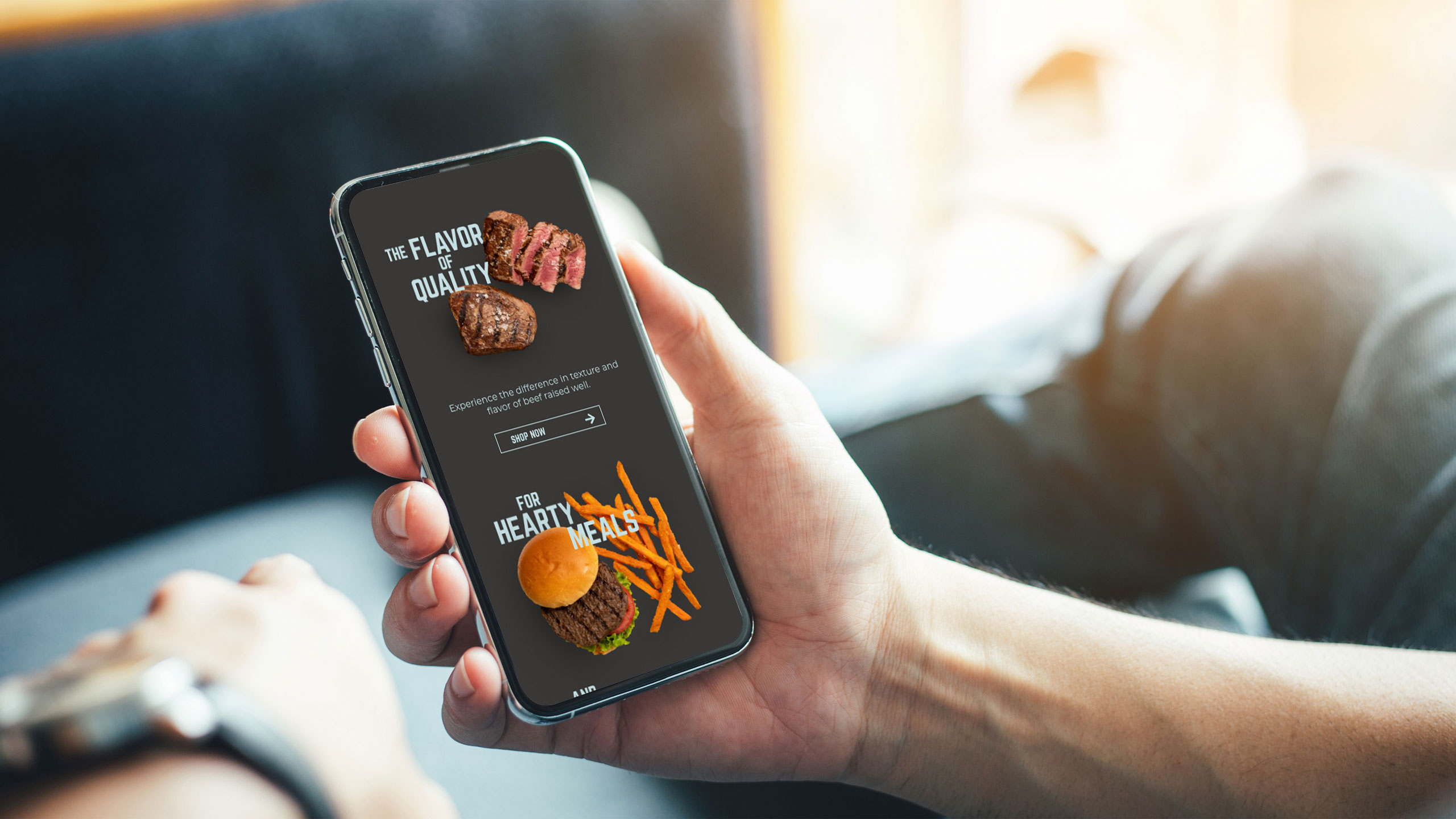
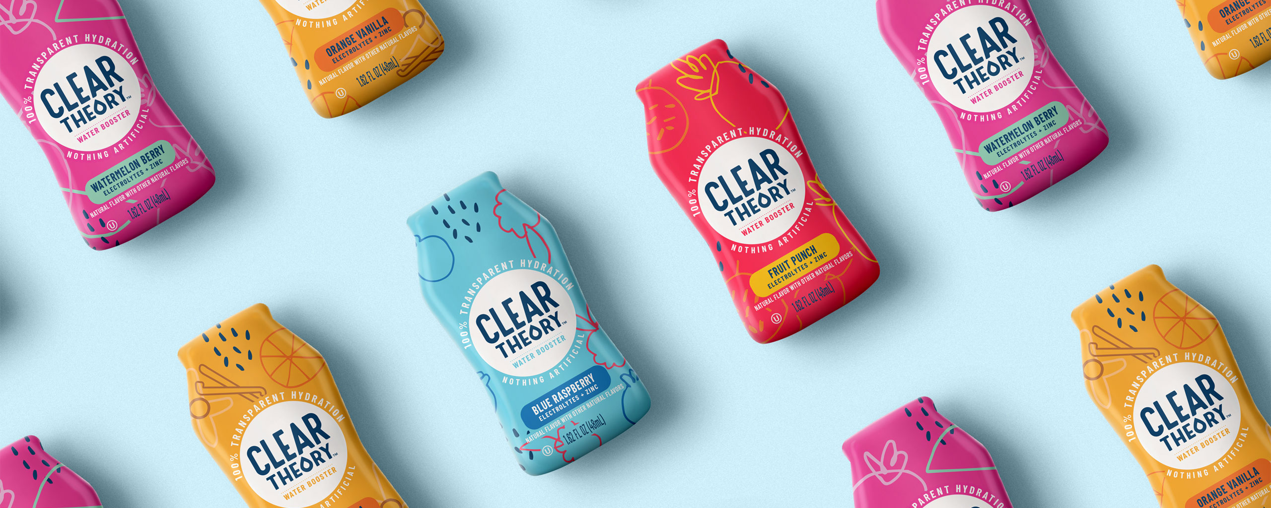
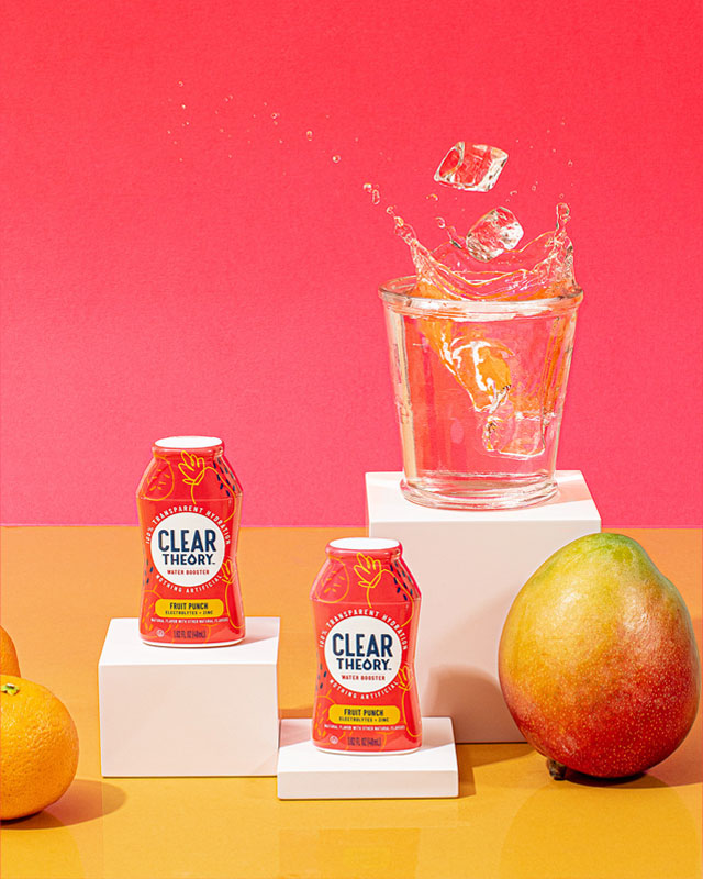
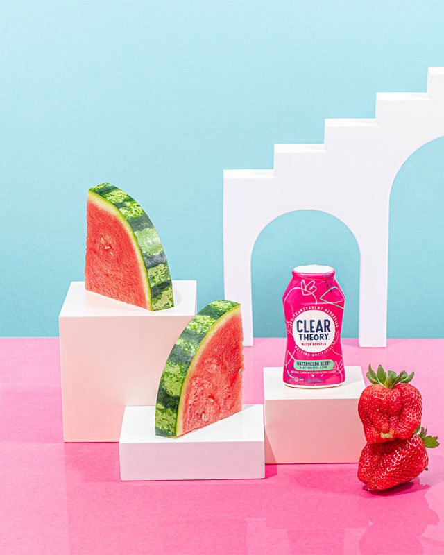
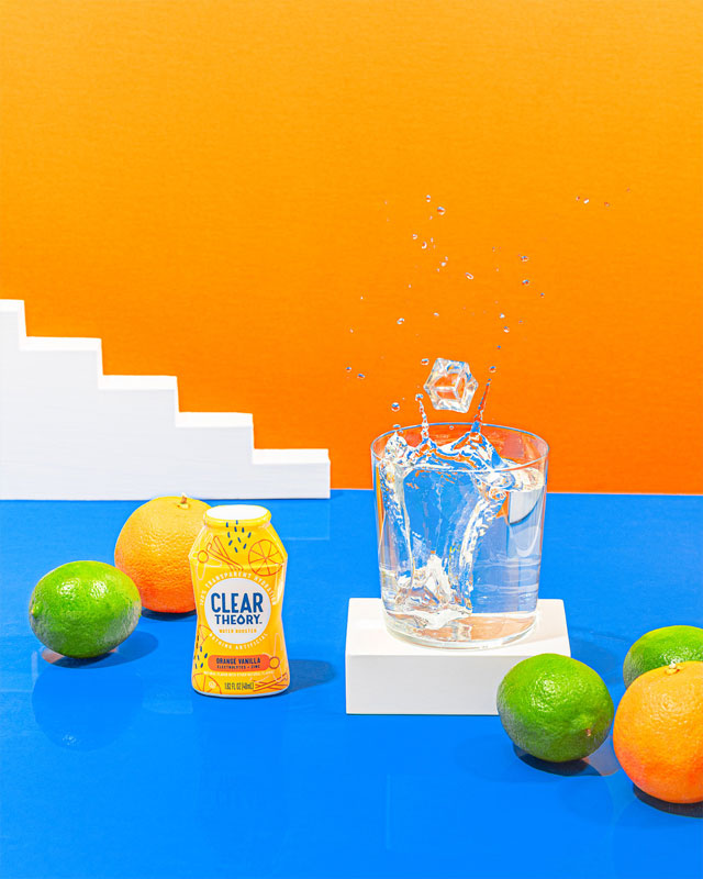
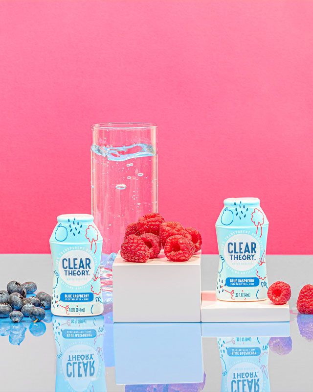
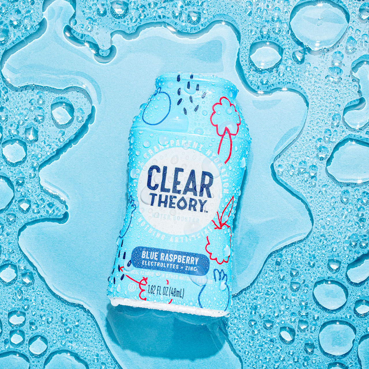
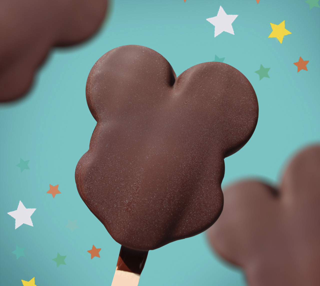
With the threat of the scroll, your design has to make a splash. It can no longer just be muted tones or busy design. Simple, modern, unique and clever are needed in your visual communication. Shoppers still want a “premium” experience when filling their carts (physical or digital) with private store label products. Premium speaks to many different attributes of a brand – tangible elements like quality ingredients, taste and source, and intangible ideas like indulgence, luxurious, tempting, evocative, etc. Also, capture solid and potentially long lasting trends that are here to stay like sustainability, plant-based, clean, etc.

Put your money where your mouth is.

Or should we say, put your money where people’s mouths are? NACS tells us that, “80% of food retailers plan to moderately or significantly increase their investments in private label products over the next two years.”

If you’re not willing to bring your store brand’s packaging up to par with national brands and competing store brands, all your other marketing efforts could fall flat. Pushing the design away from a “value-look”— little to no appetite appeal, overloaded claims or the lack of them can quickly turn consumers back to the national brands. Even in these tough economic times, people want to feel that they are getting a good value and price isn’t the only factor. 

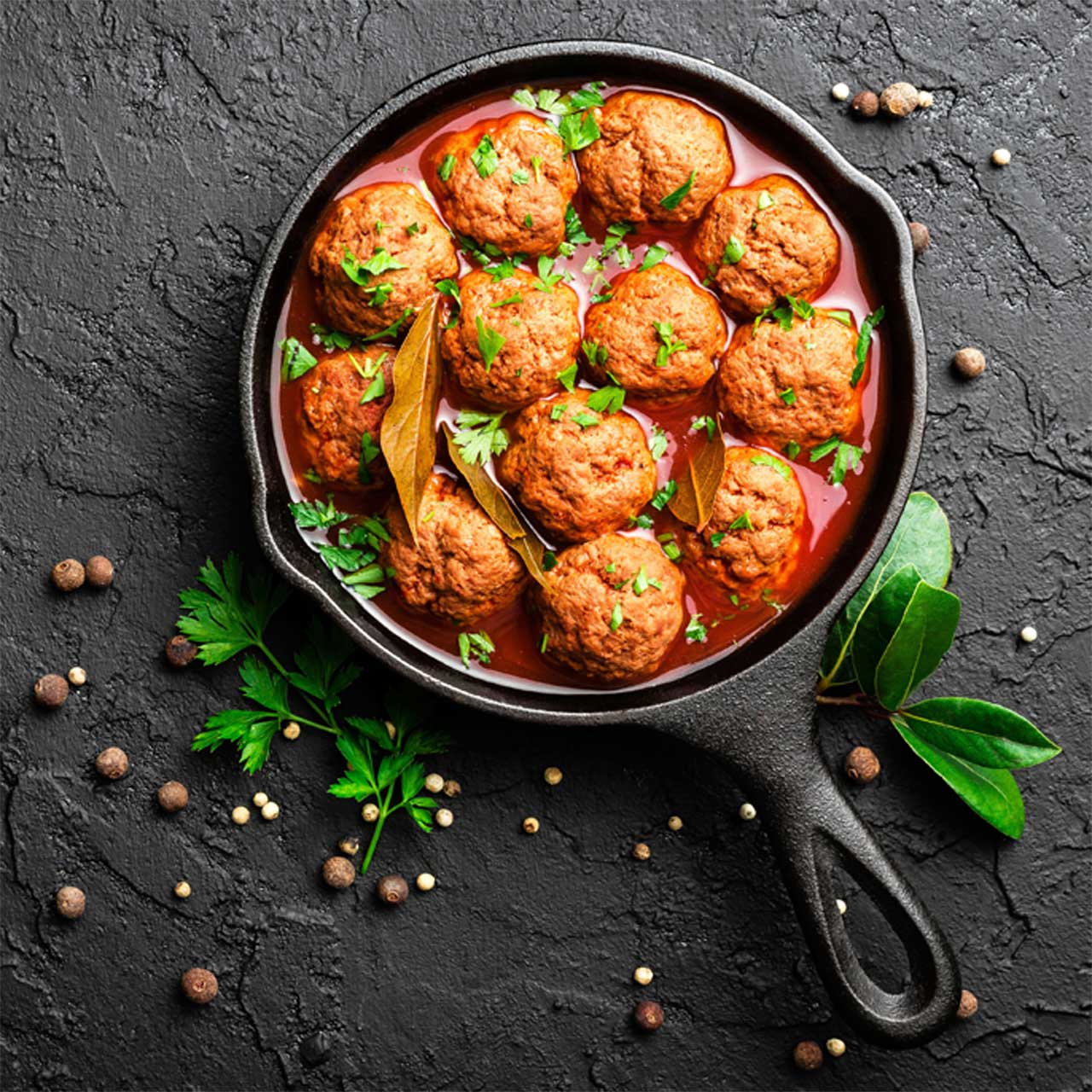
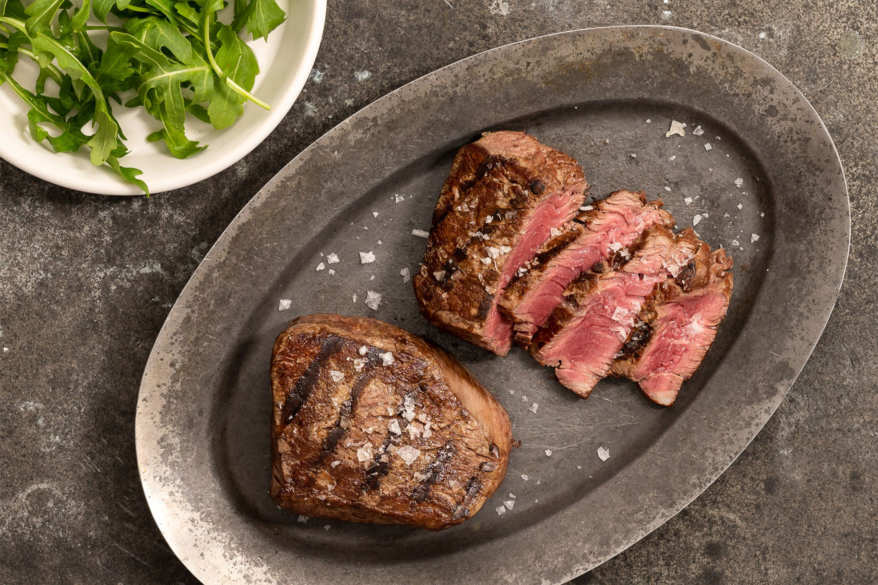
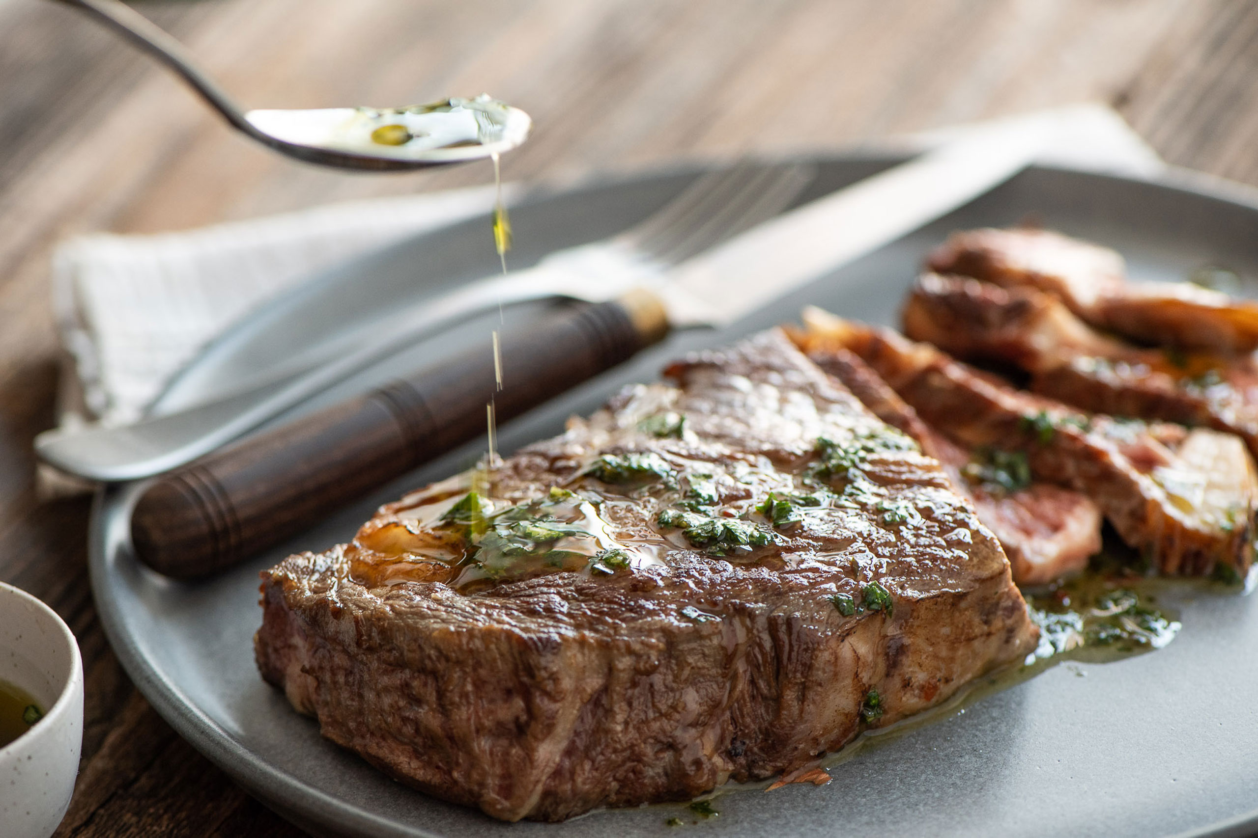
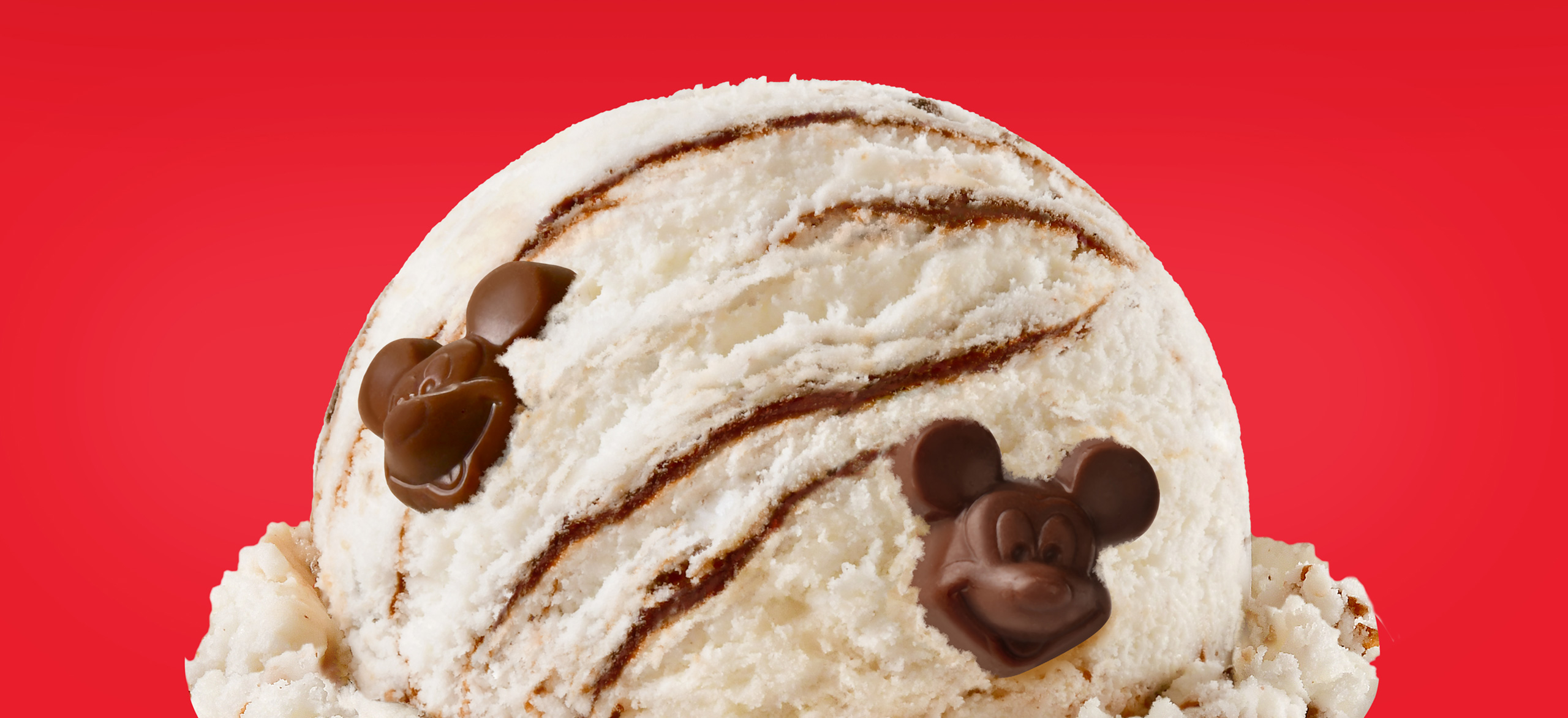
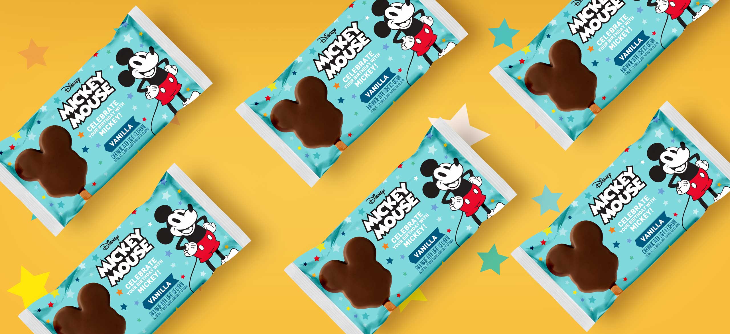
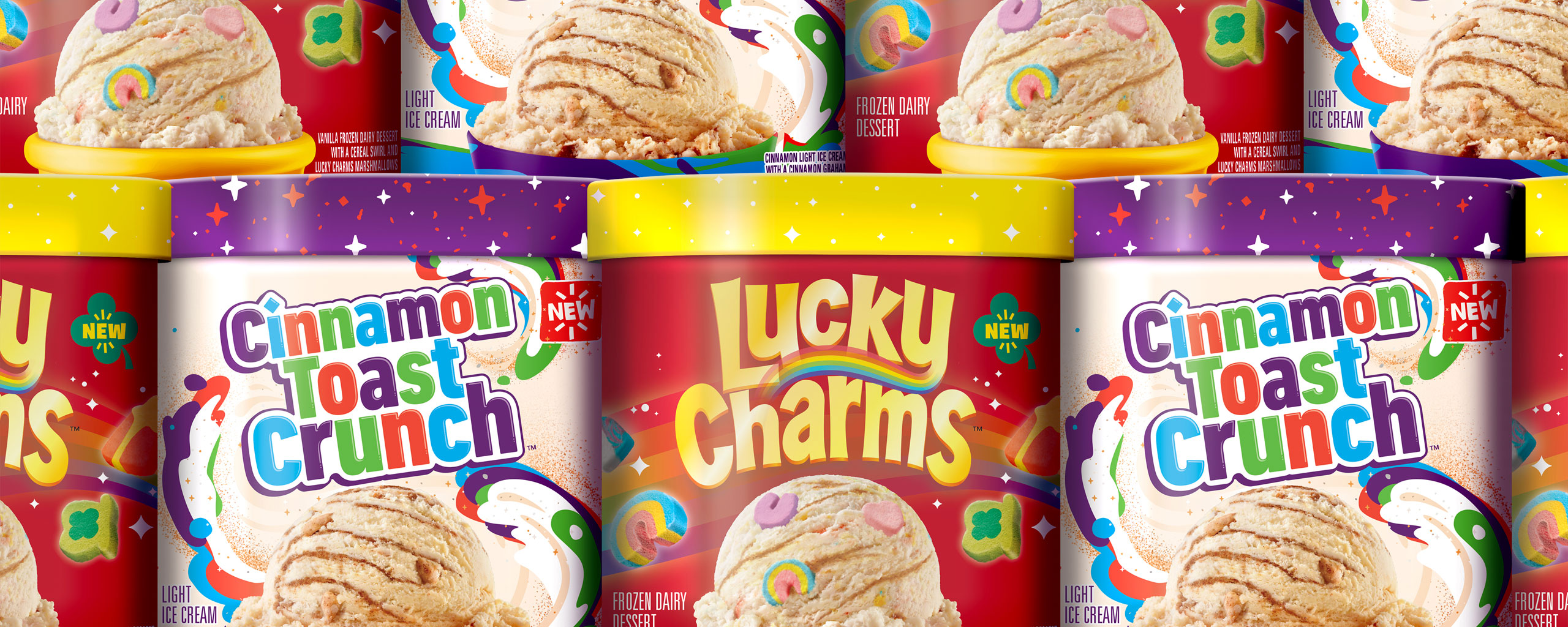
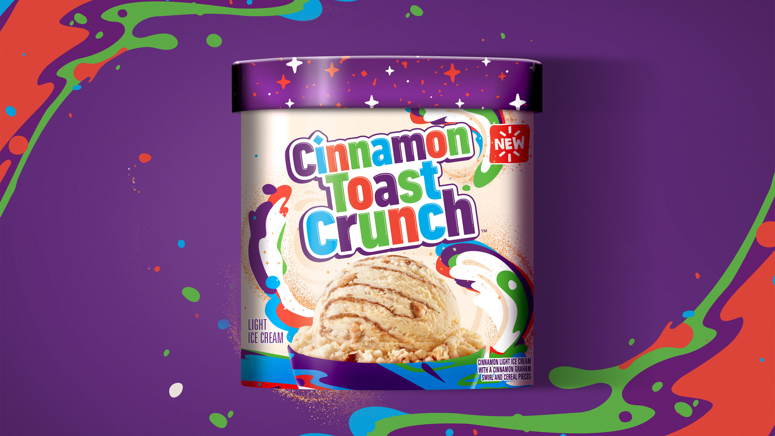
Beautiful, appetite-appealing product photography, targeted claims that are based on the audience’s needs/desires, and clear, thoughtful design and typography can quickly attract consumers to a new brand, especially when they can see that it is at a better price point. 

More than ever, you now have the opportunity to uplevel your private label lines. Just remember, the quality of your own brand’s products through ingredients and taste are paramount, but enticing customers to choose this product over national brands can come down to the packaging design.

Bashas’ A to Z Pantry

Bashas’ A to Z Pantry

The Challenge

The mid-sized, Arizona-based grocery chain, Bashas’, was looking to develop their own brands throughout the center store and beyond. The chain has a long, memorable history in Arizona and wanted to build a brand that connected with their hometown grocery roots.

While seeking to satisfy their current customers with their continued value offerings they wanted to set themselves up to capture new customers who were looking for higher-quality value products.

Our challenge was to ensure that the new brand connected to the roots of Arizona and elevated their own brand to compete with national brands while still connecting with value shoppers.

The Solution

Developing a brand name for a private-label line of groceries can be a challenge since the products span a large group of categories. It was imperative that the brand name tie back to Bashas’ and/or their Arizona roots. “Bashas’ A to Z Pantry” rose to the top of our exhaustive naming exercise and immediately provided the breadth for a large set of products while connecting to their state pride. It also allowed the brand to flex into broader categories e.g. A to Z Home, A to Z Essentials, etc.

The next step, create a brand design system where the visual architecture could quickly communicate the brand to consumers and help it stand out on shelf. The bold, iconic A to Z Pantry symbol and the simple yet playful use of photography helped to achieve a unique product set across the store.

What’s more, the flexibility of the system and typography allowed for special situations where creativity is needed to compete with national brands in categories like salty snacks, cereal, and soda. While the claims statements were designed to provide consistency across product lines, helping consumers quickly identify the product’s benefits.

Then, the packaging system needed to stretch to work across a large variety of shapes and sizes, different printing processes, and different substrates. Working to ensure that it had an impact at any point in the customer shopping journey, from frozen to canned foods. The design work proved that the system could communicate on any shelf in the store.

Services

  • Naming
  • Logo Design
  • Packaging Design
  • Packaging Adaptations
  • Packaging Production
  • Product Photography

9%

Sales increased nine percent in categories where only the packaging was updated

Bashas’ A to Z Pantry
AtoZ Canned Fruit Image
A to Z Pizza image
A to Z Canned Fruit variety image
Have A Ball

Have A Ball

The Challenge

Snack ball brand Have a Ball promised their customers a high-energy, feel-good experience from their organic fruit and nut snack, but their brand identity wasn’t bringing the message home. Have a Ball needed to create a brand identity that would differentiate and compete in the saturated fruit & nut ball market.

WIth an opportunity to create a memorable brand and improve their shelf impact, Have a Ball partnered with The GRO Agency to develop a visual identity and product packaging.

Our challenge with the Have a Ball branding was to find a perspective that uniquely illustrated the health and flavor characteristics of the Have a Ball products, while carving out an eye-catching visual identity that could be easily recognizable on the shelf.

The Solution

Through the art of personification, we helped each Have a Ball product tell the age-old adage of ‘you are what you eat’. Bestowed with lively personalities, each package showcased the Have a Ball product illustrated to perform energetic activities like jumping rope, lifting weights, tap dancing, and more.

This visual strategy immediately informed the customer what to expect after consuming the tasty, functional treat. Live product photography that highlighted the wholesome ingredients paired beautifully with bright, eye-catching colors to help consumers easily find Have a Ball on the shelf.

From there, the brand messaging propagated through a high-energy voice brimming with passion for health and wellness. The brand became a beacon for a well-balanced and nutritious diet, and allowed consumers to ‘have a ball’ while chasing a more active lifestyle.

Services

  • Naming
  • Logo Design
  • Packaging Design
  • Flavor/Size Adaptations
  • Packaging Production
  • Illustration
  • Sales Collateral
GRO helped us create a fun, memorable name and package design for our fruit & nut ball innovation. GRO is adept at building different brand strategies and visual languages for several brands in a portfolio.

Yigit Isiker
President Safe Food Corporation

Have A Ball
Have A Ball
Have A Ball
Have A Ball
Have A Ball
Wonderlab’s Doozy Pots

Wonderlab’s Doozy Pots

The Challenge

Plant-based ice cream brand Doozy Pots aspired to satisfy your sweet tooth while reshaping food systems as a whole. While food scientist Kirsten Sutaria had a dream for her brand, she still needed to create a brand identity, visual identity, and messaging strategy for her plant based gelato brand.

With the opportunity to introduce a new challenger into the vegan gelato space, Doozy Pots tapped The GRO Agency to develop an inspiring brand identity and product packaging.

Our challenge with the Doozy Pots branding and product packaging was to effectively capture and communicate all the magical alchemy of food science, while appealing to the right consumers who would resonate with the brand message.

The Solution

For an upstart brand in a highly competitive space, carving out a well-defined niche is of the utmost importance. For this female-owned, plant-based ice cream company that brought low-allergen indulgence, regenerative farming, and the magical alchemy of food science, we found the right amount of inspiration within the founder’s story herself.

First, we created a visual identity that illuminated the story behind Doozy Pots, a creative female founder with the goal of reshaping food systems with low allergen, socially responsible, plant-based ice cream. The goal with the illustrations was to catch attention and tell the whole story of the Doozy Pots company right at first glance in the frozen aisle.

Then, the messaging strategy promised an indulgent experience of taste and nourishing ingredients, unlike others in the frozen dessert sector. Not only could Doozy Pots customers satisfy their cravings, but they could do so completely guilt-free with regards to their own health and their support of sustainability through regenerative farming.

Services

  • Brand Strategy
  • Naming
  • Logo Design
  • Packaging Design
  • Flavor/Size Adaptations
  • Packaging Production
  • Illustration
  • Website
In the past 2 years of working with the team at the GRO Agency they have become an extension of our team, transforming our vision into a brand. GRO brought Doozy Pots to life, creating a category disrupting on-shelf presence for our plant-based gelatos and developing a much loved brand identity. They’re responsive, creative, and seriously talented. Everyone at the GRO agency is a pleasure to work with and we’re proud to have them as part of the extended Doozy Pots family.

Kirsten Sutaria
Founder Wonderlab’s Doozy Pots

Wonderlab’s Doozy Pots
Country Natural Beef

Country Natural Beef

The Challenge

Ranching co-operative and meat provider Country Natural Beef (CNB) had a robust history as a forward-thinking cooperative of family ranchers who have been raising healthy beef in harmony with the land since 1986, but their identity was failing to tell the full story. To better communicate their pride-ridden work and shared philosophies, CNB needed to create a more telling visual identity.

With an opportunity to carve out an elevated brand identity, CNB tapped The GRO Agency to deliver unique packaging design and mouth-watering product photography.

Our challenge with the CNB product packaging redesign was to 1) tell the authentic story of CNB’s progressive and sustainable approach to ranching, deeply ingrained in the communities and families of the Co-op, and 2) make a premium and more ownable visual identity centered around their community engagement and sustainable practices.

The Solution

In the meat industry, brands must avoid appearing like a big corporate supplier at risk of subconsciously being thrown in the overarching category of ‘over-processed’. WIth the rebrand, CNB wisely made it clear to consumers that whenever they buy CNB products, they are buying quality beef directly from a ranch family, not a big corporate supplier.

First, amongst many of CNB’s philosophies is the strong belief that they would not market products that their own families would not eat. To serve as an anchor for the rebrand, the GRO Agency rallied the brand behind a new credo, families feeding families, to emphasize their community-driven roots and co-operative practices.

In addition to the human component, the packaging design introduced a modern style to some of the existing design elements that the Co-op had owned for many years, like strong typography reminiscent of a hearty meal. To make the brand name treatments for both CNB and their sub-brand Oregon Country Beef more distinctive and therefore more ownable, the communication hierarchy was rearranged to focus more on the logomark, and appear less of a white-label brand.

Finally, to seal the deal, the website design showcased mouth-watering product photography that captured the sizzling, juicy goodness of a perfectly-prepared meat dish.

Services

  • Brand Strategy
  • Logo Design
  • Packaging Design
  • Packaging Adaptations
  • Packaging Production
  • Website
Country Natural Beef
Clear Theory

Clear Theory

The Challenge

Water booster brand Clear Theory needed to position their products in a way that could compete with existing market leaders in the water-enhancing category. With the market dominated by big brands that promised enhancing athletic performance, Clear Theory wanted to forge its own path.

With an opportunity to target a gap in the market, Clear Theory trusted The GRO Agency to deliver a cohesive brand identity and eye-catching product packaging.

Our challenge with the Clear Theory rebrand was to speak to a brand new customer segment with an authentically refreshing voice, while differentiating themselves from their big-business competitors.

The Solution

While hydration is an important factor for athletic performance, drinking more water is, in fact, good for everyone. Staying true to the authenticity of their founders, Clear Theory was positioned as a premium, family-owned alternative that targeted modern, on-the-go families.

First, the brand identity promoted functional hydration with daily, delicious, hassle-free water consumption for children and adults. What’s more, Clear Theory became a preferred choice to get children in the habit of hydrating – something that would resonate with parents who were struggling with picky eaters and drinkers.

Next, the product messaging made extra effort to distinguish itself from competitors. The packaging is sure to mention that not only does Clear Theory’s flavor combinations rank highly, but also the all-natural water drops are, as the name suggests, CLEAR – devoid of the artificial coloring and flavors included in other options.

Finally, the product packaging design leverages refreshing primary colors that contrast fruit silhouettes, serving as a reassuring nod to the flavors bursting within each drop.

Services

  • Brand Strategy
  • Naming
  • Logo Design
  • Packaging Design
  • Adaptation: Full Portfolio
  • Packaging Production
  • Website
  • Sales Collateral
Clear Theory
Clear Theory
Clear Theory
Clear Theory
Clear Theory
Clear Theory
Clear Theory
Clear Theory
Clear Theory
Clear Theory
Disney License Work

Disney License Work

The Challenge

Ice cream brand Dreyer’s Grand Ice Cream hoped to conjure up the magic of Disney in the frozen aisle with a new line of Mickey Mouse ice cream products. Previously a Disney Park exclusive, Dreyer’s Grand Ice Cream needed to design packaging that would represent the Disney brand, leverage the nostalgia of America’s favorite mouse, and create a unified line of products that would attract attention on shelf.

With the opportunity to first bring a Disney Park exclusive to the masses, Dreyer’s Grand Ice Cream tapped The GRO Agency to design packaging for their assortment of Mickey Mouse Ice Cream Products.

Our challenge with the Mickey Mouse packaging design was to 1) work within the strict licensing parameters, 2) creatively utilize brand elements and colors to design a system that fit for the Disney brand, and 3) all while standing out from the competition in the freezer aisle.

The Solution

To create impactful packaging that would thrill the devoted Disney enthusiast yet appeal to the general ice cream lover, Mickey brand assets were employed thoughtfully and strategically throughout the design. The result: In the year following the launch, Mickey Bars were the top performing Nestle ice scream snack in 2019.

First, leveraging similar Disney-branded layouts and color palettes throughout the design system, the product line shares a unified look to help them stand out and remain recognizable as a cohesive offering. The packaging is simple, straight to the point, but also communicates that essence of Disney magic, as well as the deep and poignant nostalgia inherent to the brand.

From there, appetizing product photography broadcasted the creamy textures and flavors of the ice cream product, while the appealing color palette captured the hearts of kids, adults, and even the Disney agnostic alike.

Services

  • Packaging Design
  • Packaging Adaptations
  • Packaging Production
  • Product Photography
The top performing Nestlé ice cream snack SKU the year after release

Nestlé Licensing Team

Disney License Work
Disney License Work
Disney License Work
Disney License Work
Disney License Work
Disney License Work
General Mills License Work

General Mills License Work

The Challenge

Ice cream brand Dreyer’s Grand Ice Cream was developing the highly-anticipated crossover of the decade in their new line of ice cream flavors, directly inspired by General Mills cereals like Cinnamon Toast Crunch and Lucky Charms. With this much brand firepower behind one line of products, it was crucial to properly capture and communicate the brand elements of both companies into a powerful product design strategy.

With an opportunity to introduce an innovative product line to a wider consumer base, Dreyer’s Grand Ice Cream brought on The GRO Agency to design the packaging for their new line of General Mills cereal-flavored ice cream products.

Our challenge with the General Mills product packaging was to translate the essence of the brands so that they were instantly recognizable to the shoppers, while also appealing to a slightly older consumer base.

The Solution

In the cereal aisle, brands rely heavily on mascots and kid-friendly illustrations, whereas ice cream products typically aim toward an older crowd and require a heavier focus on appetite appeal. For the Dreyer’s-General Mills packaging, the brand elements were distilled down to its key components in order to strike a balance between the competing consumer expectations.

First, to maintain the brands’ recognizability among consumers, the product packaging showcased the playful attitude and nostalgia of each respective brands, with an intentional focus to eliminate any seemingly juvenile aspects. By focusing on the brand design elements and omitting the cartoonish mascots, the package was instantly recognizable and easily targeted the whole family.

Then, by incorporating the bold use of color and a design system built for flexibility with plenty of room for the brandmark to play, the packaging truly brought life to these classic brands within this new space. Stylized bowls in the language of the respective brands helped bring the design together as a unified whole.

Finally, the appetite appeal was a key part of the overall success of this packaging. To get that right, live product photography with high-quality photo-illustration created delicious scoops that genuinely encapsulated the richness, texture, and flavor profile of the ice cream product.

Services

  • Packaging Design
  • Adaptation: Full Portfolio
  • Packaging Production
  • Photography
  • Point of Sale
General Mills License Work
Oberto

Oberto

The Challenge

Meat snack brand Oberto was already a staple for on-the-go consumers who needed a protein-packed snack. When faced with ever-changing consumer interests and competitive landscape, Oberto needed to reposition and reimagine their brand to appeal to the modern shopper.

With an opportunity to better communicate their unique value propositions, Oberto brought on The GRO Agency to modernize their brand identity and packaging.

Our challenge with Oberto’s packaging redesign was to enable the expansion of their products outside the inner aisle to the deli and meat counter, while at the same time reinvigorating their core product base.

The Solution

Based on competitive and consumer research, we identified three strategic positionings within the meat snack space, then derived three distinct brands based on the analysis: Pacific Gold Reserve, Bavarian Meats, and Snake River Farms. After developing packaging concepts based on those positions and testing among consumers, Oberto had created a new brand identity, packaging design, and in-store merchandising to support the brands’ new look.

Services

  • Logo Design
  • Packaging Design
  • Packaging Adaptations
The folks at GRO are terrific. They do a fantastic job adapting their work to our multiple brands and catering creative and deliverables to best serve each initiative.

The packaging work for both our Bavarian Meats® brand and our Snake River Farms® Wagyu Jerky are prime examples of their ability to internalize the sensibilities of a brand and have been huge successes in Costco.

Stephen O'Hare
Director of Marketing, Oberto Snacks Inc

Oberto

OBERTO BRANDS: Inspired by consumer’s interest in authenticity and quality, Oberto’s visual identity and messaging strategy strategically focused on Oberto’s 100-year history, premium ingredients, and family recipes.

Oberto
Oberto

PACIFIC GOLD RESERVE REDESIGN: To establish PGR as an upscale product amongst their target audience and within the meat-snack category, the bold, flavor-forward package and premium brand mark focused on flavor photography and strong color blocking in order to create an authentic, impactful brand block on shelf. Their distinctive look has since inspired other brands in the space to follow suit.

Oberto
Oberto

BAVARIAN MEATS: Being a very classic brand with traditional recipes, the modernized brand would appeal to their current and future consumers, all without compromising the family history message or traditional feel. This approach helped differentiate them on shelf and lay the brand foundation for a new generation of growth.

Oberto
Oberto
Oberto

SNAKE RIVER FARMS: Leveraging super premium flavor cues, a subtle texture, and simple typography, the Snake River Farms brand colors, word placement, and packaging successfully pointed to the undeniable quality and bold flavors of the jerky itself.

Oberto