Bashas’ A to Z Pantry

Bashas’ A to Z Pantry

The Challenge

The mid-sized, Arizona-based grocery chain, Bashas’, was looking to develop their own brands throughout the center store and beyond. The chain has a long, memorable history in Arizona and wanted to build a brand that connected with their hometown grocery roots.

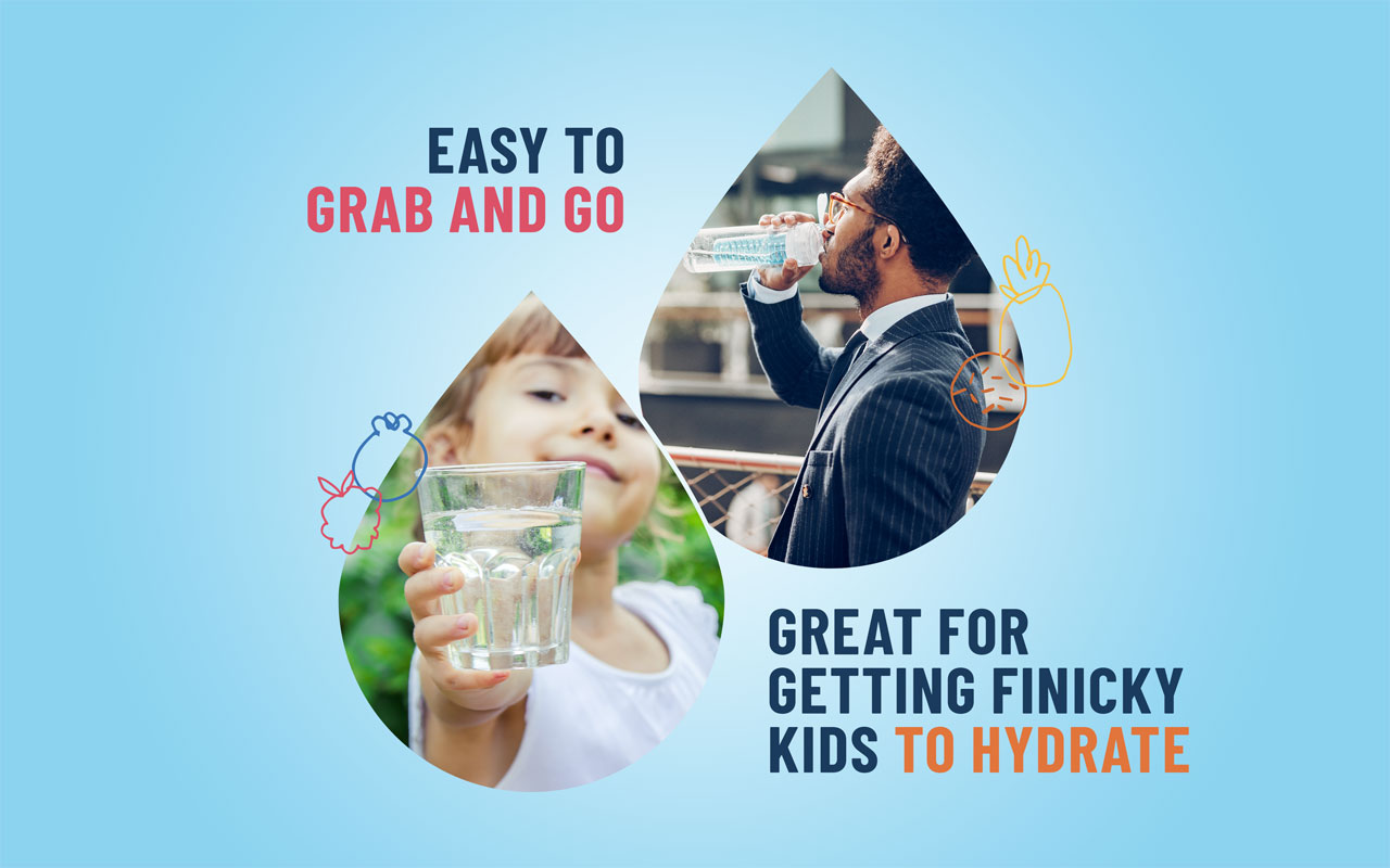
While seeking to satisfy their current customers with their continued value offerings they wanted to set themselves up to capture new customers who were looking for higher-quality value products.

Our challenge was to ensure that the new brand connected to the roots of Arizona and elevated their own brand to compete with national brands while still connecting with value shoppers.

The Solution

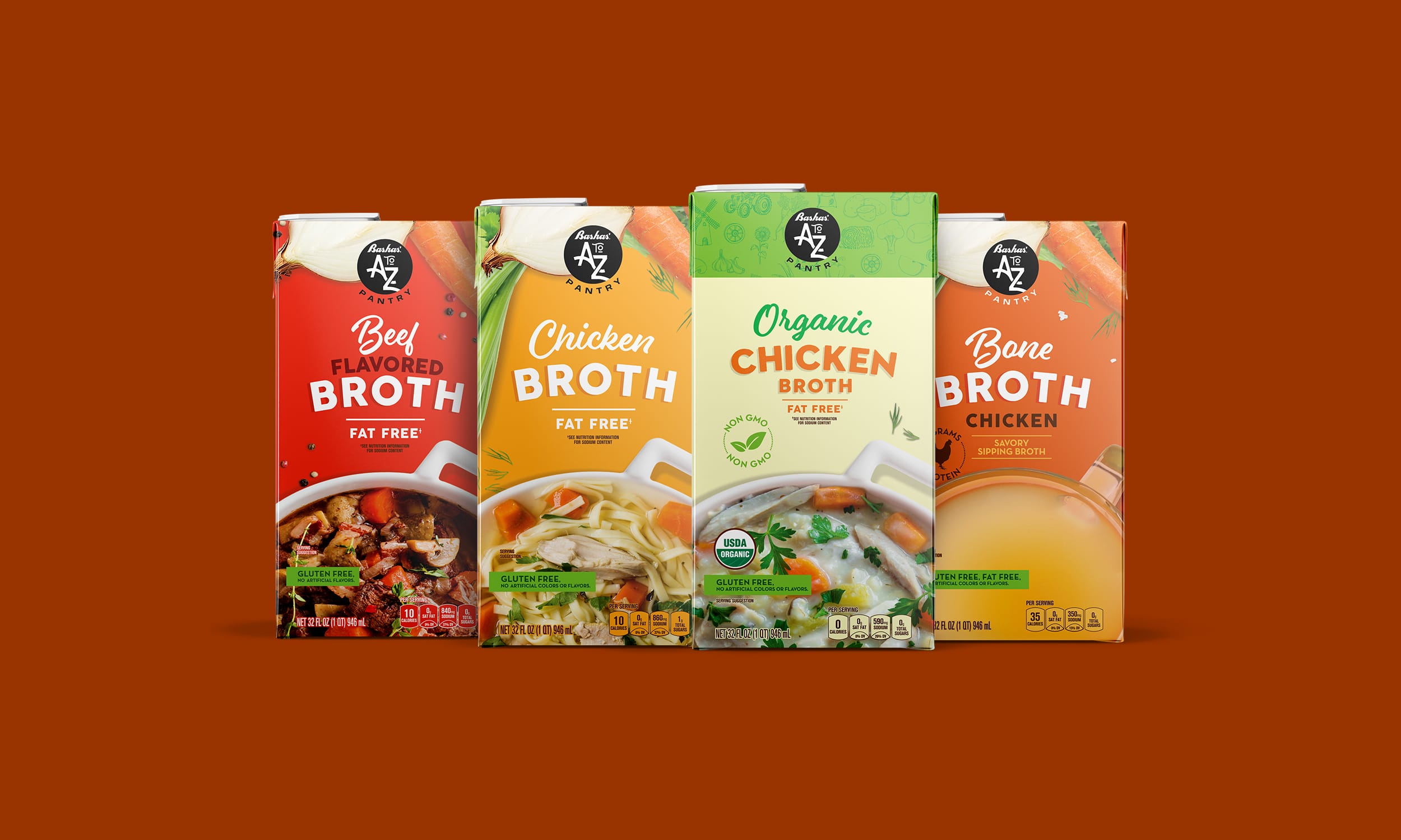
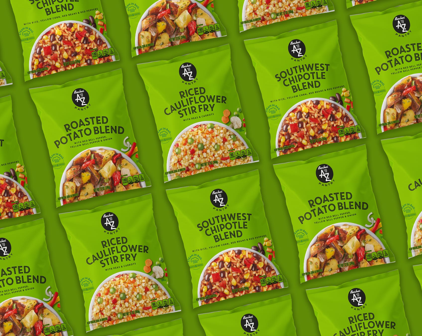
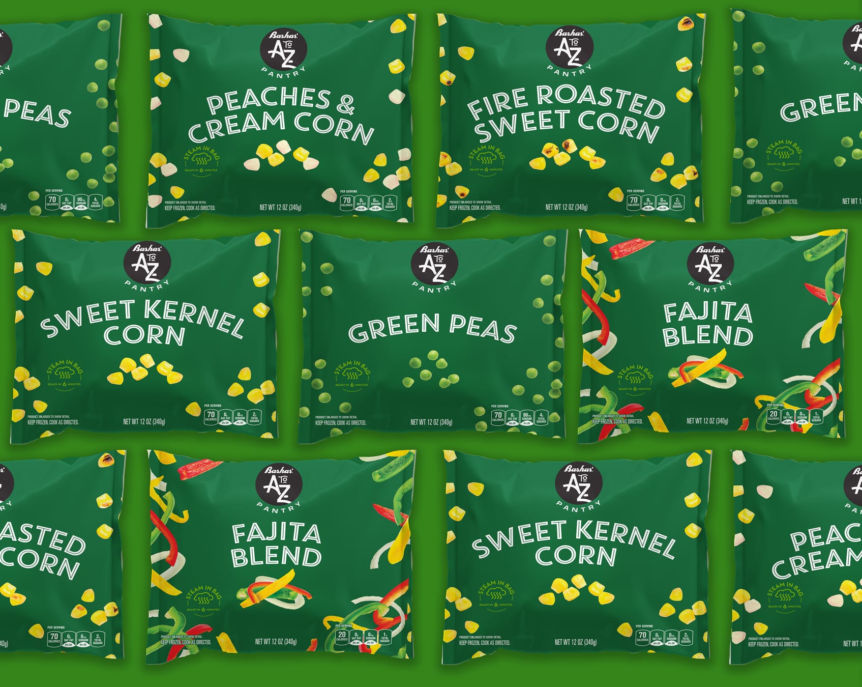
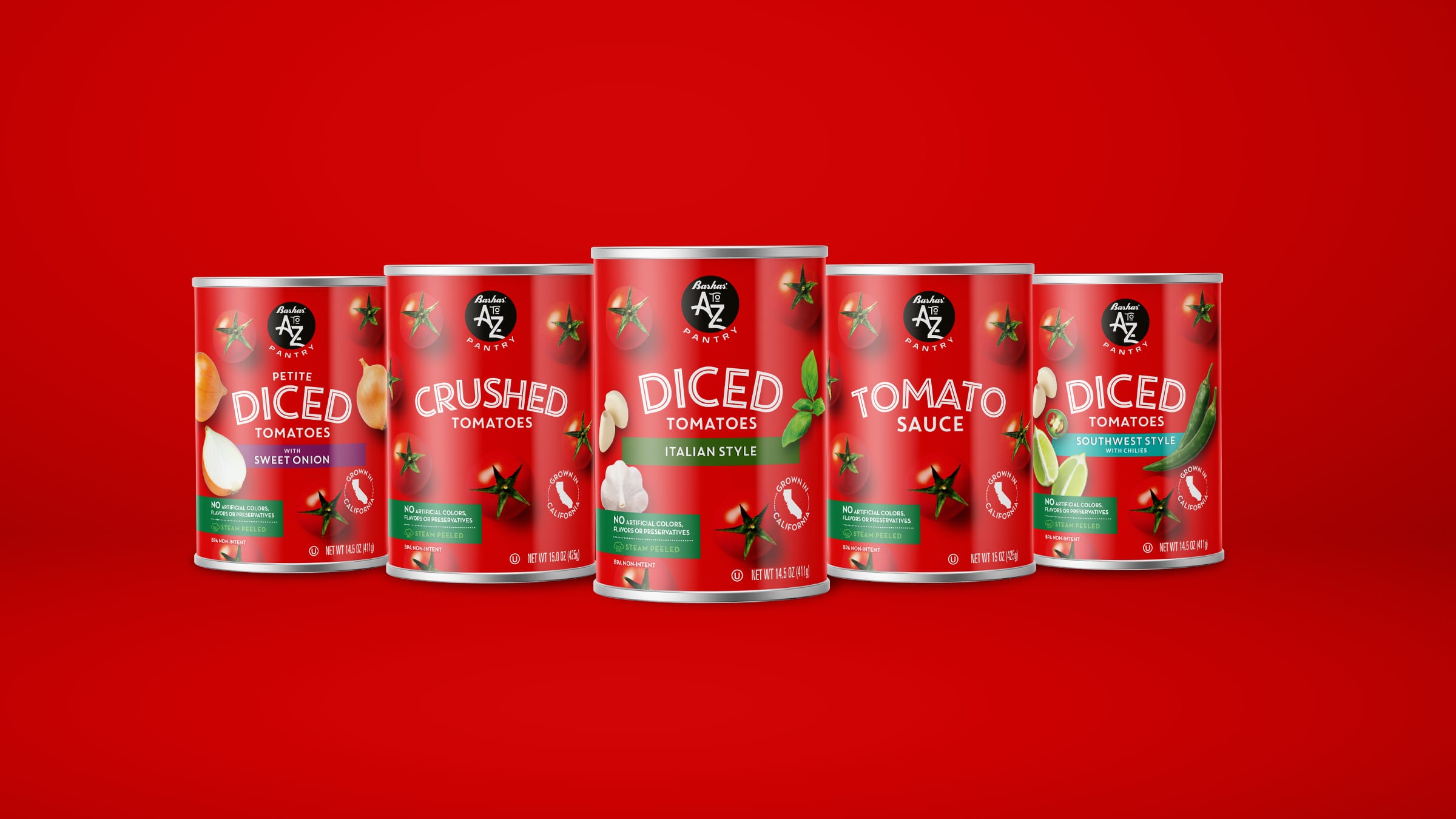
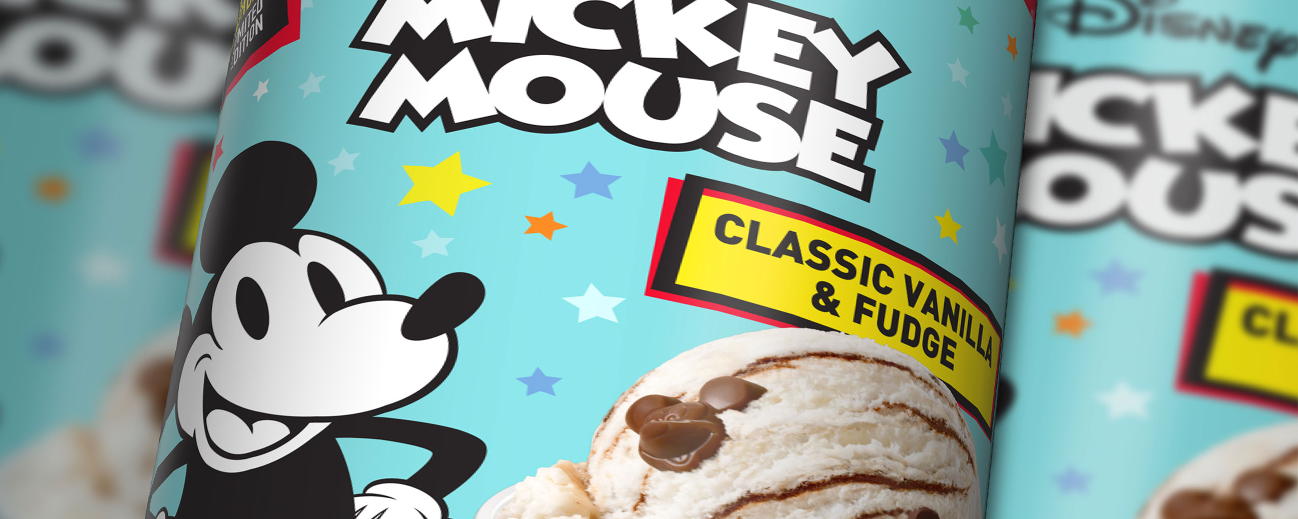
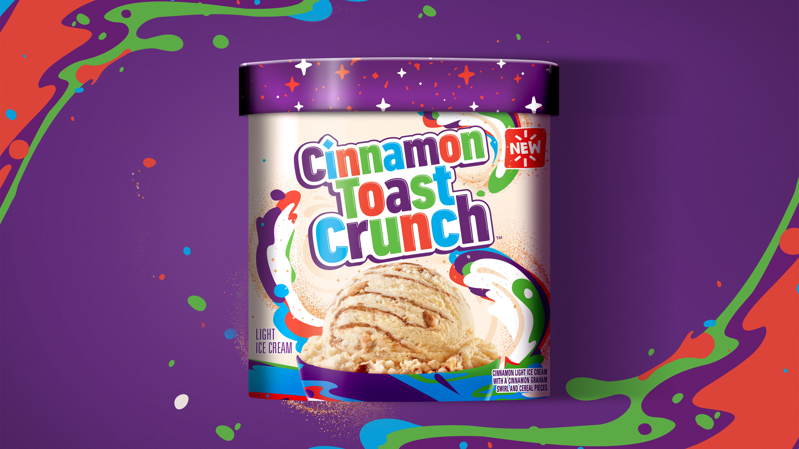
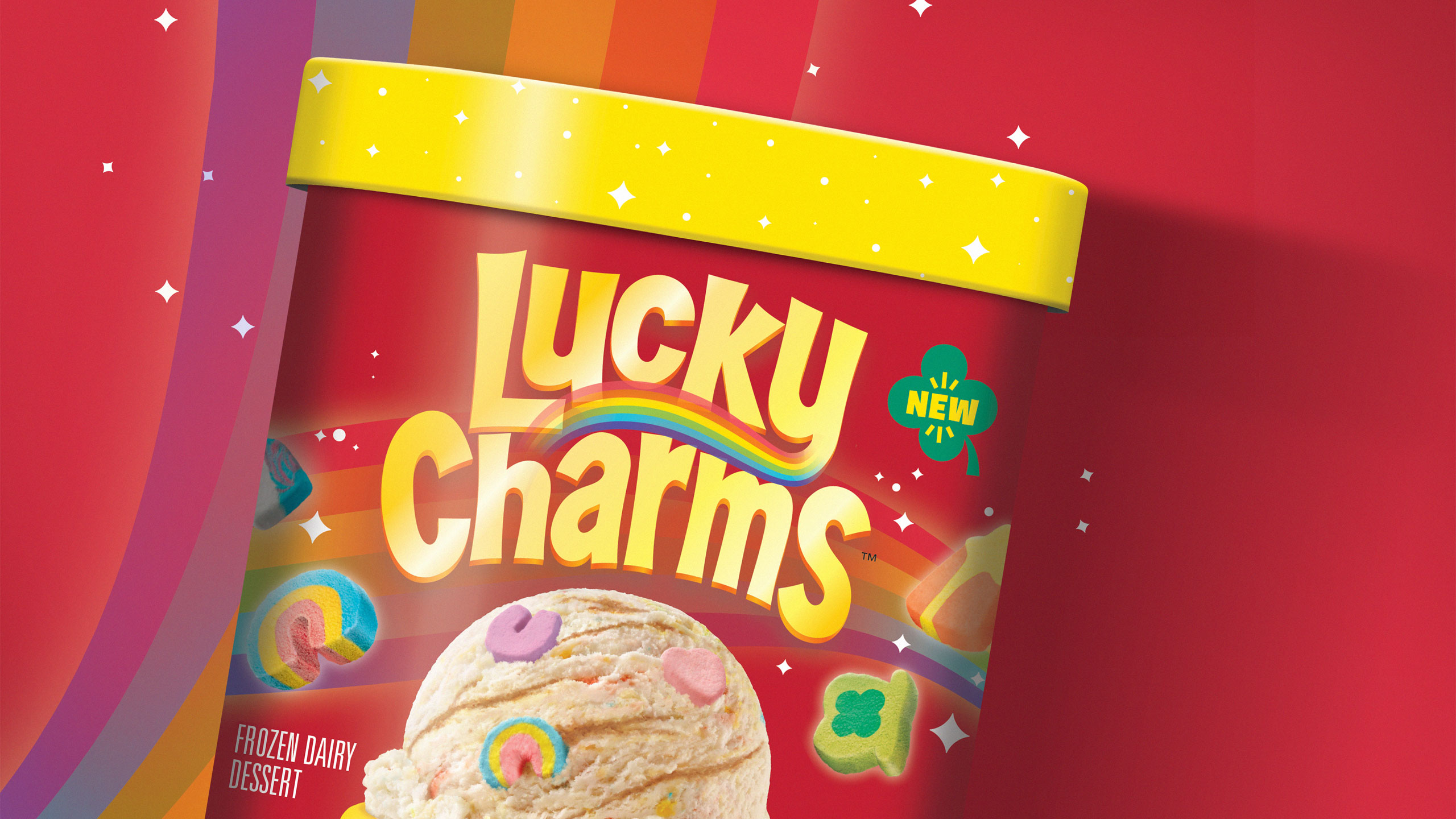
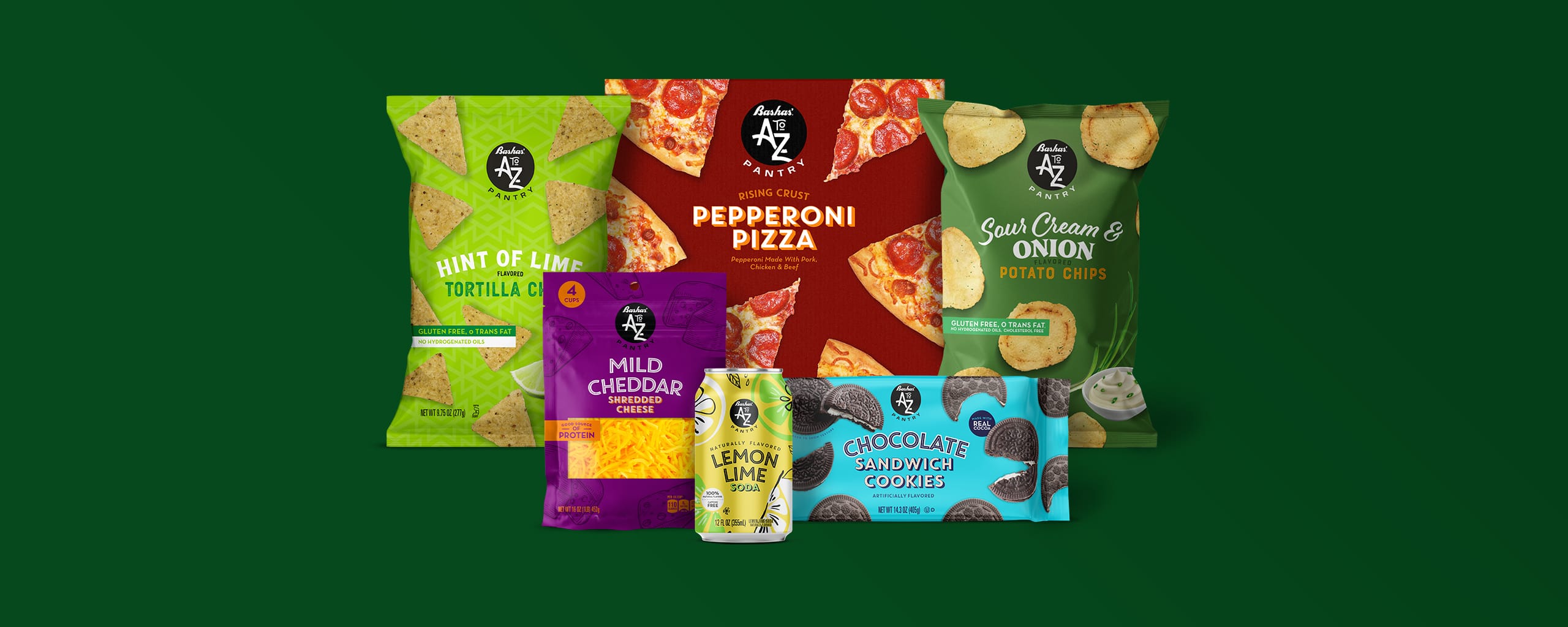
Developing a brand name for a private-label line of groceries can be a challenge since the products span a large group of categories. It was imperative that the brand name tie back to Bashas’ and/or their Arizona roots. “Bashas’ A to Z Pantry” rose to the top of our exhaustive naming exercise and immediately provided the breadth for a large set of products while connecting to their state pride. It also allowed the brand to flex into broader categories e.g. A to Z Home, A to Z Essentials, etc.

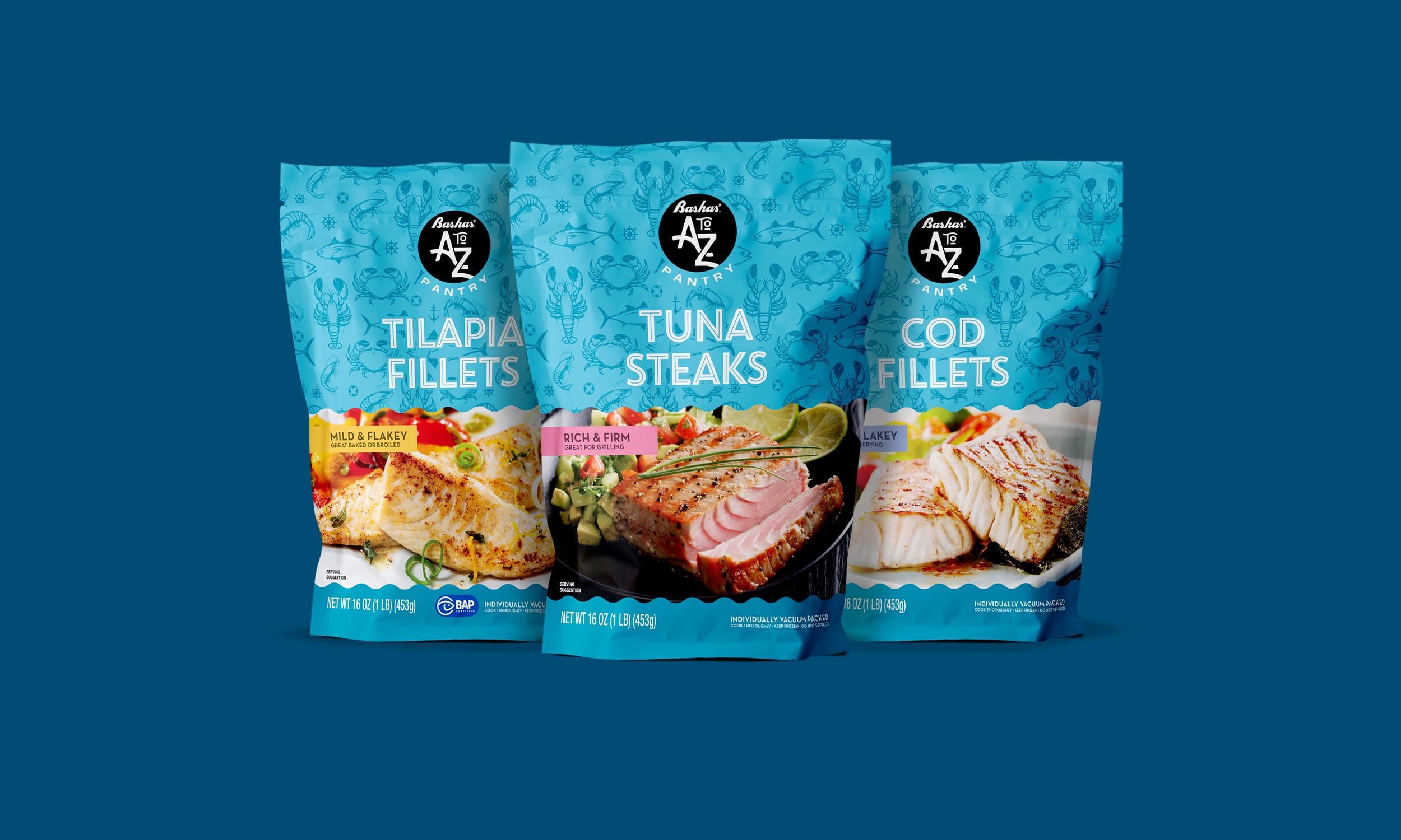
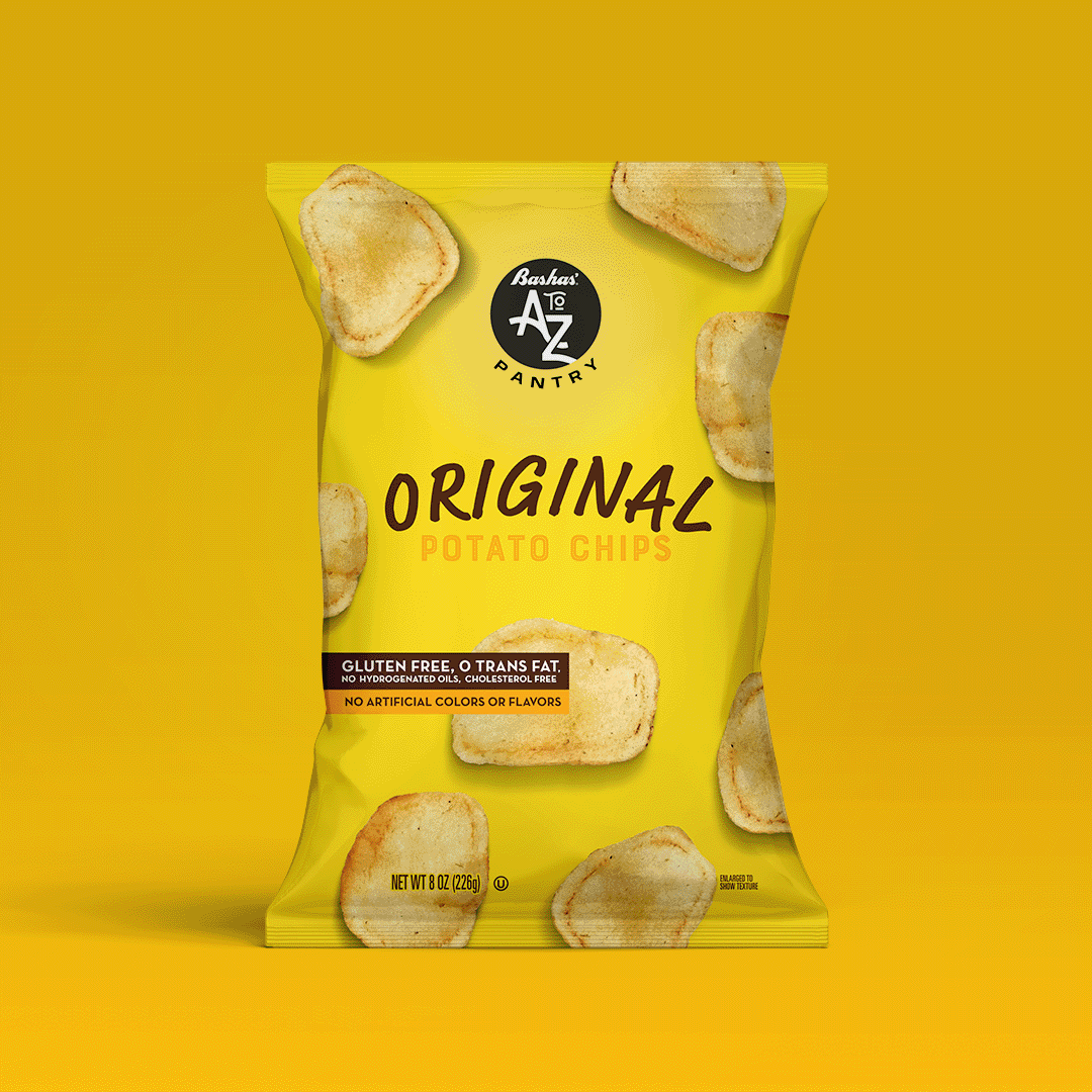
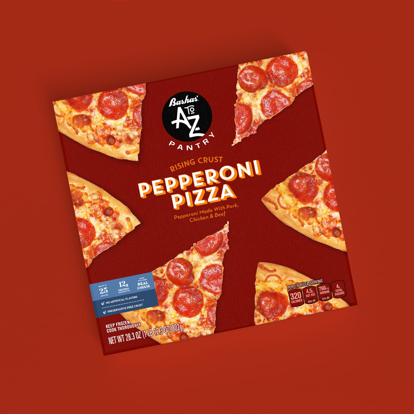
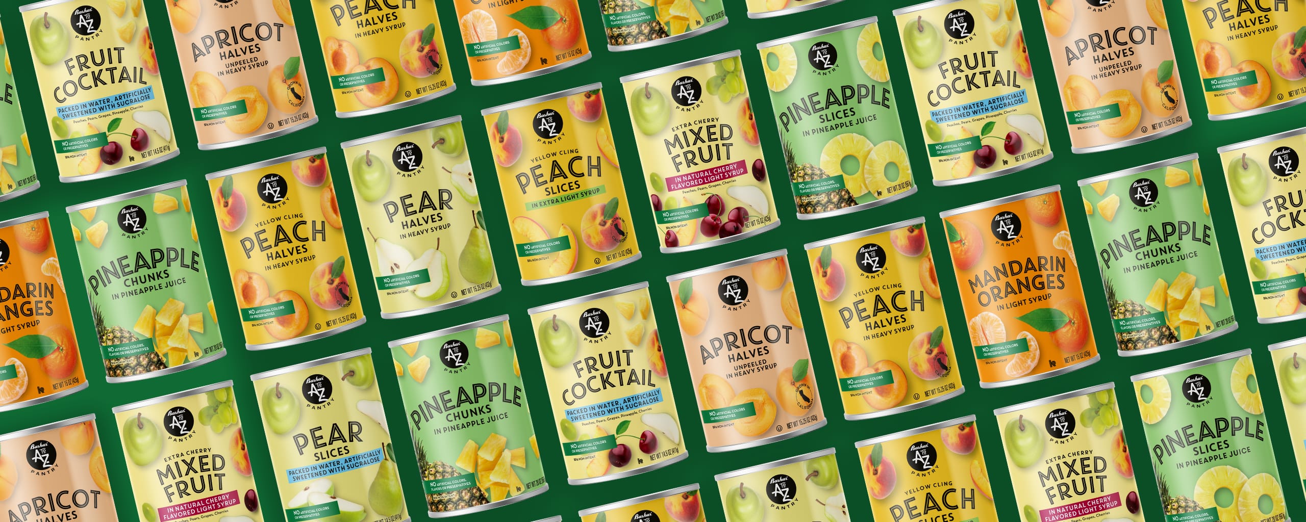
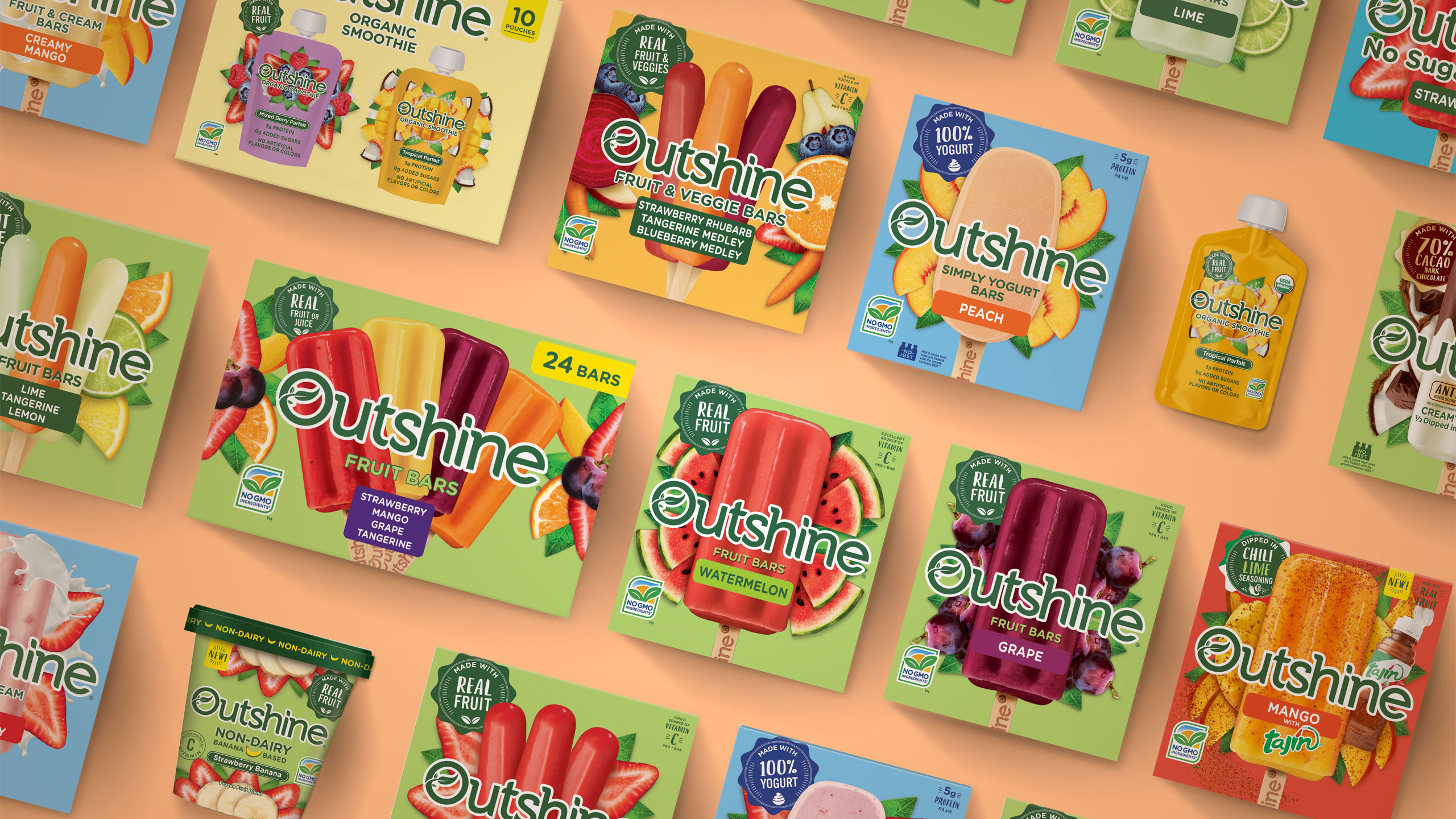
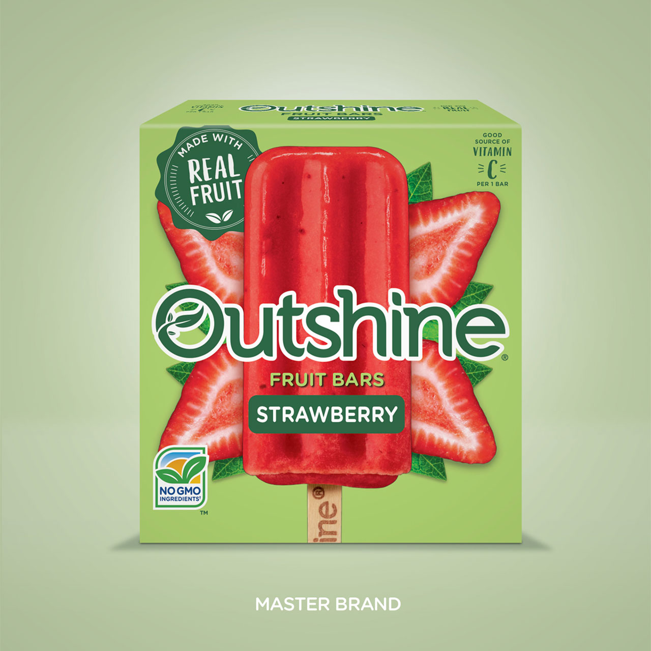
The next step, create a brand design system where the visual architecture could quickly communicate the brand to consumers and help it stand out on shelf. The bold, iconic A to Z Pantry symbol and the simple yet playful use of photography helped to achieve a unique product set across the store.

What’s more, the flexibility of the system and typography allowed for special situations where creativity is needed to compete with national brands in categories like salty snacks, cereal, and soda. While the claims statements were designed to provide consistency across product lines, helping consumers quickly identify the product’s benefits.

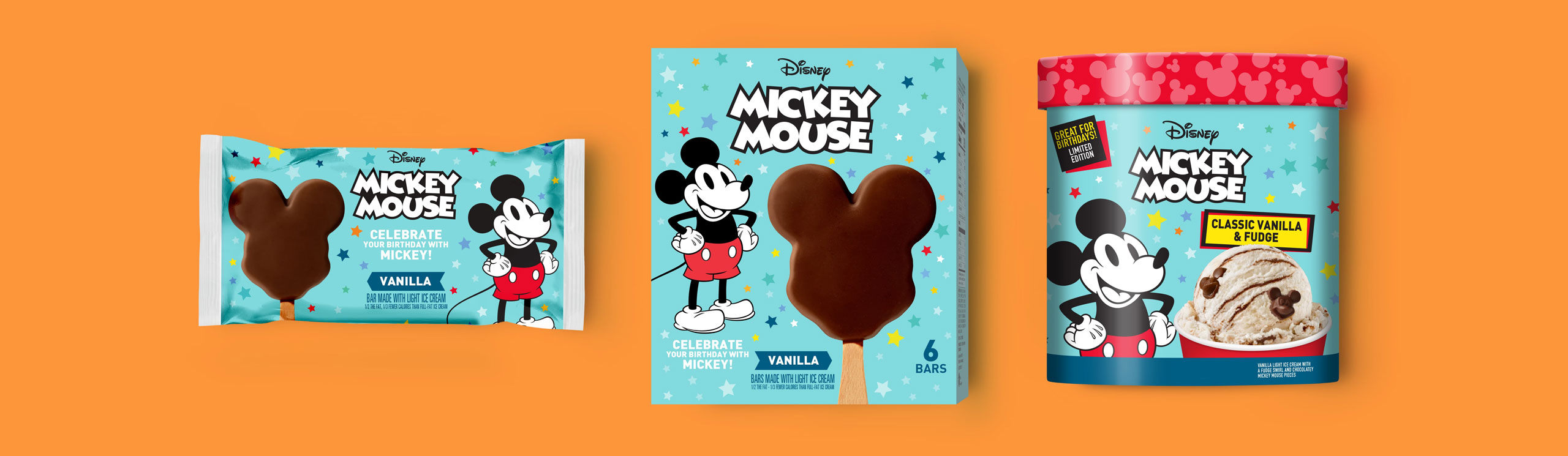
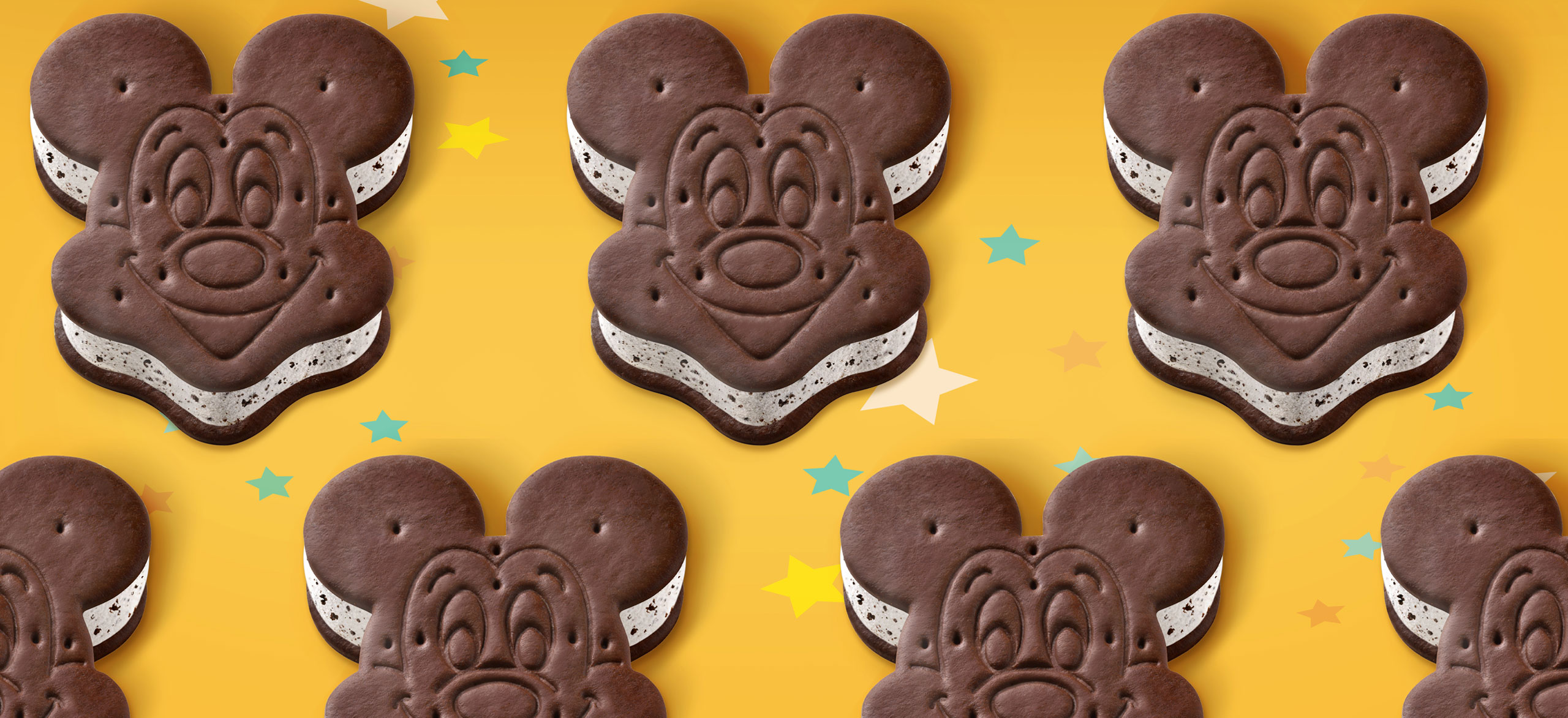
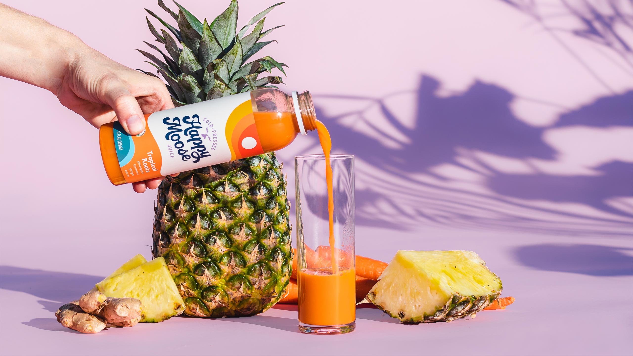
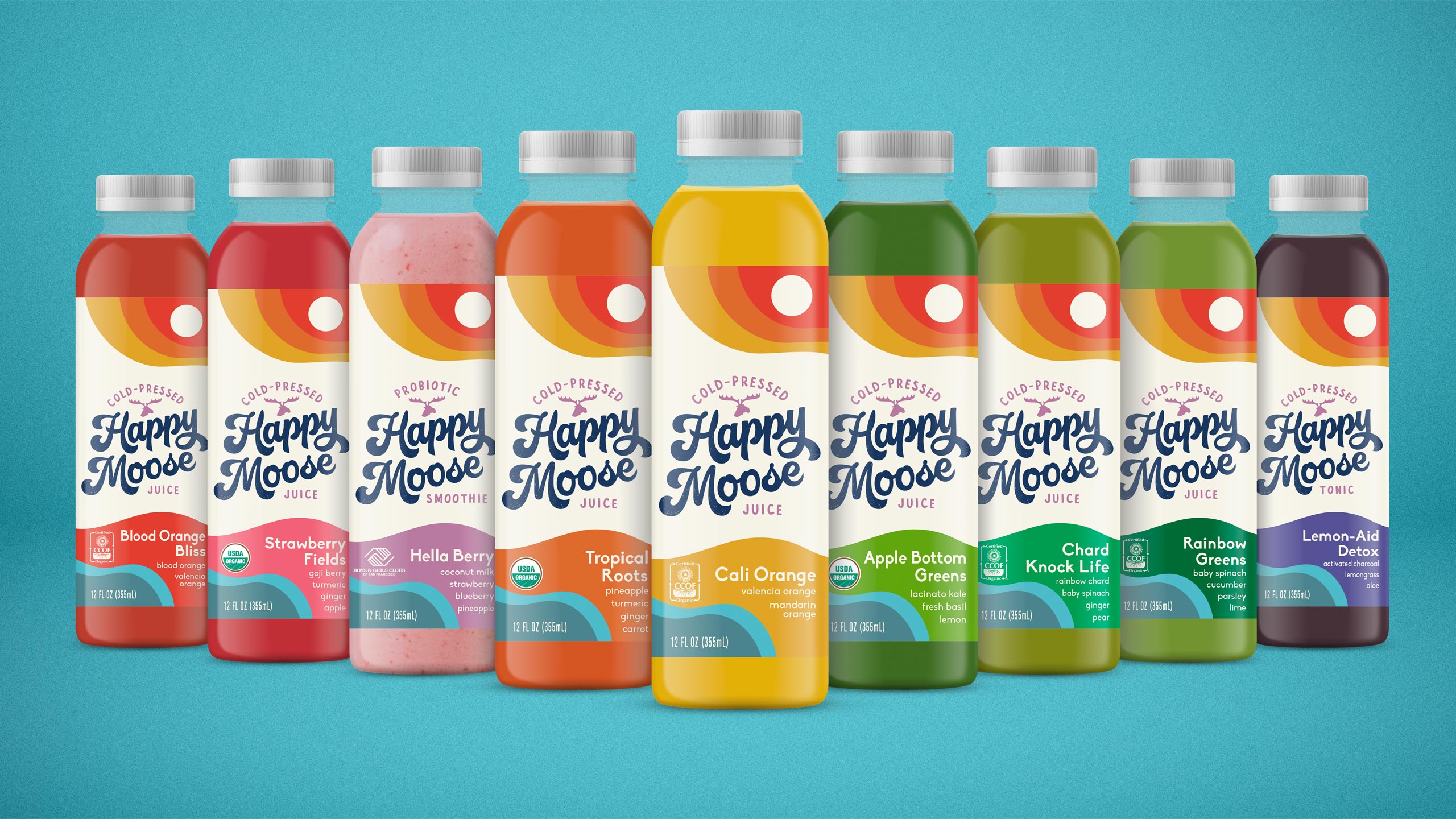
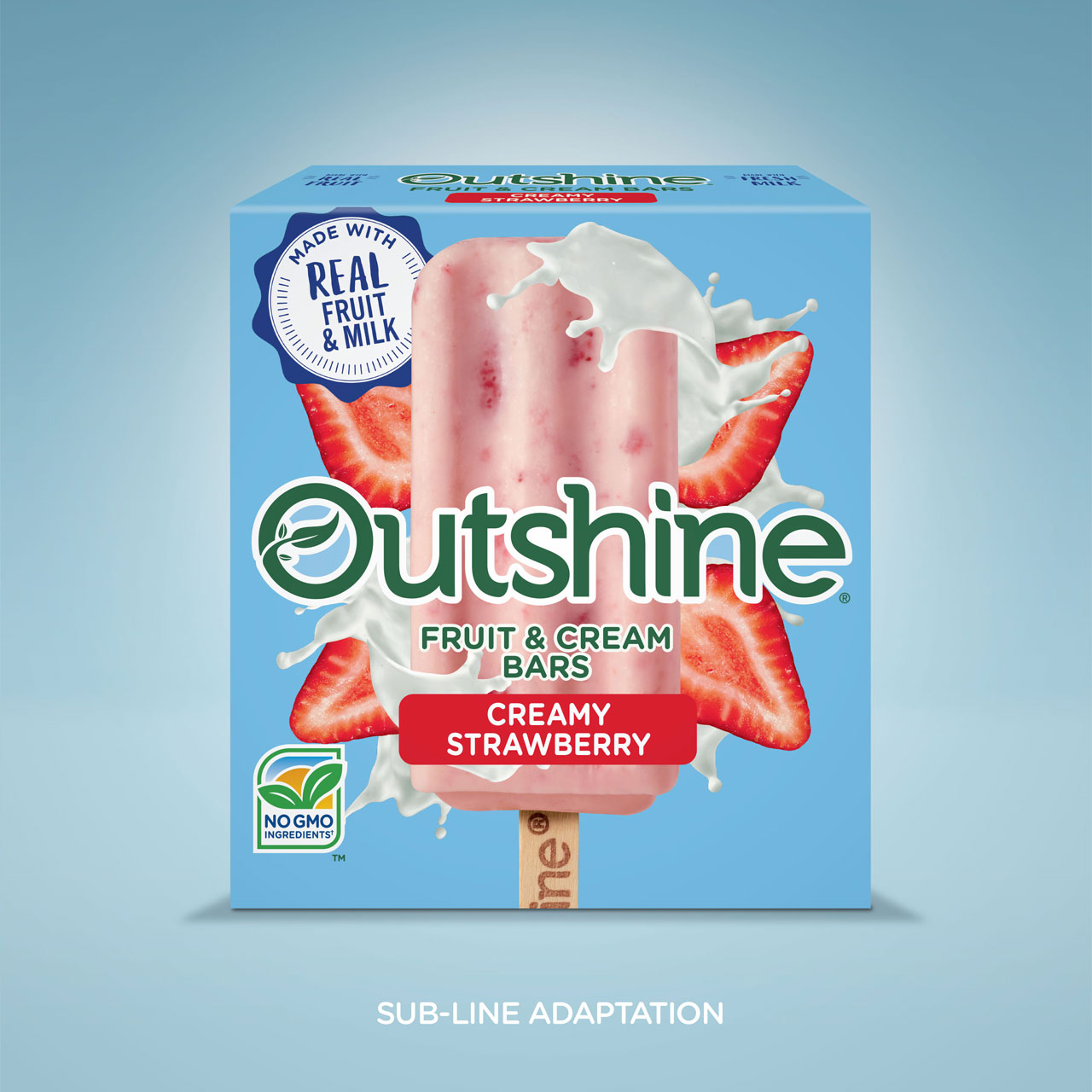
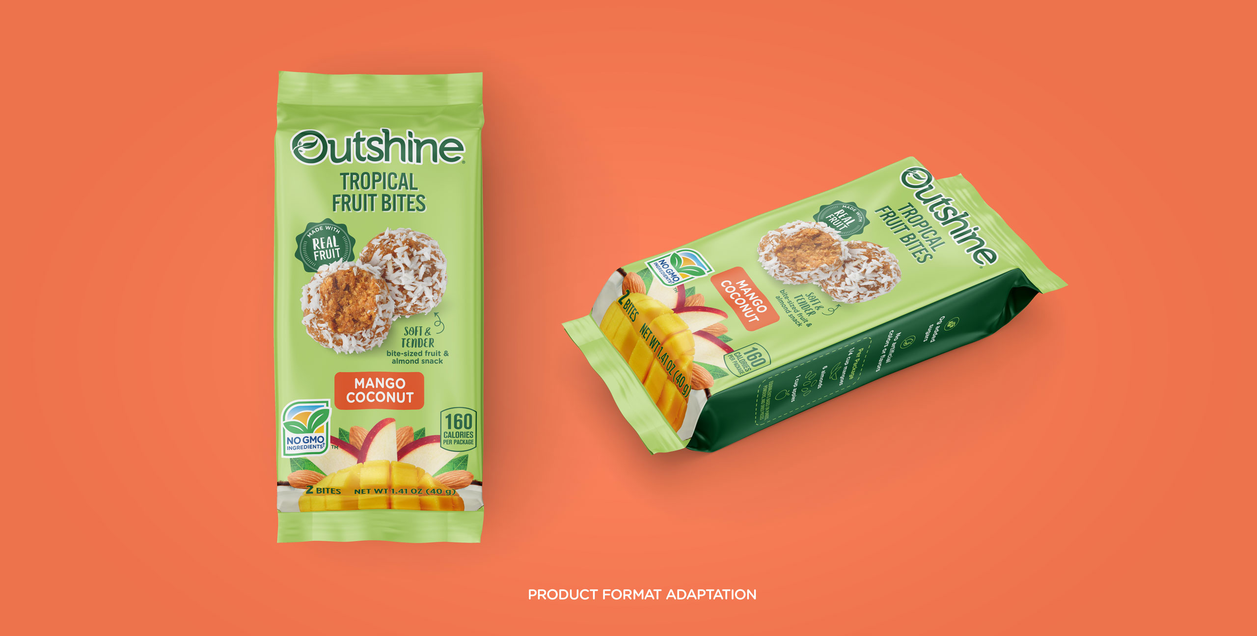
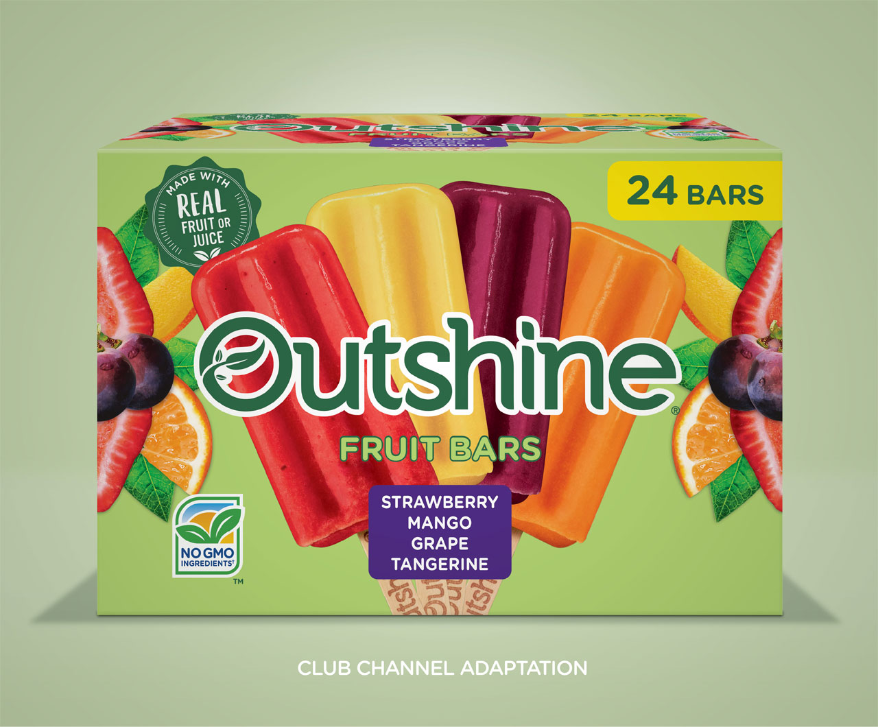
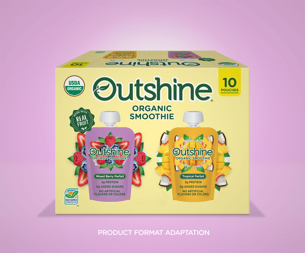
Then, the packaging system needed to stretch to work across a large variety of shapes and sizes, different printing processes, and different substrates. Working to ensure that it had an impact at any point in the customer shopping journey, from frozen to canned foods. The design work proved that the system could communicate on any shelf in the store.

Services

  • Naming
  • Logo Design
  • Packaging Design
  • Packaging Adaptations
  • Packaging Production
  • Product Photography

9%

Sales increased nine percent in categories where only the packaging was updated

Bashas’ A to Z Pantry
AtoZ Canned Fruit Image
A to Z Pizza image
A to Z Canned Fruit variety image
Have A Ball

Have A Ball

The Challenge

Snack ball brand Have a Ball promised their customers a high-energy, feel-good experience from their organic fruit and nut snack, but their brand identity wasn’t bringing the message home. Have a Ball needed to create a brand identity that would differentiate and compete in the saturated fruit & nut ball market.

WIth an opportunity to create a memorable brand and improve their shelf impact, Have a Ball partnered with The GRO Agency to develop a visual identity and product packaging.

Our challenge with the Have a Ball branding was to find a perspective that uniquely illustrated the health and flavor characteristics of the Have a Ball products, while carving out an eye-catching visual identity that could be easily recognizable on the shelf.

The Solution

Through the art of personification, we helped each Have a Ball product tell the age-old adage of ‘you are what you eat’. Bestowed with lively personalities, each package showcased the Have a Ball product illustrated to perform energetic activities like jumping rope, lifting weights, tap dancing, and more.

This visual strategy immediately informed the customer what to expect after consuming the tasty, functional treat. Live product photography that highlighted the wholesome ingredients paired beautifully with bright, eye-catching colors to help consumers easily find Have a Ball on the shelf.

From there, the brand messaging propagated through a high-energy voice brimming with passion for health and wellness. The brand became a beacon for a well-balanced and nutritious diet, and allowed consumers to ‘have a ball’ while chasing a more active lifestyle.

Services

  • Naming
  • Logo Design
  • Packaging Design
  • Flavor/Size Adaptations
  • Packaging Production
  • Illustration
  • Sales Collateral
GRO helped us create a fun, memorable name and package design for our fruit & nut ball innovation. GRO is adept at building different brand strategies and visual languages for several brands in a portfolio.

Yigit Isiker
President Safe Food Corporation

Have A Ball
Have A Ball
Have A Ball
Have A Ball
Have A Ball
Wonderlab’s Doozy Pots

Wonderlab’s Doozy Pots

The Challenge

Plant-based ice cream brand Doozy Pots aspired to satisfy your sweet tooth while reshaping food systems as a whole. While food scientist Kirsten Sutaria had a dream for her brand, she still needed to create a brand identity, visual identity, and messaging strategy for her plant based gelato brand.

With the opportunity to introduce a new challenger into the vegan gelato space, Doozy Pots tapped The GRO Agency to develop an inspiring brand identity and product packaging.

Our challenge with the Doozy Pots branding and product packaging was to effectively capture and communicate all the magical alchemy of food science, while appealing to the right consumers who would resonate with the brand message.

The Solution

For an upstart brand in a highly competitive space, carving out a well-defined niche is of the utmost importance. For this female-owned, plant-based ice cream company that brought low-allergen indulgence, regenerative farming, and the magical alchemy of food science, we found the right amount of inspiration within the founder’s story herself.

First, we created a visual identity that illuminated the story behind Doozy Pots, a creative female founder with the goal of reshaping food systems with low allergen, socially responsible, plant-based ice cream. The goal with the illustrations was to catch attention and tell the whole story of the Doozy Pots company right at first glance in the frozen aisle.

Then, the messaging strategy promised an indulgent experience of taste and nourishing ingredients, unlike others in the frozen dessert sector. Not only could Doozy Pots customers satisfy their cravings, but they could do so completely guilt-free with regards to their own health and their support of sustainability through regenerative farming.

Services

  • Brand Strategy
  • Naming
  • Logo Design
  • Packaging Design
  • Flavor/Size Adaptations
  • Packaging Production
  • Illustration
  • Website
In the past 2 years of working with the team at the GRO Agency they have become an extension of our team, transforming our vision into a brand. GRO brought Doozy Pots to life, creating a category disrupting on-shelf presence for our plant-based gelatos and developing a much loved brand identity. They’re responsive, creative, and seriously talented. Everyone at the GRO agency is a pleasure to work with and we’re proud to have them as part of the extended Doozy Pots family.

Kirsten Sutaria
Founder Wonderlab’s Doozy Pots

Wonderlab’s Doozy Pots
Country Natural Beef

Country Natural Beef

The Challenge

Ranching co-operative and meat provider Country Natural Beef (CNB) had a robust history as a forward-thinking cooperative of family ranchers who have been raising healthy beef in harmony with the land since 1986, but their identity was failing to tell the full story. To better communicate their pride-ridden work and shared philosophies, CNB needed to create a more telling visual identity.

With an opportunity to carve out an elevated brand identity, CNB tapped The GRO Agency to deliver unique packaging design and mouth-watering product photography.

Our challenge with the CNB product packaging redesign was to 1) tell the authentic story of CNB’s progressive and sustainable approach to ranching, deeply ingrained in the communities and families of the Co-op, and 2) make a premium and more ownable visual identity centered around their community engagement and sustainable practices.

The Solution

In the meat industry, brands must avoid appearing like a big corporate supplier at risk of subconsciously being thrown in the overarching category of ‘over-processed’. WIth the rebrand, CNB wisely made it clear to consumers that whenever they buy CNB products, they are buying quality beef directly from a ranch family, not a big corporate supplier.

First, amongst many of CNB’s philosophies is the strong belief that they would not market products that their own families would not eat. To serve as an anchor for the rebrand, the GRO Agency rallied the brand behind a new credo, families feeding families, to emphasize their community-driven roots and co-operative practices.

In addition to the human component, the packaging design introduced a modern style to some of the existing design elements that the Co-op had owned for many years, like strong typography reminiscent of a hearty meal. To make the brand name treatments for both CNB and their sub-brand Oregon Country Beef more distinctive and therefore more ownable, the communication hierarchy was rearranged to focus more on the logomark, and appear less of a white-label brand.

Finally, to seal the deal, the website design showcased mouth-watering product photography that captured the sizzling, juicy goodness of a perfectly-prepared meat dish.

Services

  • Brand Strategy
  • Logo Design
  • Packaging Design
  • Packaging Adaptations
  • Packaging Production
  • Website
Country Natural Beef
Clear Theory

Clear Theory

The Challenge

Water booster brand Clear Theory needed to position their products in a way that could compete with existing market leaders in the water-enhancing category. With the market dominated by big brands that promised enhancing athletic performance, Clear Theory wanted to forge its own path.

With an opportunity to target a gap in the market, Clear Theory trusted The GRO Agency to deliver a cohesive brand identity and eye-catching product packaging.

Our challenge with the Clear Theory rebrand was to speak to a brand new customer segment with an authentically refreshing voice, while differentiating themselves from their big-business competitors.

The Solution

While hydration is an important factor for athletic performance, drinking more water is, in fact, good for everyone. Staying true to the authenticity of their founders, Clear Theory was positioned as a premium, family-owned alternative that targeted modern, on-the-go families.

First, the brand identity promoted functional hydration with daily, delicious, hassle-free water consumption for children and adults. What’s more, Clear Theory became a preferred choice to get children in the habit of hydrating – something that would resonate with parents who were struggling with picky eaters and drinkers.

Next, the product messaging made extra effort to distinguish itself from competitors. The packaging is sure to mention that not only does Clear Theory’s flavor combinations rank highly, but also the all-natural water drops are, as the name suggests, CLEAR – devoid of the artificial coloring and flavors included in other options.

Finally, the product packaging design leverages refreshing primary colors that contrast fruit silhouettes, serving as a reassuring nod to the flavors bursting within each drop.

Services

  • Brand Strategy
  • Naming
  • Logo Design
  • Packaging Design
  • Adaptation: Full Portfolio
  • Packaging Production
  • Website
  • Sales Collateral
Clear Theory
Clear Theory
Clear Theory
Clear Theory
Clear Theory
Clear Theory
Clear Theory
Clear Theory
Clear Theory
Clear Theory
Disney License Work

Disney License Work

The Challenge

Ice cream brand Dreyer’s Grand Ice Cream hoped to conjure up the magic of Disney in the frozen aisle with a new line of Mickey Mouse ice cream products. Previously a Disney Park exclusive, Dreyer’s Grand Ice Cream needed to design packaging that would represent the Disney brand, leverage the nostalgia of America’s favorite mouse, and create a unified line of products that would attract attention on shelf.

With the opportunity to first bring a Disney Park exclusive to the masses, Dreyer’s Grand Ice Cream tapped The GRO Agency to design packaging for their assortment of Mickey Mouse Ice Cream Products.

Our challenge with the Mickey Mouse packaging design was to 1) work within the strict licensing parameters, 2) creatively utilize brand elements and colors to design a system that fit for the Disney brand, and 3) all while standing out from the competition in the freezer aisle.

The Solution

To create impactful packaging that would thrill the devoted Disney enthusiast yet appeal to the general ice cream lover, Mickey brand assets were employed thoughtfully and strategically throughout the design. The result: In the year following the launch, Mickey Bars were the top performing Nestle ice scream snack in 2019.

First, leveraging similar Disney-branded layouts and color palettes throughout the design system, the product line shares a unified look to help them stand out and remain recognizable as a cohesive offering. The packaging is simple, straight to the point, but also communicates that essence of Disney magic, as well as the deep and poignant nostalgia inherent to the brand.

From there, appetizing product photography broadcasted the creamy textures and flavors of the ice cream product, while the appealing color palette captured the hearts of kids, adults, and even the Disney agnostic alike.

Services

  • Packaging Design
  • Packaging Adaptations
  • Packaging Production
  • Product Photography
The top performing Nestlé ice cream snack SKU the year after release

Nestlé Licensing Team

Disney License Work
Disney License Work
Disney License Work
Disney License Work
Disney License Work
Disney License Work
General Mills License Work

General Mills License Work

The Challenge

Ice cream brand Dreyer’s Grand Ice Cream was developing the highly-anticipated crossover of the decade in their new line of ice cream flavors, directly inspired by General Mills cereals like Cinnamon Toast Crunch and Lucky Charms. With this much brand firepower behind one line of products, it was crucial to properly capture and communicate the brand elements of both companies into a powerful product design strategy.

With an opportunity to introduce an innovative product line to a wider consumer base, Dreyer’s Grand Ice Cream brought on The GRO Agency to design the packaging for their new line of General Mills cereal-flavored ice cream products.

Our challenge with the General Mills product packaging was to translate the essence of the brands so that they were instantly recognizable to the shoppers, while also appealing to a slightly older consumer base.

The Solution

In the cereal aisle, brands rely heavily on mascots and kid-friendly illustrations, whereas ice cream products typically aim toward an older crowd and require a heavier focus on appetite appeal. For the Dreyer’s-General Mills packaging, the brand elements were distilled down to its key components in order to strike a balance between the competing consumer expectations.

First, to maintain the brands’ recognizability among consumers, the product packaging showcased the playful attitude and nostalgia of each respective brands, with an intentional focus to eliminate any seemingly juvenile aspects. By focusing on the brand design elements and omitting the cartoonish mascots, the package was instantly recognizable and easily targeted the whole family.

Then, by incorporating the bold use of color and a design system built for flexibility with plenty of room for the brandmark to play, the packaging truly brought life to these classic brands within this new space. Stylized bowls in the language of the respective brands helped bring the design together as a unified whole.

Finally, the appetite appeal was a key part of the overall success of this packaging. To get that right, live product photography with high-quality photo-illustration created delicious scoops that genuinely encapsulated the richness, texture, and flavor profile of the ice cream product.

Services

  • Packaging Design
  • Adaptation: Full Portfolio
  • Packaging Production
  • Photography
  • Point of Sale
General Mills License Work
Happy Moose

Happy Moose

The Challenge

Cold-pressed juice brand Happy Moose squeezed a better juice, but without a clear visual identity, the audience found themselves hard-pressed to choose Happy Moose over their competitors. With rows and rows of juice options on the shelves, the juice brand wanted to update their packaging design to tell a more engaging brand story.

With an opportunity to stand out as a premium contender in the juice market, Happy Moose tapped The GRO Agency to align the brand essence and update the product packaging.

Our challenge with the Happy Moose packaging rebrand was to develop unique brand visuals and messaging that authentically told the Happy Moose story, as well as clearly communicate all the health benefits of drinking Happy Moose cold-pressed juice, in a way that audiences would care about.

The Solution

When defining and distilling a brand identity, oftentimes the best inspiration comes from within. In this case, the Happy Moose brand identity borrowed directly from the creative background of the music-loving founder himself.

First, borrowing from the vintage aesthetics of Dogtown, the Z Boys, skate culture, and the artistic expressions of the Californian 70’s, the Happy Moose visual language and color scheme reflected all the unique aspects of a romanticized era. With ocean waves and surfing moose, the product packaging became a promise to quench your thirst and have fun doing it.

Next, pinning the musician-turned-entrepreneur at the center of the brand strategy, the Happy Moose verbal strategy took on an organic voice of its own – Not only to describe its unique flavor combinations and heirloom ingredients, but also to communicate the nutritional benefits of cold-pressed juice in a way that customers could digest.

Finally, engaging a wide audience of eco-conscious juice drinkers, the product messaging made mention of the community partnerships that made Happy Juice special, including support from organic farmers and national organizations.

Services

  • Packaging Design
  • Flavor/Size Adaptations
  • Packaging Production
As an emerging CPG brand, I am so happy that we decided to work with GRO on our recent brand refresh and packaging design project. Along with having many talented designers in their arsenal, Kelly and Danielle are simply amazing humans to work with. They approach the project with loads of empathy for the founder/brand and when we needed to have tough conversations, they never failed to foster a client-first mentality.

Ryan Armistead
Founder Happy Moose

Happy Moose
Happy Moose
Happy Moose
Happy Moose
Happy Moose
Happy Moose
Happy Moose
Happy Moose
Happy Moose
Simply Fuel

Simply Fuel

The Challenge

Health & energy snack brand Simply Fuel had outgrown its humble beginnings as a viral homemade sensation and go-to snack of the Kansas City Royals. Founder Mitzi Dulan knew that if she wanted to expand and deliver her scrumptious, protein-packed energy balls to the masses, she would need to level up the look and feel of her packaging, but in a way that still reflected the brand’s homemade element that customers really loved.

With an opportunity to delight both new and existing customers, Simply Fuel engaged The GRO Agency to invigorate their product packaging and design.

Our challenge with the Simply Fuel packaging rebrand was to bring its appearance up to speed with modern expectations of a trustworthy snack company, all without compromising the recognizable home-made element at the core of their brand.

The Solution

Fueled by creative analysis, the concept of “home-made” foods were distilled into a list of clear visuals and experiences. Incorporating all of these elements into brand visuals, Simply Fuel’s new packaging concept successfully evoked a nostalgic and appetizing mindset.

First, to convey a visual language of warmth, care, and the handcrafted quality of the products, the packaging design employs homespun, craft paper texture with torn paper edges, as well as a rustic “stamped” typography, as a nod to fresh baked goods packaged right at the counter.

Next, because Simply Fuel was created for a health-conscious audience, the product messaging lends itself to a guilt-free indulgence as it lays a heavy focus on the health benefits, including the all-natural ingredients, protein density of a single serving, and allergen-friendly properties.

Finally, to seal in the undeniable fact that these delectable morsels taste too good to be healthy, high-quality product photography, true-to-size for enhanced effect, effectively captures the texture and density that await your first bite.

Services

  • Packaging Design
  • Flavor/Size Adaptations
  • Packaging Production
  • Website
GRO did an expert job at refreshing the brand, without alienating our existing, very loyal consumer base. Since redesigning our packaging we have seen an increase in national distribution and club store opportunities.

Mitzi Dulan
Founder Simply Fuel

Simply Fuel
Simply Fuel
Simply Fuel
Simply Fuel
Simply Fuel
Simply Fuel
Outshine Innovations

Outshine Innovations

The Challenge

Frozen fruit bar brand Outshine was branching their product portfolio in all different directions – not just new flavors and sizes, but also forging their way into new aisles and categories altogether. Along with their widespread variety of sub-brands and SKUs, Outshine needed to resolve shopability issues that began to result from flavor confusion and hierarchy issues within their established brand.

With an opportunity to improve their in-store shelf impact and expand their brand presence, Outshine tapped their long-time partner The GRO Agency to update their brand messaging and refine their product packaging across a growing number of lines and sublines.

Our challenge with the Outshine product portfolio enhancement was 1) to maintain consistency across the full portfolio, while still differentiating within it across sub brands and forms, and 2) to create strong brand recognition outside the frozen aisle where the brand is not typically encountered.

The Solution

Consumer tastes and preferences led the decision to boldly update, organize, and prioritize Outshine’s messaging and product expansion. Inspired by the brand’s core message, GRO helped Outshine develop and introduce new flavors, sub brands, product innovations, forms, and formats of their beloved frozen fruit bar – even outside the frozen aisle.

First, new flavors and formats of Outshine led the way, with their Organic line appealing to the health-conscious shopper and the Half-Dipped bars for the chocolate lover. Fruit & Cream bars brought a new texture to the table, while the Tajin line added some spice to the line-up. Outshine and GRO are still partnering on more flavors to this day.

Next, as a bold leap from the frozen food aisle, Outshine borrowed from their existing design and messaging hierarchy to introduce their shelf-stable smoothie category and snack categories. Remaining recognizable to a loyal shopper, these new products clearly articulated what made Outshine special in the frozen aisle, just geared towards a fresh audience.

Finally, to satisfy all the different ways that consumers interact with the Outshine brand, whether a personal snack or a party treat, GRO helped Outshine introduce new size variations and pack sizes, such as the ‘club’ size. With an organized brand messaging around the core brand identity, Outshine was free to expand their product lines as they pleased, without the confusion.

Services

  • Packaging Design
  • Adaptation: Full Portfolio
  • Packaging Production
  • Photography
  • Point of Sale
When we needed to expand our brand outside of our traditional aisle, we turned to GRO. The team at GRO brought expertise and creativity to the project, and were the quintessential partner throughout.

Sarah Holley Manager
Product Innovation Nestlé USA

Outshine Innovations