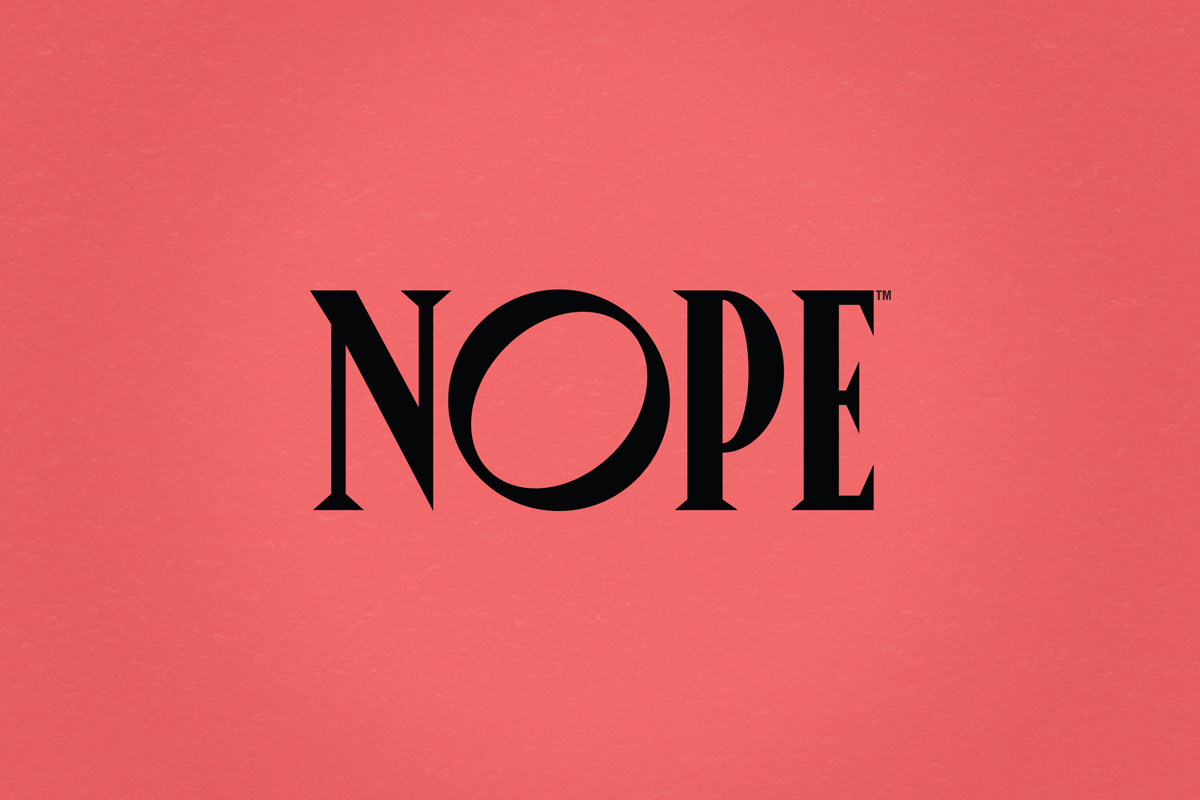
Nope Beverages

Nope Beverages

The Challenge

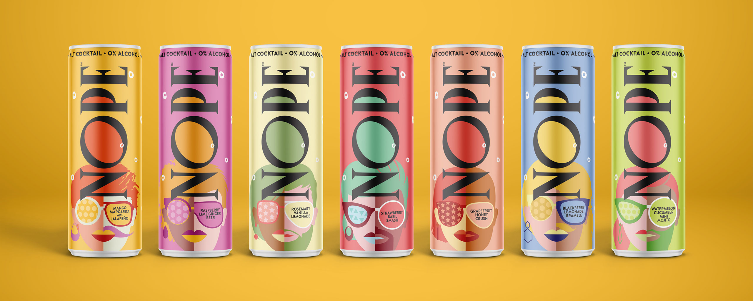
Alt-cocktail beverage brand Nope was already changing cocktail culture, but decided it was time to further carve their niche in the skyrocketing non-alcoholic beverage industry. With a sober/sober-curious audience who still very much wanted to be part of the scene, Nope needed to design their product packaging in a way that could help Nope drinkers fit in, and at the same time, stand out from their alcohol-drinking peers.

With an opportunity to appeal to sober socialites in the booming, no- and low-alcohol beverage sector (+506% since 2015, with projections of a $280 million market size in 2021 and 7.1% growth by 2025, according to Nielsen), Nope brought on The GRO Agency to deliver bold packaging concepts for their various flavored beverages.

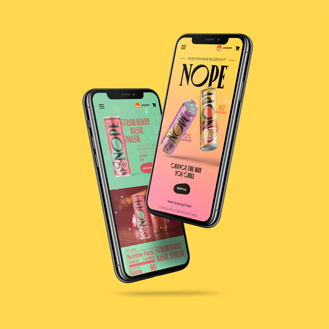
Our challenge with the Nope packaging design was to confidently engage young consumers on the shelf, across digital platforms, and even at the bar, while punctuating the occasion with a social statement that didn’t alienate drinkers.

The Solution

Through current-trend analysis on market data and social media, the Nope brand was re-engineered to address the issues that Nope’s target consumers face when it comes to drinking alcohol and social events,while positioning their “crafted” cocktails as the first-choice for taste and quality.

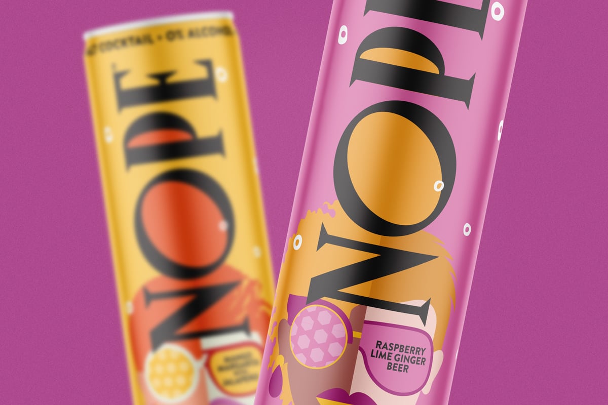
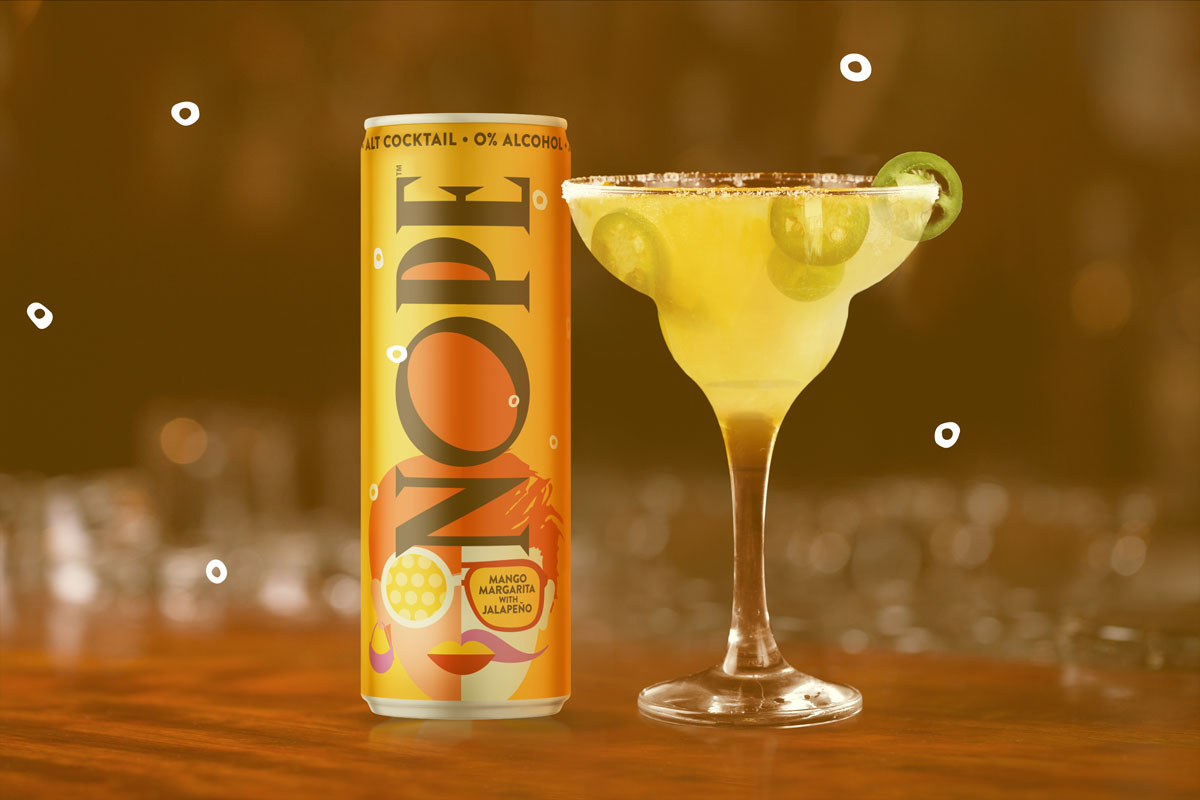
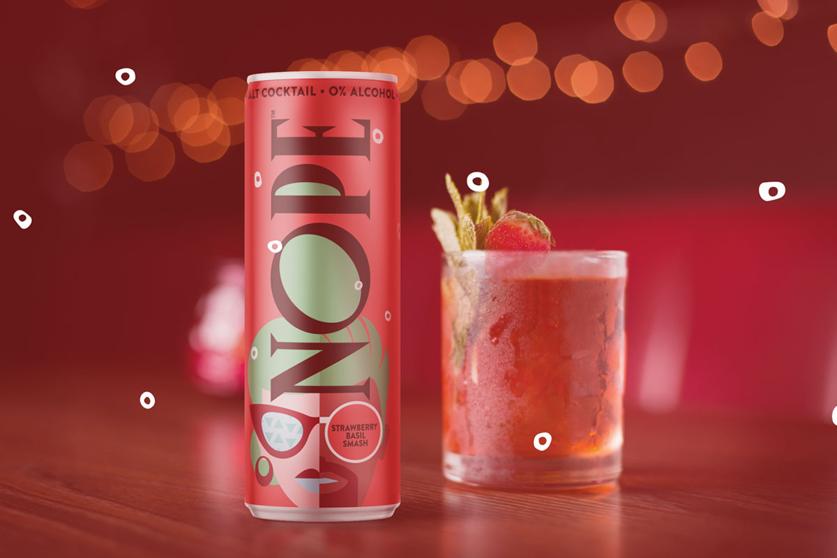
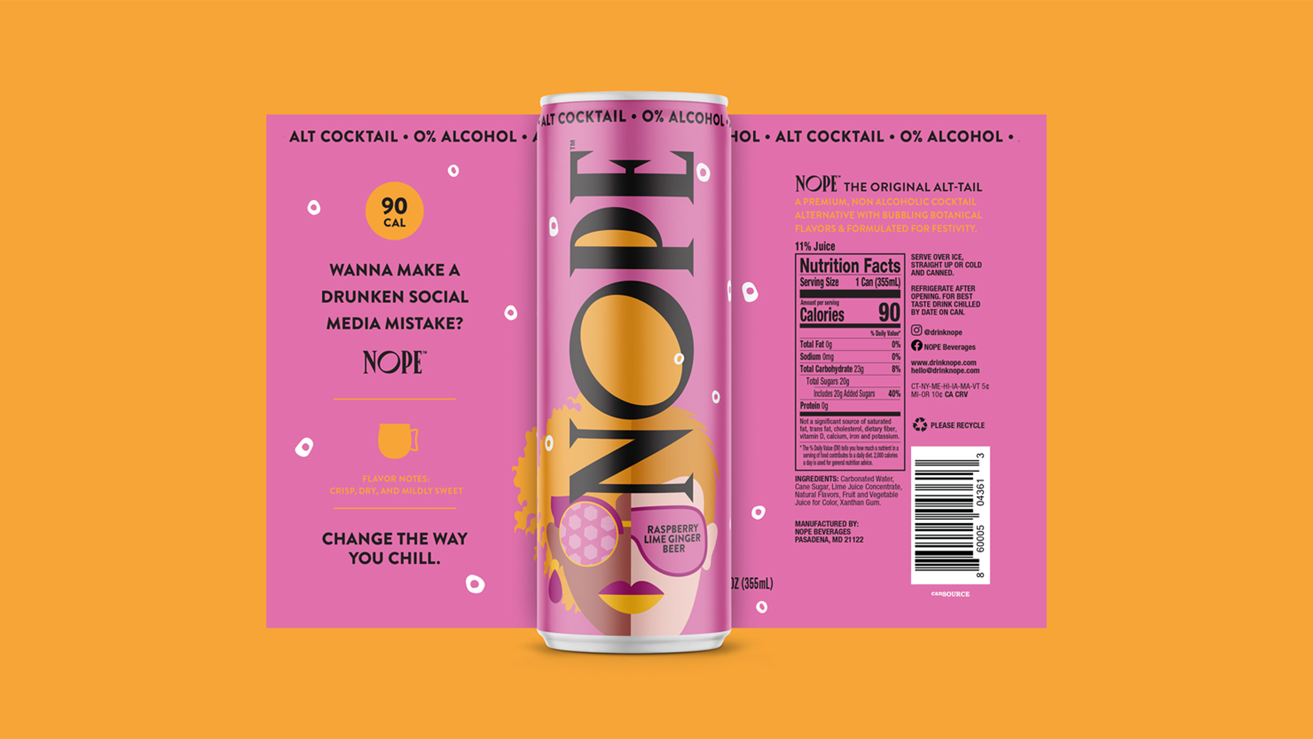
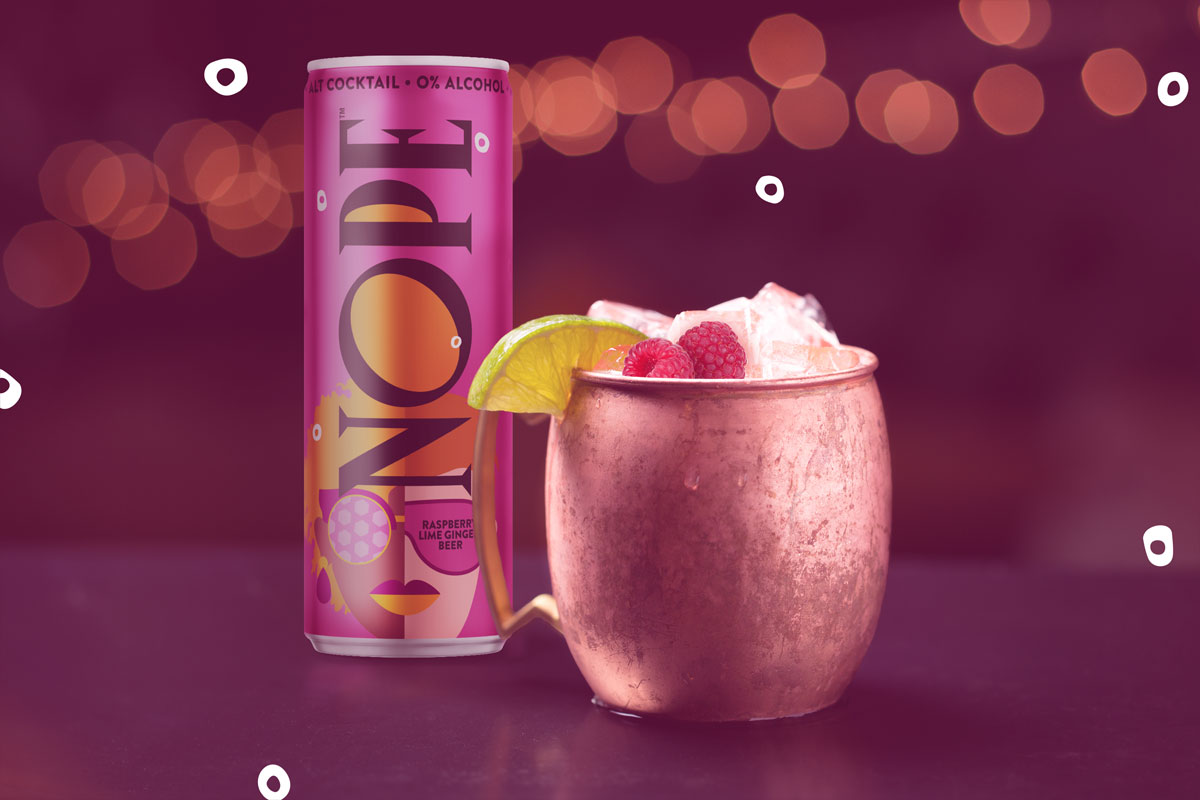
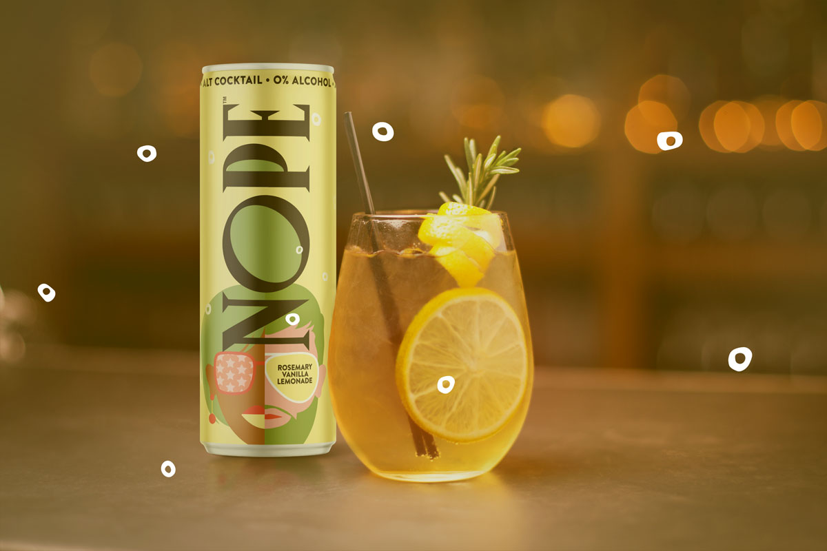
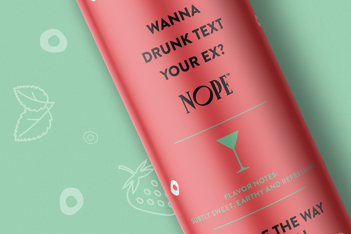
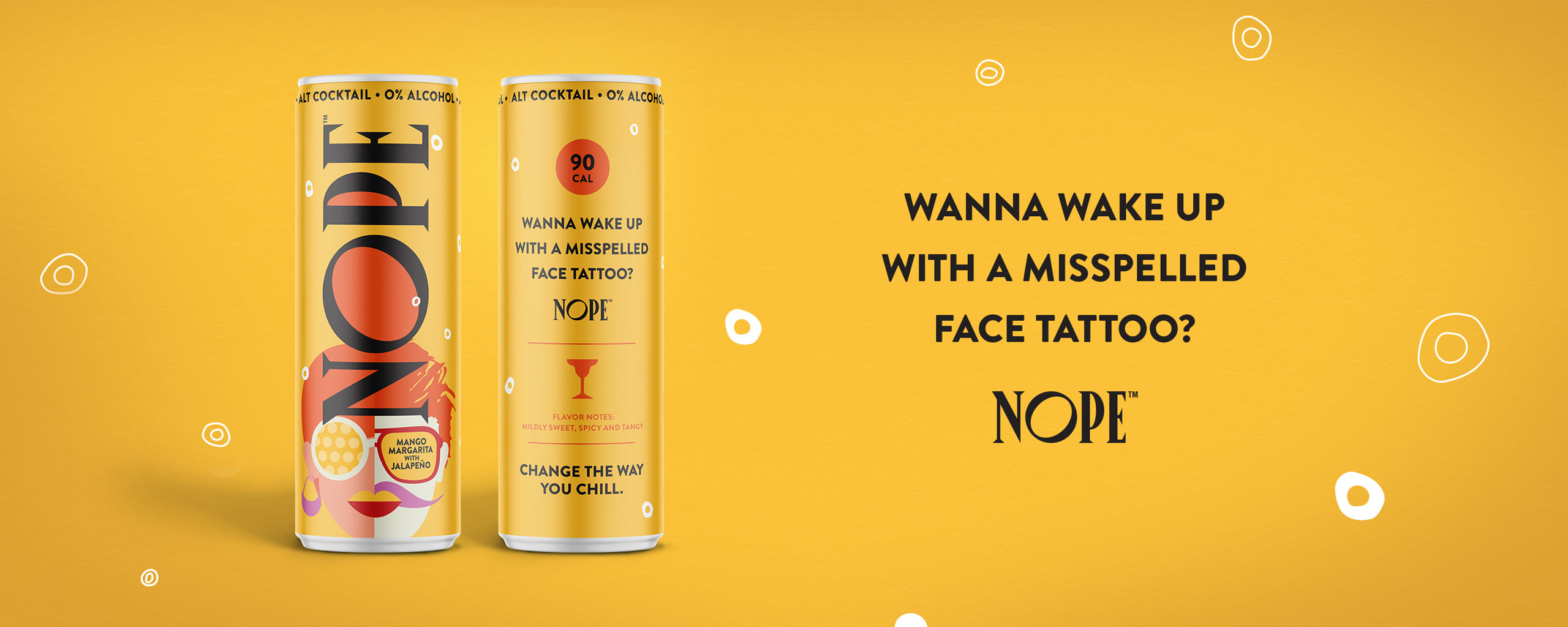
First, cocktail-themed color palettes and textures reminiscent of a vintage 90’s cocktail bar, the Nope packaging alludes to a smooth, crisp sipping experience that visually promises to satisfy the consumer’s thirst.

What’s more, at a first glance or in a dimly lit space, the Nope packaging design and colors are intentionally indistinguishable from a traditional alcoholic beverage, thus empowering the consumer to share their life choices at their own discretion.

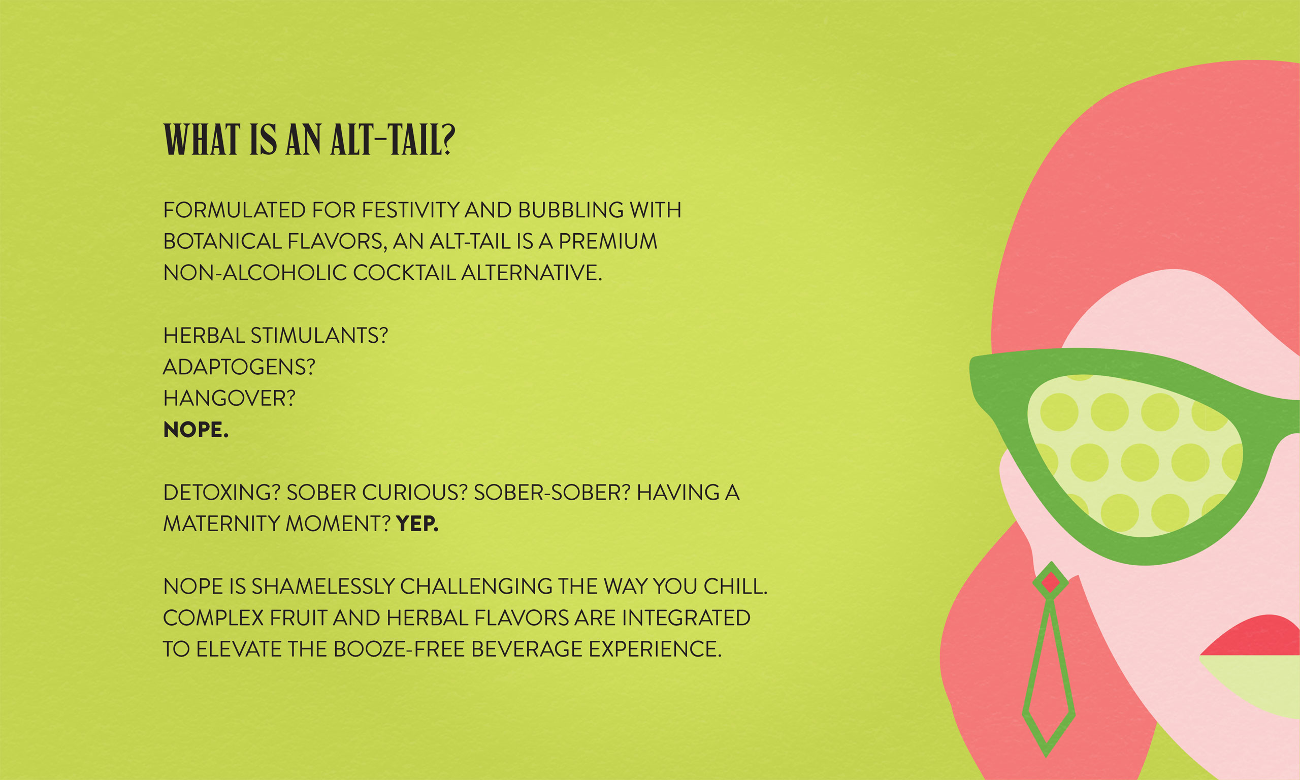
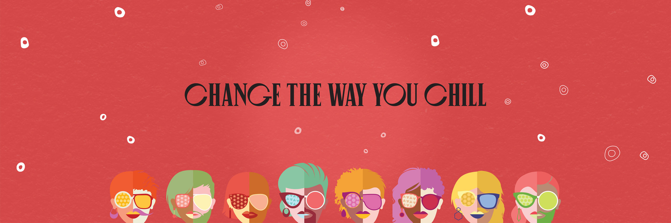
Finally, the brand messaging generates eye-catching sass and a feisty spirit that gives the consumer a low-calorie, celebratory beverage without the hangover. In other words, Nope became the brand that let you party hard, responsibly.

Services

  • Brand Strategy
  • Logo Design
  • Packaging Design
  • Flavor/Size Adaptations
  • Packaging Production
  • Illustration
  • Website
Thank you to The Gro Agency for turning my words and ideas into a vibrant and bold package that captures the fun and articulates the mission of our brand. You are truly a multi-talented team that brought a level of passion to this project that matched my own to create something that not only we love but our customers can’t put down. They’re hooked and we are grateful!

Beth Ann Shaeffer
Founder NOPE Beverages

Nope Beverages
Nope Beverages
Nope Beverages
Nope Beverages
Nope Beverages
Nope Beverages
Nope Beverages
Nope Beverages
Nope Beverages
Nope Beverages
Nope Beverages
Nope Beverages
Nestlé Drumstick

Nestlé Drumstick

The Challenge

Ice cream brand Nestle Drumstick had recently undergone an evolutionary refresh of their master brand. If that wasn’t enough, they also planned to widely release ‘Crushed It’, their break-through product line of cookie-crumb-coated ice cream cones and bars. From the first bite, these innovative frozen treats proved themselves a truly unique, multi-textural eating experience, unlike anything Nestle Drumstick had released before and unlike anything in the all-family snacking category.

With the opportunity to revitalize and modernize their entire brand portfolio, Nestle Drumstick tapped The GRO Agency to produce creative packaging for their fresh brand identity across all new and existing SKUs.

Our challenge with ‘Crushed It’ was to 1) visually communicate what a delight that first bite of ‘Crushed It’ feels like for the consumer, 2) distinguish packaging concepts and graphics from their existing offerings, and 3) build on their existing brand to remain recognizable within the Drumstick brand universe.

The Solution

Driven by consumer insights, we created a new visual and verbal strategy that would adapt and refine the new design across the whole Drumstick portfolio, including the ‘Crushed It’ product line.

First, to vividly communicate the unique feeling and texture of that first, delectable, melt-in-your-mouth bite, our team fabricated a product-specific logo leveraging the same recognizable color palettes and layout of the core brand. As it doesn’t resemble any existing Drumstick logo, this sub-logo both differentiates the packaging to catch the eye, while also reinforcing the product experience.

Next, the product messaging invites consumers to indulge and experience, not merely sample, the finely-coated ice cream snack. When it comes to dessert, we find that taste and indulgence are primary decision-drivers. Finally, in show-don’t-tell fashion, we broadcasted the enticing product photography front-and-center to illuminate a sweeter life after that first bite.

Services

  • Sub-Line Logo Design
  • Packaging Design
  • Adaptation: Full Portfolio
  • Packaging Production
  • Product Photography
  • Point of Sale
The GRO team jumped into a rush redesign project for Drumstick and executed with precision and speed. Their attention to detail and deep packaging production experience allowed us to meet our deadline with a bolder, new look for this iconic brand.

Brian Lemco
Packaging Project Manager
Dreyer’s Grand Ice Cream

Nestlé Drumstick
Nestlé Drumstick
Nestlé Drumstick
Nestlé Drumstick