3 Steps to CPG Packaging that Slays on Social Media
June 23, 2021
Consumers used to discover new food and beverage brands by strolling through their local markets and scanning the shelves for eye-catching products. But today’s “window shopping” happens 24/7 on social media. Most consumers know what brands they’ll buy before they ever step foot in a store — if they go to a physical store at all.
For obvious reasons, the pandemic further decreased our chances of going to an actual store and increased our reliance on social media for everything, including finding and even buying food and bev products.
You know you have to improve your social media game in today’s digital world. The challenge? Large legacy CPGs like yours are rooted in retail, and your packaging was designed to sell from in-store shelves. It doesn’t necessarily garner engagement on Instagram.
What’s more, smaller, younger artisanal brands often have an easier time with direct-to-consumer social media marketing because they’ve always done it. Their images were created with social media in mind. And social media is the great equalizer — your brand will be in-feed alongside smaller brands just as celebrities’ statuses are in-feed with your mom’s.
Scared yet? Deep breath, we can help!
With our three strategies, you can optimize your CPG’s packaging design for social media so you can keep up with the hippest brands. And we promise, upping the online interaction between social media users (*cough* everyone) and your packaging is a gateway to brand loyalists who promote your content willingly.
1. Make Your Mark with Your Packaging
This bears repeating: Packaging that looks good and performs well on store shelves isn’t enough anymore. Today’s consumers want and have omnichannel relationships with brands, viewing products on Facebook, Instagram, TikTok, Pinterest, and any other social network you can think of.
Not to mention non-social media touchpoints, like your website and Instacart. Plus, across categories and sub-lines. You don’t want to lose brand equity as you grow and your offerings diversify.
You have to make sure your brand identity reads across all of these diverse touchpoints. That it screams ‘YOUR BRAND’ on every platform. To do that, select a consistent visual element or elements — your mark — that unmistakably call out your brand.
Your mark could be your logo, a design convention, your color palette, a particular patterning, a specific style of photography or illustration, a unique use of typography — or some combination of these.
No matter what your mark is, it helps consumers identify you wherever they’re encountering your brand, providing a consistent customer experience.
Using visual elements in this way is perfect for social media in particular because it’s image-centric. A wordy description just wouldn’t get the job done.
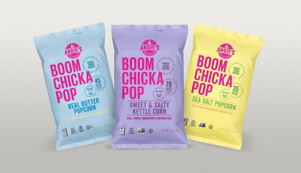
BOOMCHICKAPOP Makes a Powerful Mark Sans Logo
Angie’s BOOMCHICKAPOP is a great example of a CPG that’s totally identifiable, and not because of their logo–Boomchickapop isn’t their logo, Angie’s is their logo! Consumers know the fun pastel hues and signature all-caps (BOOMCHICKAPOP) typography, which capture the consumer’s attention and leave an imprint of the brand’s visual identity.

2. Tell Your CPG Brand’s Authentic Story
The average user spends over two hours on social media each day. People are sharing everything online, including their once private lives and mundane routines, like what they had for breakfast. This is a huge opportunity for your CPG brand. You could be the breakfast item that gets shared and labelled #Delish alongside 17,800,000 other Instagram pics. Maybe it’ll even go viral!
But the only way to earn that kind of engagement from discerning and distracted social media users is to tell an authentic story about your brand that goes beyond your product — and do it damn well.
Consumers use brands to facilitate individuality, self expression, identification, and belonging online. If your brand story communicates common values and attitudes, and establishes an emotional bond with users, they’ll want to share your stuff online and buy it in stores.
Because of social media, you need to do more — way more — than sell a product. You need to tell your story, put your brand out there, and connect meaningfully with your customers. Just like they get personal online, so should you.
How can you tell a story? One way is through visual language — perfect for image-heavy, copy-hating social platforms. Visual language is powerful. It can connect instantaneously with consumers’ conscious and unconscious needs — and motivate buying behavior, cha-ching.
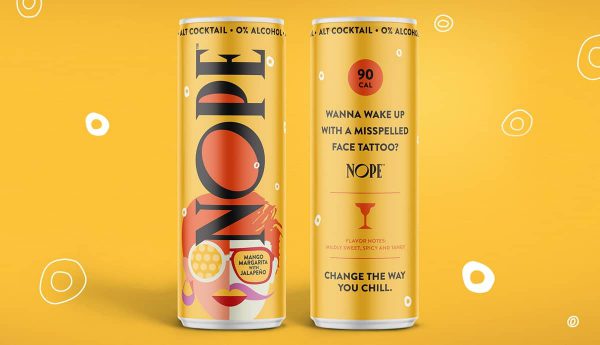
NOPE’s Story Shows Empathy for their Audience
We crafted a compelling story for Nope beverages. And it’s the perfect story for social media since their target audience is Gen X and Millennials.
We found a way to engage people by honestly calling out, on the packaging, the issues they’re facing and creating a sassy, spirited visual language to match.

3. Design Your Packaging for Scalability
From a thumbnail profile pic to full-view on a display shelf, your visual identity and branding need to be impactful everywhere. What does your packaging look like shrunken down to social media size? If users have to zoom in to read a claim or find your logo, it’s time for a redesign.
So what makes packaging work on big screens, small screens, and IRL? Simplicity and focus are key.
A busy, overcrowded design probably isn’t a good idea anyway, but especially not for social media sharing. No one will know where to look on their small screens.
You’ll have to cut down on the number of claims you’re making to accommodate different image sizes. Besides, the more you say, the less your consumers hear. Particularly on social media, where you have just a second or two — tops — to make an impact.
You can have a few packaging claims, but be sure to decide on your central message. This should be the one thing you want consumers to know about your brand. Your webiste copy and social media captions give you a platform to get into the nitty gritty, so it doesn’t ALL have to go on pack. Organize your claims in such a way that it’s clear where viewers should look first, second, and so on. Be intentional about it.
Sidenote: Pay close attention to your packaging’s color palette always, but especially for social media imagery. It’s often the first thing social media users notice. If it’s evocative, it might stop them in their scrolling tracks.
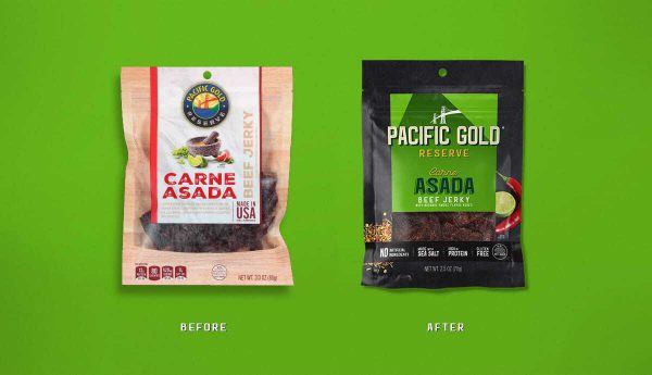
Pacific Gold Reserve’s Scalable Packaging Crushed it on Social
We simplified Pacific Gold Reserve’s packaging in a number of ways. You can see a before and after photo below. We also modernized it — outdated packaging does not play well on social media channels. As a result, it scaled well everywhere.
Post-redesign, Pacific Gold Reserve saw a 660% increase in social media engagement over the prior year. Need we say more?

Social Media is Here to Stay — Can You Keep Up?
You already know that social media isn’t going anywhere. It’s probably only going to take over our lives more and more. Do you want to be the fuddy-duddy brand on social media, or do you want to keep up with the younger, smaller brands who are, in many cases, killing the online game?
We think we know the answer, which means it’s probably time to update your packaging. In no time, you’ll have scalable, evocative, and notorious packaging worthy of shares that go viral.


