Top 4 Packaging Rebrands of 2021: Inspiration for Your CPG Company
February 16, 2022
Rebranding is critical to every CPG company’s success.
Your packaging is outdated, competitors in your category are encroaching on your look, your brand is pivoting its positioning, you’re receiving negative feedback from consumers — the list of reasons to rebrand ASAP goes on.
But while rebrands are common and important, it doesn’t mean they’re straightforward. It can be hard to know what trends to jump on and which to skip. Or how to make your packaging stand out without confusing long-time customers.
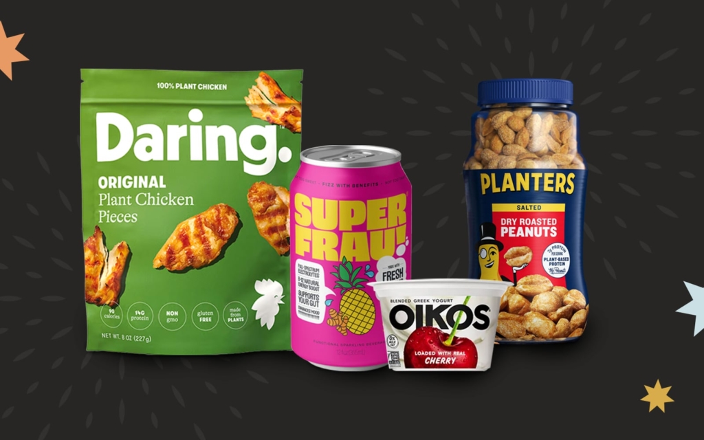
We compiled our list of the top four food and beverage rebrands of 2021 so you can see what others in the industry are up to. Get inspired by their effective new looks before you take on yours.
1. Oikos Greek Yogurt
Danone North America owns Oikos, the popular Greek yogurt brand. The brand features line extensions such as Triple Zero and Pro.
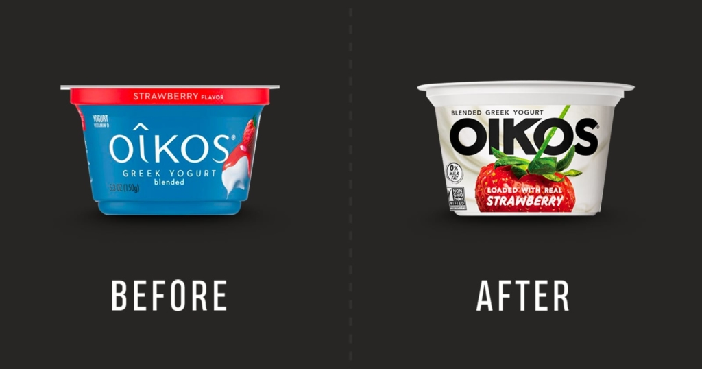
Pre-Rebrand: Packaging that Blends into the Yogurt Aisle
The yogurt aisle is predictable. Lots of brands employ pastel color palettes, and their packaging features a spoon with a bite of yogurt placed just so.
Oikos’ packaging used to follow these tropes to a tee, which is likely why they decided to refresh their aesthetic. Their old pack was a run-of-the-mill blue with the exact spoon illustration you’d expect.
It lacked appetite appeal and, frankly, originality.
Post-Rebrand: A Bold Look in a Bland Category
Oikos yogurt doesn’t blend into the yogurt section anymore. Their new packaging successfully broke away from the spoon convention. Now, it looks like the yogurt itself is overflowing from the pack, ready for you to dig in.
The boldness is in stark contrast to the usually recessive and quiet yogurt packaging. Not to mention the product looks delicious thanks to the clean packaging highlighting the yogurt’s unadulterated flavor.
Overall, the rebrand is totally ownable for Oikos and disruptive in the space.
2. Superfrau
Hip, online-only brand Superfrau offers fizzy, whey-infused beverages. The fruity flavors are combined with benefits like natural energy and vitamins to make it a perfect Gen-Z nonalcoholic social beverage.
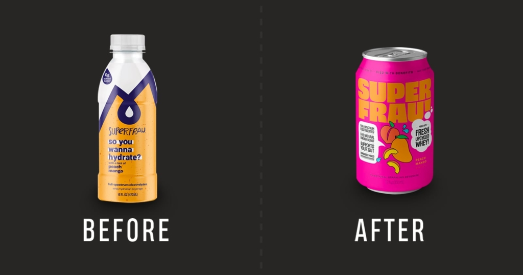
Pre-Rebrand: Way Too Much Whey
Superfrau’s previous packaging did them a disservice. Even though they were selling a disruptive, unique product, their pack lacked personality. It was far too clinical, with muted colors and no appetite appeal.
They were also too focused on their star ingredient, whey. But consumers may or may not know what whey is. Zeroing in on it with the pack’s phrase “This is how whey do it” was likely isolating shoppers who’d otherwise be interested in a fizzy drink.
To boot, Superfrau’s old packaging didn’t make their positioning clear. Is it a post-workout drink? Who exactly is it for?
Post-Rebrand: A Fun Aesthetic to Match its Positioning
The new packaging truly embodies the brand’s spirit with its bold colors, comic book-style illustrations, and quirky word bubbles. Superfrau is sure to attract young audiences impressed by the company’s innovative spirit and commitment to upcycling.
Superfrau now looks like a beverage you’d reach for at a social gathering, which hones in on their positioning. The pack also touts benefits their audience will care about — like “B12 Natural Energy Boost” and “Supports Your Gut.”
Lastly, changing the product’s container from a bottle to a can is genius. If the illustrations don’t help with appetite appeal, the can surely screams fizzy, fruity, and refreshing.
3. Planters Nuts
Everyone knows Planters. They’re the nut company, founded all the way back in 1906. Mr. Peanut is their beloved and famous mascot.
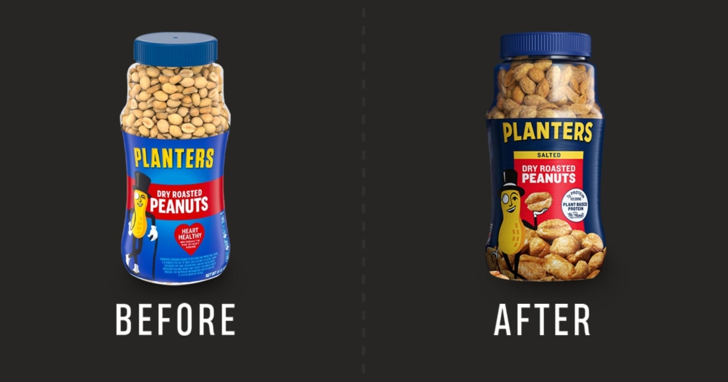
Pre-Rebrand: An Outdated Icon
Planters’ 1906 founding means their branding has been around for a long time. And their pre-rebrand packaging showed its age.
There was little appetite appeal on the old packaging — just an illustration of the peanuts. Plus the logo was beginning to recede into the background of the light blue label. Not to mention the brand was still using the no-longer-popular “Heart Healthy” sticker.
Post-Rebrand: Mr. Peanut for the Present-Day
This rebrand is slightly different from the others. It’s evolutionary, not revolutionary. As we said, Planters is a pioneering brand. They need to be careful with rebrands. A revolutionary change could alienate loyal customers who no longer recognize their favorite products. Small — yet impactful — changes to their packaging make this a top strategic rebrand of 2021.
On the new packaging, Mr. Peanut is bold and flat, which is on-trend today. The logo is now more legible, and the darker blue gives the whole pack an even more iconic feel. Overall, the updated look is slightly more premium than before, especially with the peanut photography providing much-needed appetite appeal. At the same time, it’s close enough to the old design so as to not confuse steadfast Planters shoppers.
Notably, Planters did away with the outmoded “Heart Healthy” banner and replaced it with the buzzy “Plant-Based Protein” label. This is the perfect shift considering today’s protein and plant food-obsessed consumers.
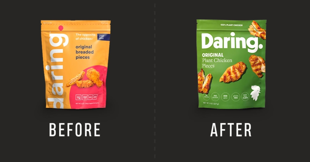
4. Daring
Daring describes itself as “The plant chicken for people who love the taste of chicken chicken.” And that pretty much sums up the brand’s M.O. It’s a delicious, plant-based, believable alternative to chicken.
Pre-Rebrand: Setting the Wrong (Color) Tone
Daring’s old packaging was actually quite wonderful. The color scheme was totally unexpected — and therefore disruptive — in the plant-based meat category.
Still, now that they’ve updated their look, it’s clear why the change was needed. Those cool colors didn’t scream “chicken.” Also, the pack lacked appetite appeal and was perhaps too young looking. Who were they targeting with their product?
Post-Rebrand: Nostalgia Marries Modern Comfort Food
The new packaging is a slam dunk. First off, the “chicken” looks irresistibly delicious. Daring’s appetite appeal game is on-point.
The muted color palette gives the pack a comfort food feel with a dash of 80s nostalgia. That’s perfect for their older audience member who has fond memories of eating chicken nuggets in their mom’s living room. Finally, the logo is now horizontal instead of vertical, which makes it easier to read.
On the whole, Daring’s rebrand remains disruptive (thanks, clean graphics) but with a novel air of sophistication.
Planning a Rebrand in 2022?
If this hit list of rebrands is inspiring you to rethink your packaging, shoot us a message. At GRO, we leverage deep industry experience and serious consumer insights to give CPG brands the next-level design they need.