3 Ways Digital Tech Can Change Your Shopper Marketing Game

All Insights

3 Ways Digital Tech Can Change Your Shopper Marketing Game

September 27, 2021

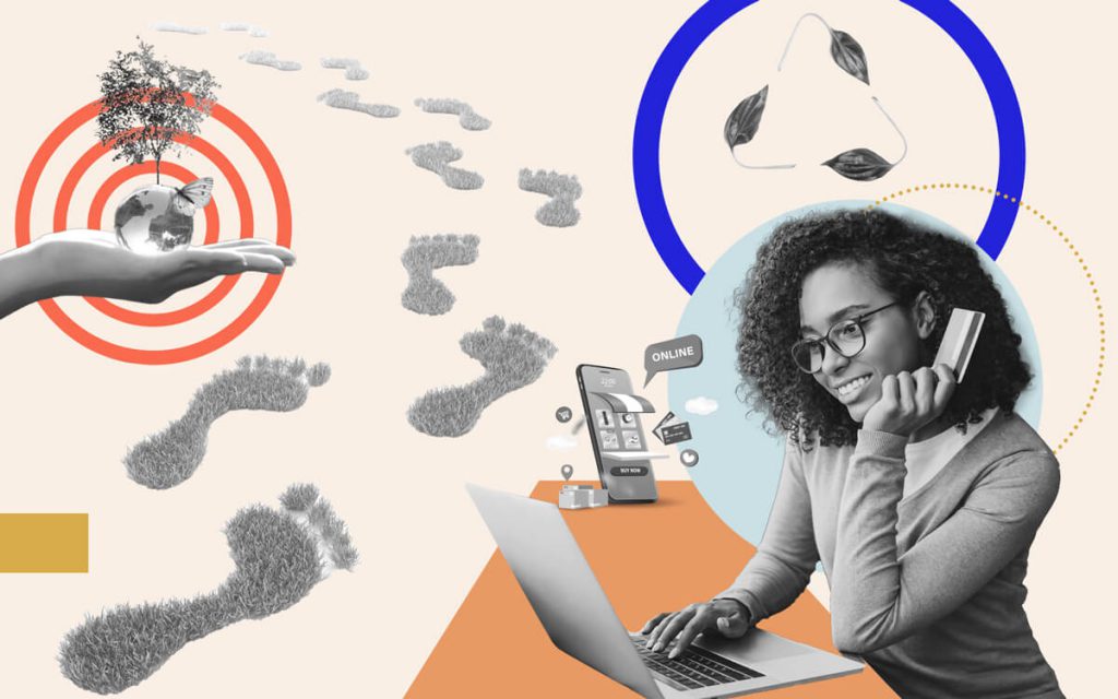
It’s no secret consumers are making fewer trips to brick-and-mortar stores. Why would they when nearly every retailer has at least one online sales platform? Omnichannel shopping is here to stay — yep, even post-COVID.

But it’s not just that consumers don’t shop in person as often, it’s also that modern buyers relate to food and beverage products differently than they did fifteen or more years ago. Food is no longer a commodity chosen based on price alone. Instead, consumers are forming emotional connections with brands, remaining brand-loyal for lifetimes.

End-caps, extra shelf space, and circulars aren’t going to cut it in today’s omnichannel sales environment. So what’s the next play for shopper marketers?

You need to recognize and understand this major shift happening in the CPG industry — and then adopt edgy digital marketing methods to impress those few-and-far-between IRL shoppers.

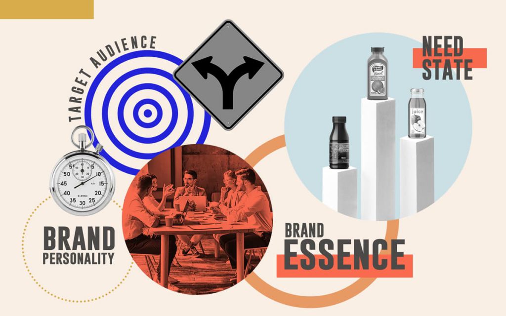
Traditional Shopper Marketing Explained

As hard as it is to remember, there was a time when online shopping didn’t exist. During that stone age, shopper marketing revolved completely around getting consumers into certain stores to buy a particular brand’s products.

Accordingly, shopper marketers like you were taught three distinct opportunities to market your CPG company’s products to these consumers:

  1. Pre-store included efforts to get buyers’ attention before they entered a grocer — like circulars, billboards, and direct mail. Pre-store marketing was all about brand awareness.
  2. In-store included your typical end-caps, front-of-store signage, and so on. All of the attempts to get your product noticed while a consumer was shopping, but before they reached your aisle.
  3. At-shelf included danglers on the product’s price tag touting two-for-one, for instance. It meant offers on or next to the product in-aisle.

It was a clean, linear customer journey from pre-store to purchase. Of course, you adapted your tactics based on the specific store (Whole Foods, Target, Dollar General, etc.), but the basics remained in-tact.

The End of Shopper Marketing as We Know It

Today’s digital technology has seriously disrupted the linearity of the customer journey. Depending on what store you’re working with, they might have their own digital app, a separate website, third-party delivery services — the list goes on. Now, your customer’s journey is less of a line and more of a tangled web. And distinguishing between marketing efforts that are pre-store, in-store, and at-shelf is nearly impossible.

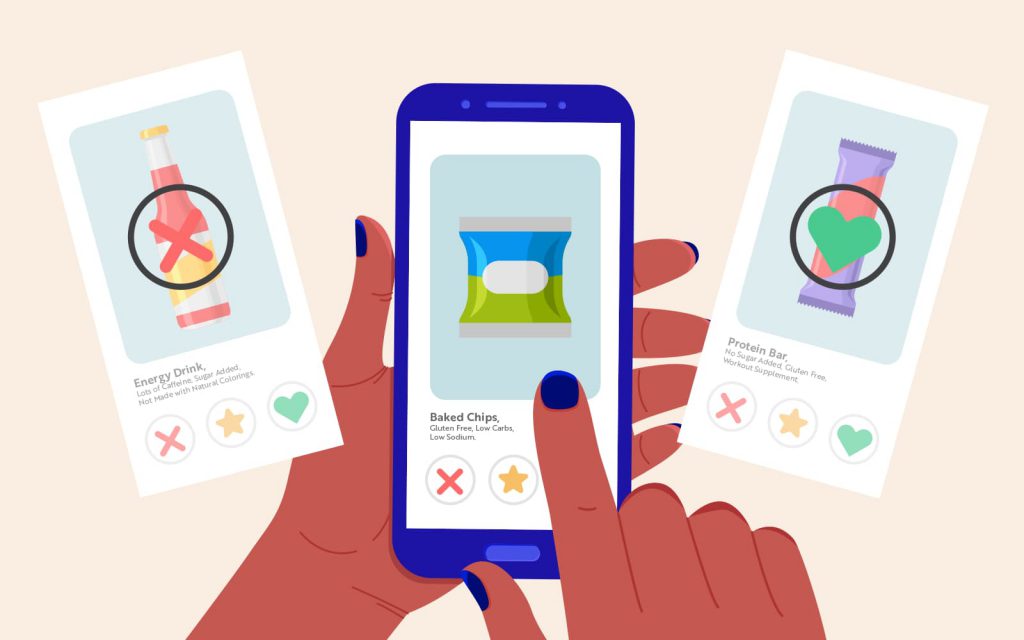
Here’s an example. Nowadays, a new product is often introduced to a consumer when they’re checking out online. They have tortilla chips in their cart, so an algorithm suggests a breakthrough salsa brand. Is this a pre-store play since it’s an awareness tactic? Is the consumer at-shelf since they’re “checking out?” You can see how the lines are getting blurry.

So yes, your goal as a shopper marketer is still conversions, but they certainly won’t always be in-store. Online purchases have to count somewhere in there, too.

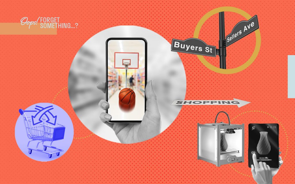
3 Methods to Attract Modern Grocery Shoppers — Both on and Beyond the Shelf

The industry is changing. Consumers are changing. Your job is changing. It’s a lot to take in.

One thing that’s not changing? People buying stuff. They love buying stuff!

We may not know exactly what the shifting definitions of pre-store, in-store, and at-shelf mean. Or precisely where online purchases fit into the equation. What we do know, however, is that people will continue to purchase products online and, sometimes, in person.

When people go to purchase these products, you better catch their attention — especially if they’re in an actual store (gasp). So, definitions aside, let’s explore three ways you can attract today’s distracted, divided shoppers.

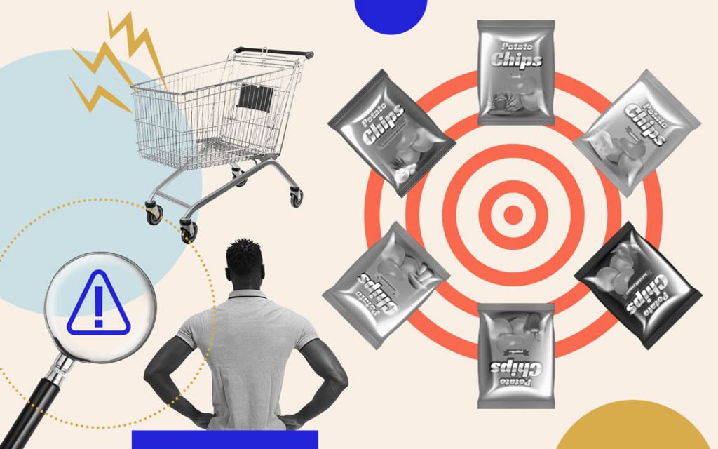
1. Leverage the Digital Shopping Cart as a Cross-Selling Tool

Regardless of whether a digital shopping cart is considered pre-store, in-store, or at-shelf, it’s an unmissable marketing opportunity. Since your job is product sales, does it really matter if they’re on Target.com or in the store itself?

A product that’s already in a shopper’s cart is your number one tool for educating consumers about other products from your brand. You could cross-sell by:

  • Adding a recipe or usage suggestion to the packaging that features your other products.
  • Offering adjacent products the shopper can add to cart instantly, like our tortilla chips and salsa example from before.

If you can get a customer to purchase a couple of your products, you’re golden. Research shows customers often return to a saved online cart over and over again. This way they can easily repurchase everything they’ve previously added. Talk about brand loyalty!

2. Create a Branded Mixed Media Experience for Shoppers

As we’ve established, in-store shoppers are becoming rarer and rarer each year. So when they actually are browsing by foot, you have to work hard — really hard — to get their attention.

Embrace technology to prove your brand is innovative and stands apart from shopper marketers stuck using tired end-caps. As we said, edgy technology has the power to enhance the in-store experience for shoppers.

One option? Give augmented reality a go. More than 100 million people have already interacted with augmented reality in a retail setting. And with more 5G connections coming online all the time, the barrier to entry for this tech continues to lower. It’s only a matter of time until the trend trickles down to grocery.

In a grocery store setting, augmented reality might look like a game to engage shoppers. Imagine if Fruit by the Foot partnered with Pokėmon GO. Kids could use their phones to scan Fruit by the Foot’s packages searching for Pokėmon to collect. Of course, they’d have to beg their parents to buy the Fruit by the Foot with the limited edition Pokėmon packaging, too.

Your brand could be a trendsetter by leveraging augmented reality. Meaning you’d likely catch the attention of even the most reluctant in-store shopper.

3. Use 3D Printing to Unveil Special Edition Packaging

Another way to innovate and impress those rare in-store shoppers? Create special or limited edition packaging.

Unique package shapes always catch consumers’ eyes. You always reach for the plastic bear and know it’s honey, right? You could try new handles for a razor blade, unique enclosures for shipping, and even personalization per customer.

Prototyping intricate designs like these was too costly, difficult, and risky to scale in the past. But now that 3D printing is becoming more mainstream, you can test all sorts of designs cost-effectively before heading to production.

A novel delivery system for an existing (or even new) product might be all it takes to differentiate your product and attract the endangered species known as in-store shoppers.

The path to purchase looks a lot different than it did even just a decade ago, so your shopper marketing tactics must change as well. The good news is that digital technology is making it easier to attract customers — no matter how they shop for and buy food and bev products.

Appropriate or Appropriation? 5 Questions to Ask About Your CPG’s Inclusive Marketing Efforts

All Insights

Appropriate or Appropriation? 5 Questions to Ask About Your CPG’s Inclusive Marketing Efforts

September 15, 2021

People around the world have been — or should be — faced with the harsh realities of systemic racism and the oppression of people of color. As a part of this reckoning, consumers are boldly holding brands in all industries accountable for their lack of appropriate, meaningful representation in their marketing initiatives.

Even so, many brands continue to miss the mark. Big time.

This inaction reflects how the undeniable need for diversity, equity, and inclusion is relegated to a trending topic rather than a point of reflection and opportunity for positive impact. The hard truth? Brands, CPG brands very much included, are wrongly exploiting–perhaps inadvertently–our current moment in history and appropriating other cultures to sell products and services to BIPOC communities.

How Your Food and Bev Brand Can Be a Part of the Solution

Your large food and beverage company has the opportunity and resources to create this change while still ensuring a loyal customer base. You can start by developing marketing strategies that authentically incorporate the views and insights of BIPOC communities. The goal is to strive for more than empty Black History Month celebrations on Instagram and diversity hires for your ads.

But it’s vital not to misstep and further contribute to the problem, even if you’re well-intentioned.

As one of only a few black-owned agencies in this space, we’re committed to brand activations and marketing campaigns that center the right voices, have an impactful point of view, and genuinely make a difference for people of color.

It’s in this spirit that we pose these five questions. Answering them truthfully will help in your efforts to market to communities of color in a respectful, responsible way and be a part of the larger movement toward a more equitable society.

Question 1: Is Your CPG Company Diverse Internally?

Let’s be real. No one will believe your brand cares about diversity, equity, and inclusion if your internal teams don’t reflect these principles and you’re doing nothing to make changes. Your marketing efforts — however inclusive — simply won’t matter.

That’s why you have to start by making sure the diversity you’re pursuing is first represented on your teams. Strive to examine the undetected bias that may be present in your hiring practices. There are BIPOC candidates that are equally as qualified as their white counterparts. Seek out job platforms, online communities, and organizations that attract BIPOC candidates and broaden your hiring field. Your teams should reflect the market or markets you’re catering to.

But it doesn’t stop once you have a diverse internal team. Make sure the work environment is equitable and respectful. You’ll also need to educate yourself and your team members on what it means to be a responsible ally to people of color. That way, your marketing initiatives won’t originate from an unaware — or, bluntly, ignorant — place.

Question 2: Are You Asking BIPOC Communities What They Need from Your Brand and Are You Serving Those Needs?

Researching and understanding your target audience is always an important step toward getting your branding and marketing to resonate. But it matters even more when you’re trying to reach historically marginalized communities of color.

Instead of assuming you know what your customers want and need, ask them! Have open dialogues with diverse consumers. Listen to what they tell you about how your brand can better serve their communities as well as how you can respectfully represent diversity in your marketing. Prove that you are listening. Incorporate their feedback about your brand’s shortcomings to develop new brand activations and company policies.

Question 3: Are You Using Your Platform to Elevate and Center BIPOC Voices?

After listening and internalizing what your BIPOC customers, partners, and employees have to say, you can use your platform to elevate their voices. Resist the urge to say things about communities of color that ring true to you and instead let members of those communities say it themselves. This will help you create an authentic connection with existing and potential consumers of color.

What do we really mean by elevate and center BIPOC voices? Quite literally share their views on your social media platforms, in your ad campaigns… everywhere!

Question 4: Do Your Brand Visuals Have Equal and Proper Representation?

You want to ensure BIPOC voices are heard through your messaging. But you also want to reaffirm that all of your brand’s visuals have equal and appropriate representation.

This means evaluating your website, advertising, social media imagery, etc. to check that it not only includes visuals of people of color, but that these visuals aren’t watered down.

So what does it mean to water down images of Black people? Simply put, brands may be more likely to choose visuals of Black people with lighter skin and a more Eurocentric look, while avoiding visuals of dark-skinned Black people with Afrocentric hairstyles like afros and braids. Selecting a “type” of Black people, who within a system of racial bias are closer in proximity to whiteness, as opposed to depicting a diverse body of Black people is watering down the visuals. It perpetuates the influence of systemic racism, and it’s decidedly not an accurate representation of our world. Instead, celebrate true diversity in your CPG brand’s imagery. Becoming aware of the ways in which our perceptions have been influenced by a system of racial bias, is a good step toward creating change.

The effects of systemic racism are so ingrained that for white marketers–no matter how well intentioned or experienced–to become effective allies to the BIPOC community it requires anti-racism education and thoughtful self reflection. Just look at Pepsi’s famous ad featuring Kendall Jenner. Pepsi took something incredibly complex and important — the Black Lives Matter movement — and trivialized it, implying the problem could be “fixed” by a white woman sharing a soda with the police. Placing a white woman at the center of a black movement sent the wrong message on many levels. Nothing serves as a better example of what not to do.

Question 5: Marketing Aside, How Does Your Company Support People of Color?

You have to walk the walk. To what causes does your company contribute? Is your company actively investing time and resources, do you leverage your brand’s platform, or are you supplying monetary support?

It doesn’t matter if you’ve done all of the other work above to make your ad campaign or brand activation inclusive if you don’t support people of color behind the scenes as well.

At the end of the day, ask yourself this about your brand: Are you participating in the equity, diversity, and inclusion conversation in the way you would if your life and the health of your community depended on it? Imagining yourself in the shoes of those calling for equal and appropriate representation may be a compelling way to understand why it’s absolutely essential, and possible, to use your brand to effect change.

Ready for a Packaging Redesign? Here’s What Your Agency Needs from Your Design Brief

All Insights

Ready for a Packaging Redesign? Here’s What Your Agency Needs from Your Design Brief

September 7, 2021

Any agency worth its salt will ask you for a design brief before they start a project. Every project, from evolutionary packaging refresh to revolutionary redesign, requires nuanced foundational information. Agencies know that it’s their job to translate your business needs into visual language that performs, but they can’t do that without a good brief.

There’s only one problem: You’ve provided your agency with a design brief before and still didn’t get the results you were after.

Sure, your design brief detailed your budget, timeline, and deliverables. But beyond these basics, what else should you give your agency partner?

Articulating your needs in a way that sets your design agency up to deliver with excellence can be tricky business. We’ve seen it all, and have a few tips! Here’s what you need to know, including what a design brief should actually highlight, why it matters, and what agencies are looking for you to provide.

What Is a Design Brief’s Role in an Efficient Project?

A design brief is the document brand directors like you give an agency to kick off a design project. The design brief (when it’s effective) gives your agency all of the information they need about your brand and goals to start their creative work and ultimately design what you envisioned.

At a minimum, your design brief needs to include:

  • Information about the design project, such as budget, timeline, and deliverables
  • Brand history, like your brand house or positioning statement
  • Objectives for the design project
  • Background on the business drivers behind the project
  • Suggested communication hierarchy
  • Visual/aesthetic references

We’ll delve into why these elements matter below. For now, hear us when we say that a comprehensive design brief is a powerful tool. It ensures you and your agency partner are aligned about the current design project. And because you’re in alignment, the design process is faster and requires fewer rounds of revisions. Plus, the final design meets — or, dare we say, exceeds — your expectations.

Sounds like a dream, right?

Why You Can’t Get Your CPG Design Briefs Quite Right

You probably have a lot of the information for a quality design brief on-hand. So why is it often a challenge to put together an effective document? For one, you honestly might not know what a creative team needs to do their best work. In fact, lots of brands just throw together their brand colors and sizing requirements, then forge ahead. That’s why we created this packaging design brief template.

More often, you don’t produce an optimal design brief because you’re taking your own brand expertise and institutional knowledge for granted.

You work for your CPG brand day in and day out. You could list off your biggest competitors in your sleep! But your agency partner isn’t inside your company, let alone inside your head. You have to make even the most obvious-seeming details evident to outsiders.

A legit agency will absorb everything about your brand and combine it with their larger industry knowledge to give you the most epic design possible. The more information you divulge in your design brief, the more they’ll have to work with.

The Often Missed Elements of a Legendary Design Brief

You want the dream scenario, of course. Your agency partner intuitively understands your brand from your amazing design brief, gets on the same page as you quickly, and creates the perfect design.

But to realize this dream, there are elements beyond the basics you must include in your design brief.

What Is Your CPG’s Overall Brand Strategy?

Your agency partner has to know everything about your brand to design packaging or creative that, well, connects with your objective. If you have brand strategy that is performing well then your agency needs the deets. If you don’t, you should consider doing a strategy refresh.

More often than not, if you need a packaging refresh your brand strategy could also use some tweaking. If you engage your design agency to fine tune your brand positioning, then they’ll provide the brief. But if you are ready to jump into design with your existing strategy, share it.

  • Brand voice and personality
  • Brand essence
  • Target audience
  • Consumer need state

What Are the Objectives of A Packaging Design Project?

Once you’ve detailed your brand strategy in your design brief, it’s time to get into the nitty gritty of why you’re completing this packaging design project. After all, your agency partner can’t create a packaging solution for your brand if they don’t know the problem — the reason you want a packaging refresh in the first place.

In most cases, companies seek a packaging redesign to:

Do any of these objectives hit home? Once you nail down what you want your project to do for your CPG brand, articulate it clearly in your design brief. That way, the end design works toward the proper solution.

Evaluate Your Visual Communication Hierarchy

Your brand’s visual communication hierarchy — the order in which shoppers visually consume the essential details of your product or brand — is one of the most important aspects of your design brief. If you and your agency partner aren’t on the same page about the hierarchy, your design just won’t perform well.

You’ve hopefully distilled your top communication and subsequent claims in the strategy phase of your packaging design project. Spell that out in your design brief as well. Perhaps you’d like a claim such as gluten-free to be noticed first, followed by appetite appeal, then brand, and so on.

Despite its importance, your visual communication hierarchy does not have to be set in stone or perfect in your design brief. Just writing something down might reveal that you need to cut some claims, which is time saved before the design work even starts. Heck, give a few possible hierarchies for the agency to play with! The key is drawing attention to your most important claims so the design eventually comes out right.

Communicate Your Aesthetic Preferences

Your design agency will want an idea of your general likes and dislikes, from an aesthetic perspective. To help, pull visuals you like (or loathe) into your design brief. These could be screenshots of other brands, photographs, art, illustrations — anything that piques your interest and might work for the packaging design at-hand. Think of it like a mood board!

One caveat: Be specific about what you like or dislike when it comes to the imagery you share. Otherwise, you might send your agency team down the wrong path. Note that you like the colors but not the typography, for example.

Of course, your agency partner will also want images of your current packaging (if you’re not a new brand) as well as your closest competition’s packaging. Most agencies can help you complete a competitive audit as a part of this process. An expert agency will also create a digital or physical shelf set of your competition’s packaging to see how your new and old design stacks up.

Don’t Worry, Your Agency Can Help with Your Design Brief

Creating the perfect design brief might seem like a lot of work, but once we have one in hand, we always have a meeting to walk through it together. In other words, you’re not on your own! We’ll give recommendations and fill in any gaps with our own industry knowledge before getting started.

And remember, the more effort you put into your design brief upfront, the more any agency will understand what you need out of your new packaging design. This will save you from reviewing endless drafts or feeling dissatisfied with the final product.

4 Societal Trends and What They Mean for the Future of Food and Bev Packaging

All Insights

4 Societal Trends and What They Mean for the Future of Food and Bev Packaging

August 25, 2021

There will always be product changes and competitor activities that force you to rethink your packaging. As a seasoned CPG brand exec, that’s predictable enough, right?

But there are societal issues and trends a step removed from your direct orbit and your day-to-day that will almost certainly impact how packaging works in the future, too.

If you see these larger influences coming, you can be proactive and adapt your packaging design to suit society’s latest preferences first. Your forethought will earn your brand credibility and leader status — all while your competitors scramble to react just a little too late.

Interested in a taste of sweet, sweet trendsetting victory? Consider four societal trends that will only continue to affect packaging more and more over the coming decade and beyond. Plus we’ll offer some unexpected opportunities they present for your brand.

1. Sustainability and How it Affects Your Packaging Material

You can’t go a day — or even a few hours — without coming across news on climate change. Consumers are rightfully concerned about the future of our suffering planet. Not only that, they want brands and corporations like yours to take part in the conversation around climate change and, importantly, contribute to a solution.

As a result, companies are becoming more sustainable as a way to participate in the moment. As a CPG brand, becoming more sustainable could include changing your packaging material.

Before the 20th century, packaging was merely a utility meant to keep contaminants out of foods. Customers brought their own containers from home to fill while shopping. But then savvy marketers realized packaging could also serve as a sales tool. Suddenly, packaging material was about more than just packaging — it needed to stand out. As a result, glossier, moldable materials capable of holding lots of ink, namely plastics, were in.

The problem? Plastic is anything but sustainable. And consumers are fed up.

The Opportunity for Your Brand

Sustainability is likely to drive packaging technology toward simpler, more easily recycled materials and methods of decoration. Take this as an opportunity to embrace retrograde simplicity and authenticity, and communicate to your consumers that you care about the environment.

You should know that some (though certainly not all) of these sustainable packaging materials are more costly right now — especially the options that mimic plastic. Someday, as more consumers demand sustainable packaging and more CPG brands move to plastic alternatives, the costs will come down.

In the meantime, consider embracing sustainable packaging, regardless of the potentially higher price tag. Your consumers will appreciate your effort and become more loyal to your brand, likely offsetting the added packaging expenses.

Besides, it’s the right thing to do.

Not ready for a big packaging material change yet? Take a page out of Barilla’s book. They simply removed the plastic panel from their pasta packaging so it’s 100% recyclable cardboard instead. Small shift, potentially big impact.

2. Carbon Footprint Reduction’s Marketing Implications

Consumers care about companies reducing their carbon footprint for the same reason they care about sustainability — climate change and the environment.

Your company’s carbon footprint is determined by how much energy and resources it takes to produce your products.

Reducing your carbon footprint may result in a more costly product because it often requires better ingredients with minimal processing and, from a packaging perspective, less plastics.

The Opportunity for Your Brand

You may be wondering: If it costs more money to reduce my food and bev brand’s carbon footprint, where’s the opportunity?

Well, aside from that pesky “right thing to do” thing again, it’s becoming increasingly popular for brands to talk about their carbon footprints as a claim on the front of their packaging. And consumers love it. In fact, there’s a whole number rating system to discover your CPG brand’s carbon footprint and a labelling system to call it out on your pack.

Promoting your low carbon footprint differentiates your product from your competition. It also leads to elevated positioning — you’re made over into an environmentally-conscious brand.

Need evidence? Oatly publishes their carbon footprint, talks openly about their environmental impact, and is totally killing it in the dairy alternative world.

3. Digitally Interactive Packaging Can Attract Mobile-First Customers

For a while now, customers have been most interested in the products in the perimeter store aisles. A lot of products in the middle aisles are ignored, meaning their packaging rarely gets the chance to shine.

And on the off chance a customer is both in the store and in a middle aisle, he probably has his head buried in his phone looking at his shopping list or googling an item. The packaging is overlooked yet again.

In light of society’s shopping preferences and our increasingly digital environment, how can you renew interest in your packaging and, therefore, your products?

The Opportunity for Your Brand

To attract distracted and rushed customers’ attention, add cutting-edge digital elements to your packaging.

We say cutting-edge because the grocery shopping experience has already been digitized through in-store scanners that allow customers to skip the check-out line and QR codes that lead to promos. You’ll need to up the ante from here to be a true trendsetter.

Try inviting customer interaction with your packaging — digitally. Perhaps, in the future, shoppers will scan a QR code on your product and get their FAQs answered. Kind of like asking Siri, but asking your packaging instead. Clever, right?

That’s just one possibility. The overarching idea is that you’ll ingratiate your brand with your customers if you can ideate any novel way to forge digital connection. To meet them where they are — on their smartphones.

4. Ecommerce and Omnichannel Retailing Growth Calls for a Packaging Design Shift

Ecommerce is booming both via online retailers and traditional retailers that now offer expanded shopping options (think delivery, curbside, and in-store pickup). In the CPG industry, it’s gone well beyond Instacart. Almost every grocery store has its own online shopping platform, too.

As a result of the rise of ecommerce, customers aren’t holding your package in their hands as often these days.

You have no choice but to sell your products online. It’s what customers want. It’s where they’re browsing. But how well does your packaging play digitally, without that in-person touch?

The Opportunity for Your Brand

In some ways, it’s harder to design packaging that looks good and performs well online. Most of the time, your product is reduced to a postage stamp-sized image among hundreds of other postage stamp-sized images. Again, customers can’t pick up your pack and read it like they can in-store.

But this article is about opportunities, right?

Don’t think of ecommerce interfaces as limiting to your packaging design options. Instead, think of how well you can tell a story online. Take Amazon for example. You can upload tons of images of your product’s packaging so customers can see every angle. And don’t discount all of the extra descriptive text you can add online that goes above and beyond your packaging’s main claims.

Track These Trends to Emerge as an Industry Leader — with the Hippest Packaging, of Course

Having a long view of up-and-coming societal trends is as vital to your CPG brand’s success as being ready to respond to more obvious near-term threats and opportunities.

And bonus: Your competition might not see it coming. Meaning, with these four trends in mind, you can emerge as a leader and set the tone for how they’ll affect the future of food and beverage packaging.

These 5 Red Flags Mean Your Packaging Needs an Update ASAP

All Insights

These 5 Red Flags Mean Your Packaging Needs an Update ASAP

August 17, 2021

The effectiveness of your marketing, the health of your sales and distribution, and the consumers’ perception of your brand are all tied, at least in part, to the performance of your packaging.

Yep, your food and beverage brand’s packaging really is that important. Yet it’s frequently overlooked and underutilized as a sales and marketing tool. In fact, when there are big picture issues with a CPG brand, a packaging refresh or redesign is often a last ditch effort as sales flatline or competitors forge ahead.

We get it. You probably have it in your head that a redesign is cost prohibitive. And while it is an investment to change up your packaging, in the long run, it’s less expensive than the three (or ten) other fixes you’ll try before turning to your packaging anyway.

So instead of scrambling, bookmark this post of five red flags indicating it’s time to consider a packaging refresh for your brand. An awareness of these red flags could help you avoid some forms of brand degradation before your sales — and reputation — take a hit.

1. Your Packaging Design Is More Than Five Years Old

The longstanding rule of thumb in the food and bev industry is that you should update your packaging every seven years. But that’s simply not often enough in today’s fast-moving digital world where trends go viral within seconds and categories change quicker than you can power down your laptop at 5:00 on Friday.

Instead, aim to evaluate the efficacy of your packaging every five years (at the very least) and change it accordingly.

Proactively monitoring the age and freshness of your packaging allows you to sidestep the perils of stale packaging. For one, old packaging can make consumers think of old food that’s been on the shelf for a decade, which seems gross regardless of the product’s actual expiration date.

Also, if your packaging stays the same for too long, it starts to blend into the background. Consumers are too accustomed to it and you need a packaging update to draw their eyes back to your brand.

An important note: Even if your packaging is more than five years old, you might not need a revolutionary (and therefore extra expensive) overhaul. Sometimes modernizing key elements through an evolutionary lens does the trick well enough.

2. Your Consumers Are Telling You They Want Something Different

There’s nothing more powerful than consumer feedback about your product. As far as your packaging is concerned, there are two main ways consumers might influence a change:

  1. Unsolicited consumer feedback via social media or other inquiries, and/or
  2. Formal consumer research data and results.

Even if you don’t currently have the budget or bandwidth to conduct consumer research, your consumers are talking to you. You just have to listen.

Try auditing your social media channels for constructive comments. Are consumers consistently asking for a lower sugar version of your cereal? Maybe it’s time to emphasize a new claim on your pack. Are they having a shopability problem and can’t locate their favorite popsicle flavor in-aisle? A packaging redesign with more distinctive colors might be in order.

You can discover the same kinds of packaging issues with more formal consumer research — and you’ll have even stronger evidence that a change is necessary. One of our clients, Ian’s Foods, realized through research that many gluten-free households are also nut-free. Ian’s was already a nut-free brand, but they weren’t elevating that claim on their old pack. Redesigning their packaging to center different claims expanded their customer base.

3. Your Food and Beverage Category Is Changing

As we said, food and bev categories shift rapidly. Not to be cliche, but innovation and change are the only constants. At some point, you will have to adapt your packaging to suit society’s hottest craze and the pivoting needs of your consumers.

Just look again at Ian’s Foods. They were a gluten-free brand turned ‘free-from’ brand (nut-free included) in response to consumers’ latest desires. In reality, they didn’t need to change their already free-from formulations. They just needed to change their packaging to spotlight the now-trendy free-from claim.

Sometimes, consumer tastes do demand a formulation change. Maybe you’re an ice cream brand that decides to simplify your ingredients because consumers (even value consumers) increasingly want healthier products. Updated packaging can do a lot of the heavy lifting of communicating your updated formulation to newly health-conscious consumers.

4. Your Competition Has Upped Its Packaging Game

There are two possible scenarios when it comes to your competition and packaging:

  1. They’re regularly updating their packaging to keep it fresh, or
  2. Their shelf set is stale and hasn’t been updated in some time.

If you’re facing the first scenario, you’d better hop to and update your product’s packaging! Otherwise, your brand will seem old and tired in comparison to all the shiny new designs.

The second scenario arguably provides an even better opportunity for your brand because, if your competition’s looks are stale or homogeneous, you can truly stand out post-refresh.

Rxbar faced scenario two. None of the competing protein bar brands had fresh packaging. In fact, they all looked too much alike with their mostly white packaging and overhead product shots. Instead of copying this overused aesthetic, Rxbar disrupted the space with simple packaging centering their ingredients — and no product shot at all. And guess what? They’re killing it.

5. Your Company’s Sales Are Flatlining

You’ll likely have to make multiple, cross-departmental changes to address flatlining — or even declining — sales. But in the process, don’t forget that packaging is a critical brand communication tool that deserves attention amid the turmoil.

Often, clarifying your mission and your product’s unique value proposition then refreshing your packaging design is the ticket to reinvigorating consumer interest in your brand.

At the end of the day, it never hurts to at least assess your packaging design. And these five red flags are just the nudge you need to ensure you’re never waiting too long to refresh.

Fix Your CPG Brand’s Shopability Issues Before You Lose Loyal Customers

All Insights

Fix Your CPG Brand’s Shopability Issues Before You Lose Loyal Customers

August 3, 2021

Lots of CPG brands — particularly large outfits with several sublines — have shopability issues. When shopping, their customers cannot easily and quickly identify the particular product or brand they want. These customers might return home from the grocery store with decaf coffee instead of regular — a mortal sin in the eyes of caffeine junkies everywhere.

If your brand has a shopability problem like this, your sales numbers will probably take a noticeable hit. And the less tangible repercussions — loss of brand equity and loyalty — can be even more detrimental to long-term brand health.

To help you avoid shopability issues, we’re about to break down:

  • What makes one particular brand unshoppable,
  • Two strategies to sidestep shopability problems, and
  • Two success stories of brands that overcame shopability challenges.

Annie’s Shopability Struggle

Sometimes the best way to wrap your head around a problem is to take an example. With that in mind, let’s consider Annie’s serious shopability struggle.

Annie’s is a beloved brand. We’re devoted to their white cheddar mac and cheese ourselves. But unfortunately, it hasn’t traditionally been a shoppable brand despite its popularity. The culprit? Their overabundance of variety.

For example, white cheddar is just one of dozens of Annie’s mac and cheese varieties. They also have yellow cheddar and four cheese, plus mac with broccoli, rice and quinoa pasta options, and even a deluxe line. And don’t even get us started on organic vs. gluten free vs. vegan vs. grass fed.

There’s nothing wrong with the number of mac and cheese options Annie’s offers. Customers appreciate choices! But Annie’s branding doesn’t make it clear what’s what. Their gluten free claim isn’t always in the same place on the packaging, for example. And you can’t easily distinguish the organic white cheddar from the regular. It makes for a frustrating shopping experience, especially when you have a picky toddler at home who will only eat one specific kind.

Sidenote: Annie’s recently rebranded. Fingers crossed they fixed their shopability issues!

2 Simple Strategies to Avoid Shopability Scourges

Even if your CPG brand makes a ton of different products, you’re not doomed to be like Annie’s. In fact, there are surefire ways to make certain your brand is extremely shoppable.

Start with these two tips:

1. Select Your Common Brand Element to Provide a Consistent Shopping Experience

To bypass shopabilty issues, your brand must be easily identifiable and cohesive across flavors, sublines, different forms, etc. In other words, your products should scream that they’re a part of your brand.

How, you ask? Make sure your packaging design includes a common element that’s present on every product in your portfolio.

Your common element could be:

  • Your logo
  • A product shot
  • Your product’s form
  • Your brand color(s)
  • An illustration

No matter what, customers know that when they see that common element, they’re looking at one of your products.

With any luck, you’ll even create a brand block — a strategy that makes your products stand out on shelves — in store aisles everywhere. Ritz Crackers, for instance, jump out in the snack aisle because they’re all in red boxes, their common element. And you know you’ve arrived at the Reese’s section of the candy aisle when you start seeing that signature brown and orange.

2. Make Your Product, Variety, and Flavor Claims Abundantly Clear

Your common element will ensure your customers can pick out your products in crowded aisles. But you still need to help them pick the right version of the specific product they want (the organic white cheddar shells over the regular ones). And this needs to happen fast, before they move on to another brand.

To do so, you have to check that your customers understand the product, variety, and flavor in the order that will help them make their decision as quick and painless as possible. How do you decide on the order? Get in your shoppers’ heads. If they’re shopping for juice, for example, they’ll probably want to know the flavor first, so make that obvious on first glance.

Color plays a big role in making product, variety, and flavor evident, too. If you sell grape juice, don’t make your label orange. That would understandably confuse the shopper — orange universally equals orange juice, after all.

Once you settle on the order of your product, variety, and flavor claims, you need to employ a design system to safeguard their placements (and your other claims’ placements) on your packaging across every version of your product. A design system is basically a communication hierarchy to structure your packaging claims.

For example, the design system for your juices dictates that your logo is always in the top center and the flavor banner is always in the middle. That way, whether your customers are searching for grape or orange (or lemon or kiwi or strawberry) juice, they know to look at the center of the bottle to find the flavor — every single time.

A design system isn’t meant to limit your creativity, by the way. It’s not so rigid that you can’t ever change your packaging. It’s just a way to simplify the shopping experience for your customers. You could easily structure the top portion of your pack with all the pertinent claims and leave the bottom portion to be more fluid with each new product release.

How Two CPG Brands Overcame Their Shopability Issues

Even if your brand currently suffers from shopability issues, it’s not hopeless! Consider how these two brands put their shopability issues behind them:

1. Outshine’s Flavors Truly Shine

Outshine came to us with a serious shopability problem: Their customers couldn’t distinguish between certain flavors.

You see, their old design relied heavily on the images of the frozen fruit bars. It was the only visual way customers could understand the flavor, since the flavor itself was always written atop a generic green banner. But the product images of the bars were too similar in certain cases. Pomegranate and grape were basically the same color, as were orange and tangerine, and watermelon and strawberry. Shoppers were bringing home purple popsicles thinking they were grape, only to realize they had mistakenly grabbed pomegranate instead.

GRO implemented a new system wherein the flavor banners are larger and have varying colors — they finally stand out. We also differentiated the bar colors just a tad to make the flavor varieties even more apparent.

Our work with Outshine has continued. Each time they extend to new subcategories, flavors, forms, or even entirely new categories, we execute a fresh design. And we’re always careful to differentiate using color and sub-brand logos while maintaining the core essence of the original design.

Customers will always know they’re getting an Outshine product — no matter how big the brand gets.

2. It’s Easy to Shop for Ian’s Foods

Ian’s Foods needed to pivot from a gluten-free brand to a “free from” brand. That’s the main reason they came to GRO.

At the same time, we discovered a shopability issue: The actual product form (chicken nuggets vs. fish sticks, for example) was hard to locate among the clutter of claims.

To help, we created a new design system that changed the hierarchy to focus on “free from” while also implementing color coding to make varieties clear. The result is an easier, more intuitive — and shoppable — in-store experience for Ian’s growing customer base.

The GRO Difference

Shopability is a serious issue that warrants an equally serious, dedicated branding agency.

You may think hiring an adaptive packaging or production agency is the way to go. And it may save you money in the short-term. But those agencies don’t generally have enough design experience to recognize and account for shopability problems. The design they give you might look good in the moment, but will it stand up against your company’s future innovations?

When GRO takes on a packaging project, we review your full portfolio of products to ensure we’re creating something fresh and new while safeguarding the original brand — and, thereby, brand loyalty — you’ve worked so hard to build.

Ready to tackle your shopability issues? We’re here whether you’re starting from scratch or extending an established brand. Get in touch.

Key Lessons Learned by Reviewing 4 Up-and-Coming Stress Supplement Brands

All Insights

Key Lessons Learned by Reviewing 4 Up-and-Coming Stress Supplement Brands

July 26, 2021

Raise your hand if your stress levels skyrocketed during the COVID-19 pandemic. Or just 2020 and 2021 life in general.

We know your hand’s up right now. And we’re right there with you. Actually, we all have both of our hands raised emphatically.

Guess what? Perhaps unsurprisingly, it’s not just us. In fact, two in three adults admitted that the issues facing our country of late (pandemic very much included) overwhelmed them more than usual.

What’s more, wellness, mental health awareness, and general healthy living habits are hot topics right now. As a result, it’s not just that people want to find ways to be less stressed post-pandemic, it’s that they want to find ways to be less stressed naturally. Pastimes like yoga and meditation are being tapped for their calming capabilities. And, from a CPG perspective, food, diet, and natural supplements are increasingly seen as tools to better your body and mind.

Unpacking 4 Stress Supplement Brands Leading the Way to Calm

So, in this unique moment of high stress coupled with a high interest in naturalness, what’s your CPG brand doing to appeal to frazzled consumers?

To get your gears turning and inspire your next big idea, we reviewed four products in the increasingly popular stress supplements space. Even if you’re not traditionally a supplements brand, there’s a lot to learn about up-and-coming herbal ingredients and design trends that’ll likely be coming to a grocery store aisle near you — and your customers — soon.

Sidenote: Why only four brands, you ask? Because we’re serious about our category reviews. We didn’t try these products once and move on. We stuck with them for a while to feel the real effects — and give you the real deets.

1. Apothekary Chill The F* Out Powder

As with all of these stress supplement brands, this particular Apothekary product was effectively targeted to us through Instagram advertising.

On Instagram, their branding and packaging play well. Their benefit claim “chill the f* out” is particularly clever. They crafted an engaging message to tell you exactly how you’ll feel (the product did work) when you consume this powder. Also, the delivery system — the small pharmacy-inspired bottle — is disruptive and stand-out, making Apothekary more memorable.

The product formula is unique from the rest of these products in a good way, too. While many stress supplements (as you’ll see) use ashwagandha, Apothekary also adds in reishi mushrooms.

But it’s not all good with Apothekary, unfortunately.

While their branding works on social media, the brand has a shopability issue on their website. They sell both dietary supplements — things you’re supposed to eat and otherwise consume — and makeup. Bad news: It’s not always clear what’s what, and ending up with face powder in your smoothie is, well, less than ideal.

Finally, and we hate to say it, but Apothekary’s chill the f* out powder is difficult to use. We tried mixing it into multiple drinks — both hot and cold — and it just isn’t soluble enough. The results? A gritty mouthfeel and too earthy taste.

2. Grummies Real Ashwagandha Gummies

Onto what we consider a better form for stress supplements: gummies. Grummies gummies (phew, say that three times fast) is doing the branding and packaging thing very right. With its playful shapes and winding typography, it’s just so energetic, fun, and youthful! This is a welcome departure from the old way of promoting stress relief, which is usually ultra-clinical and stodgy.

At the same time, we appreciate that Grummies leverages predictable, expected colors to differentiate across their varieties. Blue very clearly denotes calm and stress reduction, for instance.

The best thing about Grummies’ Ashwagandha line? The taste! These chewables may as well be candy — total win.

Now, this could vary per person, but we didn’t love the way this product made us feel. Too often, anti-stress is synonymous with sleep and drowsiness. That was true here. We were sluggish and foggy post-Grummies — and not in a good way.

3. Goli Ashwa Gummies

Goli’s stress supplement is similar to Grummies in that they’re ashwagandha gummies as well. But, overall, they’re not as well-done as Grummies.

The design is okay. Again, we appreciate the blue to imply calm, but they’re just too clinical and cold. Unlike Grummies, Goli’s packaging doesn’t work to establish an emotional connection with consumers.

How about a positive attribute? The front-of-pack claims speak to the efficacy of the product and work to establish trust.

Efficacy-wise, these were arguably even more powerful than Grummies. In fact, we were so relaxed we couldn’t function! Remember, everyone’s body will react differently to these stress supplements, but it’s worth noting how we felt after we popped a Goli.

Finally, from our perspective, Goli’s gummies tasted a bit too bitter for any kind of regular use.

4. PYM Original Mood Chews

We saved the best for last. PYM — aka prepare your mind — has something special in their mood chews.

First off, they’re formulated differently than the other products, which right away distinguishes PYM from other options. With l-theanine and rhodiola (and no ashwagandha), they increase focus and relieve stress sans sleepiness, just as advertised. We were ready to tackle the day!

Moreover, their branding and packaging reflect the way you’ll feel after a mood chew perfectly. Instead of using blues and purples to signal sleep, they use yellows and greens. This color palette is uplifting and positive, but still serene. Not to mention that yellow and green would seriously stand out among other stress supplements all in cool colors — another differentiating factor.

From a design perspective, we love the use of abstract shapes to convey a feeling. Also, their main claim — support for overwhelm, anxiety, and stress — simply states what the product does.

The delivery system is innovative and, again, differentiating. It’s in a little tin — perfect to put in your purse and pop before a stressful meeting.

As far as taste goes, they’re okay. They’re not as good as Grummies, but they’re better than Goli. However, because they work so well, we’re willing to forgive the average taste.

Inspired Yet? Key Design Takeaways for Your CPG Brand

We know new ideas don’t usually come that easily. But we do hope reading up on a category that’s becoming more popular all the time got you thinking.

At the very least, take note of some of the key takeaways from these brand reviews when you brainstorm your next product:

  • First, make sure you create a great product that does what you say it does.
  • Send a clear message about the effects consumers can expect.
  • Use color, graphics, and design to establish an emotional connection.
  • Connect your brand and packaging to the experience of using your product.
  • Find a way to differentiate your brand and stand out online or in the aisle.

And remember, taking time to review trends in other spaces can help you be a leader in yours.

3 Steps to CPG Packaging that Slays on Social Media

All Insights

3 Steps to CPG Packaging that Slays on Social Media

June 23, 2021

Consumers used to discover new food and beverage brands by strolling through their local markets and scanning the shelves for eye-catching products. But today’s “window shopping” happens 24/7 on social media. Most consumers know what brands they’ll buy before they ever step foot in a store — if they go to a physical store at all.

For obvious reasons, the pandemic further decreased our chances of going to an actual store and increased our reliance on social media for everything, including finding and even buying food and bev products.

You know you have to improve your social media game in today’s digital world. The challenge? Large legacy CPGs like yours are rooted in retail, and your packaging was designed to sell from in-store shelves. It doesn’t necessarily garner engagement on Instagram.

What’s more, smaller, younger artisanal brands often have an easier time with direct-to-consumer social media marketing because they’ve always done it. Their images were created with social media in mind. And social media is the great equalizer — your brand will be in-feed alongside smaller brands just as celebrities’ statuses are in-feed with your mom’s.

Scared yet? Deep breath, we can help!

With our three strategies, you can optimize your CPG’s packaging design for social media so you can keep up with the hippest brands. And we promise, upping the online interaction between social media users (*cough* everyone) and your packaging is a gateway to brand loyalists who promote your content willingly.

1. Make Your Mark with Your Packaging

This bears repeating: Packaging that looks good and performs well on store shelves isn’t enough anymore. Today’s consumers want and have omnichannel relationships with brands, viewing products on Facebook, Instagram, TikTok, Pinterest, and any other social network you can think of.

Not to mention non-social media touchpoints, like your website and Instacart. Plus, across categories and sub-lines. You don’t want to lose brand equity as you grow and your offerings diversify.

You have to make sure your brand identity reads across all of these diverse touchpoints. That it screams ‘YOUR BRAND’ on every platform. To do that, select a consistent visual element or elements — your mark — that unmistakably call out your brand.

Your mark could be your logo, a design convention, your color palette, a particular patterning, a specific style of photography or illustration, a unique use of typography — or some combination of these.

No matter what your mark is, it helps consumers identify you wherever they’re encountering your brand, providing a consistent customer experience.

Using visual elements in this way is perfect for social media in particular because it’s image-centric. A wordy description just wouldn’t get the job done.

BOOMCHICKAPOP Makes a Powerful Mark Sans Logo

Angie’s BOOMCHICKAPOP is a great example of a CPG that’s totally identifiable, and not because of their logo–Boomchickapop isn’t their logo, Angie’s is their logo! Consumers know the fun pastel hues and signature all-caps (BOOMCHICKAPOP) typography, which capture the consumer’s attention and leave an imprint of the brand’s visual identity.

2. Tell Your CPG Brand’s Authentic Story

The average user spends over two hours on social media each day. People are sharing everything online, including their once private lives and mundane routines, like what they had for breakfast. This is a huge opportunity for your CPG brand. You could be the breakfast item that gets shared and labelled #Delish alongside 17,800,000 other Instagram pics. Maybe it’ll even go viral!

But the only way to earn that kind of engagement from discerning and distracted social media users is to tell an authentic story about your brand that goes beyond your product — and do it damn well.

Consumers use brands to facilitate individuality, self expression, identification, and belonging online. If your brand story communicates common values and attitudes, and establishes an emotional bond with users, they’ll want to share your stuff online and buy it in stores.

Because of social media, you need to do more — way more — than sell a product. You need to tell your story, put your brand out there, and connect meaningfully with your customers. Just like they get personal online, so should you.

How can you tell a story? One way is through visual language — perfect for image-heavy, copy-hating social platforms. Visual language is powerful. It can connect instantaneously with consumers’ conscious and unconscious needs — and motivate buying behavior, cha-ching.

NOPE’s Story Shows Empathy for their Audience

We crafted a compelling story for Nope beverages. And it’s the perfect story for social media since their target audience is Gen X and Millennials.

We found a way to engage people by honestly calling out, on the packaging, the issues they’re facing and creating a sassy, spirited visual language to match.

Nope cans front and back

3. Design Your Packaging for Scalability

From a thumbnail profile pic to full-view on a display shelf, your visual identity and branding need to be impactful everywhere. What does your packaging look like shrunken down to social media size? If users have to zoom in to read a claim or find your logo, it’s time for a redesign.

So what makes packaging work on big screens, small screens, and IRL? Simplicity and focus are key.

A busy, overcrowded design probably isn’t a good idea anyway, but especially not for social media sharing. No one will know where to look on their small screens.

You’ll have to cut down on the number of claims you’re making to accommodate different image sizes. Besides, the more you say, the less your consumers hear. Particularly on social media, where you have just a second or two — tops — to make an impact.

You can have a few packaging claims, but be sure to decide on your central message. This should be the one thing you want consumers to know about your brand. Your webiste copy and social media captions give you a platform to get into the nitty gritty, so it doesn’t ALL have to go on pack. Organize your claims in such a way that it’s clear where viewers should look first, second, and so on. Be intentional about it.

Sidenote: Pay close attention to your packaging’s color palette always, but especially for social media imagery. It’s often the first thing social media users notice. If it’s evocative, it might stop them in their scrolling tracks.

Pacific Gold Reserve’s Scalable Packaging Crushed it on Social

We simplified Pacific Gold Reserve’s packaging in a number of ways. You can see a before and after photo below. We also modernized it — outdated packaging does not play well on social media channels. As a result, it scaled well everywhere.

Post-redesign, Pacific Gold Reserve saw a 660% increase in social media engagement over the prior year. Need we say more?

PGR packaging before and after

Social Media is Here to Stay — Can You Keep Up?

You already know that social media isn’t going anywhere. It’s probably only going to take over our lives more and more. Do you want to be the fuddy-duddy brand on social media, or do you want to keep up with the younger, smaller brands who are, in many cases, killing the online game?

We think we know the answer, which means it’s probably time to update your packaging. In no time, you’ll have scalable, evocative, and notorious packaging worthy of shares that go viral.

How to Predict the Next Big Threat to Your CPG Brand

All Insights

How to Predict the Next Big Threat to Your CPG Brand

June 16, 2021

As a busy brand director, you’re just trying to survive the day-to-day. You’re putting out the fires in front of you, grasping for increased efficiency and profit, monitoring your immediate competition, and making incremental product changes in response to their moves. And we know it’s a ton of work.

But while you’re (understandably) stuck in the weeds, the world is changing rapidly. It doesn’t take much for a competitor to completely disrupt an entire food and beverage category, leaving your brand in the dust.

Revolutionaries don’t usually announce themselves until they arrive.

If you don’t want to be blindsided by a revolutionary new product or a consumer trend that rocks the market, you need to think like an army commander. Look for threats to your brand not only right in front of you (your in-category competition), but also from behind, below, above, and beyond the horizon.

By anticipating change from a 360-degree view, you can be the change agent that makes your brand better, bigger, and stronger — not just a reactionary to that change.

Cautionary Tales from Two Blindsided Food and Bev Brands

What happens if you don’t look past your immediate surroundings for the next threat? Consider two cautionary tales:

The Country’s Top Beer Brand Nearly Missed the Spiked Seltzer Wave

Alcoholic seltzers are so pervasive there was actually a White Claw shortage in the summer of 2019. And the fizzy drink’s popularity has only ramped up from there. In fact, while beer sales decrease, hard seltzer continues to eat up market share.

It’s safe to say hard seltzer is totally rocking the alcoholic beverage category. But it doesn’t seem like Anheuser-Busch saw it coming, even though they’re the makers of the nation’s top light beer, Bud Light.

White Claw was the first household name in hard seltzer, leaving Anheuser-Busch in the awkward position of responding to the trend instead of setting it. Sure, they released Bon & Viv, but White Claw is still number one. Despite their powerful position in the market, Anheuser-Busch was too late to the spiked seltzer party.

Frozen Meal Brands Didn’t Account for Evolving Consumer Tastes

Back in the day, frozen entrees — like those popularized by Stouffers and Lean Cuisine — met a particular user need: Convenience. Aside from pricey takeout, there wasn’t really another option for a quick, in-front-of-your-TV meal. As a result, frozen meals were once a $9 billion business.

Then suddenly, there was a fresh, healthy revolution. Instead of turning to frozen dinners for last minute meals, consumers turned to meal delivery services. Hello Fresh and friends meet two (and likely more) user needs: Convenience and freshness. Frozen food brands plummeted.

So what was Nestlé (parent company of both Stouffers and Lean Cuisine) doing while meal delivery kits were on the rise? They could’ve been highlighting the fresh ingredients in their frozen meals, but they were probably reviewing Banquet’s newest offering instead of stepping outside of their own category to see what was up with consumers.

How to Anticipate Change to Capitalize on Trends Before the Competition

You can’t control larger societal trends. The fresh craze was probably always going to divert some consumers from the frozen aisle, regardless of Lean Cuisine’s reaction. Still, understanding how to anticipate and adapt to all kinds of change will help you position your brand ahead of fads — and your competition.

Know Where to Look for Change

The first step to safeguarding your brand against future market share encroachers is understanding where change originates. You can’t be on the lookout if you don’t know where to look, right?

Change is sly — it happens fast and manifests in many ways that can affect brand performance. Consider some of the diverse avenues for change:

  • Science and technology innovations can lead to better food formulas or newfangled delivery systems.
  • Economics and supply chain issues often change the cost of goods, or result in product shortages — both of which affect the food and bev market.
  • Demographic changes in birth rate, family units, household size, etc. can completely shift consumer needs and preferences.
  • Consumer trends and whims disrupt food and beverage categories all the time. Just consider how the adoption of meat alternatives has transformed grocery store protein sections.
  • Updated health and nutrition guidance alters consumer behavior. The prevalence of information on probiotics, fiber, omega 3, and caffeine (to name a few) have all boosted or depressed brand prospects in many industry categories.

The takeaway? Change will enter your brand’s world from unexpected places. It’s not just about reviewing your category or refreshing your packaging. It’s about keeping your eye on every possible change agent — even the less obvious influences.

Know Your Real Competition

It goes without saying that you’ll keep tabs on your competition and conduct regular SWOT (Strengths, Weaknesses, Opportunities, Threats) analyses. But here’s the problem: Your most formidable challenges probably aren’t going to come from your established, well-known competitors.

Often, it’s an unmet consumer need that drives change. If you can look past your rival brands directly to your consumers — you know, the people actually buying products — you can attempt to predict what they really want. Then, you can be the first to give it to them.

In a way, innovation is another one of your competitors. Sure, your competition will release new products or update existing items, but what will really get you is complete departure from these expected changes — aka innovation.

Remember when Daisy innovated the delivery system for their sour cream (translation: they put it in those squeezy tubes instead of in a tub)? That was a game-changer, reinvigorating the boring, static sour cream space.

TL;DR? Get Out of Your Own Way

If you only take one thing away from this article, make it this: Look past your day-to-day tasks to see what’s coming. Get out of the weeds of your own brand or you’ll never see clearly what’s beyond the horizon.

How, you ask?

When banks are worried about hackers, they set up a team to ‘mock hack’ their bank. They find their own weaknesses. You should do the same with your food and bev brand. Mount an attack (full circle on the war metaphor) on your own company. Just think of the cool ideas you could come up with if you tried to best your own products.

Make sure you schedule time — like actually put something on your calendar — to do this. Otherwise, be honest, it probably won’t happen.

There’s always someone or something in your orbit who could undermine your brand. If you can manage to anticipate their attacks and widespread change outside your own office walls, you’ll strengthen and expand your brand beyond expectations.

Everything Your CPG Brand Needs to Know about Plant-Based Protein Trends

All Insights

Everything Your CPG Brand Needs to Know about Plant-Based Protein Trends

June 8, 2021

These days, everyone and their mother is into wellness. You’ve noticed too, right? Especially since the COVID-19 pandemic really set in, it seems we’re all more attuned to our overall health.

Of course, wellness trends have poured over into the food and beverage industry. Alcohol-free drinks, naturally sweetened foods, probiotic everything — and who hasn’t at least tried Meatless Mondays?

As a result of our health-centric ways, plant-based alternatives (PBAs) have gone from hippie to mainstream and beyond. Even sworn steak-eaters are giving alternative proteins a go. And as these products become more popular, more and better options emerge, converting additional “average Joe” consumers into veggie burger lovers. It’s a classic snowball effect.

You want to understand the PBA space so you can drop an awesome new product that takes the category by storm, but you don’t really have time to dive deep into the plant product craze.

Don’t worry, we’ve got you covered.

Consider top PBA trends and brands we’re keeping our eye on so you can take advantage of this new meat-free age.

Flexitarians Are Taking Plant-Based Mainstream

At least in part, we can thank flexitarians for bringing plant-based products into the mainstream and increasing their popularity. You can probably guess from the name, but a flexitarian is a person who follows a mostly vegetarian diet with occasional meat and fish dishes.

Keep flexitarians on your radar. This group is eager to try new PBA foods and they’re unlikely to read labels as closely as full-time vegetarians or vegans. Flexitarians are also less familiar with legacy PBA brands.

All of this means you’ll have to work harder to differentiate your PBA from actual meat — emphasize flavor, call out usage suggestions, etc. — but you have a new, less-discerning, and larger audience to cater to.

Grocery Stores Are Reacting to the Rise of PBAs

When PBAs are sold in the same grocery store section as animal proteins, sales of PBAs increase 23%. It’s no wonder many stores are merchandising PBA products in the “regular” aisle instead of in a separate health food section, as was typical.

As an innovator looking to break through in the PBA space, this shift offers a huge opportunity to change your packaging and differentiate your product.

Most plant-based protein brands are still mimicking their animal protein counterparts in terms of packaging design. This was acceptable when PBAs were sold separately (and when flexitarians weren’t a thing). Loyal vegan and vegetarian shoppers knew what they were getting when they walked into the plant-based section, regardless of the meat-inspired packaging.

But now that PBAs and animal products are sold side-by-side, the copycat packaging makes it wildly confusing for shoppers. If a PBA ham is next to “real” ham, can shoppers tell? Oftentimes, consumers are left to decide which hunk of meat is PBA vs. pig.

Here’s the huge opportunity part: If you come in with a product that stands out amid both plant and animal protein products, you’ll win. Game, set, match.

PBA Packaging Trends You Should Disrupt

“Regular” people (not just lifelong veg lovers) are buying PBAs. Plus grocery stores are promoting plant-based proteins to the meat cases.

What do both of these trends point to?

A likely need for a packaging refresh that informs shoppers exactly what your brand offers and makes a splash on the shelf.

To start, analyze what current PBA product packaging tends to look like:

  • White and green are dominant PBA brand colors
  • Stylized photography that pushes appetite appeal is the norm
  • Plant-based products lean on photography instead of actually showing the “meat” through a clear window, as animal products often do
  • The packaging relies heavily on informational claims over emotional, brand-driven elements

Use some of these expected PBA packaging elements so shoppers can quickly place you in your category, but leave the rest in the dust. Again, it’s time to differentiate your PBA from meat and from the growing plant-based competition.

Plant-Based Protein Brands to Watch

Remember the snowball effect? As plant-based foods become more popular, more companies create better products. PBAs have come a long way from veggie burgers and chicken patties. In fact, you might just see PBA bacon, cold cuts, non-breaded chicken, sausage, hot dogs, and even seafood in your local store.

And we’re not just pulling your leg. We actually tried over 25 products across 16 brands! Here’s what caught our attention, from both a taste and packaging perspective

Field Roast

This “sausage” is out of this world. It might be the best plant-based item we tried. The flavor is robust and layered, and the texture is hearty, just like the real thing.

Field Roast’s packaging is successful, too. It’s high-quality, premium, and flavor-forward — showing the product used in a recipe that’s very consistent with our actual experience.

There’s one negative about Field Roast’s product: It’s nearly impossible to unwrap! The sausages are “cased” in plastic and twisted between links to emulate meat sausages. And while consumers do want their PBAs to imitate animal products, you have to strike the right balance.

The takeaway? Consider your consumers’ usage experiences. It doesn’t matter how delicious your product is if people can’t get it open.

Daring and Tofurkey

We said you should disrupt the increasingly crowded PBA space with differentiated products and packaging. How about looking at some brands doing this well?

Daring, a plant-based chicken brand, is doing everything right.

They’ve created a striking visual language that defies category conventions. At the same time, their large product photography makes it clear to consumers what they’re getting — “chicken.” While the words don’t scream “plant-based,” the logo, layout, color combos, and photos do all the legwork.

Not to mention the product itself — un-breaded vegan “chicken” — is disruptive. Most veg “chicken” options are either breaded or in liquid, not seemingly grilled like Daring’s options. Plus, it’s delicious!

Tofurkey is basically the OG plant-based player. They don’t have to educate consumers about what their products are. This could be a disadvantage, making Tofurkey seem stale and outdated. Instead, they’re leveraging the fact that they’re well-known and leaning into their brand in a fun, hip, playful way — with adorable product illustrations.

These illustrations break the visual conventions of the space. The result is a unique, ownable voice for Tofurkey, and an earned spot among younger, trendier PBA brands.

JUST Egg

As mentioned, there are a lot of cool product innovations in the PBA space right now (plant-based salmon, anyone?). Our favorite innovation has got to be PBA eggs. Yep, you heard that right!

JUST Eggs are particularly magical. They taste almost exactly like “regular” eggs, perhaps a tad sweeter (in a good way). And the texture is reminiscent of fast food eggs in the best way possible.

We have one minor complaint: The packaging is too understated.

Look, we’re brand geeks. We’re aware of nearly every CPG out there. If we weren’t, we might not have known JUST Eggs are plant-based. Especially, again, when they’re sold alongside pre-scrambled chicken eggs.

Remember: Work hard to tell consumers what your product is and what it offers them.